Webster+ HTML Merge/Bind Object
Most short codes in Webster+ can have a
class=xxx specification. The value provided can consist of a single class name or multiple class names. Multiple classes can be entered, separated by either spaces or commas. When spaces are used as the delimiter, the values must be within double quotes.
Within the bind logic, you can use four special dynamic classes to define text color, background fill color, font size and font name. These classes do not need to be defined in your CSS as the binding logic will automatically create the CSS required for you and include it in the page. These four classes are:
|
Class |
Description |
|
fill_xxxx |
This class can be used to define the background color within the short code. The value of xxxx can be any named HTML color or a Hex color code in the standard HTML format of #rrggbb.
Examples:
|
class='fill_yellow' |
Fills the background with Yellow. |
|
class='fill_NavajoWhite' |
Fills with Navajo White. |
|
class='text_#ffa500' |
Fills with color as defined by Hex value. Note:
The # (pound sign) will be converted to an _ (underscore) in the actual class name. | |
|
font_nnn |
This class (where nnn is numeric) can be used to define the relative font size as a percentage.
Examples:
|
class='font_150' |
Will output a font that is 50% larger than the current font. |
|
class='font_75' |
Will output a font that is 75% the size of the current font. | |
|
font_xxxx |
This class (where xxxx is non-numeric) can be used to define the font family to use within the short code. Spaces within the font name must be replaced by a + (plus sign) and will be converted to an _ (underscore) when creating the actual class name.
Examples:
|
class='font_Arial' |
Selects the Arial font. |
|
class='font_Times+New+Roman' |
Selects the "Times New Roman" font. | |
|
longwait |
Any control that fires an event with the class of longwait will, when initiated, cause the browser screen to dim, preventing the user from selecting any other controls while the process executes. After 1.5 seconds, the system will also display a 150x150 image in a circle on the page (generally an animated gif) to provide additional feedback.
The dimming and image will be removed once the host responds to the event. By default, the PxPlus spinning globe will appear as the image; however, the developer may alter this in the system CSS by defining:
.waitImage { background-image: URL( xxxxx ); }
Where:
xxxxx is the URL to the desired image.
(The longwait class was added in PxPlus 2023 Update 1.) |
|
text_xxxx |
This class can be used to define the color of the text within the short code. The value of xxxx can be any named HTML color or a Hex color code in the standard HTML format of #rrggbb.
Examples:
|
class='text_red' |
Generates red text. |
|
class='text_olive' |
Olive green text. |
|
class='text_#7c0a0a' |
Text color as defined by Hex value. Note:
The # (pound sign) will be converted to an _ (underscore) in the actual class name. | |
Webster+ also provides a number of internal classes that you can use:
|
Class |
Description |
|
bold |
Makes the contents bold. |
|
border |
Applies a one pixel solid black border around the item (generally for
[show] or
[image]). |
|
infobox |
Can be applied to a
[show] short code to display highlighted messages.
The type of highlighting depends on the first character, which if one of the special characters (* or ! or i), will be replaced with an appropriate symbol.
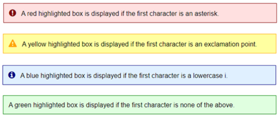
A typical use for these would be to define something like [show infomsg$], and then in your application logic, change the value of infomsg$ to the message you want displayed.
If the message is null (""), no box will be displayed.
Two additional classes that can be applied to an infobox are:
|
show_till_change |
This infobox will only appear until a field on the screen changes. This is useful for messages such as "File Updated" or "Record Saved" where you would want the message to go away once a change was made to the screen. |
|
flex |
This infobox will only occupy enough width on the screen to accommodate the contents instead of filling the section of the screen, which is the default for an infobox. |
These additional classes can be specified in the
[show] short code
class option in a quoted string with space separators, as in the following example:
Example:
[show myMsg$ class="infoboxshow_till_change"] |
|
noborder |
Suppresses the border on the item (generally for
[input],
[list] or
[grid]). |
|
no_newline |
Can be used on a
[button] short code to suppress the new line that generally follows the button. Using this will allow you to place buttons in a row across the page.
(The no_newline class was added in PxPlus 2022.) |
|
transparent |
Makes the background of the item transparent. |
Webster+ provides a
Drag and Drop List that consists of a series of items that can be manually moved (dragged) between different drag and drop lists or within the list itself.
The following classes apply only to drag and drop lists:
|
Class |
Description |
|
candelete |
(Applicable to Drag and Drop Lists Only)
This class can be added to any drag and drop list box to indicate that all items in the list are to have a small "x" on the right edge, which, if clicked, will delete the item from the list.
(The candelete class was added in PxPlus 2022.) |
|
fullline |
(Applicable to Drag and Drop Lists Only)
This class can be added to any drag and drop list box to indicate that all items in the list are to occupy the full line in the list as opposed to just the width of the contents.
(The fullline class was added in PxPlus 2022.) |
|
square |
(Applicable to Drag and Drop Lists Only)
This class can be added to any drag and drop list box to indicate that all items in the list are not to be drawn with rounded edges but rather square corners.
(The square class was added in PxPlus 2022.) |
Webster+ provides a tree view style list that provides a visual grouping of items from which a user can select. The tree view can be either loaded from embedded data within the page, from a file or from a query or placed in a memory file by a program.
(Tree view lists were added in PxPlus 2023.)
The data supplied to the tree view should consist of records that have multiple fields with the first field being the topmost level of the tree, the second field the next level, and so on:

The following classes can be applied to tree view lists to alter their appearance and function:
|
Class |
Description |
|
cbx |
(Applicable to Tree View Lists Only)
When applied to a tree view list, this class causes the inclusion of check boxes in front of all tree view elements, allowing the user to select items to process.
Example:

(The cbx class was added in PxPlus 2023.) |
|
lines |
(Applicable to Tree View Lists Only)
When applied to a tree view list, this class causes lines to be drawn, connecting items in the various levels.
Example:

(The lines class was added in PxPlus 2023.) |
|
button |
(Applicable to Tree View Lists Only)
When applied to a tree view list, this class causes the level markers (black triangles in front of the tree level) to be replaced with buttons that can be toggled to open/close the level.
Example:

(The button class was added in PxPlus 2023.) |