Format and Description
Plus
RGraph
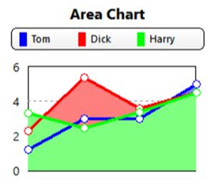
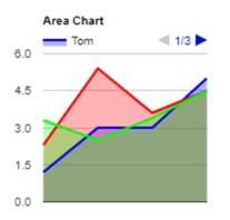
Area Chart
Displays a series as a set of points connected by a line, with all the area filled in below the line.
Available in 2D only.
Not available in RGraph, which substitutes the Line chart.
Not Available
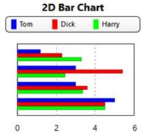
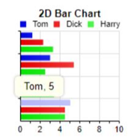
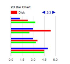
Bar Chart
A graph consisting of parallel horizontal bars or rectangles, each of which represents the value of one item of data.
Available in 2D and 3D except for Google, which has 2D only.
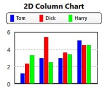
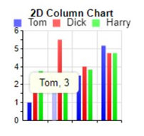
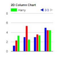
Column Chart
A graph consisting of parallel vertical bars or rectangles, each of which represents the value of one item of data.
Available in 2D and 3D, except for Google, which has 2D only.
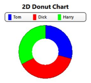
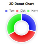
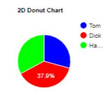
Donut Chart
A circular chart with a hole in the center, divided into slices proportional to the percentages of the whole.
Available in 2D and 3D in Plus Charts and RGraph.
The 2D Pie chart is substituted in Google Interactive Charts.
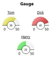
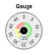
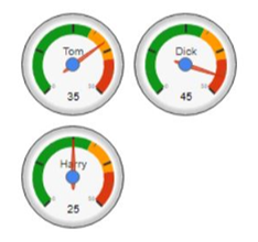
Gauge Chart
Each numeric value is displayed as a gauge.
Available in Plus Charts, Google Interactive Charts and RGraph only.
The Plus and Google gauges can show multiple values by displaying multiple gauges. RGraph shows only one gauge.
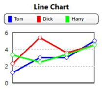
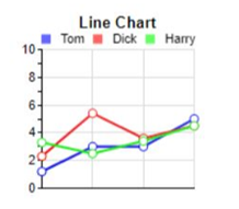
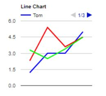
Line Chart
Displays a series as a set of data points connected by a line.
Available in 2D only, except for Plus Charts and RGraph, which also support a 3D version.
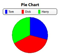
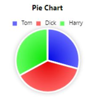
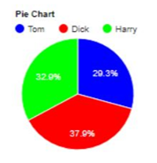
Pie Chart
A circular chart divided into triangular areas proportional to the percentages of the whole.
Available in 2D and 3D.
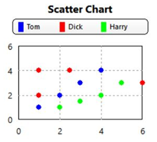
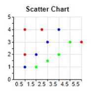
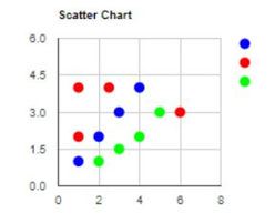
Scatter Chart
Also known as an XY Chart.
Plots sets of Cartesian coordinates. (Each dataset consists of X and Y value pairs.)
Available in Plus Charts, RGraph, and Google Interactive Charts in 2D.
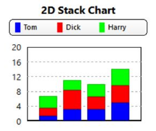
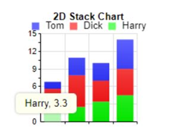
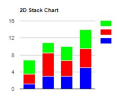
Stack Chart
A column chart whose data values are stacked (accumulated).
Available in 2D and 3D, except for Google Interactive Charts, which displays a 2D chart.