NOMADS Graphical Application
|
File Maintenance Generator | |
The File Maintenance Generator provides a simple seven-step process that, when completed, generates new NOMADS panels and/or
Webster+ HTML pages as file maintenance or inquiry-only panels. File maintenance panels provide the capability to browse, write, edit and delete records. Inquiry-only panels provide view-only access to records, as well as browsing capability.
See
File Maintenance Generator Steps.
The generated file maintenance panels are based on data files defined in a PxPlus
Data Dictionary and are built with controls representing the data fields in the
Data Dictionary and
Data Class Objects. The data dictionary also supplies key structure information to enable accessing and writing the data records. Element names, prompts, default values, validation rules, print formats, associated queries, help and control types are derived from the data dictionary and data class definitions.
Note:
If a data element definition includes a
Dynamic data class, information from the dynamic data class will load the control's properties on a generated panel. If the Dynamic data class definition is for a Multi-Line control,
Extended Class Validation can be defined to provide additional table validation and allow access to data elements for creating display-only Multi-Line controls when designing NOMADS panels.
If a data element definition includes a non-dynamic data class, information for the control's properties will come from the data dictionary. The only exceptions are Short Description (used for prompts) and Default/Input Value, which always come from the data dictionary. See
Element Description.
In addition,
Non-File Maintenance Forms, which do not use the standard file maintenance logic, can be created. This provides the capability to generate informational/dashboard-like NOMADS panels and/or HTML pages.
(The File Maintenance Generator was added in PxPlus 2019.)
(The ability to create HTML pages using File Maintenance Generator was added in PxPlus 2021.)
(The ability to create Non-File Maintenance forms was added in PxPlus 2022.)
Invoking the File Maintenance Generator
The File Maintenance Generator is invoked from NOMADS
Library Object Selection by using one of the methods in the table below, depending on which
Views menu option is selected.
You can also select the
File Maintenance Generator task on the IDE Main Launcher.
(The File Maintenance Generator task on the IDE was added in PxPlus 2023 Update 1.)
Note:
When entering a new panel Name, valid characters are: letters (A-Z, a-z); numbers (0-9); ~ (tilde); @ (at symbol); . (period); $ (dollar sign); _ (underscore); - (dash); + (plus sign). If an invalid character is used, a message displays.
|
Views Menu Option |
Method |
|
Button View |
Under Objects New/Maintain, type a new file maintenance panel name in the Name field (see Note above). Then either click the File Maint button or select Objects > File Maint from the menu bar. The
Welcome panel is launched. |
|
Toolbar View |
Click the File Maint button on the toolbar, and when prompted, type a new file maintenance panel Name (see Note above). The
Welcome panel is launched.
Another method is to select Objects > File Maint from the menu bar, and when prompted, type a new file maintenance panel Name. |
|
Menubar View |
Select Objects > File Maint from the menu bar, and when prompted, type a new file maintenance panel Name (see Note above). The
Welcome panel is launched. |
Step 1: File Maintenance Object Definition
Define the file maintenance object:
- Select the type of form(s) to create
- Select a data dictionary table
- Enter a file maintenance object for the file definition
- Enter an optional HTML interface program
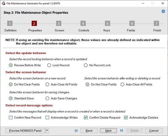
Step 2: File Maintenance Object Properties
Define the options for record update behavior, screen behavior and record messages.
Step 3: File Maintenance Screen Layout
Define the options for screen positioning, browse and action buttons, and panel header:
- Define NOMADS
Panel Header Options and add a panel note
- Specify the locations of
Browse and
Action buttons
- Define any
Additional Buttons to be added before and/or after the browse and action buttons
- Specify whether an optional embedded panel and/or HTML page will be included
Step 4: File Maintenance Control Settings
Define the options for field and screen layout, fonted text and full horizontal lines.
Step 5: File Maintenance Key Settings
Define the options for a record query or a fixed key segment.
Step 6: File Maintenance Field Layout
Define the layout for the file maintenance Main panel and any folder panels:
Step 7: File Maintenance Generator Completion
Complete the File Maintenance Generator and generate the panels. Before panels are generated:
- Review selections for previous steps and make any necessary changes
- Enter the name of a
File Maintenance Template for saving settings
Once the file maintenance NOMADS panels and/or HTML pages are generated, they can be easily modified by using the
NOMADS Panel Designer or the
HTML Editor. Alternatively, they can be regenerated by using the File Maintenance Generator. See
Updating a Generated File Maintenance Panel.
For examples of generated panels with different settings, see
File Maintenance Sample Panels.
(The ability to regenerate an existing file maintenance panel was added in PxPlus 2020.)
(The ability to add Smart List Boxes, Smart Charts, Images, Embedded Panels, HTML Short Codes, and Hyperlink Prompts was added in PxPlus 2021.)
(The ability to add Buttons was added in PxPlus 2021 Update 1.)
(The ability to add Input Fields, Text and Grids was added in PxPlus 2022.)
The Welcome panel shows the panel name and provides general information about the File Maintenance Generator, as well as two links:
|
|
How to Create File Maintenance Panels link launches PxPlus Help documentation for the current version of the File Maintenance Generator.
To access the legacy version of the File Maintenance Generator click here link launches the legacy version of the
File Maintenance Generator. |
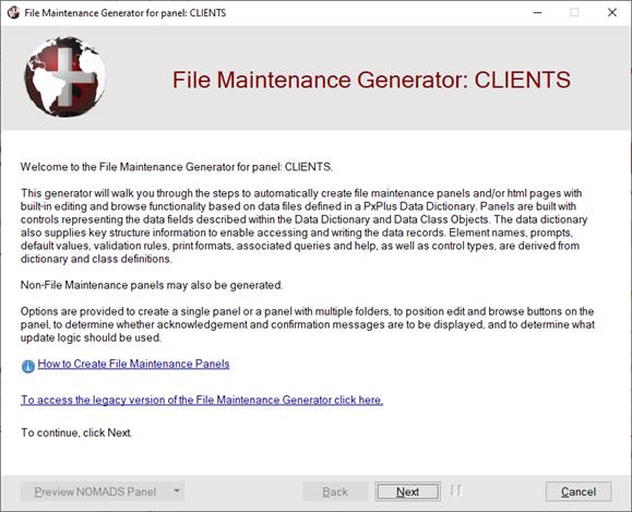
Click Next to proceed to the first step. Each step presents a panel made up of three main sections: a progress bar, a work area and a navigation bar.
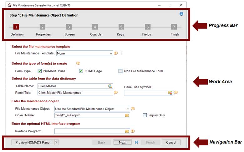
These sections are explained below:
|
Progress Bar |
Displays the seven steps for generating a file maintenance panel. A white step number against a dark red background indicates the current step being defined.
Clicking on a step number goes directly to that step without having to select intermediate steps in order. This is useful when reviewing or changing previous selections before exiting the generator. Keep in mind that certain steps may require data before advancing to subsequent steps. |
|
Work Area |
Body of the File Maintenance Generator panel that consists of fields used to process each step. |
|
Navigation Bar |
Consists of buttons that are enabled or disabled, depending on the step being defined:
|
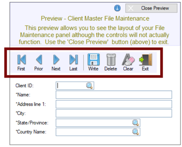
Preview NOMADS Panel
(or Preview HTML Page) |
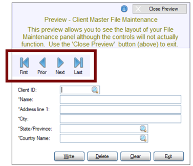
This button is enabled on all panels in the File Maintenance Generator after a Table Name is entered or selected in Step 1: Definition. It is used to display a preview of the layout of the NOMADS panel or HTML page; however, the controls will not actually function. The button text defaults to Preview NOMADS Panel or Preview HTML Page. Click the drop-down arrow for preview options. See
Preview Mode. |
|
(First browse button) |
Goes directly to
Step 1: Definition. |
|
Back |
Returns to the previous panel. |
|
Next |
Advances to the next panel. If information is required before advancing to the next panel, a message will display. |
|
(Last browse button) |
Goes directly to
Step 7: Finish. If no fields (besides Key fields) have been added in
Step 6: Fields, a message about adding fields to the Main panel will display. |
|
Finish |
Completes the File Maintenance Generator and generates the NOMADS panels and/or HTML pages. See
Step 7: Finish. |
|
Cancel |
Closes the File Maintenance Generator. No panels or HTML pages are generated. | |
Select the type of form(s) to create and the data dictionary table to use. The file maintenance object for the file definition is also specified, if applicable.
Note:
For file maintenance panels, Table Name and Object Name are required before proceeding to Step 2: Properties.
This panel consists of the following:
|
Select the file maintenance template |
Select a template to apply its settings to the new panel(s) or HTML page(s) to be generated.
A template consists of predetermined settings that define the appearance of a panel or HTML page. Using templates makes designing new panels or HTML pages easier and gives them a consistent look and feel.
The templates data file "maint_templates.dat" is created according to the prefix settings the first time the File Maintenance Generator is accessed on a new PxPlus installation or for a new PxPlus project. Therefore, different PxPlus projects may have unique template data files.
(Support for creating the templates data file according to prefix settings was added in PxPlus 2021.)
Different templates can be used to create different panel or HTML page designs. For example:
A simple maintenance panel with (or without) browse buttons
A panel that includes a folder with top (or bottom) tabs
A panel that includes a folder with left (or right) sidebar tabs
A panel with an embedded toolbar
To save template settings for future use, click the Save Template button in
Step 7: Finish. |
|
File Maintenance Template |
(Available when a Template exists)
Click the drop-down arrow for a list of previously saved templates (if applicable). See
Save Template (in Step 7: Finish).
When a template is selected, its settings are applied to the current panel or HTML page to be generated.
If no templates exist or an existing template is not selected, the default will be None.
If a template was saved with the Default Template check box selected (see
Save Template), that template name will be the default when a new file maintenance panel is being generated, and the words *Default Template* will display. Note:
If a panel is being regenerated, the File Maintenance Template drop box will initially be disabled. To enable this drop box and choose another template, select the Reset Template check box.
(The default setting "None" was added in PxPlus 2019 Update 1.) |
|
(Copy Template) |
(Available when no Templates are defined)
Button (next to the File Maintenance Template drop box) that launches the Copy File Maintenance Templates window.
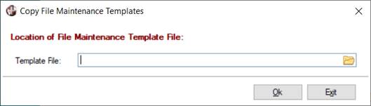
This window is used to copy the file maintenance templates from an existing templates data file (maint_templates.dat) to the templates data file in the current PxPlus installation or project. This allows previously defined templates to be available in subsequent PxPlus installations or projects without having to recreate them.
For example, assuming that file maintenance templates were defined in PxPlus 2020, after installing PxPlus 2021, you would need to use the Copy Template button to copy those existing templates to the currently empty templates data file in PxPlus 2021.
This window consists of the following:
|
Template File |
Specify the location of the existing file maintenance templates data file (maint_templates.dat) to copy from. |
|
OK |
Copies the existing templates from the selected data file into the currently empty templates data file. The File Maintenance Template drop box is loaded with the templates from the specified file, and the Copy Templates button is hidden. |
|
Exit |
Closes the Copy File Maintenance Templates window without copying any templates. |
Note:
If a panel is being regenerated and the template used is invalid for the new installation or project, the template will be reset to the original value if it is valid after the copy is complete.
(The Copy Template button was added in PxPlus 2020.) |
|
(Delete Template) |
(Available when a previously saved template is selected)
Button (next to the File Maintenance Template drop box) that is used to delete a template. Prior to deleting a template, a message will display.
This button is enabled when a previously saved template (other than None) is selected from the File Maintenance Template drop box. Note:
If the template that was used to generate a panel is subsequently deleted, a message will display when regenerating the panel, stating that the template is no longer valid. However, the template settings that were used to generate the original panel will not be deleted. |
|
Reset Template |
(Available when an existing panel is being regenerated)
Select this check box to enable the File Maintenance Template drop box and reset the template by choosing one from the drop box. The settings associated with the selected template will be used instead of the settings when the panel was generated.
If the Reset Template check box is unchecked after another template has been selected, the original template name and its settings will be put back to the way they were on the original panel.
By default, this check box is not selected. When generating a new file maintenance (or inquiry-only) panel, this check box is hidden.
(The Reset Template option was added in PxPlus 2020.) |
|
Screen Designer |
(Available when an existing panel is being regenerated)
Button that opens the regenerated file maintenance panel in the
NOMADS Panel Designer.
If any File Maintenance settings were changed, a message will display when clicking this button.
(The Screen Designer button was added in PxPlus 2023.) |
|
Select the type of form(s) to create |
A NOMADS panel, an HTML page or both types can be created. Non-File Maintenance forms, which do not use the standard file maintenance logic, can also be created. |
|
Form Type |
Select the type of form(s) to create: a NOMADS Panel (Default), a Webster+ HTML Page, or both types.
The Non-File Maintenance Form check box is used for creating a NOMADS panel and/or HTML page that does not use the standard file maintenance logic. Selecting this check box provides the capability to generate informational/dashboard-like panels or pages. Entering a data dictionary table is optional. If a table is entered, fields can be added to the layout if desired. The Non-File Maintenance Form setting is not saved to a template.
Before an HTML page can be created, a location must be defined to store the
Webster+ generated HTML forms. This is done by selecting Webster+ > Directory on the Library Object Selection menu bar. If the location is not defined and the HTML Page option is selected, a message will display.
(The Form Type option was added in PxPlus 2021.)
(The Non-File Maintenance Form option was added in PxPlus 2022.) |
|
Select the table from the data dictionary |
A definition must exist in the data dictionary (providex.ddf and providex.dde files) to generate a new panel. |
|
Table Name |
Name of an existing data dictionary table for which the file maintenance object is being defined. Click the Query Table View button (magnifying glass) to invoke the
Lookup Table Names window to search for a table name or type the table name.
If the Non-File Maintenance Form check box is selected, the table name is optional. Note:
When the panel is generated, the table name is recorded in the Tag Field property in the
Panel Header record for the main panel. |
|
Panel Title |
Title to display at the top of the generated panel. The panel title is required before proceeding to the next step.
By default, the panel title displays as xxxxxx Maintenance (where xxxxxx is the Table Name selected from the data dictionary).
If the Inquiry Only check box is selected, the panel title defaults to xxxxxx Inquiry.
If the Non-File Maintenance Form check box is selected, a panel title must be entered. Note:
The default Panel Title is derived using the data dictionary description and one of the standard message library references - 'FM_TITLE' for the word 'Maintenance' and 'FM_INQ' for the word 'Inquiry'.
For generating panels in languages other than English, corresponding message library entries should be created. |
|
Panel Title Symbol |
(Applicable for HTML Pages Only)
A symbol can be optionally added before the panel title in Webster+ HTML pages. It can be either a Font Awesome symbol or a standard PxPlus bitmap selected from the Bitmap Library lookup button.
For a list of Font Awesome symbols, visit https://fontawesome.com/v4/icons/. Note:
When specifying the Font Awesome symbol name, do not include the leading 'fa-'.
(The Panel Title Symbol option was added in PxPlus 2022 Update 1.) |
|
Enter the maintenance object |
Generated file maintenance panels require a file maintenance object as the Default Program in the
Panel Header for a generated main panel. This object contains properties that correspond to the options on the
Step 2: Properties panel. This object can be unique to each generated file maintenance panel or can be shared among different generated file maintenance panels. |
|
File Maintenance Object |
Click the drop-down arrow for available selections:
|
Use the Standard File Maintenance Object |
(Default) The panel will use the standard *win/fm_maint.pvc object and the properties on the
Step 2: Properties panel will be set from the default values stored as %NOMADS Object properties. See
File Maintenance and Object Inheritance.
PROPERTY FM_Update_Option$='R'
PROPERTY FM_New_Option$='0'
PROPERTY FM_Clear_Option$='0'
PROPERTY FM_Auto_Save_Option$='0'
PROPERTY FM_Confirm_New_Rec$='0'
PROPERTY FM_Acknowledge_Writes$='0'
PROPERTY FM_Confirm_Deletes$='1'
PROPERTY FM_Acknowledge_Deletes$='1' Note:
These properties may be overridden by setting them in the
NOMADS Environment Maintenance utility or by setting them individually elsewhere. |
|
Create a New File Maintenance Object |
Enter the name of a new object to be created with properties defined on the
Step 2: Properties panel. |
|
Use an Existing File Maintenance Object |
Enter the name of an existing object to be used with properties defined at the time the object was initially created. Note:
If an existing file maintenance object is entered, the options in
Step 2: Properties will be set based on the values in the selected file maintenance object and cannot be modified. See
File Maintenance and Object Inheritance for information on file maintenance objects. |
(The File Maintenance Object drop box was added in PxPlus 2020.) |
|
Object Name |
Input depends on the File Maintenance Object drop box selection:
|
|
If Use the Standard File Maintenance Object is selected, Object Name defaults to the standard *win/fm_maint.pvc object and is disabled. |
|
|
If Create a New File Maintenance Object is selected, enter a new Object Name. If a duplicate Object Name is entered, a message will display. |
|
|
If Use an Existing File Maintenance Object is selected, enter an existing Object Name or click the Query button. If an Object Name is entered that does not exist, a message will display. | Note:
Object names must end with the file extension .pvc. |
|
Inquiry Only |
Select this check box to create a file maintenance panel in inquiry mode, which allows view-only access to records. Records cannot be added, edited or deleted.
If this check box is selected, the Panel Title defaults to xxxxxx Inquiry. In addition, all options in
Step 2: Properties, as well as the Required Fields option in
Step 4: Controls, are disabled. |
|
Enter the optional HTML interface program |
As with the File Maintenance logic in NOMADS, hooks are available to allow additional logic to be performed for the HTML page. If the HTML page requires additional logic at some or all of the following points, ensure that the methods are named as shown below:
|
FM_INIT |
Will be performed on initial page display. |
|
FM_POST_READ |
Will be performed after each record is read. |
|
FM_PRE_WRITE |
Will be performed before writing any record. |
|
FM_POST_WRITE |
Will be performed after writing a record. |
|
FM_PRE_REMOVE |
Will be performed before removing a record. |
|
FM_POST_REMOVE |
Will be performed after removing a record. | |
|
Interface Program |
(Applicable for HTML Pages Only)
Enter the name of the interface program or click the Query button.
An interface program is needed if you want to add code for any of the methods listed above. It is also needed to code events associated with various
Objects (Buttons, Grids, Input Fields, etc.) that you are adding to the HTML page in Step 6: Fields.
If adding a
Grid object, the HTML interface program is required to create a method to load the Grid using a memory file. The interface program name entered will be used as the default
Initialization Program.
For an example of an interface program, see
Grid Example. For additional Grid information, see
Using Grids in Webster+.
(The Interface Program option was added in PxPlus 2021.) |
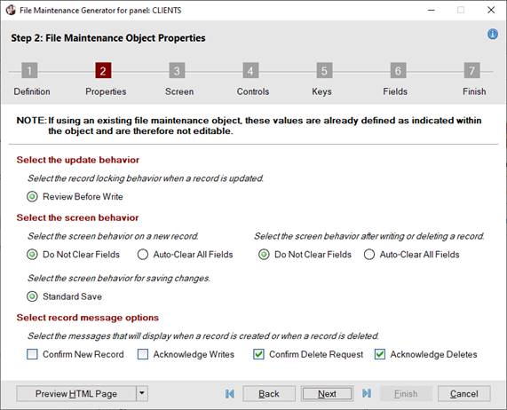
Define the options for record update behavior, screen behavior and record messages.
Note:
If an existing file maintenance object is entered in
Step 1: Definition, the options in Step 2: Properties will be set based on the values in the selected file maintenance object and cannot be modified.
See
File Maintenance and Object Inheritance for information on file maintenance objects.
When only HTML Page is selected as the form type in
Step 1: Definition, options that are not applicable are not displayed, as shown in the second screen shot:
|
 |
When only "HTML Page" is selected |
This panel consists of the following:
|
Select the update behavior |
Select the record locking behavior when a record is updated. |
|
Review Before Write |
(Default) Record's contents are reviewed before the record is written to determine if another user changed any fields. |
|
Lock Record |
(Applicable for NOMADS Panels Only)
Locks the record. |
|
No Record Lock |
(Applicable for NOMADS Panels Only)
Writes the record with no lock. |
|
Select the screen behavior |
Select the screen behavior on a new record, for saving changes and after writing or deleting a record. |
|
Do Not Clear Fields |
(Default) Record's contents are not cleared from data fields. This behavior can be applied after a new record key is entered and after a record is written or deleted. |
|
Auto-Clear All Fields |
Record's contents are automatically cleared from data fields. This behavior can be applied after a new record key is entered and after a record is written or deleted. |
|
Standard Save |
(Default) To save a new or edited record, the Write button is selected; otherwise, a confirm-save message displays when tabbing off an input control and selecting the Clear, Exit, browse or X (Close) buttons. |
|
Auto-Save Changes |
(Applicable for NOMADS Panels Only)
A new or edited record is automatically saved when tabbing off an input control and selecting the Exit, browse or X (Close) buttons. No Write button is provided. |
|
Select record message options |
Select the messages that will display when a record is created or deleted. |
|
Confirm New Record |
A message asks to create the new record before proceeding. |
|
Acknowledge Writes |
A message confirms that the new record has been added or an existing record has been updated. |
|
Confirm Delete Request |
(Default) A message asks to delete the selected record before proceeding. |
|
Acknowledge Deletes |
(Default) A message confirms that the selected record is deleted. |
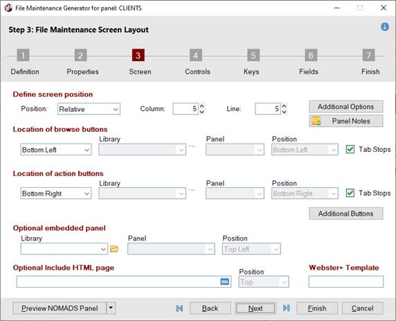
Define the options for screen positioning, browse and action buttons locations, and the panel header. Specify whether an optional
Embedded Panel and/or HTML page will be included.
When only HTML Page is selected as the form type in
Step 1: Definition, options that are not applicable are not displayed, as shown in the second screen shot:
|
 |
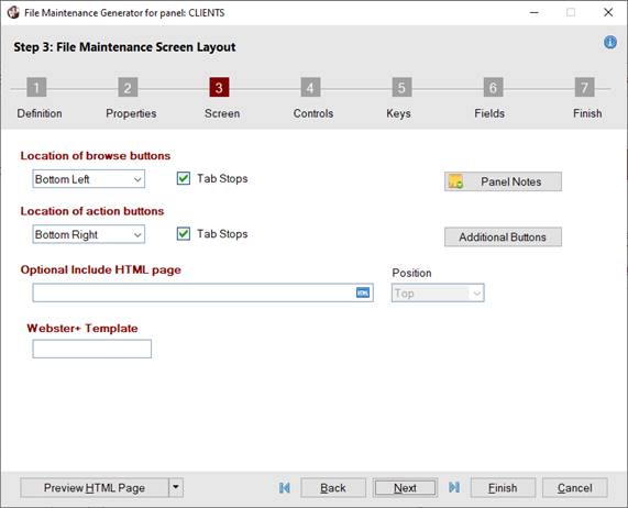
When only "HTML Page" is selected |
This panel consists of the following:
|
Define screen position |
Define the options for screen position for the NOMADS panel. Click the Additional Options button for panel header options. |
|
Position |
(Applicable for NOMADS Panels Only)
Determines where the panel is placed on the desktop. NOMADS provides the capability for the system to remember where a panel was last placed and will attempt to restore it to the same position. See
Panel Persistence.
Click the drop-down arrow for a list of selections:
|
Absolute |
The panel will be positioned on the current monitor at the Column and Line specified. The current monitor will be the main monitor for the initial screen or the monitor in use if you currently have a panel/window being displayed. |
|
Relative |
(Default) The panel will be positioned using the Column and Line values as relative positions based on the current panel/window being displayed.
If no window is displayed, then the position will be relative top of the screen. Note:
There is almost always a window logically present even if it is minimized, as PxPlus creates a main window during start up and preserves its last location automatically. |
|
Centered |
The panel is displayed as centered on the current display. Column and Line values are not applicable. | |
|
Column |
(Applicable for NOMADS Panels Only - Available when Position is Absolute or Relative)
Starting vertical position for the top left corner of the generated panel. Valid values are 1 - 620. (Default is 5.)
(Support for increased Column maximum was added in PxPlus 2021.) |
|
Line |
(Applicable for NOMADS Panels Only - Available when Position is Absolute or Relative)
Starting horizontal position for the top left corner of the generated panel. Valid values are 1 - 255. (Default is 5.)
(Support for increased Line maximum was added in PxPlus 2021.) |
|
Additional Options |
(Applicable for NOMADS Panels Only)
Button that launches the
Additional Options window with more options for defining the panel header. |
|
Panel Notes |
Button that is used to add notes/comments for the panel. Maximum 1024 characters. (Same as the
Notes button in NOMADS Panel Definition.)
(The Panel Notes button was added in PxPlus 2022.) |
|
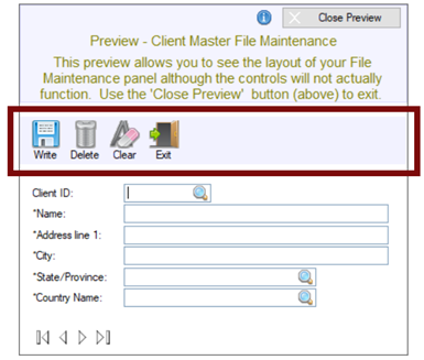
Location of browse buttons |
Specify the location of the browse buttons. Define any
Additional Buttons to be added before and/or after the browse buttons. |
|
(Location Drop Box) |
Click the drop-down arrow for a list of locations.
If selecting a Location that is either identical to or conflicts with the location of the Action buttons, a message will display, in which case, select a different location.
For additional information, see
Browse and Action Buttons in HTML Pages.
|
Bottom Left |
(Default) Buttons are positioned horizontally in the bottom left corner of the main panel. |
|
Bottom Right |
Buttons are positioned horizontally in the bottom right corner of the main panel. |
|
Top Left |
Buttons are positioned horizontally in the top left corner of the main panel. |
|
Top Right |
Buttons are positioned horizontally in the top right corner of the main panel. |
|
Beside Key |
Buttons are positioned horizontally next to the primary Key field. |
|
Beside Last Key Seg |
(Available when primary Key has more than one segment)
If the data dictionary table selected in
Step 1: Definition has a primary Key with more than one segment, buttons will be positioned horizontally next to the last segment.
(The Beside Last Key Seg option was added in PxPlus 2021.) |
|
Toolbar |
Fixed toolbar (i.e. does not stretch) comprised of individual button controls and is positioned at the top left of the main panel.
Example:
If Toolbar is selected for both the Browse and Action buttons, the toolbar will contain browse and action buttons.
(The Toolbar selection for browse buttons was added in PxPlus 2020.) |
|
Embedded Panel |
(Applicable for NOMADS Panels Only)
Select an existing embedded panel to use in place of the standard browse buttons. |
|
Embedded Toolbar |
(Applicable for NOMADS Panels Only)
Embedded toolbar that extends horizontally across the top of the main panel and contains embedded button controls.
Example:
If Embedded Toolbar is selected for both the Browse and Action buttons, the embedded toolbar will contain browse and action buttons.
(The Embedded Toolbar selection for browse buttons was added in PxPlus 2020.) |
|
None |
No browse buttons. |
(The Toolbar and Embedded Toolbar selections were added in PxPlus 2020.) |
|
Library |
(Applicable for NOMADS Panels Only - Available when browse buttons Location is Embedded Panel)
Library path for the existing embedded panel. Click the drop-down arrow for a list of (up to nine) previous library selections.
Click the Browse button to look through the directory structure to find the library or type the library path. An expression can also be entered by preceding the expression with an = (equals sign); e.g. =libname$ or ="mylib.en". Note:
The Library name may be a specific or generic reference. See
Cascading Language Suffixes. |
|
Panel |
(Applicable for NOMADS Panels Only - Available when a Library is selected)
Embedded panel name. Click the drop-down arrow for a list of panels in the selected library. Note:
It is not recommended to embed a generated file maintenance panel into another file maintenance panel to be generated, as this may cause issues when the NOMADS panel or HTML page is displayed. |
|
Position |
(Applicable for NOMADS Panels Only - Available when an Embedded Panel Name is selected)
Position of the selected embedded panel on the file maintenance panel.
Click the drop-down arrow for a list of positions: Top Left, Top Center, Top Right, Left Edge, Right Edge, Bottom Left, Bottom Center, Bottom Right, to Right of Key, Right of Last Key Seg. Note:,
The Position cannot be duplicated if using more than one embedded panel to define the screen layout in Step 3: Screen; otherwise, a message will display. |
|
Tab Stops |
(Not Available when browse buttons Location is Toolbar, Embedded Panel, Embedded Toolbar or None)
Select this check box to add the browse buttons to the panel's tabbing sequence. |
|
Location of action buttons |
Specify the location of the action buttons (i.e. Write, Delete, Clear, Exit). Define any
Additional Buttons to be added before and/or after the action buttons.
If the location is set to "Embedded Panel" and the Position selected is either Top Bar or Bottom Bar, any before/after Action buttons that are added will be ignored when generating the NOMADS panel. In that case, the additional buttons should be added directly to the panel being embedded. |
|
(Location Drop Box) |
Click the drop-down arrow for a list of locations.
If selecting a Location that is either identical to or conflicts with the location of the Browse buttons, a message will display, in which case, select a different location.
For additional information, see
Browse and Action Buttons in HTML Pages.
|
Bottom Right |
(Default) Buttons are positioned horizontally in the bottom right corner of the main panel. |
|
Bottom Left |
Buttons are positioned horizontally in the bottom left corner of the main panel. |
|
Top Right |
Buttons are positioned horizontally in the top right corner of the main panel. |
|
Top Left |
Buttons are positioned horizontally in the top left corner of the main panel. |
|
Right Side |
(Applicable for NOMADS Panels Only)
Buttons are aligned vertically (one below the other) at the right side of the main panel. |
|
Toolbar |
Fixed toolbar (i.e. does not stretch) comprised of individual button controls and is positioned at the top left of the main panel.
Example:
If Toolbar is selected for both the Browse and Action buttons, the toolbar will contain browse and action buttons.
 |
|
Embedded Panel |
(Applicable for NOMADS Panels Only)
Select an existing embedded panel to use in place of the standard action buttons (i.e. Write, Delete, Clear, Exit). |
|
Embedded Toolbar |
(Applicable for NOMADS Panels Only)
Embedded toolbar that extends horizontally across the top of the main panel and contains embedded button controls.
Example:
If Embedded Toolbar is selected for both the Browse and Action buttons, the embedded toolbar will contain browse and action buttons.
 | |
|
Library |
(Applicable for NOMADS Panels Only - Available when action buttons Location is Embedded Panel)
Library path for the existing embedded panel. Click the drop-down arrow for a list of (up to nine) previous library selections.
Click the Browse button to look through the directory structure to find the library or type the library path. An expression can also be entered by preceding the expression with an = (equals sign); e.g. =libname$ or ="mylib.en". Note:
The Library name may be a specific or generic reference. See
Cascading Language Suffixes. |
|
Panel |
(Applicable for NOMADS Panels Only - Available when a Library is selected)
Embedded panel name. Click the drop-down arrow for a list of panels in the selected library. Note:
It is not recommended to embed a generated file maintenance panel into another file maintenance panel to be generated, as this may cause issues when the NOMADS panel or HTML page is displayed. |
|
Position |
(Applicable for NOMADS Panels Only - Available when an Embedded Panel Name is selected)
Position of the selected embedded panel on the file maintenance panel. Click the drop-down arrow for a list of positions: Top Left, Top Center, Top Right, Top Bar, Left Edge, Right Edge, Bottom Left, Bottom Center, Bottom Right, Bottom Bar.
Embedding a panel in the Top Bar or Bottom Bar position is similar to embedding it in the Top Left or Bottom Left position except that when Top Bar or Bottom Bar is selected, the
Stretchable check box is automatically selected for the embedded panel control on the generated panel. This allows an embedded panel that contains a rectangle shape to be stretched to fill the entire width of the panel, which is useful when creating a Toolbar.
When Top Bar or Bottom Bar is selected, any
Additional Buttons that are added before and/or after the Action buttons will be ignored; therefore, any additional buttons that are required should be added directly to the panel being embedded. Note:
The Position cannot be duplicated if using more than one embedded panel to define the screen layout in Step 3; otherwise, a message will display. |
|
Tab Stops |
(Not Available when action buttons Location is Toolbar, Embedded Panel or Embedded Toolbar)
Select this check box to add the action buttons to the panel's tabbing sequence. |
|
Additional Buttons |
Button that launches the
Maintain Additional Buttons window for adding (and editing) additional buttons that are placed before and/or after the browse and action buttons.
(The Additional Buttons button was added in PxPlus 2022.) |
|
Optional embedded panel |
Define the options for adding an embedded panel to the NOMADS panel. |
|
Library |
(Applicable for NOMADS Panels Only)
Library path for the existing embedded panel to be added. Click the drop-down arrow for a list of (up to nine) previous library selections.
Click the Browse button to look through the directory structure to find the library or type the library path. An expression can also be entered by preceding the expression with an = (equals sign); e.g. =libname$ or ="mylib.en". Note:
The Library name may be a specific or generic reference. See Cascading Language Suffixes. |
|
Panel |
(Applicable for NOMADS Panels Only - Available when a Library is selected)
Embedded panel name. Click the drop-down arrow for a list of panels in the selected library. Note:
It is not recommended to embed a generated file maintenance panel into another file maintenance panel to be generated, as this may cause issues when the NOMADS panel or HTML page is displayed. |
|
Position |
(Applicable for NOMADS Panels Only - Available when an Embedded Panel Name is selected)
Position of the selected embedded panel on the file maintenance panel. Click the drop-down arrow for a list of positions: Top Left (Default), Top Center, Top Right, Top Bar, Left Edge, Right Edge, Bottom Left, Bottom Center, Bottom Right, Bottom Bar. Note:
The Position cannot be duplicated if using more than one embedded panel to define the screen layout in Step 3; otherwise, a message will display. |
|
Optional Include HTML page |
Specify an HTML page to include on the file maintenance panel to be generated. |
|
(Input field) |
(Applicable for HTML Pages Only)
(Optional) Enter the directory and an existing HTML page to include or click the Query button.
(The option to include an HTML page was added in PxPlus 2021.) |
|
Position |
(Applicable for HTML Pages Only - Available when an HTML Page is specified)
Position of the HTML page on the file maintenance panel, either Top (Default) or Bottom.
(The Position option was added in PxPlus 2021.) |
|
Webster+ Template |
Specify a Webster+ template file. |
|
(Input field) |
(Applicable for HTML Pages Only)
Enter the template file name. If no suffix is entered, an .html suffix is added at run time.
(The Webster+ Template option was added in PxPlus 2023 Update 1.) |
Browse and Action Buttons in HTML Pages
The browse and action buttons that are used in generated Webster+ HTML pages work a little differently from the way they work in NOMADS panels, as explained below.
The Embedded Panel options for browse and action buttons do not apply to generated HTML pages.
The browse and action buttons are added to the HTML page using the Webster+
[include] short code and one of the following pages located in the *webster/pages directory:
|
FM_BROWSE.HTML |
Standard browse buttons (not in a toolbar) |
|
FM_ACTION.HTML |
Standard action buttons (Write, Delete, Clear, Exit) |
|
FM_INQ_ACTION.HTML |
Standard action buttons for an inquiry panel (Clear, Exit) |
|
FM_BROWSE_TOOLBAR.HTML |
Browse buttons in a toolbar |
|
FM_ACTION_TOOLBAR.HTML |
Action buttons in a toolbar |
|
FM_INQ_ACTION_TOOLBAR.HTML |
Inquiry panel action buttons in a toolbar |
|
FM_FULL_TOOLBAR.HTML |
Browse and action buttons in a toolbar |
|
FM_INQ_FULL_TOOLBAR.HTML |
Browse and inquiry panel action buttons in a toolbar |
Note:
If custom versions of the browse and action buttons are required, these files may be copied to a location that will be found in the prefix prior to *webster/pages and edited.
Additional Options
The Additional Options button is available only when creating a NOMADS Panel and launches the Additional Options window with more options for defining the panel header.
These options do not apply to HTML pages.
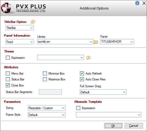
This window consists of the following:
|
TitleBar Option |
Specify a panel to insert as a title bar at the top of the panel. You can also specify that the default title bar or no title bar will be used.
Click the drop-down arrow for a list of selections:
|
Default |
Use the current default Title Bar setting for the panel based on the
%NOMADS'TitleBar$ and
Library Defaults settings. |
|
TitleBar |
Use the panel defined in the Panel Information section as the title bar for the panel. |
|
None |
The panel will not have a title bar. |
For information on the use of the Frame Style parameter when creating a custom title bar, see
Custom Title Bars. |
|
Panel Information |
(Available when the TitleBar Option is TitleBar)
|
Fixed or Expression |
The Custom Title Bar panel information can be entered as a Fixed value or as an Expression:
|
|
If Fixed is selected, enter the Library and Panel information. |
|
|
If Expression is selected, enter an expression that can be evaluated to a value consisting of the panel name and library, separated by a comma (e.g. PanelName,LibraryName). | |
|
Library |
Library path that contains the Title Bar panel definition. Click the drop-down arrow for a list of recently used libraries. Click the Browse button to look through the directory structure to find the library. Be sure to use the simplest form of the path for your application. Note:
The Library name may be a specific or generic reference. See Cascading Language Suffixes. |
|
Panel |
Name of the panel definition to use as the Title Bar for the panel. Click the drop-down arrow for a list of all panels in the library. | |
|
Theme |
Assign a
Theme to be applied to the panel. The Theme can be defined as a Fixed value or string Expression. Note:
A Theme applied at the Panel level overrides the General level Theme set in
%NOMADS'Theme$ and the Library level Theme assigned in
Library Defaults.
A Theme assigned to the
%NOMADS'ThemeOverride$ property overrides all other Theme settings. See
Applying a Theme to Your Application. |
|
Attributes |
|
Menu Bar |
Panel has a
Menu Bar. |
|
Status Bar |
Panel will be created with a status line/message bar. |
|
Close Box |
Enables the Windows close button at the top right corner of the panel. |
|
Status Bar Segments |
(Available when Status Bar check box is selected)
Define up to three additional (optional) status bar segments for the current panel by clicking the button next to the input control and entering the starting column number for the segment.
The default segment (0) starts at column 0. Additional segments can be defined with a positive column number to specify the starting column from the left, or a negative column number to specify the start of a segment from the right. Display text in the individual segments using the
'MESSAGE' mnemonic.
Example:
PRINT 'MESSAGE'(text$,segnum)
Where:
The first segment number is 0.
If the Status Bar attribute is checked and no segments are defined, the system status bar will be used. If segments are defined for the panel, they will override the system definition. Note:
Use the
'MESSAGE' mnemonic to define a system status bar. |
|
Minimize Box |
Enables the minimize box in the top right corner of the window. |
|
Maximize Box |
Enables the maximize box in the top right corner of the panel. |
|
Auto Refresh |
The screen display is refreshed automatically when any control values are changed by the application. |
|
Auto Close Files |
If enabled, all non-global files opened by the application are closed automatically when the panel terminates. |
|
Full Screen Drag |
If selected, a panel can be moved by clicking anywhere on the panel outside of the controls (as well as on the title bar) and dragging the panel to the desired location. This setting overrides the
%NOMADS'Full_Screen_Drag property and the Full Screen Drag setting in
Library Defaults.
Click the drop-down arrow for a list of selections:
|
Default |
Use the default setting based on the
%NOMADS'Full_Screen_Drag property and the Full Screen Drag setting in
Library Defaults. |
|
Always on |
The panel will always have the Full Screen Drag feature turned On, regardless of default settings. |
|
Always off |
The panel will always have the Full Screen Drag feature turned Off, regardless of default settings. | | |
|
Parameters |
|
Sizing |
Determines whether the panel will remain fixed in size or can be resized at run time by dragging the edges of the window. Click the drop-down arrow for a list of selections: Fixed, Resizable, Resizable/Auto Scroll, Resizable/Auto Size, Resizable/Custom. Note:
To make it possible for users to resize a panel larger than the defined size while still maintaining a minimum panel size, select the Maximize Box attribute and set the Sizing parameter to Resizable/Custom. |
|
Frame Style |
Controls the type of frame or border for the current window. Click the drop-down arrow for a list of selections:
|
Default |
Uses current settings. The standard Windows title bar is displayed. |
|
Thick border with caption |
Adds a thick border and a caption to the current window. The standard Windows title bar is displayed. |
|
Thick with no caption |
Adds a thick border to the current window but no caption. The standard Windows title bar is not displayed. |
|
Thin with no caption |
Adds a thin border to the current window but no caption. The standard Windows title bar is not displayed. |
|
No frame or caption |
Does not add a border or a caption. The standard Windows title bar is not displayed. |
For information on the use of the Frame Style parameter when creating a custom title bar, see
Custom Title Bars. | |
|
iNomads Template |
If specified, the
iNomads Template will be applied to the panel, overriding the template specified for the session. |
|
OK |
Saves changes and closes the Additional Options window, returning to the Step 3: Screen panel. |
|
Cancel |
Does not save changes and closes the Additional Options window, returning to the Step 3: Screen panel. |
Maintain Additional Buttons
The Maintain Additional Buttons window is launched when the Additional Buttons button is selected. It is used for adding (and editing) the additional buttons to be placed before and/or after the browse and action buttons. Up to 20 additional buttons can be added.
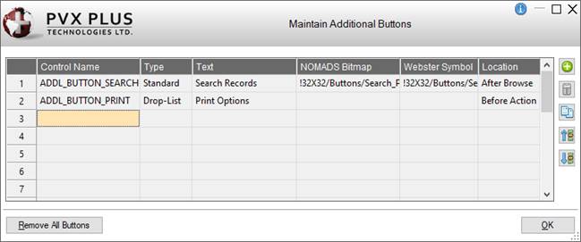
This window consists of the following:
|
(Additional Buttons Grid) |
Displays a list of the additional buttons. After a new additional button is defined, it is automatically added to this list. |
|
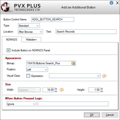
Add or Edit an Additional Button |
Button that launches the Add an Additional Button window for defining a new additional button and editing an existing one.
Many of these options are also available when adding a Button object on the file maintenance panel in Step 6: Fields (see
Button object), except for these differences:
|
Location |
Select the location of the additional Button control: Before Action, After Action, Before Browse, After Browse. |
|
NOMADS |
|
|
Appearance |
|
Popup Library |
(Available when button Type is Drop List)
Library path for the popup menu. Click the drop-down arrow for a list of (up to nine) previous library selections.
Click the Browse button to look through the directory structure to find the library or type the library path. An expression can also be entered by preceding the expression with an = (equals sign); e.g. =libname$ or ="mylib.en". Note:
The Library name may be a specific or generic reference. See Cascading Language Suffixes. |
|
Popup Panel |
(Available when button Type is Drop List)
Popup menu name. Click the drop-down arrow for a list of existing popup menus in the selected library. Click the Popup button to invoke the
Menu Bar Definition for the selected popup menu.
A new popup menu can be created on-the-fly. Enter a new Popup Panel name and then click the Popup button to define the menu. | |
|
Size |
|
Width
Height |
Enter the width (in number of columns only) and the height for the additional Button on the NOMADS panel or use the spinner control.
The width and height of the additional Button will default based on the location selected for the action or browse buttons:
New "browse" buttons default to a width of 3 and a height of 1.5. If the location of the browse buttons is set to Toolbar or Embedded Toolbar, then they will default to a width of 6 and a height of 3.
New "action" buttons default to a width of 10 and a height of 1.5. If the location of the action buttons is set to Toolbar or Embedded Toolbar, then they will default to a width of 6 and a height of 3.
If an actual number of columns has been entered and the Button text is edited so that its length exceeds the number of columns, the value will adjust to match the length of the Button text entered plus 2. | |
|
Webster+ |
|
|
Appearance |
|
List Items |
(Available when button Type is Drop List)
Grid used for entering the text and the
HTML Event to trigger for each item in the drop list. |
|
HTML Class |
A single HTML Class can be entered (e.g. bold). Multiple classes can be entered, separated by either spaces or commas. When spaces are used as the delimiter, the values must be within double quotes (e.g. "bold text_red fill_cyan" or bold,text_red,fill_cyan).
See
Webster+ Defined Classes.
Three system defined classes are used:
|
fm_action |
Assigned to the action buttons on the system fm_action.html page. Can be defined to change the appearance of the action buttons. |
|
fm_browse |
Assigned to the buttons on the system fm_browse.html page. Changes the appearance of buttons located beside a key segment to be borderless and one line high. |
|
fm_toolbar |
Assigned to the various system toolbar html pages. Can be defined to change the appearance of toolbar buttons. | | |
|
Size |
|
Width
Height |
Enter the width (in number of columns only) and the height for the additional Button on the Webster+ page or use the spinner control.
In Webster+, the width defaults to Auto. A width of Columns - Auto will result in the Button being just wide enough to accommodate the text (and symbol if present). To set it back to Auto, enter 0. Otherwise, enter the desired value or use the spinner control. Valid entries are 0 to 300.
The height of the additional Button will default based on the location selected for the action or browse buttons:
New "browse" buttons default to a height of 2. If the location of the browse buttons is set to Toolbar or Embedded Toolbar, then they will default to a height of 5. If the location is set to Beside Key, they will default to a height of 1.25.
New "action" buttons default to a height of 2. If the location of the action buttons is set to Toolbar or Embedded Toolbar, then they will default to a height of 5.
If an actual number of columns has been entered and the Button text is edited so that its length exceeds the number of columns, the value will adjust to match the length of the Button text entered plus 2. | | |
|
Delete an Additional Button |
Removes the selected additional Button. Prior to deletion, a message will display. |
|
Copy an Additional Button |
Creates a new additional button by copying the settings from an existing button selected in the grid.
(Copy an Additional Button was added in PxPlus 2023.) |
|
Move Up
Move Down |
Moves the selected additional Button up or down within the list, changing the order of the additional Buttons on the NOMADS panel and Webster+ page. |
|
Remove All Buttons |
(Available when an additional Button is defined)
Removes all the additional Buttons listed in the grid. Prior to deletion, a message will display.
(Remove All Buttons was added in PxPlus 2023.) |
(The ability to add/maintain Additional Buttons was added in PxPlus 2022.)
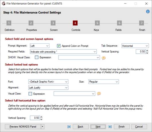
Define the options for field and screen layout, fonted text and full horizontal lines. Fonted text and horizontal lines can be added to the panel layout in
Step 6: Fields.
When only HTML Page is selected as the form type in
Step 1: Definition, options that are not applicable are not displayed, as shown in the second screen shot:
|
 |
When only "HTML Page" is selected |
This panel consists of the following:
|
Select field and screen layout options |
Define the options for field and screen layout. |
|
Prompt Alignment |
Sets the alignment of text controls displayed as field names on the generated panel. Click the drop-down for a list of selections:
|
Left |
(Default) Field names are left-aligned. |
|
Right |
Field names are right aligned. This option does not apply to HTML pages. |
|
No Prompts |
No field names are displayed. | |
|
Append Colon on Prompt |
(Available if Prompt Alignment is Left or Right)
Adds a : (colon) to the end of text controls displayed as field names (e.g. City:). (Default is On.) |
|
Tab Sequence |
(Applicable for NOMADS Panels Only)
Sets the tabbing order:
|
Horizontal |
Tabbing moves across, one row at a time. |
|
Vertical |
Tabbing moves down column 1, then continues at the top of column 2 and moves down, etc. | |
|
Required Fields |
(Available if Prompt Alignment is Left or Right)
Determines whether required fields are marked with a preceding * (asterisk) and includes the option to display a brief explanation for the asterisk in the bottom left of the generated panel. Note:
If there are no required fields or the Prompt Alignment option is set to No Prompts or the
Inquiry Only check box is selected, this drop box will be set to Do not indicate required fields and disabled.
Click the drop-down arrow for a list of selections:
|
Indicate with preceding * |
(Default) Required fields are marked with a preceding * (asterisk). |
|
Indicate with preceding * and include explanation text |
Required fields are marked with a preceding * (asterisk). The explanation text, * indicates required field, is displayed in the bottom left of the generated panel. |
|
Do not indicate required fields |
Required fields are not marked. | |
|
Vertical Spacing |
(Applicable for NOMADS Panels Only)
Determines the amount of vertical spacing between input controls on the generated panel.
Values between 0.50 and 3.0 lines are allowed. (Default is 0.50.) |
|
SHOW. Visual Class |
(Applicable for NOMADS Panels Only and if Extended Class Validation was defined)
Specify a
Visual Class (Fixed value or string Expression) for applying default settings to Extended Validation SHOW.xxxxxx Multi-Lines created from data elements in the selected table.
See
Extended Class Validation and Display. Note:
If a SHOW. Visual Class is specified, the Locked, Borderless and Transparent properties for the SHOW.xxxxxx Multi-Lines will be turned Off unless specifically defined in the Visual Class.
If no SHOW. Visual Class is specified, the Locked, Borderless and Transparent properties will remain On.
(The SHOW. Visual Class option was added in PxPlus 2020.) |
|
Select fonted text options |
Define the options for fonted text (other than field prompts) on the NOMADS panel. These options do not apply to HTML pages.
Fonted text can be added to the panel layout in
Step 6: Fields by entering text directly into a row in the Layout Grid. |
|
Font |
(Applicable for NOMADS Panels Only)
Font type to apply to the Fonted Text entered in the Layout Grid. Click the drop-down arrow for a list of selections. |
|
Size |
(Applicable for NOMADS Panels Only)
Click the drop-down for a list of sizes that relate to the current font (Quarter, Half, Regular (Default), Double) or enter a specific size. |
|
Alignment |
(Applicable for NOMADS Panels Only)
Click the drop-down for a list of selections: Left Justify (Default), Center, Right Justify. |
|
Visual Class |
(Applicable for NOMADS Panels Only)
Assign a
Visual Class to the fonted text control. Note:
Visual class names that begin with an "*" (asterisk) are pre-defined visual classes used by PVX Plus and may be subject to change without notice. |
|
Select full horizontal line option |
Define the option for full horizontal lines on the NOMADS panel. This option does not apply to HTML pages.
Full horizontal lines can be added to the panel layout in Step 6: Fields by right clicking on the Layout Grid and selecting Add Full Horizontal Line from the popup menu. |
|
Vertical Spacing |
(Applicable for NOMADS Panels Only)
Vertical spacing to be applied before and after each full horizontal line added in
Step 6: Fields. This option does not apply to half horizontal lines.
Values between 0.25 and 3.0 lines are allowed. (Default is 0.50.) |
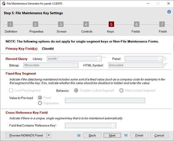
Information about the file, such as the primary Key field(s), required fields, etc., is determined from the embedded data dictionary record on the file at run time.
The options in this step allow you to define either a record query or a fixed key segment if the primary Key has more than a single segment. If defining a record query, a record query button will be added beside the first segment of the key. If defining a fixed key segment and the first segment of the key contains a fixed value that does not change, then that field can be preloaded, and the field disabled or hidden at run time.
If the primary Key has a single segment, the options on this panel will not apply and will be disabled since the record query and fixed key segment are not applicable to a key with only one segment.
If the primary Key has a single segment and a default value is assigned to the segment in the data dictionary, the value will not be applied when the panel is generated. In addition, if the primary Key has more than a single segment, a default value assigned to the last key segment will not be applied.
Note:
If editing a primary Key field in NOMADS after generating a file maintenance panel, any tag value entered should be preceded with "TAG=" (case insensitive).
(The use of "TAG=" was added in PxPlus 2021.)
|
Primary Key Field (single segment) |
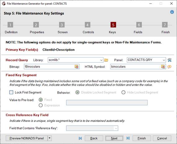
Primary Key Field (multi-segments) |
This panel consists of the following:
|
Primary Key Field(s) |
The primary Key field(s) identifies each record in the file. |
|
|
(Display Only) Primary Key field(s) for the data dictionary table selected in
Step 1: Definition. Note:
For single-segment keys, the remainder of the options on this panel do not apply and are disabled. |
|
Record Query |
The Record Query applies only to files that have a multi-segment key. When defined, a record query button displays beside the first key segment on the panel.
If the
Lock First Segment check box is selected, the Record Query fields will be disabled, and the record query button will not display.
(The Record Query was added in PxPlus 2023 Update 1.) |
|
Library |
Enter the path to the library containing the query definition. The drop-down arrow invokes a list of recently used libraries. The Browse button allows you to browse the directory to find the library. |
|
Panel |
Name of the query definition to invoke. The drop-down list contains all panels in the library. If the query has not yet been defined, enter a new name and click the Define Query button to create it.
When adding a query to the Webster+ HTML page, the Return Prime Key value in Hex check box in Query Header Definition (on the Options tab) must also be selected. Note:
When entering a new name, valid characters are: letters (A-Z, a-z); numbers (0-9); ~ (tilde); @ (at symbol); . (period); $ (dollar sign); _ (underscore); - (dash); + (plus sign). If an invalid character is used, a message will display. |
|
(Define Query) |
Button (beside the Panel drop box) that launches
Query Definition (for Standard Query) or
Query List Definition (for Query List) using the Panel name to either create a new or edit an existing query definition. If creating a new query definition, a prompt displays for selecting a
Query Type. |
|
Bitmap |
(Applicable for NOMADS Panels Only)
Bitmap to display on the query button. Click the Bitmap Library lookup button to invoke the Bitmaps dialog. |
|
HTML Symbol |
(Applicable for HTML Pages Only)
A symbol that will be displayed on the query button on the Webster+ HTML page. It can be either a Font Awesome symbol or a standard PxPlus bitmap selected from the Bitmap Library lookup button.
For a list of Font Awesome symbols, visit https://fontawesome.com/v4/icons/. Note:
When specifying the Font Awesome symbol name, do not include the leading 'fa-'. |
|
Fixed Key Segment |
Fixed Key Segment applies only to files that have a fixed value, which makes up the first segment of the key. |
|
Lock First Segment |
(Not Applicable for Single Segment Keys)
If the primary Key has more than a single segment defined, selecting this check box allows the first key segment to be locked to contain a fixed value that does not change. If selected, a value for the fixed key segment must be entered in the Value to Pre-load field. |
|
Behavior |
(Available when Lock First Segment check box is selected)
Select to Disable or Hide the locked segment at run time. |
|
Value to Pre-load |
(Available when Lock First Segment check box is selected)
Sets a value to preload, which can be defined as a Fixed value or an Expression. |
|
Cross Reference Key Field |
This option is applicable if a unique, single segment key is to be maintained automatically. If a cross reference key is used, this data is stored in the Tag Field property of the control corresponding to the first key segment. |
|
Field that Contains 'Reference Key' |
Click the drop-down arrow to select the field that contains the unique identifier generated by the system to cross-reference with the primary Key field. |
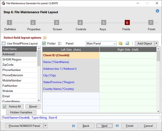
Define the layout for the file maintenance Main panel and any folder panels:
Example:
The example below shows a two-column panel layout with two folder panels added, Contact and Details. On the Details folder panel, a full horizontal line and Smart List Box have been added, which are shown when the NOMADS panel is previewed.
|
Two-Column Panel Layout with Folder |
 |
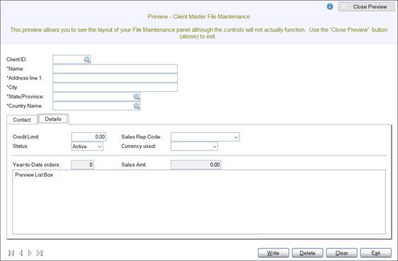
Previewing NOMADS Panel |
Fields List Box and Panel Layout Grid
Add the fields from the selected data dictionary table to the panel. First, select the fields in the
Fields List Box on the left, and then drag and drop them into the panel
Layout Grid on the right.
You can add one, some or all fields to the Layout Grid. See
Adding Data Dictionary Fields.
Once fields are added, they can be moved or removed from the Layout Grid. See
Moving Fields and
Removing Fields.
|
(Fields List Box) |
Lists all the fields in the data dictionary table that was selected in
Step 1: Definition. Fields flagged as Required in the data dictionary table are preceded with an * (asterisk), providing that the Non-File Maintenance Form check box was not selected in Step 1: Definition.
Fields are listed in the same order as they appear in the data dictionary definition (in
Data Dictionary Maintenance on the Elements tab).
If a field is defined with a Multi-Line data class that is using
Extended Validation with a Descriptive Field specified, the descriptive field will be listed and named SHOW.xxxxxx (where xxxxxx is the name of its related field); e.g. SHOW.SalesRep. If the descriptive field is related to a single-segment primary Key field, the descriptive field will not be listed.
Use this list to select the fields to drag and drop into the Layout Grid on the right when defining the panel layout.
To select multiple fields, use Shift-Click (consecutive selections) or Ctrl-Click (random selections). To select all fields, click the Select All button.
If any data dictionary fields are removed from the Layout Grid, they will be returned to the Fields list box.
Data dictionary fields that are added as
Hidden Variables are shown in gray text as a visual cue only.
(The gray text display to indicate hidden variables was added in PxPlus 2023.) |
|
(Layout Grid) |
Grid used for defining the layout of the main panel and any folder panels (if
Folder Tabs have been defined). By default, a two-column grid (for defining the Left and Right sides of a panel) is displayed. If the Use SmartPhone Layout check box is selected, only a single-column grid will display.
Each layout accommodates a maximum of 50 grid rows.
Key Fields
Key fields are in dark red bolded font and, by default, occupy either half rows or full rows (depending on the type of layout selected) at the top of the Main panel. Key fields are on the Main panel only. They cannot be deleted or moved to a folder panel; however, they can be moved to any row on the Main panel by using drag and drop.
If the Non-File Maintenance Form check box was selected in
Step 1: Definition and a table name was entered, Key fields will not be in dark red bolded font and will be treated the same as other fields.
(The ability to move Key fields to any row on the main panel was added in PxPlus 2021.)
Adding Data Dictionary Fields
Data dictionary fields that are added to the Layout Grid display in blue font.
|
|
To add a single field, drag and drop a field from the Fields list box to the desired grid row. |
|
|
To add multiple fields, highlight the fields in the Fields list box using Shift-Click (consecutive selections) or Ctrl-Click (random selections). Then, drag and drop the selections to the grid row that will be the starting point. |
|
|
To add all fields, click the Select All button to highlight all fields in the Fields list box. Then, drag and drop the selections to the grid row that will be the starting point. | Note:
If the number of fields being dropped at one time will exceed the maximum number of rows (50) based on the starting row, a message will display. For example, attempting to drop 15 fields starting at row 40 will display a message, and the move will not be performed.
If adding a data dictionary field for which a Multi-Line will be created with no assigned data class and a length greater than or equal to 256, the Multi-Line will be created 5 lines high. It will be 40 columns wide if on a half row or 80 columns wide if on a full row.
(The expanded Multi-Line input was added in PxPlus 2023 Update 1.)
Adding Extended Validation Descriptive Fields (SHOW.xxxxxx)
A SHOW.xxxxxx field (where xxxxxx is the name of its related field) can be added beside its related field in the adjoining cell (in a two-column layout) or directly below it. It can also be added or moved to the same cell as its related field, which may also be a Key field if the primary Key has more than one segment. This combines the two fields in one cell and allows another field to be placed beside it in the adjoining cell.
To combine a SHOW.xxxxxx field with its related field, the related field must first be in the Layout Grid. Before the two fields are combined, a message will display.
(The ability to combine a SHOW.xxxxxx field and its related field was added in PxPlus 2021.)
(The ability to combine a SHOW.xxxxxx field and its related Key field was added in PxPlus 2021 Update 1.)
See
Extended Class Validation and Display.
When added to the grid, the SHOW.xxxxxx field is displayed in the following format:
elementname from file
Where:
elementname is the name of the element and file is the data file in the data dictionary.
Example:
Name from Sales Rep (SHOW.SalesRep)
When the panel is generated, the SHOW.xxxxxx field Multi-Line is locked and is not included in the tab sequence.
Adding Fonted Text Fields
Enter the text directly into a grid row. See
Step 4: Controls for fonted text options.
HTML Events and HTML Calculations
Colored ticks in the top left corner of a cell indicate the following:
|
|
A red tick in a cell that contains a data dictionary field or fonted text indicates that an
HTML Event was added. |
|
|
A blue tick in a cell that contains a data dictionary field indicates that an
HTML Calculation was added. |
|
|
A magenta tick in a cell that contains a data dictionary field indicates that both an HTML calculation and an HTML event were added. |
(The colored tick indicators were added in PxPlus 2023.)
Moving Fields
Use drag and drop to move a single field to a target row. Fields cannot be multi-selected when using this method.
Key fields always remain on the Main panel. They can be dragged and dropped to any row on the Main panel but not to a row on a folder panel. Fields can be moved to a row in the same column or in the adjoining column (if Use SmartPhone Layout is not selected).
Another alternative would be to use the
Cut Cell and Paste Cell(s) options on the right click menu. Note:
Care should be taken when moving to a target row that is not blank, as the contents being moved will overwrite the contents of the target row except if the target row contains a Key field. In that case, the Key field will not be overwritten and a message will display.
If the target row contains a data dictionary field, that field will be returned to the Fields list box.
If the target row contains a horizontal line or fonted text, the line or text will be removed.
If the target row contains a Smart List Box, Smart Chart, Image, Embedded Panel or HTML Short Codes, a message will display.
Removing Fields
Key fields cannot be removed. When a data dictionary field is removed from the Layout Grid, it is returned to the Fields list box. Other controls (i.e. List Box, Chart, Image, horizontal line, fonted text, etc.) are deleted.
To remove a single field, use one of the following methods:
Press the Delete key to remove the contents of the currently selected cell from the Layout Grid. (Fields cannot be multi-selected for removal.)
Drag and drop a data dictionary field from the Layout Grid to the Fields list box. (Fields cannot be multi-selected for removal.)
Right click on the cell or row containing the field and select either Clear Current Cell or Delete Row from the popup menu.
To remove all fields on the current panel, use one of the following methods:
Click the
Reset button, which displays a message for resetting the Layout Grid.
Right click on a cell in the Layout Grid and select Clear All Cells from the popup menu.
(The ability to use the Delete key to remove a field was added in PxPlus 2021.) |
Additional Panel Layout Functionality
|
Use SmartPhone Layout |
Select this check box to use a SmartPhone (single column) layout for the panel; otherwise, a two-column (side-by-side) layout is presented.
If this check box is selected (or deselected) after fields have been added to the Layout Grid, a Reset message will display:
|
|
Yes removes all fields (except Key fields) from the Layout Grid. Data dictionary fields are returned to the Fields list box in their original sequence in the data dictionary definition. Any fonted text fields and horizontal lines previously added are removed, as well as any Smart List Boxes, Smart Charts, Images, etc. If any folder tabs were previously added, an additional message will display. |
|
|
No does not remove any fields from the Layout Grid. Folder tabs (if any) remain unchanged. | |
|
(Info Line) |
The Info line is located above the
Navigation Bar and displays information about a selected field or control in the Fields list box or the Layout Grid.
For example, when a data dictionary field is selected, the Info line displays the field name, type and size. When a Smart List Box control is selected, the Info line displays the width, height, query library/panel, and Span Multiple Lines settings.
(The Info Line was added in PxPlus 2021.) |
|
Select All
(Deselect All) |
Toggle button that selects (or deselects) all remaining fields in the Fields list box. |
|
Reset |
Selecting this button displays a message for resetting the Layout Grid. The message will have either two or three possible responses, depending on whether the Layout Grid is being reset when creating a new file maintenance panel or regenerating an existing panel.
When creating a new panel, the Reset message displays Yes/No responses:
|
|
Yes removes all fields (except Key fields) from the Layout Grid. Data dictionary fields are returned to the Fields list box in their original sequence in the data dictionary definition. Any fonted text fields and horizontal lines previously added are removed, as well as any Smart List Boxes, Smart Charts, Images, etc. If any folder tabs were previously added, an additional message will display. |
|
|
No does not remove any fields from the Layout Grid. Folder tabs (if any) remain unchanged. |
If regenerating an existing panel, the Reset message displays Yes/No/Cancel responses:
|
|
Yes resets the Layout Grid (including any folder tabs and options) to the original layout when the panel was last generated. |
|
|
No removes all fields (except Key fields) from the Layout Grid. Data dictionary fields are returned to the Fields list box in their original sequence in the data dictionary definition. Any fonted text fields and horizontal lines previously added are removed, as well as any Smart List Boxes, Smart Charts, Images, etc. If any folder tabs were previously added, an additional message will display. |
|
|
Cancel closes the Reset message. The field layout and folder tabs (if any) remain unchanged. |
(Support for resetting a regenerated panel layout was added in PxPlus 2020.) |
|
Hidden Variables |
(Available when
HTML Page check box is selected for Form Type)
Button that launches the Include Hidden Fields on HTML Page window. Data dictionary fields and/or additional variables that do not appear on the panel Layout Grid may be added as hidden variables for use in
HTML Calculations associated with other data dictionary fields or with
Input Fields added to the panel Layout Grid. Any data dictionary fields that are added as hidden variables are shown in gray text in the Fields list box as a visual cue only.
(The gray text display to indicate hidden variables was added in PxPlus 2023.)
This button displays a check mark to indicate hidden variables have been added.
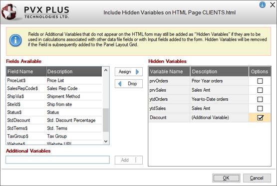
This window consists of the following:
|
Fields Available |
Lists the data dictionary fields that have not been added to the panel Layout Grid and may be optionally added as hidden variables.
Adding a data dictionary field to the panel Layout Grid automatically removes it from the Fields Available list. |
|
Hidden Variables |
Lists the data dictionary fields and/or additional variables that have been added as hidden variables.
Adding a data dictionary field to the panel Layout Grid automatically removes it from the Hidden Variables list. |
|
Options |
Clicking the Options check box beside a hidden variable invokes the Hidden Variable Options window. This window is used for entering (or editing) an initial value for a hidden variable that is not a data dictionary field or for entering an HTML calculation. A check mark in the Options check box indicates that options have been entered.
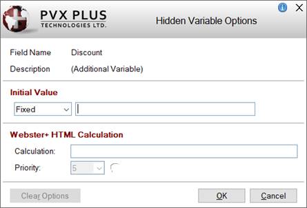
This window consists of the following:
|
Field Name |
(Display Only) Name of the selected hidden variable. |
|
Description |
(Display Only) Description of the selected hidden variable (i.e. this will be the data dictionary field description or the words "Additional Variable"). |
|
Initial Value |
(Available for Additional Variables Only)
Enter (or edit) the initial value (either a Fixed value or a string Expression) for the additional variable. This field is not applicable when the hidden variable is a data dictionary field. |
|
Webster+ HTML Calculation |
(Available when
HTML Page check box is selected for Form Type)
Enter (or edit) an
HTML Calculation for the selected hidden variable. Set the calculation Priority or leave it at 5 (Default).
Example:
An example of when entering an HTML calculation for a hidden variable would be useful is when you need to total the taxable items but not show that total, only use it to figure out the amount of tax owed. |
|
Clear Options |
Clears the hidden variable options and does not close the Hidden Variable Options window. |
|
OK |
Saves any changes to the hidden variable options and closes the Hidden Variable Options window. |
|
Cancel |
Closes the Hidden Variable Options window without saving changes. |
(The Options check box column was added in PxPlus 2023.) |
|
Assign |
The data dictionary fields selected in the Fields Available list are added to the Hidden Variables list. Double clicking on a single field also adds it to the list.
Multiple fields can be selected by using Shift-Click (consecutive selections) or Ctrl-Click (random selections). |
|
Drop |
The data dictionary field(s) selected in the Hidden Variables list are removed from this list and returned to the Fields Available list.
Any additional variables that are selected are deleted. Double clicking on a single field also removes it from the list.
Multiple fields can be selected by using Shift-Click (consecutive selections) or Ctrl-Click (random selections). |
|
Additional Variables |
Enter the name of an additional variable to be added as a hidden variable. Multiple additional variables can be added, one variable at a time. The additional variable(s) must be used in the associated HTML program. |
|
Add |
Adds the additional variable to the Hidden Variables list. |
|
OK |
Saves any changes and closes the Include Hidden Fields on HTML Page window. |
|
Cancel |
Closes the Include Hidden Fields on HTML Page window without saving changes. |
(The Hidden Variables button was added in PxPlus 2022.) |
Adding a Folder
A Folder control can be added anywhere on the Main panel, except on a row containing a Key field, by selecting the
Folder Location option from the right click menu.
|
Folder |
Select this check box to set up Folder sub-panels.
For information about folders in NOMADS panels, see
NOMADS Folder Controls.
For information about folders in Webster+ HTML pages, see
Webster+ Folders/Tabs. |
|
(Folder Options) |
(Available when Folder check box is selected)
Button (next to the Folder check box) that launches the Folder Options window for specifying Folder properties.
When only HTML Page is selected as the form type in
Step 1: Definition, options that are not applicable are not displayed, as shown in the second screen shot:
|
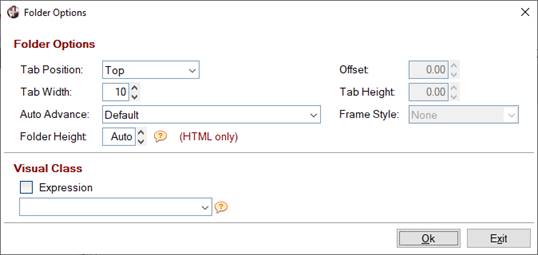 |
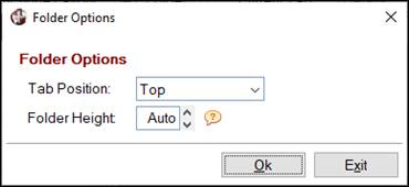
When only "HTML Page" is selected |
This window consists of the following:
|
Folder Options |
|
Tab Position |
Tabs placement. Click the drop-down arrow for a list of selections to indicate where the folder tabs will be drawn on the folder region: Top (Default), Bottom, Left Sidebar, Right Sidebar and Web (Top). The Bottom and Right Sidebar options do not apply to HTML pages.
(The Web (Top) tab position was added in PxPlus 2021.) |
|
Tab Width |
(Applicable for NOMADS Panels Only)
Uniform width to be used for all tabs. Default is 10. |
|
Auto Advance |
(Applicable for NOMADS Panels Only)
Determines if focus will automatically advance to the next folder when tabbing forward from the last control on a folder. Click the drop-down arrow for a list of selections:
|
Default |
Based on the
%NOMADS'FolderAdvance setting. |
|
Off (Advance to main panel) |
Tabbing from the last control on a folder will proceed to the next control after the folder on the main panel. The current folder will not change. |
|
Advance to next folder tab |
Tabbing from the last control on a folder will advance to the next folder and place focus on the folder tab. If it is the last folder, then focus will advance to the next control after the folder on the main panel. |
|
Advance to first control on next folder |
Tabbing from the last control on a folder will advance to the next folder and place focus on the first control. If it is the last folder, then focus will advance to the next control after the folder on the main panel. |
|
Advance to next folder tab loop |
Tabbing from the last control on a folder will advance to the next folder and place focus on the folder tab. If it is the last folder, then focus will return to the first folder and place focus on the folder tab, resulting in a tab loop.
(The Advance to next folder tab loop option was added in PxPlus 2021 Update 1.) | |
|
Folder Height |
(Applicable for HTML Pages Only)
Enter the height of the Folder control on the HTML page. Leave as Auto (Default) to have the height calculated automatically based on the controls within the Folder.
(The Folder Height option was added in PxPlus 2021.) |
|
Offset |
(Applicable for NOMADS Panels Only - Available when Tab Position is Left Sidebar or Right Sidebar)
Determines the distance by which the starting line of the folder tabs will be offset from the starting line of the Folder control. |
|
Tab Height |
(Applicable for NOMADS Panels Only - Available when Tab Position is Left Sidebar or Right Sidebar)
Height of the sidebar folder tabs. If not specified, the value of
%NOMADS'SidebarFolderTabHeight will be used. If neither is set, the default height is 2.5 lines. Note:
The height of the tabs will automatically be adjusted smaller if the tabs will not fit in the allotted vertical space next to the folder. |
|
Frame Style |
(Applicable for NOMADS Panels Only - Available when Tab Position is Left Sidebar or Right Sidebar)
Determines the style level and bevel sizes in creating the frame. This is used if (at run time) only one sub-panel exists. Click the drop-down arrow for a list of selections: None, 3D Frame, Recessed Frame, Raised Frame, Top/Bottom line. | |
|
Visual Class |
(Applicable for NOMADS Panels Only)
Assign a
Visual Class to the Folder control for setting up default settings such as font, color and various attributes. |
|
OK |
Saves any changes and closes the Folder Options window. |
|
Exit |
Closes the Folder Options window saving any changes. | |
|
Panel (or Current Tab) |
(Available when Folder check box is selected)
Indicates the main panel or folder tab being defined. When the Folder check box is selected, the fonted text changes from Panel to Current Tab, and the Maintain Folder Tabs button next to the drop box is enabled.
New tabs can be added either by typing the new tab name in the drop box and then pressing Enter or by clicking the Maintain Folder Tabs button.
Use the Current Tab drop box to view a list of the tabs created (if applicable) and to select the tab or Main Panel for which the field layout will be defined. |
|
(Maintain Folder Tabs) |
(Available when Folder check box is selected)
Button (next to the Current Tab drop box) that launches the File Maintenance Panel Tabs window. This window is used to add, delete or rename folder tabs on the file maintenance panel. Note:
A maximum of nine folder tabs can be created; otherwise, a message will display. If more tabs are required, use the NOMADS Panel Designer to edit the Folder control once the file maintenance panel is generated. To edit a Folder control, see
Folder Properties.
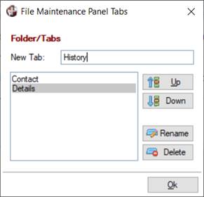
This window consists of the following:
|
New Tab |
Enter the name for the new tab. The new tab is added to the list of tabs. |
|
(List Box) |
Lists the tabs in the order of appearance on the file maintenance panel. |
|
Up/Down |
Changes the order of the tabs on the file maintenance panel. |
|
Rename |
Launches a separate window for changing the name of a selected tab. |
|
Delete |
Removes the selected tab and all of its contents. Prior to deleting the tab, a message will display. |
(The Rename button was added in PxPlus 2021.) |
Dependency Definition
|
(Dependency Definition) |
Button (next to the Maintain Folder Tabs button) that launches the Dependency Definition window.
Dependency definitions are the equivalent of IF THEN and (optionally) ELSE conditions. The Dependency Definition window is used to define selected controls to be hidden, shown, locked, unlocked, enabled or disabled based on preset conditions. Dependency definitions are applied to the current file maintenance main panel or folder panel (if
Folder Tabs have been defined) or Webster+ HTML page to be generated.
Each dependency definition created in the table will consist of a conditional expression, as well as one or more actions and/or logic to be performed when the Condition is true.
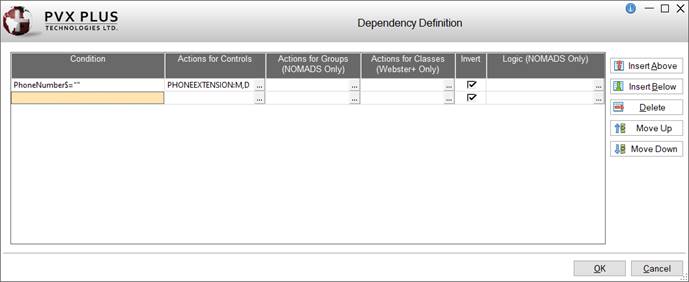
This window consists of the following:
|
Condition |
Conditional expression to be tested. |
|
Actions for Controls |
(Applicable for Both NOMADS Panels and Webster+ HTML Pages)
Assigns functions to be applied to selected controls when the Condition tests true. Click the dotted button to invoke the Actions for Controls window.
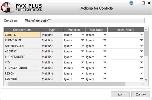
This window consists of the following:
|
Condition |
Conditional expression (previously entered). |
|
Control Name |
Preset list of controls existing in the current active panel. This includes controls from embedded panels, which are identified by including their panel name. |
|
Type |
Control type. |
|
Function |
Function to be applied to the control when the Condition is true. Click the drop-down arrow for a list of selections: Ignore, Enable, Disable, Show, Hide, Lock, Unlock. |
|
Tab Table |
(Applicable to Controls on the NOMADS Main Panel Only)
Tab behaviour override to be applied to the control when the Condition is true. Click the drop-down arrow for a list of selections: Ignore, Add, Remove. |
|
Insert Before |
(Applicable for NOMADS Panels Only)
Sets location in Tab Order for when the Action is to be applied (if Tab Table override is set to Add). Click the drop-down arrow for a list of existing panel controls. |
|
OK |
Saves any changes and closes the Actions for Controls window. |
|
Cancel |
Cancels any changes and closes the Actions for Controls window. | |
|
Actions for Groups
(NOMADS Only) |
(Applicable for NOMADS Panels Only)
Assigns functions to be applied to selected groups when the Condition tests true. Click the dotted button to invoke the Actions for Groups window.
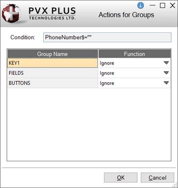
This window consists of the following:
|
Condition |
Conditional expression (previously entered). |
|
Group Name |
Preset list of groups created in the current active panel. See
Group Assignment.
This includes groups from embedded panels, which are identified by including their panel name. |
|
Function |
Function to be applied to the group when the Condition is true. Click the drop-down arrow for a list of selections: Ignore, Enable, Disable, Show, Hide, Lock, Unlock. |
|
OK |
Saves any changes and closes the Actions for Groups window. |
|
Cancel |
Cancels any changes and closes the Actions for Groups window. | |
|
Actions for Classes
(Webster+ Only) |
(Applicable for Webster+ HTML Pages Only)
Assigns functions to be applied to selected groups when the Condition tests true. Click the dotted button to invoke the Actions for Groups window.
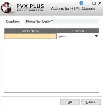
This window consists of the following:
|
Condition |
Conditional expression (previously entered). |
|
Class Name |
Name of Webster+ class. See
Webster+ Defined Classes. |
|
Function |
Function to be applied to the HTML class when the Condition is true. Click the drop-down arrow for a list of selections: Ignore, Enable, Disable, Show, Hide, Lock, Unlock. |
|
OK |
Saves any changes and closes the Actions for HTML Classes window. |
|
Cancel |
Cancels any changes and closes the Actions for HTML Classes window. | |
|
Invert |
(Applicable for Both NOMADS Panels and Webster+ HTML Pages)
Check box to apply the opposite function for when the Condition tests false. Same as an ELSE statement.
Example:
If a control is set to Enabled and the Condition tests false, the control will be Disabled instead. This does not apply to Logic functions. |
|
Logic
(NOMADS Only) |
(Applicable for NOMADS Panels Only)
Logic to be executed when the Condition tests true. Click the dotted button to invoke the Logic window for creating or editing this string.
Available processes include Ignore, Link, Perform, Call, Execute, Help, Jumpto and End. See
Actions and Parameters. |
|
Insert Above
Insert Below |
Adds a blank row above or below the currently selected row. |
|
Delete |
Removes the currently selected row (i.e. removes the definition). |
|
Move Up
Move Down |
Changes the order of the existing definitions. |
|
OK |
Saves any changes and closes the Dependency Definition window. |
|
Cancel |
Cancels any changes and closes the Dependency Definition window. |
(The Dependency Definition button was added in PxPlus 2023 Update 1.) |
Adding Objects
Click the Add Object button for a list of objects that can be added to the file maintenance panel:
When an object is selected, a separate window displays for defining its properties and applicable logic.
(The Add Object button was added in PxPlus 2021 Update 1.)
|
Smart List Box | |
|
Launches the Add a Smart List Box window for adding (and editing) a Smart List Box on the file maintenance panel. See Webster+
[list] short code.
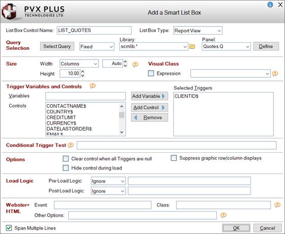
Many of these options are also available when defining a Smart List Box control in the NOMADS Panel Designer (see
Defining Smart Controls), except for these differences:
|
List Box Control Name |
Enter a unique name or use the default name provided. (Same as
Name property in List Box Properties.) |
|
List Box Type |
Style of the Smart List Box. Click the drop-down arrow for a list of selections: Report View (Default) and Tree View.
|
Report View |
Displays multiple data elements in a tabular list with the use of headings and other attributes.
Example:
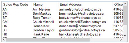 |
|
Tree View |
Displays data using a tree-like structure view. In the NOMADS Panel Designer, the following
TreeView Attributes in List Box Properties are automatically set: Data Has Bitmaps and Show Lines.
Example:
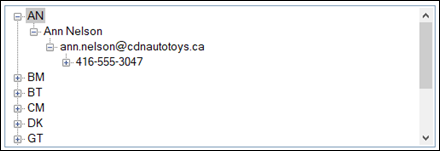 |
(The ability to create a Tree View type of Smart List Box was added in PxPlus 2023 Update 1.) |
|
Size |
|
Width |
Enter the width for the List Box either in number of Columns (Default) or as a Percentage of the column width.
When Columns is selected, the width defaults to Auto, which will result in the List Box filling the entire column or full line. If a List Box with an Auto width is the only control in the column, it will default to a width of 35. Otherwise, enter the desired value or use the spinner control. Valid entries are 0 to 300.
When Percentage is selected, the percentage defaults to 100%. Otherwise, enter the desired percentage or use the spinner control. |
|
Height |
Enter the height for the List Box in number of lines or use the spinner control. Valid entries are 0 to 255. (Default is 10.) | |
|
Visual Class |
(Optional) Assign a
Visual Class to the List Box control for setting up default settings such as font, color and various attributes. |
|
Webster+ HTML |
(Available when
HTML Page check box is selected for Form Type)
|
Event |
Enter an optional
HTML Event. |
|
Class |
A single HTML Class can be entered (e.g. noborder). Multiple classes can be entered, separated by either spaces or commas. When spaces are used as the delimiter, the values must be within double quotes (e.g. "bold text_redfill_cyan" or bold,text_red,fill_cyan).
See
Webster+ Defined Classes. |
|
Other Options |
One or multiple short code options associated with the
[list] short code can be entered. Multiple options must be separated by a space.
See Webster+
Short Code Options.
Example:
tip=FloatingTip
tip=FloatingTip link=https://www.pvxplus.com Important Note:
The Other Options field should not be used for entering class=xxx or event=xxx short code options. |
(HTML Event was added in PxPlus 2022.)
(The Other Options and Class fields were added in PxPlus 2023 Update 1.) |
|
Span Multiple Lines |
(Applicable for NOMADS Panels Only)
When selected (Default), the List Box spans according to its size. Fields placed in the rows below the List Box and below the adjoining cell (in a two-column layout) are pushed down to accommodate the List Box. The field in the adjoining cell remains in place beside the List Box.
Deselecting this option allows fields to be placed beside the List Box (in a two-column layout). However, fields below the List Box (in the same column) are not pushed down, which may result in overlapping and hidden fields.
This option works the same for Smart List Boxes, Smart Charts, Images and Embedded Panel/HTML Short Codes. For an example using a Smart List Box, see Example - Span Multiple Lines below. |
Example - Span Multiple Lines:
This panel layout shows a List Box on the left side, a field in the adjoining cell on the right side, and fields in the rows below.
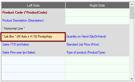
Panel Layout with Smart List Box
To demonstrate the effect of the Span Multiple Lines option, two screen shots are provided, showing this NOMADS panel in Preview mode.
For this first screen shot, the Span Multiple Lines option is On. Notice that the field in the adjoining cell beside the List Box remains in place, and the fields below the List Box are pushed down to accommodate it.
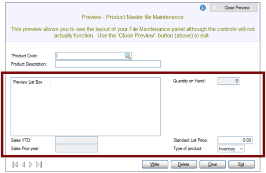
Smart List Box - Span Multiple Lines (On)
For this second screen shot, the Span Multiple Lines option is Off. Notice that the field in the adjoining cell and the fields on the right side remain in place. The fields on the left side below the List Box are not pushed down. In this case, the List Box is overlapping the fields below it.
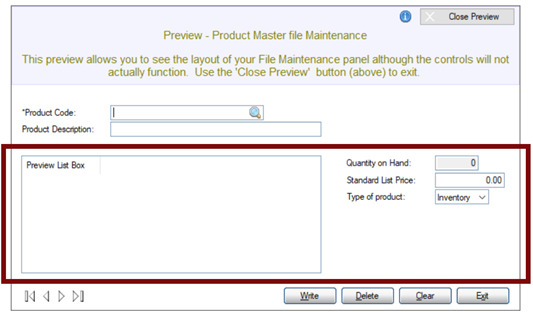
Smart List Box - Span Multiple Lines (Off)
(The ability to add/edit a Smart List Box was added in PxPlus 2021.) |
|
Smart Chart | |
|
Launches the Add a Smart Chart window for adding (and editing) a Smart Chart on the file maintenance panel. See Webster+
[chart] short code.
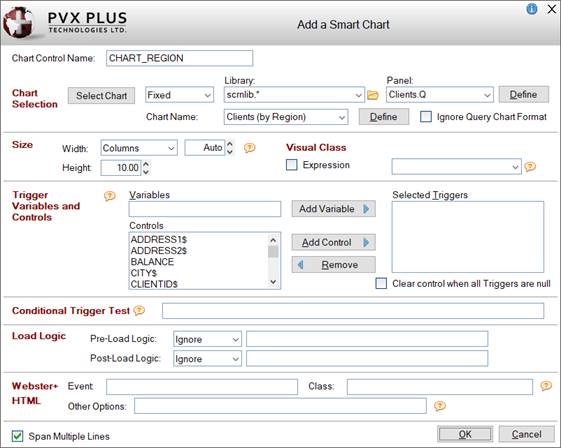
Many of these options are also available when defining a Smart Chart control in the NOMADS Panel Designer (see
Defining Smart Controls), except for these differences:
|
Chart Control Name |
Enter a unique name or use the default name provided. (Same as
Name property in Chart Properties.) |
|
Size |
|
Width |
Enter the width for the Chart either in number of Columns (Default) or as a Percentage of the column width.
When Columns is selected, the width defaults to Auto, which will result in the Chart filling the entire column or full line. If a Chart with an Auto width is the only control in the column, it will default to a width of 35. Otherwise, enter the desired value or use the spinner control. Valid entries are 0 to 300.
When Percentage is selected, the percentage defaults to 100%. Otherwise, enter the desired percentage or use the spinner control. |
|
Height |
Enter the height for the Chart in number of lines or use the spinner control. Valid entries are 0 to 255. (Default is 10.) | |
|
Visual Class |
(Optional) Assign a
Visual Class to the Chart control for setting up default settings such as font, color and various attributes. |
|
Webster+ HTML |
(Available when
HTML Page check box is selected for Form Type)
|
Event |
Enter an optional
HTML Event. |
|
Class |
A single HTML Class can be entered. Multiple classes can be entered, separated by either spaces or commas. When spaces are used as the delimiter, the values must be within double quotes.
See
Webster+ Defined Classes. |
|
Other Options |
One or multiple short code options associated with the
[chart] short code can be entered. Multiple options must be separated by a space.
See Webster+
Short Code Options.
Example:
tip=FloatingTip
tip=FloatingTip link=https://www.pvxplus.com Important Note:
The Other Options field should not be used for entering class=xxx or event=xxx short code options. |
(HTML Event was added in PxPlus 2022.)
(The Other Options and Class fields were added in PxPlus 2023 Update 1.) |
|
Span Multiple Lines |
(Applicable for NOMADS Panels Only)
When selected (Default), the Chart spans according to its size. Fields placed in the rows below the Chart and below the adjoining cell (in a two-column layout) are pushed down to accommodate the Chart. The field in the adjoining cell remains in place beside the Chart.
Deselecting this option allows fields to be placed beside the Chart (in a two-column layout). However, fields below the Chart (in the same column) are not pushed down, which may result in overlapping and hidden fields.
This option works the same for Smart List Boxes, Smart Charts, Images and Embedded Panel/HTML Short Codes. For an example using a Smart List Box, see
Example - Span Multiple Lines. |
(The ability to add/edit a Smart Chart was added in PxPlus 2021.) |
|
Image | |
|
Launches the Add an Image window for adding (and editing) an Image control on the file maintenance panel. See Webster+
[image] short code. Note:
To properly view images on HTML pages, Webster+ Security must be enabled.
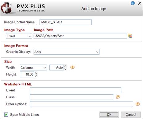
This window consists of the following:
|
Image Control Name |
Enter a unique name or use the default name provided. (Same as
Name property in Image/Picture Properties.) |
|
Image Type |
Specify whether the Image is a Fixed value, string Expression or Dynamic. (Default is Fixed.) |
|
Image Path |
(Available when Image Type is Fixed or Expression)
Name and path of the image (Fixed value or string Expression).
Click the Bitmap Library button to select a bitmap from the Bitmaps dialog. This button is available when the Image Type is Fixed. |
|
Variable Name |
(Available when Image Type is Dynamic)
Name of the variable that will contain the name of the image. |
|
Image Format |
|
Graphic Display |
Defines how the Image is to be drawn. See
Image Format. Note:
Image formats are not currently supported in Webster+. | |
|
Size |
|
Width |
Enter the width for the Image either in number of Columns (Default) or as a Percentage of the column width.
When Columns is selected, the width defaults to Auto, which will result in the Image filling the entire column or full line. If an Image with an Auto width is the only control in the column, it will default to a width of 35. Otherwise, enter the desired value or use the spinner control. Valid entries are 0 to 300.
When Percentage is selected, the percentage defaults to 100%. Otherwise, enter the desired percentage or use the spinner control. |
|
Height |
Enter the height for the Image in number of lines or use the spinner control. Valid entries are 0 to 255. (Default is 10.) | |
|
Webster+ HTML |
(Available when
HTML Page check box is selected for Form Type)
|
Event |
Enter an optional
HTML Event. |
|
Class |
A single HTML Class can be entered. Multiple classes can be entered, separated by either spaces or commas. When spaces are used as the delimiter, the values must be within double quotes.
See
Webster+ Defined Classes. |
|
Other Options |
One or multiple short code options associated with the
[image/picture] short code can be entered. Multiple options must be separated by a space.
See Webster+
Short Code Options.
Example:
tip=FloatingTip
tip=FloatingTip link=https://www.pvxplus.com Important Note:
The Other Options field should not be used for entering class=xxx or event=xxx short code options. |
(HTML Event was added in PxPlus 2022.)
(The Other Options and Class fields were added in PxPlus 2023 Update 1.) |
|
Span Multiple Lines |
(Applicable for NOMADS Panels Only)
When selected (Default), the Image spans according to its size. Fields placed in the rows below the Image and below the adjoining cell (in a two-column layout) are pushed down to accommodate the Image. The field in the adjoining cell remains in place beside the Image.
Deselecting this option allows fields to be placed beside the Image (in a two-column layout). However, fields below the Image (in the same column) are not pushed down, which may result in overlapping and hidden fields.
This option works the same for Smart List Boxes, Smart Charts, Images and Embedded Panel/HTML Short Codes. For an example using a Smart List Box, see
Example - Span Multiple Lines. |
(The ability to add/edit an Image was added in PxPlus 2021.) |
|
Button |
|
|
Launches the Add a Button window for adding (and editing) a Button control on the file maintenance panel. See Webster+
[button
] short code.
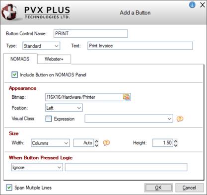
This window is divided into two tabbed folder panels,
NOMADS and
Webster+, for defining Button properties, depending on whether a NOMADS panel, a Webster+ HTML page, or both are being generated.
This window consists of the following:
|
Button Control Name |
Enter a unique name or use the default name provided. (Same as
Name property in Button Properties.) |
|
Type |
Select the type of Button control:
|
Standard |
(Default) Creates a standard button control. |
|
Hyperlink |
Creates a Web-link style button (i.e. no frame, is underscored, and text on the button is highlighted whenever the mouse hovers over the button). |
|
Drop List |
Creates a drop-down style button. |
(The Drop List button type was added in PxPlus 2022.) |
|
Text |
Enter the button text or leave blank. If left blank, a bitmap (NOMADS panel) and/or a symbol (Webster+ page) must be entered; otherwise, a message will display. |
|
Span Multiple Lines |
(Applicable for NOMADS Panels Only)
When selected (Default), the Button spans according to its size. Fields placed in the rows below the Button and below the adjoining cell (in a two-column layout) are pushed down to accommodate the Button. The field in the adjoining cell remains in place beside the Button.
Deselecting this option allows fields to be placed beside the Button (in a two-column layout). However, fields below the Button (in the same column) are not pushed down, which may result in overlapping and hidden fields.
This option works the same for Smart List Boxes, Smart Charts, Images and Embedded Panel/HTML Short Codes. For an example using a Smart List Box, see
Example - Span Multiple Lines. |
|
NOMADS |
|
|
Include Button on NOMADS Panel |
(Available when
NOMADS Panel check box is selected for Form Type)
When adding a new Button, this check box is selected by default to enable the options on the NOMADS folder panel. |
|
Appearance |
|
Bitmap |
(Available when button Type is Standard or Hyperlink)
Bitmap to display on the Button. Click the Bitmap Library button to select a bitmap or enter the text value for the bitmap (e.g. !Checkmark). |
|
Position |
(Available when button Type is Standard or Hyperlink)
Bitmap position on the Button: Left (Default), Right. Top or Bottom. This option is enabled when button Text is entered.
(The Top and Bottom bitmap positions were added in PxPlus 2022 Update 1.) |
|
Popup Library |
(Available when button Type is Drop List)
Library path for the popup menu. Click the drop-down arrow for a list of (up to nine) previous library selections.
Click the Browse button to look through the directory structure to find the library or type the library path. An expression can also be entered by preceding the expression with an = (equals sign); e.g. =libname$ or ="mylib.en". Note:
The Library name may be a specific or generic reference. See Cascading Language Suffixes. |
|
Popup Panel |
(Available when button Type is Drop List)
Popup menu name. Click the drop-down arrow for a list of existing popup menus in the selected library. Click the Popup button to invoke the
Menu Bar Definition for the selected popup menu.
A new popup menu can be created on-the-fly. Enter a new Popup Panel name and then click the Popup button to define the menu. |
|
Visual Class |
Associate a
Visual Class for setting up default settings for the Button control such as font, color and various attributes. Click the drop-down arrow for a list of pre-defined visual classes. Note:
Visual class names that begin with an "*" (asterisk) are pre-defined visual classes used by PVX Plus and may be subject to change without notice. |
(The Popup Library and Popup Panel options were added in PxPlus 2022.) |
|
Size |
|
Width |
Enter the width for the Button either in number of Columns (Default) or as a Percentage of the column width.
When Columns is selected, the width defaults to Auto. In NOMADS, a width of Columns - Auto will result in the Button filling the entire column or full line. If a Button with an Auto width is the only control in the column, it will default to a width of 35. To set it back to Auto, enter 0. Otherwise, enter the desired value or use the spinner control. Valid entries are 0 to 300.
If an actual number of columns has been entered and the Button text is edited so that its length exceeds the number of columns, the value will adjust to match the length of the Button text entered plus 2.
When Percentage is selected, the percentage defaults to 100%. Otherwise, enter the desired percentage or use the spinner control. |
|
Height |
Enter the height for the Button in number of lines or use the spinner control. Valid entries are 0 to 255. The default is 1.5. |
(The default Button Height of 1.5 for NOMADS was added in PxPlus 2023.) |
|
When Button Pressed Logic |
Logic to be executed when focus leaves the Button or the state of the control has changed. Click the drop-down arrow to add/edit logic. See
Actions and Parameters. |
|
Webster+ |
|
|
Include Button on Webster+ Page |
(Available when
HTML Page check box is selected for Form Type)
When adding a new Button, this check box is selected by default to enable the options on the Webster+ folder panel. |
|
Appearance |
|
Symbol |
(Available when button Type is Standard or Hyperlink)
A symbol can be optionally added to the button text. It can be either a Font Awesome symbol or a standard PxPlus bitmap selected from the Bitmap Library lookup button.
For a list of Font Awesome symbols, visit https://fontawesome.com/v4/icons/. Note:
When specifying the Font Awesome symbol name, do not include the leading 'fa-'.
(The Bitmap Library lookup button was added in PxPlus 2022 Update 1.) |
|
Position |
(Available when button Type is Standard or Hyperlink)
Symbol position on the button: Left (Default), Right. Top or Bottom. This option is enabled when button Text is entered.
(The Top and Bottom symbol positions were added in PxPlus 2022 Update 1.) |
|
List Items |
(Available when button Type is Drop List)
Grid used for entering the text and the
HTML Event to trigger for each item in the drop list. |
|
HTML Class |
A single HTML Class can be entered (e.g. bold). Multiple classes can be entered, separated by either spaces or commas. When spaces are used as the delimiter, the values must be within double quotes (e.g. "bold text_red fill_cyan" or bold,text_red,fill_cyan).
See
Webster+ Defined Classes. |
(The List Items option was added in PxPlus 2022.) |
|
Size |
|
Width |
(Available when button Type is Standard or Drop List)
Enter the width for the Button either in number of Columns (Default) or as a Percentage of the column width.
When Columns is selected, the width defaults to Auto. In Webster+, a width of Columns - Auto will result in the Button being just wide enough to accommodate the text (and symbol if present). To set it back to Auto, enter 0. Otherwise, enter the desired value or use the spinner control. Valid entries are 0 to 300.
If an actual number of columns has been entered and the Button text is edited so that its length exceeds the number of columns, the value will adjust to match the length of the Button text entered plus 2.
When Percentage is selected, the percentage defaults to 100%. Otherwise, enter the desired percentage or use the spinner control. |
|
Height |
(Available when button Type is Standard or Drop List)
Enter the height for the Button in number of lines or use the spinner control. Valid entries are 0 to 255. The default is 2. |
(The default Button Height of 2 for Webster+ was added in PxPlus 2023.) |
|
HTML |
|
Event/URL |
If the button Type is set to Standard or Drop List, an
HTML Event can be entered for the Button.
For Standard buttons only, you can add a
target=xxx short code option or any other short code options to the event, separated by a space (e.g. sample_event target=same). See Webster+
Short Code Options. Instead of an event, you can add a hyperlink by entering a
link=xxx short code option as the first five characters in the HTML Event field (e.g. link=page:invoices target=same).
If the button Type is set to Hyperlink, either an HTML Event or a URL (preceded with http:// or https://) must be entered; otherwise, a message will display if left blank.
(The ability to add Webster+ short code options to Standard buttons was added in PxPlus 2022 Update 1.) |
|
Other Options |
One or multiple short code options associated with the
[button] short code can be entered. Multiple options must be separated by a space.
See Webster+
Short Code Options.
Example:
tip=FloatingTip
tip=FloatingTip link=https://www.pvxplus.com Important Note:
The Other Options field should not be used for entering class=xxx or event=xxx short code options.
(The Other Options field was added in PxPlus 2023 Update 1.) | |
(The ability to add/edit a Button was added in PxPlus 2021 Update 1.) |
|
Input Field | |
|
Launches the Add an Input Field window for adding (and editing) an Input Field on the file maintenance panel.
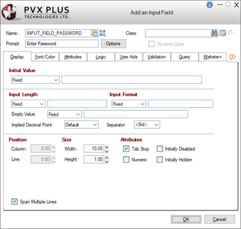
This window is divided into tabbed folder panels for defining Input Field properties, depending on whether a NOMADS panel and/or a Webster+ HTML page are being generated.
Many of these properties are also available when defining a Multi-line control (see
Multi-line Properties) in the NOMADS Panel Designer, except for these differences:
|
Name |
Enter a unique name or use the default name provided. (Same as
Name property in Multi-Line Properties.) |
|
Prompt |
Enter text to describe the Input Field. The text displays as a field name on the generated panel. |
|
Options |
Button that launches the Prompt Options window for defining the Input Field prompt.
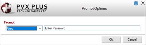
This window consists of the following:
|
Prompt |
Click the drop-down arrow to select whether the prompt will be defined as a Fixed value (Default), a string Expression, or a Message Library Reference.
If a Message Library Reference will be used and the Input Field will be added to a Webster+ HTML page, the message that is selected must also exist (with the same key) in the Webster+ Message Library. See Webster+
Message Library Maintenance. |
|
Ok |
Updates the Prompt field on the Add an Input Field window with the value entered. The value will be preceded with an = (equals sign) if an Expression or Message Library Reference was entered. |
|
Cancel |
Cancels any changes and returns to the Add an Input Field window. |
(The Options button was added in PxPlus 2022 Update 1.) |
|
Display |
|
|
Span Multiple Lines |
(Applicable for NOMADS Panels Only)
When selected (Default), the Input control spans according to its size. Fields placed in the rows below the Input control and below the adjoining cell (in a two-column layout) are pushed down to accommodate the Input control. The field in the adjoining cell remains in place beside the Input control.
Deselecting this option allows fields to be placed beside the Input control (in a two-column layout). However, fields below the Input control (in the same column) are not pushed down, which may result in overlapping and hidden fields.
This option works the same for Smart List Boxes, Smart Charts, Images and Embedded Panel/HTML Short Codes. For an example using a Smart List Box, see
Example - Span Multiple Lines. |
|
Webster+ |
|
|
HTML |
(Available when
HTML Page check box is selected for Form Type)
|
Class |
A single HTML Class can be entered (e.g. bold). Multiple classes can be entered, separated by either spaces or commas. When spaces are used as the delimiter, the values must be within double quotes (e.g. "bold text_red fill_cyan" or bold,text_red,fill_cyan).
See
Webster+ Defined Classes. |
|
Event |
Enter an optional
HTML Event. |
|
Calculation |
Enter an HTML calculation. Fields used in the calculation must either exist on the panel Layout Grid or be included as
Hidden Variables.
Example:
ytdSales+prvSales |
|
Priority |
(Available when an HTML Calculation is entered)
Controls the order in which the HTML calculations are done. Can be any number between 1 and 9 (1 is first priority). The default priority is 5 for each calculation defined.
The
[addcalc] short codes, which correspond to all the HTML calculations entered on the panel Layout Grid, are added at the end of the generated HTML page, sorted by priority. If two or more HTML calculations are assigned the same priority level, calculations will be done in field name sequence within each priority level.
If the order of the HTML calculations is not important, the priority can be left as 5 for all HTML calculations.
(The HTML Calculation Priority was added in PxPlus 2022 Update 1.) |
|
Other Options |
One or multiple short code options associated with the
[input] short code can be entered. Multiple options must be separated by a space.
See Webster+
Short Code Options.
Example:
tip=FloatingTip
tip=FloatingTip link=https://www.pvxplus.com Important Note:
The Other Options field should not be used for entering class=xxx or event=xxx short code options. | |
(The ability to add/edit an Input Field was added in PxPlus 2022.) |
|
Text | |
|
Launches the Add Text window for adding (and editing) a Text field on the file maintenance panel.
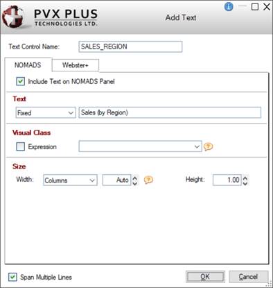
This window consists of the following:
|
Text Control Name |
Enter a unique name or use the default name provided. |
|
Span Multiple Lines |
(Applicable for NOMADS Panels Only)
When selected (Default), the Text spans according to its size. Fields placed in the rows below the Text and below the adjoining cell (in a two-column layout) are pushed down to accommodate the Text. The field in the adjoining cell remains in place beside the Text.
Deselecting this option allows fields to be placed beside the Text (in a two-column layout). However, fields below the Text (in the same column) are not pushed down, which may result in overlapping and hidden fields.
This option works the same for Smart List Boxes, Smart Charts, Images and Embedded Panel/HTML Short Codes. For an example using a Smart List Box, see
Example - Span Multiple Lines. |
|
NOMADS |
|
|
Include Text on NOMADS Panel |
(Available when
NOMADS Panel check box is selected for Form Type)
When adding new Text, this check box is selected by default to enable the options on the NOMADS folder panel. |
|
Text |
Click the drop-down arrow to select whether the Text will be a Fixed value (Default), a string Expression, or a Message Library Reference. |
|
Visual Class |
Assign a
Visual Class to the Text. Note:
Visual class names that begin with an "*" (asterisk) are pre-defined visual classes used by PVX Plus and may be subject to change without notice. |
|
Size |
|
Width |
Enter the width for the Text either in number of Columns (Default) or as a Percentage of the column width.
When Columns is selected, the width defaults to Auto. In NOMADS, a width of Columns - Auto will result in the text filling the entire column or full line. If Text with an Auto width is the only control in the column, it will default to a width of 35. To set it back to Auto, enter 0. Otherwise, enter the desired value or use the spinner control. Valid entries are 0 to 300.
If an actual number of columns has been entered and the Text is edited so that its length exceeds the number of columns, the value will adjust to match the length of the Text entered plus 2.
When Percentage is selected, the percentage defaults to 100%. Otherwise, enter the desired percentage or use the spinner control. |
|
Height |
Enter the height for the Text in number of lines or use the spinner control. Valid entries are 0 to 255. Default is 1. | |
|
Webster+ |
|
|
Include Text on Webster+ Page |
(Available when
HTML Page check box is selected for Form Type)
When adding new Text, this check box is selected by default to enable the options on the Webster+ folder panel. |
|
Text |
Click the drop-down arrow to select whether the text will be a Fixed value (Default), string Expression, or HTML. If HTML is selected, a TinyMCE® HTML Editor control with a menu and tool bar options will display. See
TinyMCE® HTML Editor.
|
HTML Class |
(Applicable if Text is Fixed or Expression)
A single HTML Class can be entered (e.g. bold). Multiple classes can be entered, separated by either spaces or commas. When spaces are used as the delimiter, the values must be within double quotes (e.g. "bold text_red fill_cyan" or bold,text_red,fill_cyan).
See
Webster+ Defined Classes. | |
|
Size |
(Applicable if Text is Fixed or Expression)
|
Width |
Enter the width for the Text either in number of Columns (Default) or as a Percentage of the column width.
When Columns is selected, the width defaults to Auto. In Webster+, a width of Columns - Auto will result in the Text being just wide enough to accommodate the text (and symbol if present). To set it back to Auto, enter 0. Otherwise, enter the desired value or use the spinner control. Valid entries are 0 to 300.
If an actual number of columns has been entered and the Text is edited so that its length exceeds the number of columns, the value will adjust to match the length of the Text entered plus 2.
When Percentage is selected, the percentage defaults to 100%. Otherwise, enter the desired percentage or use the spinner control. |
|
Height |
Enter the height for the Text in number of lines or use the spinner control. Valid entries are 0 to 255. Default is 1. | |
|
HTML |
(Available when
HTML Page check box is selected for Form Type)
|
Event |
Enter an optional
HTML Event. |
|
Other Options |
One or multiple short code options associated with the
[show] short code can be entered. Multiple options must be separated by a space.
See Webster+
Short Code Options.
Example:
tip=FloatingTip
tip=FloatingTip link=https://www.pvxplus.com Important Note:
The Other Options field should not be used for entering class=xxx or event=xxx short code options. |
(The Other Options field was added in PxPlus 2023 Update 1.) |
(The ability to add/edit a Text field was added in PxPlus 2022.) |
|
Grid | |
|
(Available when
HTML Page check box is selected for Form Type)
Launches the Add a Grid window for adding (and editing) a Grid on a file maintenance HTML page only (not available for file maintenance NOMADS panels).
The data entered in the Column Definitions grid is used to define the Webster+
[grid] and
[col] short codes, which are needed to render a Grid on the generated HTML page. See
Using Grids in Webster+.
For an example of a Grid definition, see
Grid Example.
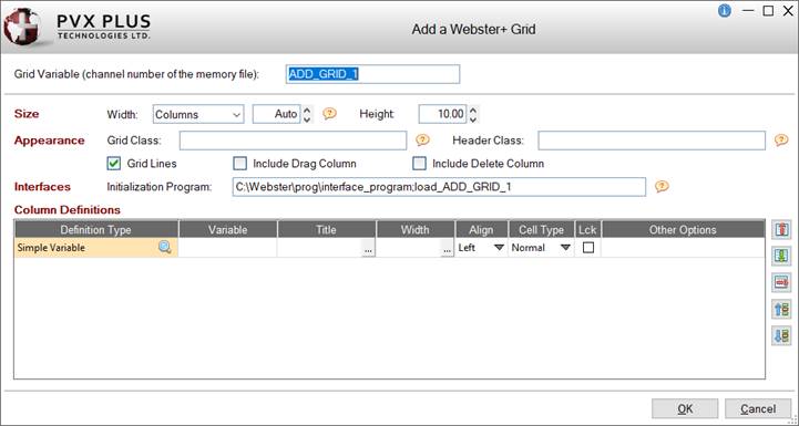
This window consists of the following:
|
Grid Variable |
Enter the name of the Grid variable that will be the handle to the memory file used to load the Grid.
The Grid must be associated with an
HTML Interface Program (entered in Step 1: Definition) that contains a method for loading the Grid using a memory file. The HTML interface program must contain the method:
LOAD_xxxx
Where:
xxxx (case insensitive) is the Grid Variable entered (e.g. ADD_GRID_1).
For an example of a Grid definition with a sample Load_MyGrid method, see
Grid Example.
The Grid Variable defaults to ADD_GRID_1, ADD_GRID_2, etc.; however, it can be changed to any numeric variable. Other events that are associated with entering values in the Grid at run time are also added to this interface program. |
|
Size |
|
Width |
Enter the width for the Grid either in number of Columns (Default) or as a Percentage of the column width.
When Columns is selected, the width defaults to Auto. In Webster+, a width of Columns - Auto will result in the Grid being just wide enough to display all of the columns or fill the section. To set it back to Auto, enter 0. Otherwise, enter the desired value or use the spinner control. Valid entries are 0 to 300.
When Percentage is selected, the percentage defaults to 100%. Otherwise, enter the desired percentage or use the spinner control. |
|
Height |
Enter the height for the Grid in number of lines or use the spinner control. Valid entries are 0 to 255. Default is 10. | |
|
Appearance |
|
Grid Class |
Controls the appearance of the cells in the Grid.
A single Grid Class can be entered (e.g. bold). Multiple classes can be entered, separated by either spaces or commas. When spaces are used as the delimiter, the values must be within double quotes (e.g. "bold text_redfill_cyan" or bold,text_red,fill_cyan).
See
Webster+ Defined Classes. |
|
Header Class |
Controls the appearance of the Grid header row.
A single Header Class can be entered (e.g. bold). Multiple classes can be entered, separated by either spaces or commas. When spaces are used as the delimiter, the values must be within double quotes (e.g. "bold text_red fill_cyan" or bold,text_red,fill_cyan). If no text color is specified for the Header Class, the text color for the Grid Class will be used.
See
Webster+ Defined Classes. |
|
Grid Lines |
Check box to indicate that lines will be shown between the Grid columns and rows. By default, this check box is selected. |
|
Include Drag Column |
Check box to indicate that the first column in the Grid will be a "Drag" column, which will have a triple bar symbol that is used to drag a row up/down in the Grid. By default, this check box is not selected. |
|
Include Delete Column |
Check box to indicate that the last column in the Grid will be a "Delete" column, which will have a trash can symbol that is used to delete a row in the Grid. By default, this check box is not selected. |
(Header Class was added in PxPlus 2022 Update 1.) |
|
Interfaces |
|
Initialization Program |
The program and method (separated with a ; semi-colon) that is to be run to load the Grid memory file.
If an
HTML Interface Program has been entered in Step 1: Definition, the Initialization Program will default to that interface_program+';load_'+grid_variable (e.g. interface_program;load_ADD_GRID_1).
If the Grid is being defined elsewhere in the interface program (such as the FM_INIT method), the Initialization Program may be left blank (shows <none>). |
(Initialization Program was added in PxPlus 2022 Update 1.) |
|
Column Definitions |
The data entered in the Column Definitions grid is used to define the Webster+
Short Codes on the generated HTML page.
For each column to be added to the Grid, define a new row with the following details:
|
Definition Type |
Type of Grid column being defined: Simple Variable, File or Data Class. Defaults to Simple Variable for the first column when defining a new Grid.
To select a Definition Type, click the Query button (magnifying glass) to invoke the Grid Column Definition Type window:
|
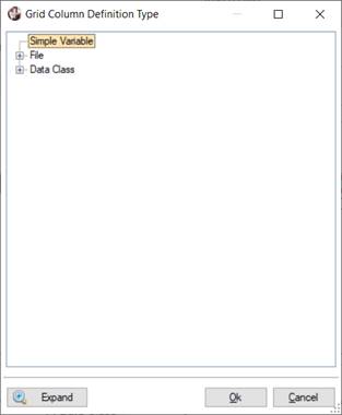
All Nodes Collapsed |
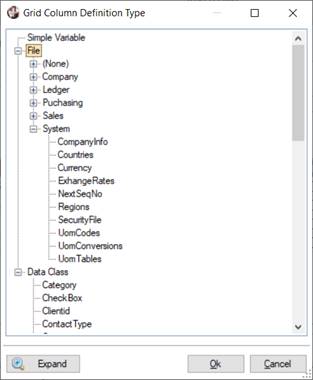
Specific Nodes Expanded |
This window displays a tree view and consists of the following:
|
Simple Variable |
If the Grid column does not relate to a field in a data file or to a data class, select Simple Variable. |
|
File |
If the Grid column relates to a field in a particular data file, expand the File node and select a file from the list of data files in the data dictionary, organized by group. |
|
Data Class |
If the Grid column relates to a particular data class, expand the Data Class node and select a data class from the list of defined data classes. See
Data Classes. |
|
Expand (Collapse) |
Toggle button that either expands or collapses the entire tree view. To collapse or expand a single "parent" node, click the corresponding +plus or - minus sign. |
|
Ok |
Enters the selected Definition Type into the Column Definitions grid. |
|
Cancel |
Cancels any selections and returns to the Column Definitions grid. |
When a File is selected, the Definition Type is populated with the group and file name, and the Variable column drop box is loaded with fields from that file. At the same time, a new row is added to the Column Definitions grid with Definition Type defaulting to the same file name. By defining a Grid column in this way, the
usefile=xxx option will be used with the
[col] short code, allowing additional options (i.e. format, default, etc.) to be set from the data dictionary.
When a Data Class is selected, the Definition Type is populated with the data class. The values for Variable, Title, Width and Cell Type default into the Column Definitions grid based on the data class definition; however, this can be changed. By defining a Grid column in this way, the
dataclass=xxx option will be used.
When Simple Variable is selected, any options that are needed must be specified in the
Other Options column. |
|
Variable |
If the Definition Type is Simple Variable, enter a unique name for the variable in the Grid definition.
If the Definition Type is File, select a field from the Variable drop box, which will be loaded with fields from the selected data file.
If the Definition Type is Data Class, the name of the selected data class is defaulted as the variable; however, this can be changed.
The variable must also correspond directly to the variable in the IOList that is used in the
HTML Interface Program entered in Step 1: Definition to load the memory file corresponding to the Grid. |
|
Title |
Enter the title to display for the Grid column. |
|
Width |
Enter the width for the Grid column. It should be wide enough to display the Title and the data. |
|
Align |
Select the alignment for the data in the Grid column: Left, Right or Center. Default is Left. |
|
Cell Type |
Select the type of cell being defined:
|
Normal |
(Default) Normal text cell that contains one line of data. |
See
[input] short code. |
|
Button |
Contains a button. |
See
[button] short code. |
|
CheckBox |
Contains a check box with no 3D effect. |
See
[checkbox] short code. |
|
DropBox |
Allows a selection to be made from a drop-down list. |
See
[list] short code. |
|
Image |
Contains a specified image. |
See
[image] or
[picture] short codes. |
|
ListBox |
Allows a selection to be made from a list box. |
See
[list] short code. | |
|
Lck |
Check box to indicate that the Grid column will be locked to prevent its contents from being changed. Defaults to On if Definition Type is a File and the selected field (in the Variable column) is defined as Read Only in the data dictionary. Note:
If a data dictionary field is defined as Read Only but the Grid column being defined should not be locked, uncheck the Lck check box and enter locked="" in the Other Options column. See
locked short code option. |
|
Other Options |
Specify other short code options that are associated with the
[input] short code or other cell types (if needed).
See Webster+
Short Code Options.
Examples:
|
class=bold,text_red |
See
class=xxx short code option. |
|
event=button_event |
See
event=xxx short code option. |
|
format="###.00" |
See
format=xxx short code option. |
|
query=scrnlib.en;client.q |
See
query=xxx short code option. |
|
tip="Enter Client Name" |
See
tip=xxx short code option. |
Multiple options can be entered for each column with a space separating each option.
For an example of a Grid definition with options entered, see
Grid Example. | |
|
Insert Above
Insert Below |
Adds a blank row above or below the currently selected row for creating a new column. |
|
Delete |
Removes the currently selected row, which also removes the column from the Grid being defined. |
|
Move Up
Move Down |
Changes the order of the existing columns in the Grid being defined. |
(The ability to add/edit a Grid was added in PxPlus 2022.) |
Grid Example:
The example below shows a Grid definition with eight rows of data entered in the Column Definitions grid:
|
|
Rows 1, 2, 3 and 5 define columns that are based on the SalesRepCode, Name, ImagePath$ and ytdOrders fields in the Salesreps data file. |
|
|
Row 4 defines a column that is based on the Department data class. |
|
|
Rows 6, 7 and 8 define columns that are based on Simple Variables named email$, image$ and comments$. |
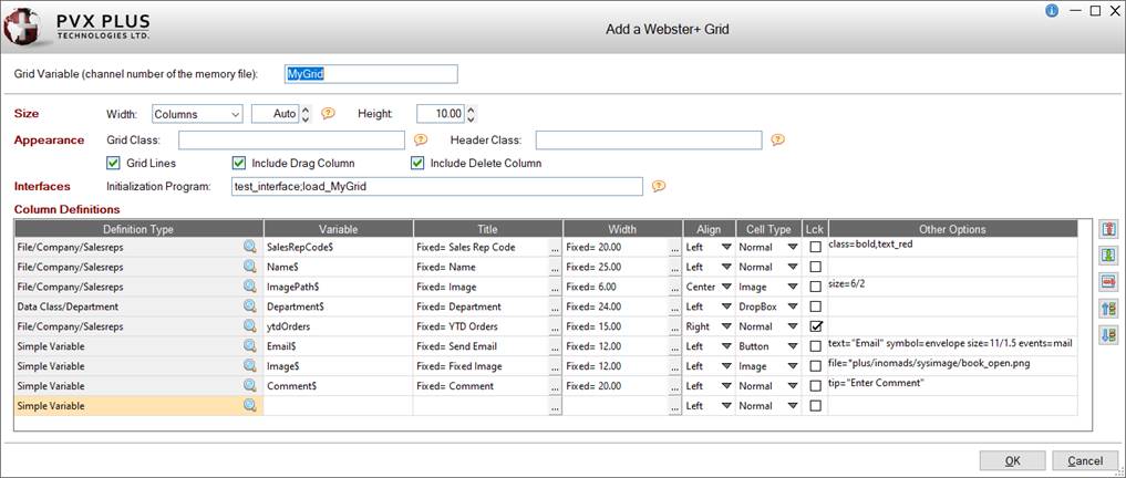
The following program, which contains an event (Mail) and a method to load the grid (Load_MyGrid), was defined as the
HTML Interface Program:
! grid_interface demo program
!
goto lno(_event$,err=*next)
%webster'msgbox("Invalid event: "+_event$,"Internal Error - "+pgm(-3),"!")
exit
!
Mail:
! code needed when Mail button is pushed
%webster'msgbox("Pushed Mail button","Button event","!")
exit
!
Load_MyGrid:
enter MyGrid
if MyGrid<>0 \
then exit
open (hfn,iol=*)"salesreps"
reps=lfo
open (hfn,iol=MyGridIOL)"*memory*"
MyGrid=lfo
select * from reps
write (MyGrid)
next record
close (reps,err=*proceed)
exit
!
MyGridIOL: \
iolist SalesRepCode$,Name$,ImagePath$,Department$,ytdOrders,Email$,Image$,Comment$
When the HTML file is generated, the Webster+ short codes for this Grid look like this:
[grid MyGrid program="test_interface;Load_MyGrid" gridlines size=Auto/10 class=""]
[col width=5 ttl="Drag" align=center event=*Rowdrag][symbol reorder][/col]
[col usefile=Salesreps source=SalesRepCode$ ttl="Sales Rep Code" width=20 align=left class=bold,text_red]
[col usefile=Salesreps source=Name$ ttl="Name" width=25 align=left]
[col ttl="Image" width=6 align=center][picture file=(ImagePath$) size=6/2][/col]
[col ttl="Department" width=24 align=left][list Department$ dataclass=Department program=*class;ClassList,"Department"][/list][/col]
[col usefile=Salesreps source=ytdOrders ttl="YTD Orders" width=15 align=right locked]
[col ttl="Send Email" width=12 align=left][button email$ size=auto size=11/1.5 event=mail][symbol envelope] Email[/button][/col]
[col ttl="Fixed Image" width=12 align=left][picture size=auto file=*plus/inomads/sysimage/book_open.png][/col]
[col source=comment$ ttl="Comment" width=20 align=left tip="Enter Comment"]
[col width=4.5 align=center ttl="Del"][symbol trash event=*Rowdel][/col]
[/grid]
In Webster+, the Grid looks like this:
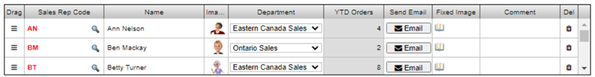
This Grid shows the following, based on the
Grid Definition:
|
|
The Drag column is shown because the Include Drag Column check box was selected. |
|
|
The Grid is loaded with records from the Salesreps file in the data dictionary. All the columns are populated, except for Comments, which is not a field in the Salesreps file. |
|
|
The Sales Rep Code column contains a query button because the SalesRepCode$ field was defined with a query in the data dictionary. The data in this column is red and bolded because a class was entered in the Other Options column. |
|
|
The Image column was defined with a Cell Type of Image and contains the image referred to in the ImagePath$ column of the Salesreps file with a width of 6 and a height of 2. If no size was specified in the Other Options column, the cell would be made large enough to fit the image. |
|
|
The Department column shows a drop-down arrow in each cell because the Department data class was defined for a Drop Box control, which the Cell Type column indicates. |
|
|
The YTD Orders column is locked because the ytdOrders field was defined as Read Only in the data dictionary. The data in this column is right aligned because Right was selected in the Align column. |
|
|
The Send Email column shows a button in each cell because Button was selected in the Cell Type column. The button's size, symbol, text and event are based on the text, symbol, size and event options that were entered in the Other Options column. When the button is clicked, the mail event in the HTML interface program will be triggered. This needs to be coded to determine the email address and launch the email program. |
|
|
The Fixed Image column is defined with a Cell Type of Image and displays the file specified in the Other Options column in all rows of the Grid. |
|
|
The Comments column shows a tip when you hover over it because a tip option was entered in the Other Options column. |
|
|
The Del column is shown because the Include Delete Column check box was selected. |
|
Button Bar |
|
|
Launches the Add Button Bar window for adding (and editing) Button controls horizontally (in a button bar) on the file maintenance panel. Up to 10 buttons can be added to a button bar, and more than one button bar can be added to a file maintenance panel.
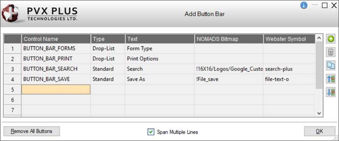
This window consists of the following:
|
(Button Bar Buttons Grid) |
Displays a list of the buttons in the button bar. After a new button is defined, it is automatically added to this list. |
|
Add or Edit a Button Bar Button |
Button that launches the Add a Button window for adding a new button to the button bar or editing an existing one.
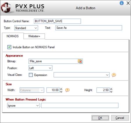
These options are also available when defining a Button object on the file maintenance panel in Step 6: Fields (see
Button object), except for these differences:
|
NOMADS |
|
|
Size |
|
Width |
Enter the width (in number of columns only) for the button bar Button on the NOMADS panel or use the spinner control. The default is 10. | |
|
Webster+ |
|
|
Size |
|
Width |
(Available when button Type is Standard or Drop List)
Enter the width (in number of columns only) for the button bar Button on the Webster+ page. | |
|
HTML |
|
Event/URL |
An HTML event or a URL may be added to individual buttons in a button bar when defining a new button or editing a button selected in the Add Button Bar window. | | |
|
Delete a Button Bar Button |
Removes the selected button from the button bar. Prior to deletion, a message will display. |
|
Copy a Button Bar Button |
Creates a new button bar button by copying the settings from an existing button selected in the same button bar. |
|
Move Up
Move Down |
Moves the selected button up or down within the list, changing the order of the buttons in the button bar on the NOMADS panel and Webster+ page. |
|
Remove All Buttons |
(Available when a button bar Button is defined)
Removes all the buttons in the selected button bar. Prior to deletion, a message will display.
Removing all the buttons will also remove the button bar object from the Layout Grid after exiting the Add Button Bar window. |
|
Span Multiple Lines |
(Applicable for NOMADS Panels Only)
When selected (Default), the button bar spans according to its size. Fields placed in the rows below the button bar and below the adjoining cell (in a two-column layout) are pushed down to accommodate the button bar. The field in the adjoining cell remains in place beside the button bar.
Deselecting this option allows fields to be placed beside the button bar (in a two-column layout). However, fields below the button bar (in the same column) are not pushed down, which may result in overlapping and hidden fields.
This option works the same for Smart List Boxes, Smart Charts, Images and Embedded Panel/HTML Short Codes. For an example using a Smart List Box, see
Example - Span Multiple Lines. |
(The ability to add/edit a Button Bar was added in PxPlus 2023.) |
|
Embedded Panel or HTML Short Codes | |
|
Launches the Embed a Panel/Short Codes window (except when the current cell is on a Key field) for specifying the panel and/or HTML short code(s) to embed.
See
Webster+ HTML Merge/Bind Object.
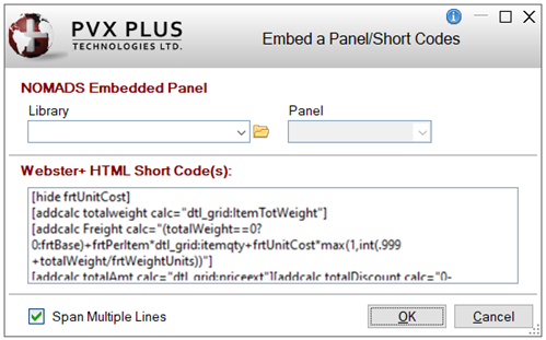
This window consists of the following:
|
NOMADS Embedded Panel |
(Applicable for NOMADS Panels Only)
|
Library |
Library path of the panel to embed. Click the drop-down arrow for a list (up to nine) of previous selections. Click the Browse button to look through the directory structure to find the library or type the library path. An expression can also be entered by preceding the expression with an = (equals sign); e.g. =libname$ or ="mylib.en". |
|
Panel |
Select the name of the panel whose contents you want to embed. Click the drop-down arrow for a list of panels in the selected library. | Note:
It is not recommended to embed a generated file maintenance panel into another file maintenance panel to be generated, as this may cause issues when the NOMADS panel or HTML page is displayed. |
|
Webster+ HTML Short Code(s) |
(Applicable for HTML Pages Only)
Enter the HTML
Short Code(s) for the specific element(s) or simple function(s) you want to embed inside the HTML page.
Example:
Short codes were used to define the grid below for the generated Webster+ HTML page:
[row "Special product prices:"]
[grid dtl_gridnosort size=auto/20 program=pricelist;makegrid gridlines]
[col ttl="Product Code" width=20][input productcode$ query=scrnlib.en;product.q event=chkline][/col]
[col source=listprice$ locked ttl="List Price" width=15 class=align_center]
[col source=UOM$ width=14 ttl="UOM" query=scrnlib.en;uom.q event=chkline]
[col source=minQty format="#####0", ttl="Min Qty" width=12 bwz]
[col source=price format="###,##0.00" ttl="Special Price" width=12]
[col source=itemDiscount format="#0.00" ttl="Disc. %" width=9]
[col width=5 align=center ttl="Del"][symbol trash event=*Rowdel]
[/grid]<br>
[button size=Auto/2 event=pricelist@add10 text="+10 rows"]
[/row]
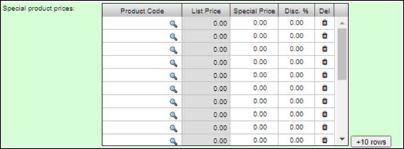 |
|
Span Multiple Lines |
(Applicable for NOMADS Panels Only)
When selected (Default), the embedded panel or short code (if applicable) spans according to its size. Fields placed in the rows below the embedded panel or short code and below the adjoining cell (in a two-column layout) are pushed down to accommodate the embedded panel or short code. The field in the adjoining cell remains in place beside the embedded panel or short code.
Deselecting this option allows fields to be placed beside the embedded panel or short code (in a two-column layout). However, fields below the embedded panel or short code (in the same column) are not pushed down, which may result in overlapping and hidden fields.
This option works the same for Smart List Boxes, Smart Charts, Images and Embedded Panel/HTML Short Codes. For an example using a Smart List Box, see
Example - Span Multiple Lines. |
(The ability to add/edit an Embedded Panel or HTML Short Codes was added in PxPlus 2021.) |
|
Hyperlink Prompt | |
|
Launches the Add a Hyperlink Prompt window for adding a hyperlink to a data dictionary field prompt only if the field is not the last Key segment. For example, a hyperlink can be added to the "SalesRepCode" prompt to launch Sales Representatives Maintenance. When a hyperlink prompt is added, the cell contents are underlined.
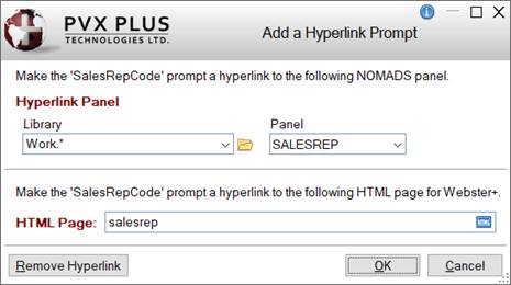
This window consists of the following:
|
Hyperlink Panel |
Specify the NOMADS panel to display when the hyperlink prompt is clicked at run time.
|
Library |
Library that contains the NOMADS panel. Click the drop-down arrow for a list (up to nine) of previous selections. Use the Browse button to locate the library or enter the pathname. |
|
Panel |
NOMADS panel name. Click the drop-down arrow for a list of panels in the selected library. If left blank, the prompt will not be a hyperlink. | |
|
HTML Page |
(Available when
HTML Page check box is selected for Form Type)
Specify the HTML page to display when the hyperlink prompt is clicked at run time. Use the HTML query button to locate the HTML page or enter the pathname. If left blank, the prompt will not be a hyperlink. |
|
Remove Hyperlink |
Clears the Panel and HTML Page selections and removes the hyperlink from the prompt. |
(The ability to add/edit a Hyperlink Prompt was added in PxPlus 2021.) |
|
HTML Event/Other Options | |
|
(Available when
HTML Page check box is selected for Form Type)
Launches the Add an HTML Event/Other Options window for adding an
HTML Event and/or Webster+
Short Code Options to a cell that contains either a data dictionary field or fonted text.
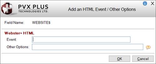
This window consists of the following:
|
Field Name or Text |
Displays the name of the data dictionary field or the fonted text. |
|
Webster+ HTML |
|
Event |
Enter an
HTML Event. |
|
Other Options |
One or multiple short code options can be entered for a cell that contains a non-key data dictionary field or fonted text. Multiple options must be separated by a space.
See Webster+
Short Code Options.
Example:
tip=FloatingTip
tip=FloatingTip link=https://www.pvxplus.com Important Note:
The Other Options field should not be used for entering the event=xxx short code option. |
(The Other Options field was added in PxPlus 2023 Update 1.) |
|
OK |
Saves the HTML event and returns to the Layout Grid. A red tick displays in the top left corner of the cell to indicate that an HTML event was added.
If a data dictionary field has both an
HTML Calculation and an HTML event defined, a magenta tick will display.
(The colored tick indicator was added in PxPlus 2023.) |
|
Cancel |
Cancels any changes and returns to the Layout Grid. |
(The ability to add/edit an HTML Event was added in PxPlus 2022.) |
|
HTML Calculation | |
|
(Available when
HTML Page check box is selected for Form Type)
Launches the Add an HTML Calculation window for adding an HTML calculation to a cell that contains a data dictionary field.
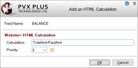
This window consists of the following:
|
Field Name |
Displays the name of the data dictionary field. |
|
Webster+ HTML Calculation |
|
Calculation |
Enter an HTML calculation. Fields used in the calculation must either exist on the panel Layout Grid or be included as
Hidden Variables.
Example:
ytdSales+prvSales |
|
Priority |
(Available when an HTML Calculation is entered)
Controls the order in which the HTML calculations are done. Can be any number between 1 and 9 (1 is first priority). The default priority is 5 for each calculation defined.
The
[addcalc] short codes, which correspond to all the HTML calculations entered on the panel Layout Grid, are added at the end of the generated HTML page, sorted by priority. If two or more HTML calculations are assigned the same priority level, calculations will be done in field name sequence within each priority level.
If the order of the HTML calculations is not important, the priority can be left as 5 for all HTML calculations.
When an HTML calculation is entered for a data dictionary field, the priority level displays at the end of the
Info Line for that field.
(The HTML Calculation Priority was added in PxPlus 2022 Update 1.) | |
|
OK |
Saves the HTML calculation and returns to the Layout Grid. A blue tick displays in the top left corner of the cell to indicate that an HTML calculation was added.
If a data dictionary field has both an HTML calculation and an
HTML Event defined, a magenta tick will display.
(The colored tick indicator was added in PxPlus 2023.) |
|
Cancel |
Cancels any changes and returns to the Layout Grid. |
(The ability to add/edit an HTML Calculation was added in PxPlus 2022.) |
Email and URL Input Validation (Applicable for HTML Pages Only)
To validate the input entered for a data dictionary field as either an email address or URL on a generated Webster+ HTML page, the data dictionary field must have a data class with a Class Name "Email" or "URL" (case insensitive) assigned to it.
To do this, create a new data class definition in
Data Class Definitions maintenance, and for the Class Name, enter "Email" or "URL" (case insensitive). Then, assign the data class to the data dictionary field in
Data Dictionary Maintenance (on the Elements tab).
(Email and URL input validation for generated Webster+ HTML pages was added in PxPlus 2021 Update 1.)
Right-Click Menus
Right clicking on a column header in the Layout Grid displays a popup menu with the following options:
|
Right-Click Menu Options |
Two-Column Grid or SmartPhone Layout |
|
HTML Section Size |
(Applicable for HTML Pages Only)
Sets the width of an HTML section. A section is a block of data elements or controls that occupies a specified portion of the page width. Multiple sections can be placed across the page until the available space is occupied at which point further sections will start below. For example, you can have 2 half sections, 3 third sections, 4 quarter sections or 1 half and 2 quarter sections.
Possible values are:
|
Auto |
Default is Auto for the Left side; however, a different value can be set for each side. Auto is the same as a Half section except when nothing is entered in the rows on the Right side in the entire Layout Grid, in which case, Auto makes the Left column a whole section. |
|
Half |
A half section. Default is Half for the Right side. |
|
Third |
A third section. |
|
Quarter |
A quarter section. |
|
Flex |
A flex section will occupy the width of the largest element inside the section; thus, the number of flex elements that can appear across the page will vary based on contents. |
The current setting is indicated with a check mark.
HTML Sections
When an HTML page is resized, the controls in a section stay together. If the HTML page is resized smaller, a section on the Right side of the Layout Grid will eventually move below a section on the Left side of the Layout Grid.
Some section breaks are inserted into the HTML page automatically when it is generated (i.e. when a full line or a line containing two blank cells is encountered). However, at certain times, it may be desirable to control exactly when section breaks occur, especially when using section sizes that result in more than 2 sections across the page. This can be accomplished by using the right click menu within the Layout Grid to insert either an
HTML Section Break or a
Full HTML Section Break. |
(The right-click popup menu on a column header was added in PxPlus 2021.)
Right clicking on a cell or row inside the Layout Grid displays a popup menu with the following options:
Note:
When right clicking on a Key field, only certain selections are available.
|
Right-Click Menu Options |
Two-Column Grid Layout |
SmartPhone Layout |
|
Clear Current Cell |
Clears the contents of the currently selected cell. This option is not available when the current cell contains a Key field.
If the cell contains a data dictionary field, the cleared field will be returned to the Fields list box. |
(Same as for Two-Column Grid Layout) |
|
Clear All Cells |
Clears the contents of all cells (except Key fields) on the currently selected panel or folder tab. Prior to clearing all cells, a message will display.
(The Clear All Cells option was added in PxPlus 2021.) |
(Same as for Two-Column Grid Layout) |
|
Insert Cell Above |
Inserts a blank cell above the currently selected cell.
If on a half-row cell, all half-row cells below in the same column will be moved down one row until a full-row cell is encountered. When a full-row cell is encountered, if the cell being pushed down is empty, it will be discarded and the insertion ends. If the cell being pushed down into the full row is not empty, a new row with the contents of the cell being pushed down will be inserted before the full row, and the last row of the grid will then be deleted.
If on a full-row cell, a new row will be inserted above the current row, and the last row of the grid will be deleted. This will push all subsequent rows down.
(The Insert Row Above option was changed to Insert Cell Above in PxPlus 2022 Update 1.) |
Inserts a new cell above the currently selected cell, and the last cell of the grid will be deleted. This will push all subsequent cells down. |
|
Delete Cell |
Deletes the currently selected cell.
If on a half-row cell, all half-row cells below in the same column will be moved up one row until a full-row cell is encountered. When a full-row cell is encountered, if the row above the full-row cell is empty (that is, nothing in either column), the row above will be deleted, which effectively moves everything below up one row. A new empty row will be added to the end of the grid.
If on a full-row cell, the current row will be deleted, and an empty row will be added to the end of the grid. This will move all subsequent rows up.
This option is not available if the current cell contains a Key field.
(The Delete Row option was changed to Delete Cell in PxPlus 2022 Update 1.) |
Deletes the currently selected cell, and an empty cell will be added to the end of the grid. This will move all subsequent rows up.
This option is not available if the current cell contains a Key field. |
|
Cut Cell
Paste Cell(s) |
Cuts the contents of a single cell and then pastes the contents into a destination cell.
If multiple cells are to be cut and pasted, first cut each cell one at a time in the order in which they are to be pasted and then use the Paste Cell(s) option to paste them all at once into the destination location. To ensure that all cut cells are successfully pasted, it is recommended to remain in the Step 6: Fields panel until the cut/paste process has been completed.
Cells can be cut and pasted within the same panel or between different panels, such as from the Main panel to a folder panel and vice versa.
The Cut Cell option is not available if the cell contains a Key field, Horizontal Line, Section Break, Full Section Break or Folder Location.
The Paste Cell(s) option is available only when one or more cells have been previously cut.
(The Cut Cell and Paste Cell(s) options were added in PxPlus 2021.) |
(Same as for Two-Column Grid Layout) |
|
Full Row |
Changes the selected half row (in one column) to a full row (across both columns) except when a Key field is in the adjoining cell. In that case, a message displays, and the half row is not changed. Note:
If the adjoining cell contains a data dictionary field (other than a Key field), the field will be cleared from the grid and returned to the Fields list box.
If the adjoining cell contains fonted text, the fonted text will be removed.
(The checking for Key fields was added in PxPlus 2021.) |
Not Applicable |
|
Half Row |
Changes the selected full row (across both columns) to a half row in each column. The half row in the Right Side column will be blank. |
Not Applicable |
|
Lock/Unlock |
Locks or unlocks a data dictionary field.
This option is applicable only for data dictionary fields (except for Key fields or fields set as Read Only or Required).
When a field is locked, "Locked" displays at the end of the
Info Line for that field. When a field with a Query button is locked, the Query button does not display.
(The Lock/Unlock option was added in PxPlus 2021.) |
(Same as for Two-Column Grid Layout) |
|
HTML Section Size |
(Applicable for HTML Pages Only)
Sets the width of an HTML section. Possible values are Half, Third, Quarter and Flex. See
HTML Section Size.
(The HTML Section Size option was added in PxPlus 2022.) |
(Same as for Two-Column Grid Layout) |
|
Add HTML Section Break |
(Applicable for HTML Pages Only)
Adds an HTML section break in the current column only. See Webster+
[section xxx] short code.
This option is not available when the current row contains a Key field.
A section is a block of data elements or controls that occupies a specified portion of the page width. Sections are placed across the page until the available space is occupied at which point further sections will start below.
An HTML section break indicates the end of one section and the beginning of the next section, which becomes apparent when the panel is resized. See
HTML Sections.
(The Add HTML Section Break option was added in PxPlus 2021.) |
(Same as for Two-Column Grid Layout) |
|
Add Full HTML Section Break |
(Applicable for HTML Pages Only)
Adds a full HTML section break across both columns. See Webster+
[section xxx] short code.
This option is not available when the current row contains a Key field.
A section is a block of data elements or controls that occupies a specified portion of the page width. Sections are placed across the page until the available space is occupied at which point further sections will start below.
An HTML section break indicates the end of one section and the beginning of the next section, which becomes apparent when the panel is resized. See
HTML Sections. Note:
Adding a full section break before a row(s) may be necessary to align subsequent rows vertically in the HTML output.
(The Add Full HTML Section Break option was added in PxPlus 2021.) |
(Same as for Two-Column Grid Layout) |
|
Add Half Horizontal Line |
Adds a half horizontal line. The Layout Grid displays the text * Horizontal Line *.
This option is not available when the current row contains a Key field.
(The Add Half Horizontal Line option was added in PxPlus 2022.) |
(Same as for Two-Column Grid Layout) |
|
Add Full Horizontal Line |
Adds a full horizontal line (across both columns). The Layout Grid displays the text * Horizontal Line *.
This option is not available when the current row contains a Key field. Note:
If the adjoining half row contains a Key field, a message will display, and the horizontal line will not be added.
(The checking for Key fields was added in PxPlus 2021.) |
Adds a full horizontal line. The Layout Grid displays the text * Horizontal Line *.
This option is not available when the current row contains a Key field. |
|
Folder Location |
(Available when
Folder check box is selected)
Adds the Folder control to the current row when you are on the Main panel only. The Layout Grid displays the text * Folder Location *.
This option is not available when the current row contains a Key field or when you are not on the Main panel or a Folder Location has already been added.
If
Folder Tabs have been defined but no Folder Location has been added, the Folder control will be located at the bottom of the Main panel.
(The Folder Location option was added in PxPlus 2023 Update 1.) |
(Same as for Two-Column Grid Layout) |
|
Add Object |
Displays a list for selecting an object to add or edit:
|
Add or Edit a Smart List Box |
Launches the
Add a Smart List Box window for adding (and editing) a Smart List Box on the panel.
This option is not available when the current cell contains a Key field.
(The Add or Edit a Smart List Box option was added in PxPlus 2021.) |
|
Add or Edit a Smart Chart |
Launches the
Add a Smart Chart window for adding (and editing) a Smart Chart on the panel.
This option is not available when the current cell contains a Key field.
(The Add or Edit a Smart Chart option was added in PxPlus 2021.) |
|
Add or Edit an Image |
Launches the
Add an Image window for adding (and editing) an Image control on the panel.
This option is not available when the current cell contains a Key field.
(The Add or Edit an Image option was added in PxPlus 2021.) |
|
Add or Edit a Button |
Launches the
Add a Button window for adding (and editing) a Button control on the panel.
This option is not available when the current cell contains a Key field.
(The Add or Edit a Button option was added in PxPlus 2021 Update 1.) |
|
Add or Edit an Input Field |
Launches the
Add an Input Field window for adding (and editing) an Input Field on the panel.
This option is not available when the current cell contains a Key field.
(The Add or Edit an Input Field option was added in PxPlus 2022.) |
|
Add or Edit a Text Field |
Launches the
Add Text window for adding (and editing) a Text field on the panel.
This option is not available when the current cell contains a Key field.
(The Add or Edit a Text Field option was added in PxPlus 2022.) |
|
Add or Edit a Grid |
(Available when
HTML Page check box is selected for Form Type)
Launches the
Add a Grid window for adding (and editing) a Grid on a file maintenance HTML page.
This option is not available when the current cell contains a Key field.
(The Add or Edit a Grid option was added in PxPlus 2022.) |
|
Add or Edit a Button Bar |
Launches the
Add Button Bar window for adding (and editing) Button controls that are grouped horizontally (in a button bar) on the panel.
This option is not available when the current cell contains a Key field.
(The Add or Edit a Button Bar option was added in PxPlus 2023.) |
|
Add or Edit Embed Panel/Short Codes |
Launches the
Embed a Panel/Short Codes window for specifying the panel and/or HTML short code(s) to embed.
This option is not available when the current cell contains a Key field.
(The Add or Edit Embed Panel/Short Codes option was added in PxPlus 2021.) |
|
Add or Edit a Hyperlink Prompt |
Launches the
Add a Hyperlink Prompt window for adding a hyperlink to a data dictionary field prompt only if the field is not the last Key segment.
For example, a hyperlink can be added to the "Sales Rep Code" prompt to launch Sales Rep Maintenance. When a hyperlink prompt is added, the cell contents are underlined.
(The Add or Edit a Hyperlink Prompt option was added in PxPlus 2021.) |
|
Add or Edit an HTML Event/Other Options |
(Available when
HTML Page check box is selected for Form Type)
If the current cell contains a data dictionary field or fonted text, this option launches the
Add an HTML Event/Other Options window for adding an
HTML Event and/or Webster+
Short Code Options.
If the current cell contains an object (List Box, Chart, Image, Button, Input Field or Text), the Webster+ HTML options for that object will display for input.
This option is not available when the current cell contains a Key field.
(The Add or Edit an HTML Event option was added in PxPlus 2022.) |
|
Add or Edit an HTML Calculation |
(Available when
HTML Page check box is selected for Form Type)
If the current cell contains a data dictionary field, this option launches the
Add an HTML Calculation window for adding an HTML calculation.
If the current cell contains an
Input Field object, the HTML Calculation option for that object will display for input.
If the current cell does not contain either one of these, a message will display.
This option is not available when the current cell contains a Key field.
(The Add or Edit an HTML Calculation option was added in PxPlus 2022.) |
(The Add Object option was added in PxPlus 2021 Update 1.) |
(Same as for Two-Column Grid Layout) |
Preview Mode
The Preview button is enabled on all panels in the File Maintenance Generator after a Table Name is entered or selected in
Step 1: Definition. Once fields are placed in the Layout Grid, use this button to display a preview of the layout of the NOMADS panel or HTML page. The controls will not actually function; however, tabbing through the fields and switching folder tabs (if included) will work.
Click the drop-down arrow for preview options:
|
Preview NOMADS Panel |
(Available when
NOMADS Panel check box is selected for Form Type)
Displays a preview of the layout of the NOMADS panel; however, the controls will not actually function. |
|
Preview HTML Page |
(Available when
HTML Page check box is selected for Form Type)
Displays a preview of the layout of the HTML page; however, the controls will not actually function.
If the Webster Preview URL has not been defined, a message will display. |
|
Webster Preview URL |
Launches a separate window for entering a valid URL, which is required to preview an HTML page created by the File Maintenance Generator.
A Web server must be running and pointing to an installation of
Webster+. The URL should specify the server and the Port number, separated by a : (colon).
Example:
localhost:8088/ (indicates that the Web server is running on your local machine on Port 8088) |
Prior to completing the File Maintenance Generator, use the Preview button when needed to view results, for example, after adjusting the field layout or when visiting previous steps to change settings.
(The drop-down Preview button options were added in PxPlus 2021.)
Review the selections for the previous steps, which are presented in a grid format with a vertical scroll bar. At this point, the Finish button is enabled on all panels in the File Maintenance Generator.
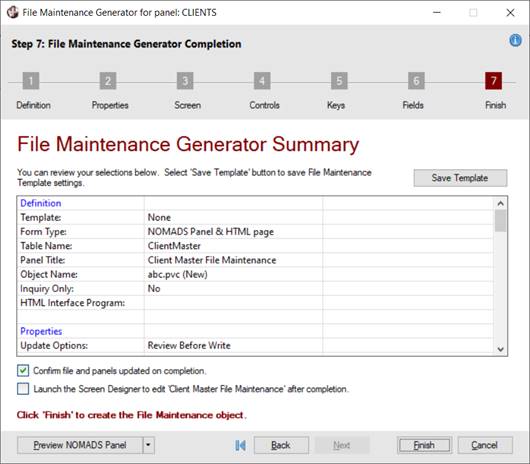
Note:
If no fields (besides Key fields) have been added in
Step 6: Fields, navigating to Step 7: Finish by any method (i.e. Next button, Step 7: Finish button or Last browse button) will display a message about adding fields to the Main panel.
Responding Yes adds all fields to the Main panel. Responding No does not add any fields; however, this message will continue to redisplay until at least one field is added or the Finish button is selected.
This panel consists of the following:
|
Save Template |
Button that launches the File Maintenance Template Save Settings window for saving File Maintenance template settings to a file name.
Saving them to a file name allows the same settings to be used again when defining new panels by selecting the desired Template in
Step 1: Definition. Using File Maintenance templates makes it easier to maintain a consistent look and feel to panels that are generated.
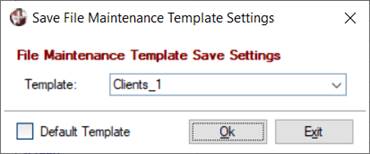
This window consists of the following:
|
Template |
Enter the name of the new template to be saved. If a template name is entered that already exists, a message will display. |
|
Default Template |
Select this check box to save the current template settings as the default to be used when creating new file maintenance panels.
This default template will initially display as the File Maintenance Template (in
Step 1: Definition) when a new file maintenance panel is being created.
(The Default Template check box was added in PxPlus 2020.) |
|
OK |
Saves the current settings to the template and closes the File Maintenance Template Save Settings window. |
|
Exit |
Closes the File Maintenance Template Save Settings window without saving the template. | |
|
Confirm file and panels updated on completion |
When this option is checked (Default), a confirmation message will display after clicking the Finish button. This message shows the names of panels that have been generated, including folders, and the pathname of the HTML page that was created if the HTML Page option was selected in
Step 1: Definition.
If this option is unchecked, the confirmation message will not display, and this option will remain unchecked for panels and HTML pages that are subsequently generated in the current screen library.
(The Confirm file and panels updated on completion option was added in PxPlus 2021.) |
|
Launch the Screen Designer to edit 'xxxxxx' after completion |
Select this check box to open the generated main panel in the
NOMADS Panel Designer after clicking the Finish button.
If this check box is not selected, the NOMADS Panel Designer will not launch. Instead,
Library Object Selection will open with the file maintenance panel(s) added to the Object Name list. |
|
Finish |
This button is enabled in Step 7: Finish, at which time, it is also enabled on all panels in the File Maintenance Generator. It is used to complete the File Maintenance Generator and generate the file maintenance panel(s). If required fields are missing in
Step 6: Fields, a message will display.
The main panel will be generated using the object name specified. Any additional folders will be created with the name object_name.n where n is a sequence number beginning with 1.
Example:
Client_mnt (Main Panel)
Client_mnt.1 (Folder Panel 1)
Client_mnt.2 (Folder Panel 2) |
Once the file maintenance NOMADS panels and/or HTML pages are generated, they can be easily modified by using the
NOMADS Panel Designer or the
HTML Editor. Alternatively, they can be regenerated by using the File Maintenance Generator.
Using NOMADS Panel Designer
In NOMADS
Library Object Selection, select the file maintenance panel and click the Open toolbar button to launch the Panel Designer. Alternatively, click the Panel toolbar button or select Objects > Panel Object from the menu bar, and use the same panel Name.
Using HTML Editor
Invoke the
HTML Editor and select File > Open from the menu bar. Go to the directory in which the generated HTML pages are stored and select the HTML page to modify.
Using File Maintenance Generator
To regenerate a file maintenance panel, the Name of the existing file maintenance panel is used to allow the File Maintenance Generator to reload the settings for the current panel definition. Once changes to the settings are made, the panel can be generated again.
Important Note:
Be aware that once a panel is regenerated, any previous modifications that were made to the original panel after it was generated will be lost.
The steps for regenerating a panel are:
|
1. |
In NOMADS
Library Object Selection, select the existing file maintenance panel. If folder tabs were previously defined, select the Main panel (not a folder tab panel). |
|
2. |
Press Enter or double click to launch the File Maintenance Generator. Alternatively, click the File Maint button or select Objects > File Maint from the menu bar, and use the same panel Name. |
|
3. |
The settings for the generated file maintenance panel are reloaded. Make any necessary changes, and when done, click the Finish button to regenerate the panel. |
(The ability to regenerate an existing file maintenance panel was added in PxPlus 2020.)
See Also
File Maintenance Sample Panels
Webster+