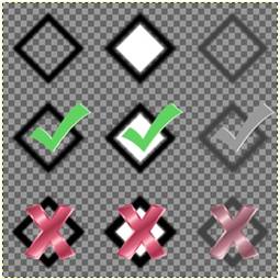
Check Box (3x3)
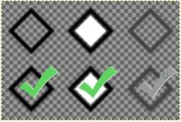
Radio Button (2x3)
Sample Image Files
(The patterned background indicates that Transparency is turned On.)
|
Customizing Radio Buttons and Check Boxes |
You can customize the default Radio Button and Check Box display when using the '4D' GUI display mnemonic. This can be done by using the following pairs of device options with either the 'OPTION' mnemonic or SETDEV directive (for Windows Only):
|
|
For Check Boxes: |
CbxImage and CbxMarkSize |
|
|
For Radio Buttons: |
RbtImage and RbtMarkSize |
(New options for customizing Radio Buttons and Check Boxes were added in PxPlus 2017.)
The 'xxxImage' setting for each of these defines an image file (BMP, JPG or PNG) that contains various images to be displayed to represent the control status.
For Check Boxes, the image file must contain 9 sections (3 rows of three). For Radio Buttons, the image file must contain 6 sections (2 rows of three).
Refer to the sample illustrations below.
|
Check Box (3x3)
|
Radio Button (2x3)
|
|
Sample Image Files | |
Each row within the image file contains the image you want to display based on the state of the control: Normal, Mouse Over and Disabled.
The first row of images is used for the Off state of the control.
The second row of images is used for the On state of the control.
The third row of images (for Check Boxes only) is used for the optional third state for Tristate_Box controls.
The images contained within each section will be scaled and centered to fit in front of the text for their respective controls. To improve the quality of the output, it is strongly suggested that you use PNG images with alpha blending.
The 'xxxMarkSize' settings control the width of the space in front of the text that will be reserved for the images.