|
How to Create a .NET Button (NOMADS) |
Starting with PxPlus 2025, a .NET Interface was added to PxPlus that enables the creation of .NET objects in your application.
For this example, you will be creating a .NET button control in NOMADS. You will be adding various button properties, such as color and text, and creating an event when the button is pressed using the new interface.
Properties and Event of the .NET Button
The .NET button is associated with various properties that allow you to customize its appearance and behavior. For this tutorial, you will be shown just a few of the many possibilities that are available when using properties.
This table lists the properties and the event for the .NET button you will be creating.
|
Object/Property |
Description |
|
BackColor |
Background color of the button. |
|
Enabled |
Makes the button available for use or disables it so that it cannot be used. |
|
ForeColor |
Color of the button text. |
|
Image |
Adds an image on the button. |
|
Text |
Adds text on the button. |
|
Event |
Description |
|
Click |
Event triggered by a button click. |
These steps show you how to create a new panel and add a .NET button control.
|
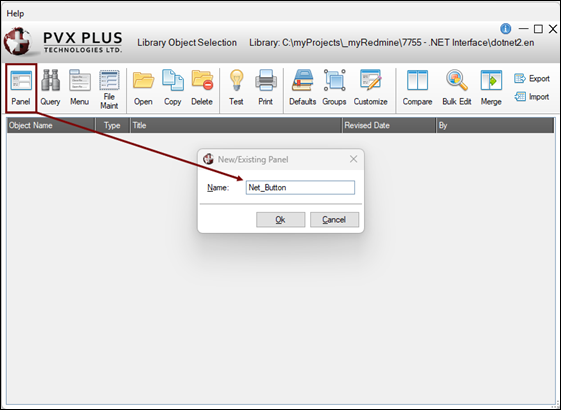
1. |
In the Library Object Selection window, launch the NOMADS Panel Designer by clicking the Panel toolbar button or selecting Objects > Panel Object in the menu bar. Enter the name of the new panel. For this example, enter: Net_Button Click OK. |
|
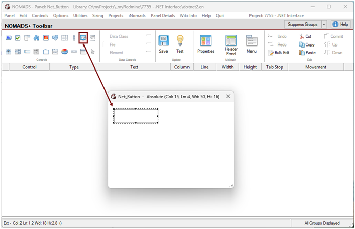
2. |
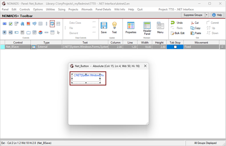
In the NOMADS Panel Designer, select the External Control button on the toolbar. Draw an External Control on the panel. |
|
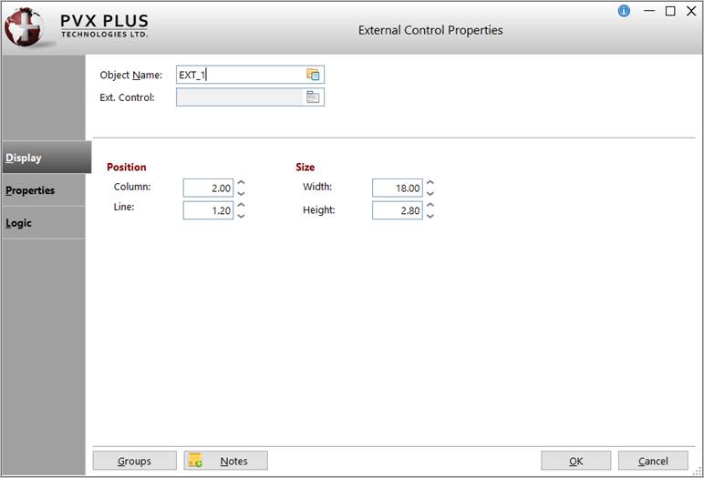
3. |
The External Control Properties window is displayed. |
|
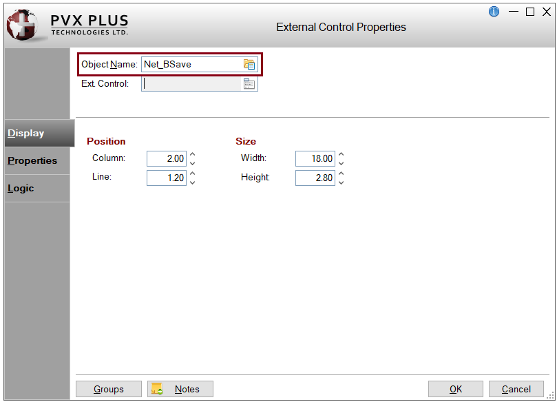
4. |
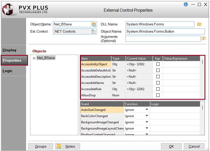
In the Object Name field, enter the control name or object handle. For this example, enter: Net_BSave |
|
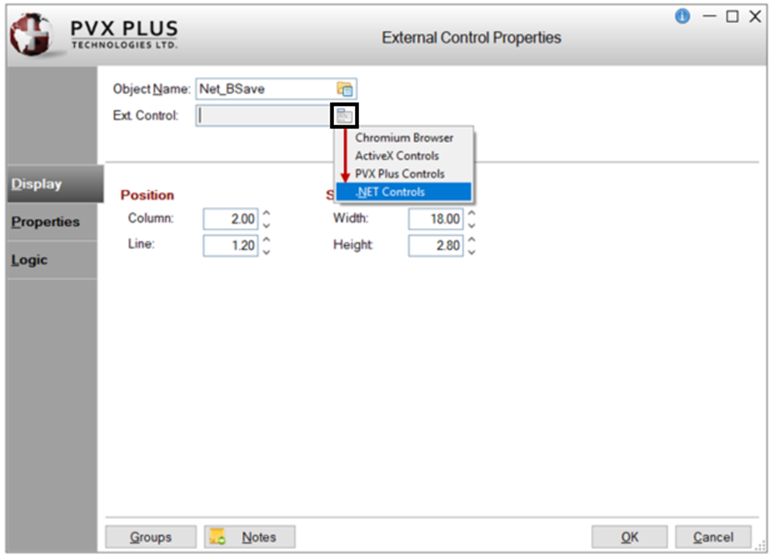
5. |
For the Ext. Control field, click the Query button. From the list, select the type of External Control you want to create. For this example, select: .NET Controls |
|
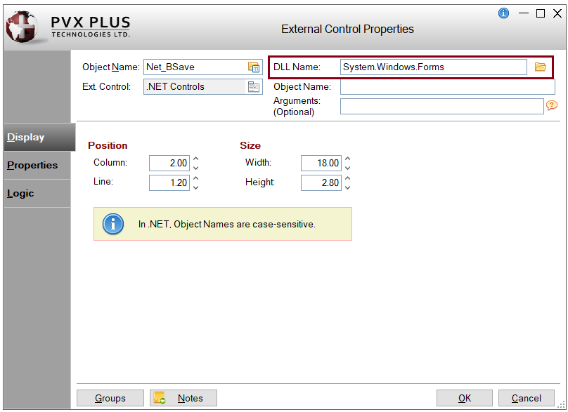
6. |
Additional fields display for specifying a .NET DLL Name, Object Name and any optional Arguments. |
|
7. |
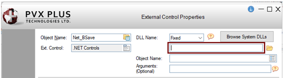
The DLL Name can be defined either as a Fixed value or an Expression. For this example, define it as a fixed value. Leave the DLL Name drop box set to Fixed. The remaining fields will be completed later. To define the DLL Name as an expression, you would change the DLL Name drop box to Expression and then enter the expression in the input field. The expression must evaluate to the correct value while in the NOMADS Panel Designer. |
|
8. |
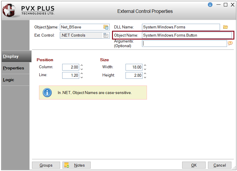
To define the DLL Name as a fixed value, three methods are available. For this example, use Method 1. Method 1: Click the Browse System DLLs button. If the button is disabled, make sure that the DLL Name drop box is set to Fixed and the DLL Name input field is empty. The Select a System DLL window is displayed. Select a system DLL from the list. For this example, select System.Windows.Forms. Click OK. The Select a System Object window is displayed automatically. Select a system Object from the list. For this example, select System.Windows.Forms.Button. Click OK. To continue with this example, go to Step 9. OR Method 2: Click the Browse button (yellow folder icon) beside the input field to specify the location of the .dll file. The DLL Name does not require the .dll extension. The Path to [.NET] DLL File window is displayed, allowing you to browse to or enter the path to the .dll file. OR Method 3: Enter the name of the .NET DLL directly in the DLL Name input field. |
|
9. |
In the External Control Properties window, the DLL Name and Object Name fields should now be populated, and the Browse System DLLs button should be disabled. This example demonstrates how the Browse System DLLs button (Method 1) simplifies the selection of a system DLL and its associated object. With Method 2 or Method 3, the Object Name must be specified separately, either by clicking the Object Name lookup button or entering the Object Name directly in the Object Name input field. Note: |
|
10. |
You can optionally pass in arguments when creating .NET objects. These arguments can be strings, numbers, or .NET object handles. See PvxHandle$. Multiple numeric or string arguments must be separated by commas. For this example, leave the Arguments field blank. |
|
11. |
You can optionally adjust the button's Position and Size coordinates. For this example, leave the values unchanged. |
|
12. |
Click OK to save the changes and exit the External Control Properties window. |
|
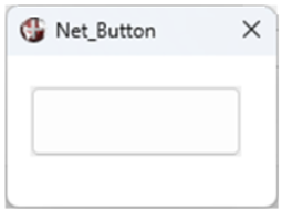
13. |
In the NOMADS Panel Designer, the .NET button control is displayed on the panel. |
|
14. |
Save and test the panel by clicking the Save and Test buttons on the toolbar. |
|
15. |
The .NET button will look similar to the one below: |
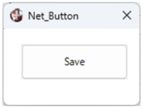
These steps show you how to add text to the .NET button control.
|
1. |
In the NOMADS Panel Designer, double click on the .NET button control on the panel to invoke the External Control Properties window. |
|
2. |
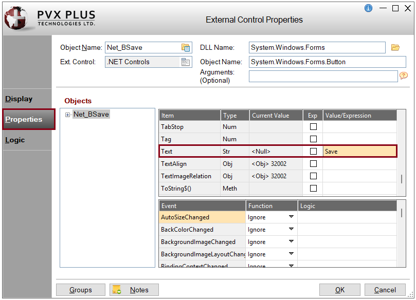
In the External Control Properties window, click the Properties tab to specify the properties, methods or events you would like to set. |
|
3. |
For this example, add the text "Save" to the .NET button. Under the Item grid column, scroll down the list until you find the word Text. On this row, enter the Value/Expression: Save |
|
4. |
Click OK to save the changes and exit the External Control Properties window. |
|
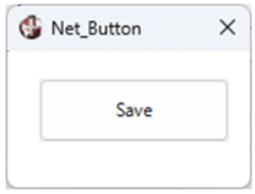
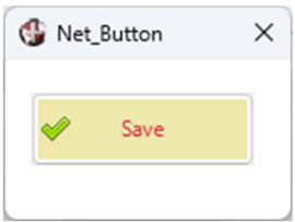
5. |
Save and test the panel. The .NET button will look similar to the one below: |
These steps show you how to set up a default program for the .NET button in the header Panel Definition window.
|
1. |
In the NOMADS Panel Designer, click the Header Panel option on the toolbar or select Panel > Header from the menu bar. |
|
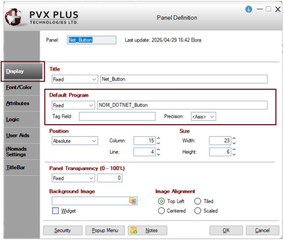
2. |
To define the appearance of the control, you will need to create a default program with some logic. This logic will be additional objects or variables that are needed for the properties you will be using in the NOMADS panel. In the header Panel Definition window, on the Display tab, enter the name of the Default Program. For this example, enter: NOM_DOTNET_Button |
|
3. |
Leave the header Panel Definition window open, as you will enter additional settings later. |
These steps show you how to set the color for the .NET button control.
|
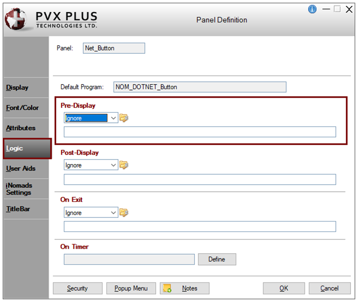
1. |
In the header Panel Definition window, click the Logic tab. |
|
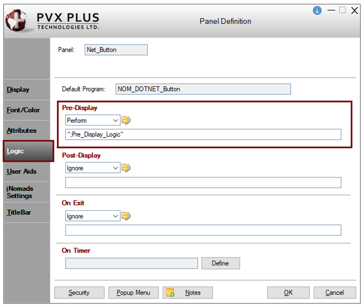
2. |
In the Pre-Display section, you will define a method in the program where you will set some logic to define the other objects needed for adding appearance. Select Perform from the drop box. Create a method called: ";Pre_Display_Logic" This will perform the method where all the main objects and variables will be defined. |
|
3. |
Click the Program Logic button to the right of the drop box. The default PxPlus program editor will launch and will have created the method. Keep the program editor open as you will be adding to the program later. |
|
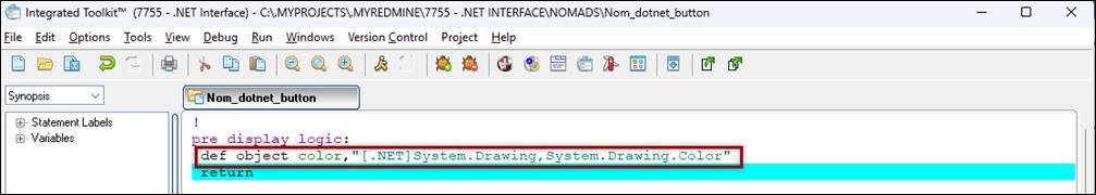
4. |
Create a new object for Color. Insert the following line and save the program: def object color,"[.NET]System.Drawing,System.Drawing.Color" |
|
5. |
Save the program in the editor if you have not already done this. |
|
6. |
In the NOMADS Panel Designer, double click on the .NET button control on the panel to invoke the External Control Properties window. |
|
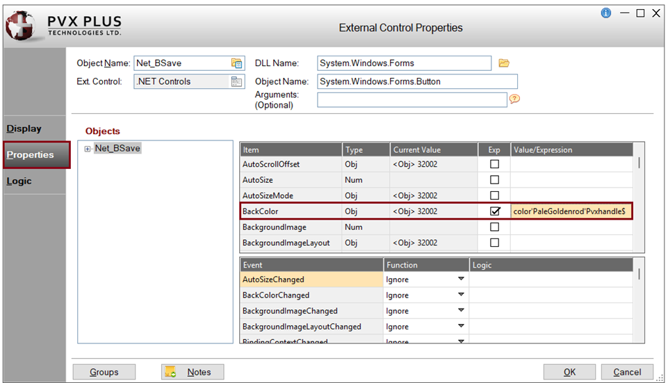
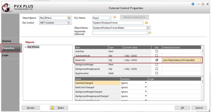
7. |
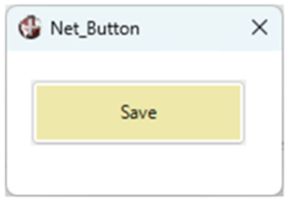
In the External Control Properties window, click the Properties tab. In the first grid, look for BackColor in the Item column. For this example, set the color PaleGoldenrod. Select the Exp check box and enter the Value/Expression: color'PaleGoldenrod'Pvxhandle$ Click OK. |
|
8. |
Save and test the panel. The .NET button will look similar to the one below: |
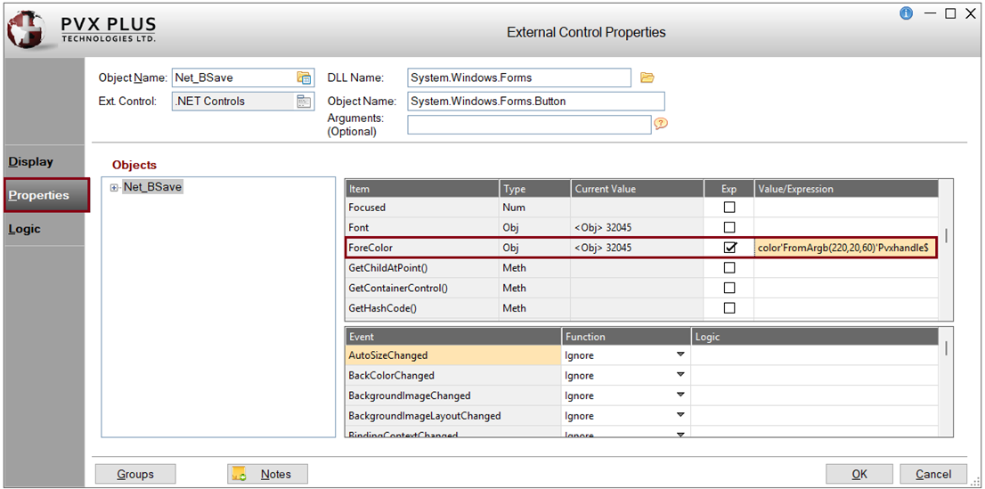
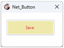
When setting colors, you also have the option to use RGB colors.
For this example, the steps below show you how to set the color for the button text using the RGB code for the color Crimson, which is RGB: 220 20 60.
|
1. |
In the External Control Properties window, click the Properties tab. In the first grid, look for ForeColor in the Item column. Select the Exp check box and enter the Value/Expression: color'FromArgb(220,20,60)'Pvxhandle$ Click OK. |
|
2. |
Save and test the panel. The .NET button will look similar to the one below: |
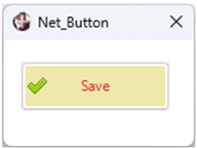
These steps show you how to add an image to the .NET button control.
|
1. |
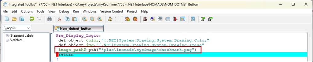
Load the default program, NOM_DOTNET_Button, which you created earlier. For this example, define another object called Image. The Image object will allow the placement of an image. Insert the following line and save the program: def object img,"[.NET]System.Drawing,System.Drawing.Image" |
|
2. |
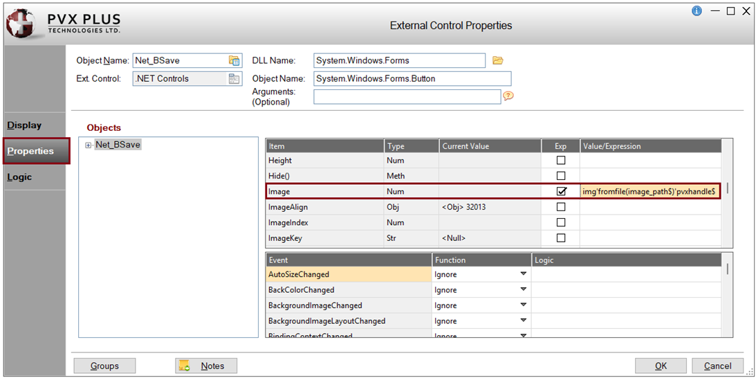
Create a variable to hold the path to the image file using the PTH() function. For this example, the variable name is called image_path$. The path will depend on the location of the image you will be using. Insert the following line and save the program: image_path$=pth("*plus\inomads\sysimage\checkmark.png") |
|
3. |
In the NOMADS Panel Designer, double click on the .NET button control on the panel to invoke the External Control Properties window. |
|
4. |
In the External Control Properties window, click the Properties tab. In the first grid, look for Image in the Item column. Select the Exp check box and enter the Value/Expression: img'fromfile(image_path$)'pvxhandle$. The FromFile object will look for the specified image location. The image will default to the center of the text. In the next set of steps, you will change the alignment. Click OK. |
|
5. |
Save and test the panel. The .NET button will look similar to the one below: |
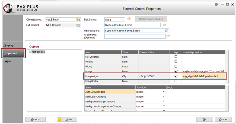
These steps show you how to align an image on the .NET button control.
|
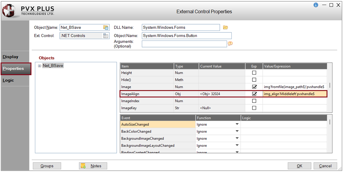
1. |
Load the default program, NOM_DOTNET_Button, which you created earlier. For this example, define another object called ContentAlignment to control the alignment of an image. Apply the Left alignment (the default is Centered). Insert the following line and save the program: def object img_align,"[.NET]System.Drawing,System.Drawing.ContentAlignment" |
|
2. |
In the NOMADS Panel Designer, double click on the .NET button control on the panel to invoke the External Control Properties window. |
|
3. |
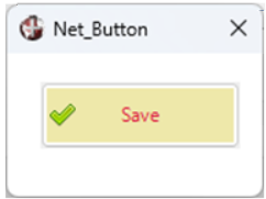
In the External Control Properties window, click the Properties tab. In the first grid, look for ImageAlign in the Item column. For this example, align the image to the left of the text. The MiddleLeft property will be used with the ImageAlign property. Select the Exp check box and enter the Value/Expression: img_align'Middleleft'pvxhandle$ Click OK. |
|
4. |
Save and test the panel. The .NET button will look similar to the one below: |
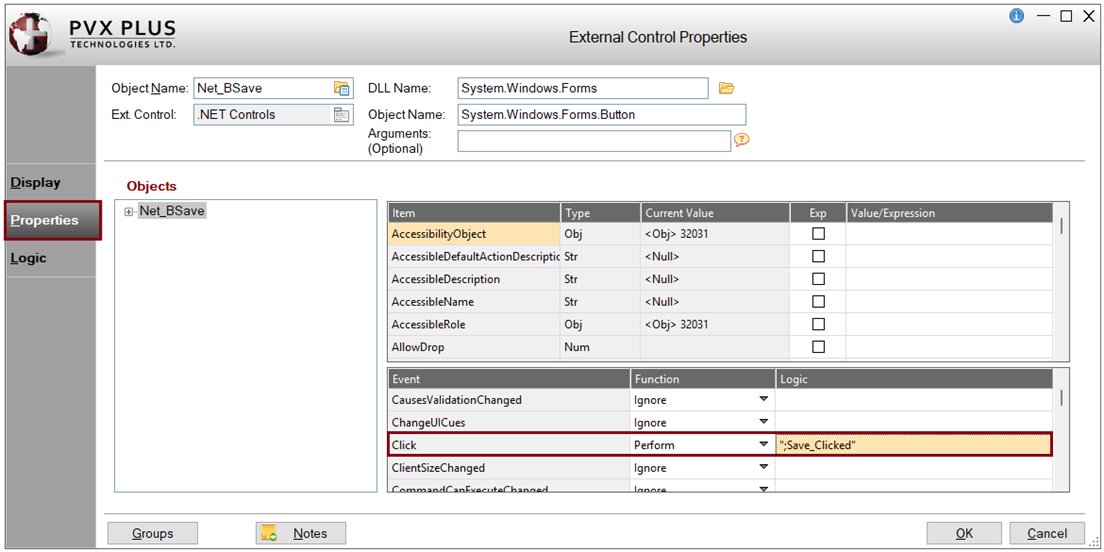
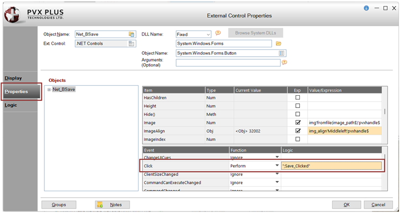
These steps show you how to set an event that shows a message box confirmation when the button is clicked.
For this example, the Click event will be triggered when a user clicks the button.
|
1. |
In the NOMADS Panel Designer, double click on the .NET button control on the panel to invoke the External Control Properties window. |
|
2. |
In the External Control Properties window, click the Properties tab. In the second grid, look for Click in the Event column. In the Function column, select Perform from the drop box In the Logic cell, enter: ";Save_Clicked" |
|
3. |
Load the default program, NOM_DOTNET_Button, which you created earlier. Insert this method and save the program: Save_Clicked: |
|
4. |
Click OK to save the changes and exit the External Control Properties window. |
|
5. |
Save and test the panel. In Test mode, click the .NET button. The message box is displayed. |
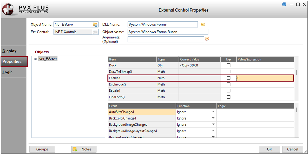
How to Enable or Disable the .NET Button
These steps show you how to enable or disable the .NET button control.
|
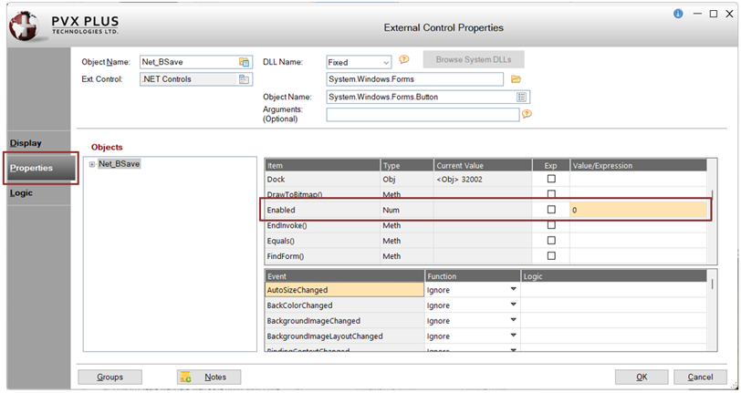
1. |
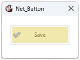
In the Extended Control Properties window, click the Properties tab. In the first grid, look for Enabled in the Item column. · If the button is to be Enabled, leave everything blank or enter 1 in the Value/Expression cell. For this example, enter 0 in the Value/Expression cell. Click OK. |
|
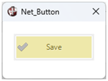
2. |
Save and test the panel. The .NET button is disabled. |
These steps show you how to clean up any objects that were defined.
|
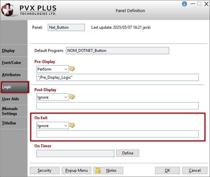
1. |
From the NOMADS Panel Designer, invoke the header Panel Definition window for the Net_Button panel by clicking the Header Panel option on the toolbar or selecting Panel > Header from the menu bar. |
|
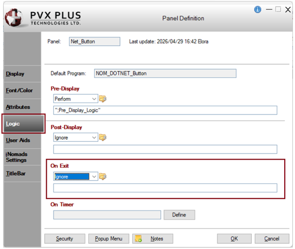
2. |
In the Panel Definition window, click the Logic tab. In the On Exit section, perform the cleanup of any objects defined. |
|
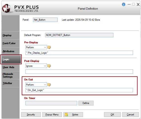
3. |
In the On Exit section, select Perform from the drop box. Create a method called: ";On_Exit_Logic" This will perform the method where all the objects will be dropped. |
|
4. |
If the program is not already loaded in the editor, click the Program Logic button to the right of the drop box to load the default program NOM_DOTNET_Button. Insert this method and save the program: On_Exit_Logic: |
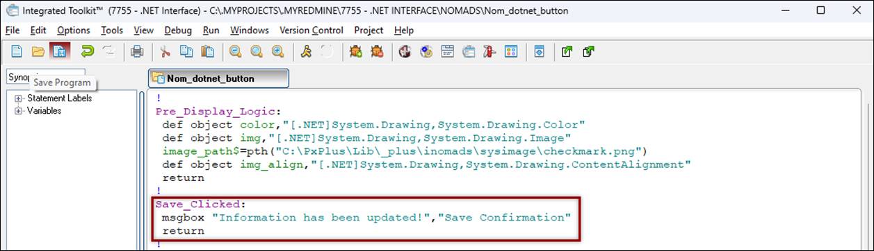
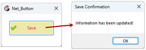
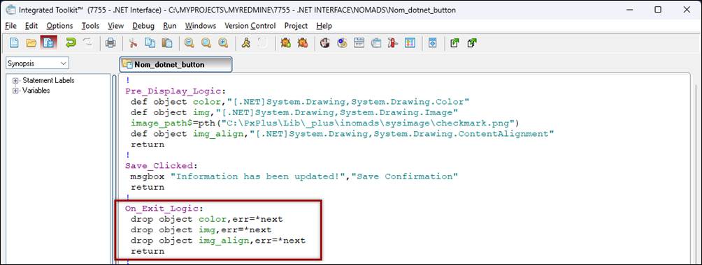
After completing this tutorial example, you should have a working program similar to the one below:
Pre_Display_Logic:
def object color,"[.NET]System.Drawing,System.Drawing.Color"
def object img,"[.NET]System.Drawing,System.Drawing.Image"
image_path$=pth("*plus\inomads\sysimage\checkmark.png")
def object img_align,"[.NET]System.Drawing,System.Drawing.ContentAlignment"
return
!
Save_Clicked:
msgbox "Information has been updated!","Save Confirmation"
return
!
On_Exit_Logic:
drop object color,err=*next
drop object img,err=*next
drop object img_align,err=*next
return
.NET Interface
How To Tutorials (for .NET Interface)
DEF OBJECT Define Windows Object
ON EVENT Event Processing