|
Scrollbar Controls |
|
Scrollbars are slider controls that can be used to create a spinner control, progress bar or volume slide for a panel object.
To draw a new horizontal or vertical scrollbar on your panel, select the Vertical Scrollbar or Horizontal Scrollbar control tool from the Controls Toolbar. Hold down the left mouse button and drag the mouse to create a rectangle to the desired size. Release the mouse button to create the new object.
For making other adjustments, see Modifying Objects.
To define the specific attributes for the new control, see Scrollbar Properties.
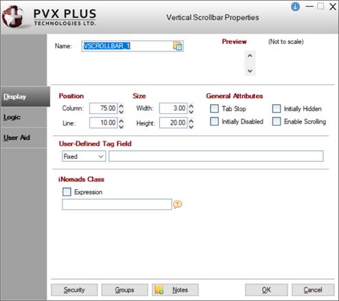
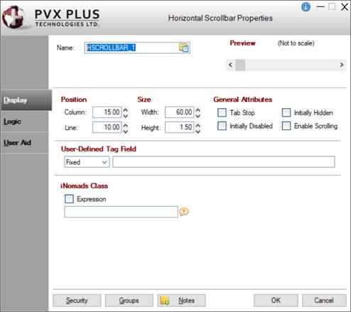
When creating or editing a Vertical or Horizontal Scrollbar control, the Vertical (or Horizontal) Scrollbar Properties dialogue (pictured below using the Folder Style version of the NOMADS designer) is displayed:
|
|
|
|
This dialogue is divided into the following tabbed panels for viewing and/or changing scrollbar properties: Display, Logic and User Aid.
|
Name |
Unique name of the scrollbar control (NOMADS provides a default). Naming conventions for variables apply. Click the Browse Library button to copy parameters from an existing object (via the Library Browse dialogue). Note: | ||||||||||||||||
|
Preview |
Displays how the visible properties of the control will appear at run time. | ||||||||||||||||
|
Position |
(Support for increased Column and Line maximums was added in PxPlus 2021.) | ||||||||||||||||
|
Size |
(Support for increased Width and Height maximums was added in PxPlus 2021.) | ||||||||||||||||
|
General Attributes |
| ||||||||||||||||
|
User-Defined Tag Field |
For controls, data/tag field that can be used to pass information on such things as formatting, error messages or validation rules. Field contents are placed in a variable using the control name with a .TAG$ extension. | ||||||||||||||||
|
iNomads Class |
Assign an iNomads class to the control. The iNomads class contains class attribute references used when defining the control in the HTML code generated in iNomads. An iNomads class reference must start with an alpha character (A-Z or a-z), followed by any combination of A-Z, a-z, 0-9, underscore or dash. Multiple references may be entered, separated by a space. For a list of pre-defined iNomads classes, see iNomads Classes. (The iNomads Class property was added to Scrollbars in PxPlus 2019.) | ||||||||||||||||
|
Default Program |
Displays the name of the Default Program used in the Panel Header definition. (The Default Program was added for display in PxPlus 2019.) | ||||||||||||||||
|
Post Create |
Logic to be processed after the control is drawn. Click the drop-down arrow for a list of selections. See Events Logic. Click the Program Logic button beside the Perform or Call action to launch the default program editor, which is typically the *IT - Integrated Toolkit. To make Ed+ the default program editor, change the setting for the %NOMADS'Program_Editor property to Ed+. (The ability to set Ed+ as the default program editor was added in PxPlus 2023.) | ||||||||||||||||
|
When Receiving Focus |
Logic to execute when the control receives focus. Click the drop-down arrow for a list of selections. See Events Logic. Click the Program Logic button beside the Perform or Call action to launch the default program editor, which is typically the *IT - Integrated Toolkit. To make Ed+ the default program editor, change the setting for the %NOMADS'Program_Editor property to Ed+. (The ability to set Ed+ as the default program editor was added in PxPlus 2023.) | ||||||||||||||||
|
When Scrollbar Repositioned |
Logic to be executed when focus leaves the control or the state of the control has changed. Click the drop-down arrow for a list of selections. See Events Logic. Click the Program Logic button beside the Perform or Call action to launch the default program editor, which is typically the *IT - Integrated Toolkit. To make Ed+ the default program editor, change the setting for the %NOMADS'Program_Editor property to Ed+. (The ability to set Ed+ as the default program editor was added in PxPlus 2023.) | ||||||||||||||||
|
Help Reference |
Help text to be invoked at run time by pressing Shift - F1 while focus is on a control.
| ||||||||||||||||
|
Floating Tip |
Mouse pointer message for the control (Fixed value, string Expression or Message Library Reference). | ||||||||||||||||
|
Message Bar |
Text to be displayed in the panel's status bar when focus is on the control (Fixed value, string Expression or Message Library Reference). | ||||||||||||||||
|
| |||||||||||||||||
|
Security |
Security restrictions. See Restricting Access for information on Object Security Definition. | ||||||||||||||||
|
Groups |
Assign the control to a group. See Group Assignment. | ||||||||||||||||
|
Notes |
Add notes/comments for the control. Maximum 1024 characters. (The Notes button was added in PxPlus 2023.) | ||||||||||||||||
H_SCROLLBAR Properties
H_SCROLLBAR Directive
V_SCROLLBAR Properties
V_SCROLLBAR Directive