|
Check Box and Tri-State Control |
|
CHECK_BOX [ * ] ctl_id, @(col,ln,wth,ht) = contents$ [, ctrlopt ]
CHECK_BOX { REMOVE | DISABLE | ENABLE | ON | OFF }[ * ] ctl_id
CHECK_BOX { GOTO | HIDE | SHOW } [ * ] ctl_id
CHECK_BOX SET_FOCUS ctl_id, ctl_val
CHECK_BOX READ [ * ] ctl_id, state$ [ ,mode$ ]
CHECK_BOX WRITE [ * ] ctl_id, state$
The check box is a button type control that allows users to toggle between states: On to select it, Off to deselect it. Check boxes may include a text label and graphics. For complete syntax, see CHECK_BOX directive.
For information on adding a check box to a panel using the NOMADS Panel Designer, see Check Box and Tri-State Control.
The CHECK_BOX directive can also be used to create a Taskbar Notification Icon.
For a list of properties that can be applied to a check box, see Check_Box Properties.
Example:
CHECK_BOX 10,@(10,18,20,1.5)="&Toggle for Status"
CB2=20
CHECK_BOX CB2,@(10,20,20,1.5)="Option &B",FNT="Arial,1,I"
CB2'VALUE=1
CB3=30
CHECK_BOX CB3,@(40,18,4,2.5)="{!Unlock|!Lock}"
CB4=40
CHECK_BOX CB4,@(48,18,4,2.5)="{!Unlock|!Lock}",OPT="F",TBL="YN";
CB4'VALUE$="N"
INPUT "Press any key to end ",*,'CS',
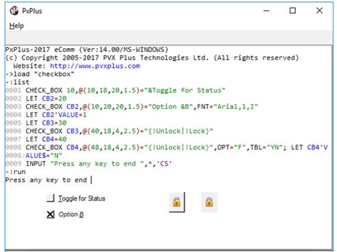
This example creates four check box controls.
The first two are standard check boxes in the Off (default) and On states. Notice the use of the & ampersand. This makes the T in Toggle a hot key, which, when used in conjunction with the Alt key, will transfer focus to this control.
The last two check boxes contain images. When an image is included, the check box takes on the appearance of a button, in this case a regular and a flat button. These check boxes are created with two images, one for each state. The last check box is also created with a translation table "YN". This means that the Off/On values are Y and N, rather than 0 and 1.
TRISTATE_BOX [ * ] ctl_id, @( col,ln,wth,ht ) = contents$ [, ctrlopt ]
TRISTATE_BOX { REMOVE | DISABLE | ENABLE | ON | OFF } [ * ] ctl_id
TRISTATE_BOX { GOTO | HIDE | SHOW } [ * ] ctl_id
TRISTATE_BOX READ [ * ] ctl_id,state$
TRISTATE_BOX WRITE [ * ] ctl_id,state$
A tri-state box is a type of Check Box that allows a third state to be activated; e.g. the third state may have the control greyed out to indicate that the option is unavailable. See TRISTATE_BOX directive.
For information on adding a tri-state box to a panel using the NOMADS Panel Designer, see Check Box and Tri-State Control.
The TRISTATE_BOX directive can also be used to create a Taskbar Notification Icon.
For a list of properties that can be applied to a tri-state box, see Tristate_Box Properties.
Example:
CB1=10,CB2=20,CB3=30,CB4=40,CB5=50,CB6=60
TRISTATE_BOX CB1,@(10,18,20,1.5)="&Toggle for Status"
TRISTATE_BOX CB2,@(10,20,20,1.5)="Option &B",FNT="Arial,1,I"
CB2'VALUE=1
TRISTATE_BOX CB3,@(10,22,20,1.5)="Option &C",TIP="Check to select"
CB3'VALUE=2
ButtonText$="&Destroy{!Trash|!Trash_open|!Bomb_blast}"
TRISTATE_BOX CB4,@(40,18,10,2)=ButtonText$
TRISTATE_BOX CB5,@(40,20,10,2)=ButtonText$
TRISTATE_BOX CB6,@(40,22,10,2)=ButtonText$
CB4'VALUE=0,CB5'VALUE=1,CB6'VALUE=2
INPUT "Press any key to end ",*,'CS',