Property
Description
Background color when button is pressed
If the check box is drawn as a button, which occurs when a bitmap is added, this property defines the background color when the button is pressed. Then, two colors can be specified for the check box by using the / (slash) as a separator (i.e. RGB:100 100 100/Light Blue).
If a standard check box is drawn (with no bitmap added), this property defines the background color when the check box is set.
For information on valid color names and color specifications, see Color Properties.
(Support for standard Check Boxes was added in PxPlus 2025.)
Color(s) of button border when button is pressed. Two colors can be specified for check boxes by using the / (slash) as a separator (i.e. RGB:100 100 100/Light Blue).
For information on valid color names and color specifications, see Color Properties.
Border colors are applied only if a Border$ property is specified for the button.
Note:
This property is effective on a check box only when it is drawn as a button, which occurs when a bitmap is added.
Foreground text color when button is pressed.
For information on valid color names and color specifications, see Color Properties.
Note:
This property is effective on a check box only when it is drawn as a button, which occurs when a bitmap is added.
Background color. (Default: "DEFAULT")
For information on valid color names and color specifications, see Color Properties.
Defines where in a button the bitmap will be positioned relative the text on a button. It is only applicable if there is both a bitmap and text on the button.
Possible values are:
|
1 |
To the left of the button text. (Default) |
|
2 |
To the right of the button text. |
|
3 |
Above the button text. |
|
4 |
Below the button text. |
|
5 |
Bitmap is centered and scaled to fill the button. Button text, if present, will be centered and overlay the image. |
(The Bitmap Centered option was added in PxPlus 2018 Update 1.)
Controls the type of border that will be used when drawing a button-style check box. Possible values and formats are Solid, None, Double, Groove, Ridge, Inset and Outset.
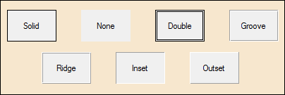
If not set, it will have the value of "Default" (or ""), which indicates that the system should use the system default button styling.
Note:
This property is effective on a check box only when it is drawn as a button, which occurs when a bitmap is added.
Controls the color(s) of the border for any button-style check box whose border style (see Border$ property) is other than the system default.
For information on valid color names and color specifications, see Color Properties.
This property can include either one or two colors separated by a / (slash). If only a single color is provided, then this color is used for all four borders. If two colors are supplied, the first color is used to define the Top/Left borders, while the second color is used to define the Bottom/Right borders.
The value can be set to either a numeric or a string value. If setting a numeric value, the value set is the internal color number for the desired color. If setting a string value, any form of color specification may be used (color name, RGB, HSL, or HTML color code).
Note:
This property is effective on a check box only when it is drawn as a button, which occurs when a bitmap is added.
Controls the width of the border (in pixels) for any button-style check box whose border style (see Border$ property) is other than the system default. This property can only contain a numeric integer.
Note:
This property is effective on a check box only when it is drawn as a button, which occurs when a bitmap is added.
This property, when set to any value, will cause the control to be moved to the top of the display order. Once at the top of the display order, the control will appear visually on top of any other control on the window.
(Default: Not Applicable - Always returns 0)
Sets the corner radius for a check box that looks like a check box (no bitmap defined), not for a check box that looks like a normal button. Works only in 4D mode.
Possible values are:
|
|
(Null) |
Property is not set. |
|
|
Round |
Sets the default radius of 3 for round corners. |
|
|
Square |
Sets the default radius of 0 for square corners. |
|
|
(Value) |
Enter a value from 0 to 255 inclusive. |
To set the corner radius for a check box created as a button (when a bitmap is added), use the CornerRadius$ property.
Example:
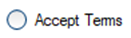
CbCornerRadius$ set to Round:
CHECK_BOX 100,@(12,12,20,10)="Accept Terms"
y=100
y'CBCornerRadius$="round"
CbCornerRadius$ set to Square:
CHECK_BOX 100,@(12,12,20,10)="Accept Terms"
y=100
y'CBCornerRadius$="square"
CbCornerRadius$ set to a value of 7:
CHECK_BOX 100,@(12,12,20,10)="Accept Terms"
y=100
y'CBCornerRadius$="7"
Note:
Corner rounding is limited based on the control type and/or the control size.
(The CbCornerRadius$ property was added in PxPlus 2026.)
Color of the disabled check box frame. Applies only to check boxes that look like check boxes (no bitmap defined), not for check boxes that look like normal buttons.
For information on valid color names and color specifications, see Color Properties.
(The CbDisableFrameColor$ property was added in PxPlus 2025.)
Color of the check mark or X in the disabled check box. Applies only to check boxes that look like check boxes (no bitmap defined), not for check boxes that look like normal buttons.
For information on valid color names and color specifications, see Color Properties.
(The CbDisableMarkColor$ property was added in PxPlus 2025.)
Color of the check box frame. Applies only to check boxes that look like check boxes (no bitmap defined), not for check boxes that look like normal buttons.
For information on valid color names and color specifications, see Color Properties.
(The CbFrameColor$ property was added in PxPlus 2024.)
Color of the hover rectangle in the check box when the mouse is over the control. Applies only to check boxes that look like check boxes (no bitmap defined), not for check boxes that look like normal buttons.
For information on valid color names and color specifications, see Color Properties.
(The CbHoverColor$ property was added in PxPlus 2024.)
Color of the check mark or X in the check box. Applies only to check boxes that look like check boxes (no bitmap defined), not for check boxes that look like normal buttons.
For information on valid color names and color specifications, see Color Properties.
(The CbMarkColor$ property was added in PxPlus 2024.)
Screen position (column) of control.
Width of control in column units.
Sets the corner radius for a check box only when it is drawn as a button, which occurs when a bitmap is added. Works only in 4D mode.
To set the corner radius for a check box with no bitmap defined, see CBCornerRadius$.
Possible values are:
|
|
(Null) |
Property is not set. |
|
|
Round |
Sets the default radius of 3 for round corners. |
|
|
Square |
Sets the default radius of 0 for square corners. |
|
|
(Value) |
Enter a value from 0 to 255 inclusive. |
Example:
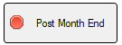
CornerRadius$ set to Round:
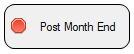
CHECK_BOX 100,@(10,20,18,3)="{!Stop}Post Month End"
y=100
y'CornerRadius$="round"
CornerRadius$ set to Square:
CHECK_BOX 100,@(10,20,18,3)="{!Stop}Post Month End"
y=100
y'CornerRadius$="square"
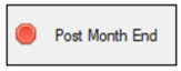
CornerRadius$ set to a value of 10:
CHECK_BOX 100,@(10,20,18,3)="{!Stop}Post Month End"
y=100
y'CornerRadius$="10"
Note:
Corner rounding is limited based on the control type and/or the control size.
(The CornerRadius$ property was added in PxPlus 2026.)
Control type ("CHECK_BOX"). See CHECK_BOX directive.
Controls the type of cursor to display whenever the mouse moves over the specified control.
Possible values are:
|
|
0 = Arrow |
7 = Rabbit in Hat |
|
|
1 = Wait (Hourglass) |
8 = Happy Face |
|
|
2 = I-Beam |
9 = Sad Face |
|
|
3 = Movement Arrows |
10 = Resize Vertical Up/Down Arrow |
|
|
4 = Sizing Arrow |
11 = Resize Horizontal Left/Right Arrow |
|
|
5 = Hand |
12 = Not Allowed (Diagonal line across circle) |
|
|
6 = Hand in Crossed Circle ("No" hand) |
-1 = Default Cursor (Default) |
Background color when the control is disabled. If the check box is drawn as a button, which occurs when a bitmap is added, then two colors can be specified for the check box by using the / (slash) as a separator (i.e. RGB:100 100 100/Light Blue).
For information on valid color names and color specifications, see Color Properties.
(Support for standard Check Boxes was added in PxPlus 2025.)
Button border color when button is disabled. Two colors can be specified for check boxes by using the / (slash) as a separator (i.e. RGB:100 100 100/Light Blue).
For information on valid color names and color specifications, see Color Properties.
Border colors are applied only if a Border$ property is specified for the button.
Note:
This property is effective on a check box only when it is drawn as a button, which occurs when a bitmap is added.
Foreground text color when the control is disabled.
For information on valid color names and color specifications, see Color Properties.
(Support for standard Check Boxes was added in PxPlus 2025.)
Enabled indicator: 1 = True; 0 = False (Default: 1)
Last change terminator.
Focus indicator: 1 = Control has focus. (Default: 0)
Background color when the control has focus. Two colors can be specified for check boxes by using the / (slash) as a separator (i.e. RGB:100 100 100/Light Blue).
For information on valid color names and color specifications, see Color Properties.
Note:
This property is effective on a check box only when it is drawn as a button, which occurs when a bitmap is added.
Color(s) of button border when button has focus. Two colors can be specified for check boxes by using the / (slash) as a separator (i.e. RGB:100 100 100/Light Blue).
For information on valid color names and color specifications, see Color Properties.
Border colors are applied only if a Border$ property is specified for the button.
Note:
This property is effective on a check box only when it is drawn as a button, which occurs when a bitmap is added.
Controls whether a dotted focus rectangle displays around the Check Box text. Default is On.
Possible values are:
|
|
0 |
No focus rectangle is shown. |
|
|
1 |
Focus rectangle is shown. |
Example:
To turn Check Box focus Off:
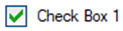
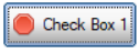
CHECK_BOX 100,@(40,12,12,2)="Check Box 1"
y=100
y'FocusRect=0
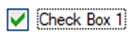
To turn Check Box focus On:
CHECK_BOX 100,@(40,12,12,2)="Check Box 1"
y=100
y'FocusRect=1
Example:
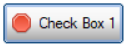
To turn Check Box focus Off (when a bitmap is added):
CHECK_BOX 100,@(40,12,12,2)="{!Stop}Check Box 1"
y=100
y'FocusRect=0
To turn Check Box focus back On (when a bitmap is added):
CHECK_BOX 100,@(40,12,12,2)="{!Stop}Check Box 1"
y=100
y'FocusRect=1
(The FocusRect property was added in PxPlus 2026.)
Foreground text color when the control has focus.
For information on valid color names and color specifications, see Color Properties.
Note:
This property is effective on a check box only when it is drawn as a button, which occurs when a bitmap is added.
This property is used to reference the font for a control. It will contain (or can be set to) a string containing three comma-separated fields of the font name, size and attributes. See 'FONT' mnemonic.
Example:
To set the font to Arial, 1.5 times normal size, and Bold, the format would be xxx'Font $="Arial,1.5,B".
Controls how the image on the button will display when the button is disabled. Applicable only when there is a bitmap on the button.
Possible values are:
|
0 |
Images on the disabled buttons will display only as shadows. This means that only the shadow left by the outline of the image will be seen. |
|
1 |
Images on the disabled buttons will be converted to gray scale. |
|
-1 |
Default gray disabled BMP setting. (Default) |
Note:
This property is effective on a check box only when it is drawn as a button, which occurs when a bitmap is added.
(The GrayDisabledBmp property was added in PxPlus 2024.)
Height of control in pixels.
Background color when mouse is over the control. If the check box is drawn as a button, which occurs when a bitmap is added, then two colors can be specified for the check box by using the / (slash) as a separator (i.e. RGB:100 100 100/Light Blue).
For information on valid color names and color specifications, see Color Properties.
(Support for standard Check Boxes was added in PxPlus 2025.)
Color of border when mouse is over the control. If the check box is drawn as a button, which occurs when a bitmap is added, then two colors can be specified for the check box by using the / (slash) as a separator (i.e. RGB:100 100 100/Light Blue).
For information on valid color names and color specifications, see Color Properties.
(Support for standard Check Boxes was added in PxPlus 2025.)
Hover color. The button is highlighted when the mouse moves over its location.
For information on valid color names and color specifications, see Color Properties. (Default: "DEFAULT")
Note:
This property is effective on a check box only when it is drawn as a button, which occurs when a bitmap is added.
Foreground text color when mouse is over the control. For information on valid color names and color specifications, see Color Properties.
(Support for standard Check Boxes was added in PxPlus 2025.)
Windows handle for control.
Number of images contained in a bitmap button: 1 to 4. (Default: 0)
Hot key to jump to control.
Left margin for control in pixels.
Screen position of control.
Height of control in number of lines.
Defines how a control will look. Possible values are:
|
2 |
Old Windows 3.1 2D look. |
|
3 |
Windows 95/98 3D look. |
|
4 |
Windows XP/Vista/Windows 7 look. |
This property reports/sets the CTL value to generate when an object is selected on a right-click of the mouse.
Message line text for the control.
User object method. (Default: 0 - No object specified)
The 'ObjectID property allows applications to intercept property values and add methods to controls. When set to a valid Object ID by the application, you can add methods and add/override property logic for any control in the system. When set in the system, it allows the application to logically request methods against the control that, in turn, will be performed by the related Object ID. It will also first check the object for any property requests and, if the property is defined in the object, set or get that property instead of the controls.
To allow the specified object to get true access to the control, while executing within the object identified by the 'ObjectID property, the system will direct any property requests directly to the control.
Note:
When a control is deleted from the system, any object identified by an 'ObjectID property will be automatically dropped.
On Focus CTL event. 0 is returned if no On Focus CTL value is set up for the control.
This property controls the CTL event that will be fired prior to the system displaying the Tip for any control. If the value of this property is non-zero, the system will use its value of a CTL event to fire and will defer the display of the tip until the application changes the value in 'Tip$. If the value in 'Tip$ is not changed, no tip will be displayed.
Setting this to zero (Default) disables the event from being sent and the current 'Tip$ will be displayed.
Parent window handle.
Signal only - do not get focus: 0 = Off; 1 = On. (Default: 0)
This property can also be read, returning 1 or 0 to indicate if the control is to signal only and not get focus.
Controls the translation of the values selected in a control and how the value will be passed to/from the application.
Generally, it contains a table of single-character values representing selections from the controls with each character representing each of the values in the control in sequence. The size of each entry can be changed using the 'TblWidth property.
Text of item or label.
Foreground text color. (Default: "DEFAULT")
For information on valid color names and color specifications, see Color Properties.
Tip message for control.
Top of control in pixels.
Underline button text.
Current item value.
Control visible flag: 1 = Yes; 0 = No (Default: 1)
Width of control in pixels.
Controls the list of properties to be returned in '_PropValues$. Each value is separated by the value in '_PropSep$.
This property can be used to speed up the processing of multiple property accesses but reducing the number of interactions with the control. See Multi-Property Access.
Controls the separator used between each of the values of the properties returned in '_PropValues$ as defined by '_PropList$.
This property can be used to speed up the processing of multiple property accesses but reducing the number of interactions with the control. See Multi-Property Access.
Accesses the values of the properties defined in '_PropList$. Each value is separated by the value in '_PropSep$.
This property can be used to speed up the processing of multiple property accesses but reducing the number of interactions with the control. See Multi-Property Access.