|
Properties List |
The Properties List is a complete list (in alphabetical order) of all the various properties available for defining PxPlus common control objects. Each property name cross-references to one or more control object(s).
For quick access to a list of properties for a specific control type, use the links below:
|
|
||||
|
|
||||
|
|
||||
|
|
For additional information, see:
Using Property Names
Compound Properties
Color Properties
Used By: BUTTON • CHECK_BOX • RADIO_BUTTON • TRISTATE_BOX
Background color when button is pressed: If the check box or radio button is drawn as a button, which occurs when a bitmap is added, this property defines the background color when the button is pressed. Then, two colors can be specified for the check box or radio button by using the / (slash) as a separator (i.e. RGB:100 100 100/Light Blue).
If a standard check box or a standard radio button is drawn (with no bitmap added), this property defines the background color when the check box or radio button is set.
For information on valid color names and color specifications, see Color Properties.
(Support for standard Check Boxes and standard Radio Buttons was added in PxPlus 2025.)
Used By: BUTTON • CHECK_BOX • RADIO_BUTTON • TRISTATE_BOX
Color(s) of button border when button is pressed: Two colors can be specified for buttons, check boxes, radio buttons and tristate boxes by using the / (slash) as a separator (i.e. RGB:100 100 100/Light Blue).
For information on valid color names and color specifications, see Color Properties.
Border colors are applied only if a Border$ property is specified for the button.
Used By: BUTTON • CHECK_BOX • RADIO_BUTTON • TRISTATE_BOX
Foreground text color when button is pressed: For information on valid color names and color specifications, see Color Properties.
Used By: GRID
Text alignment of the data in a grid cell: Possible values are:
|
|
"BC" |
Bottom-Center |
"ML" |
Middle-Left |
|
|
"BL" |
Bottom-Left |
"MR" |
Middle-Right |
|
|
"BR" |
Bottom-Right |
"R" |
Right |
|
|
"C" |
Center |
"TC" |
Top-Center |
|
|
"L" |
Left |
"TL" |
Top-Left |
|
|
"MC" |
Middle-Center |
"TR" |
Top-Right |
Default: "TL" (Top-Left)
(The alignment values "MC", "ML" and "MR" were added in PxPlus 2014 FP1 Update 0001.)
Used By: DROP_BOX • GRID • H_SCROLLBAR • LIST_BOX • LIST_VIEW • MULTI_LINE • MULTI_LINE (RTF word processing style) • REPORT_VIEW • TREE_VIEW • VARDROP_BOX • VARLIST_BOX • V_SCROLLBAR
Signal on all changes: When set, the control will generate a 'Change' event whenever its value changes as opposed to the default Off state where the control will only generate the change event when losing focus.
Possible values are:
|
|
0 |
Only signal change when exiting the control or on special event such as double click/Enter. (Default) |
|
|
1 |
Signal all changes to the value of the control regardless of why the change occurred. |
|
|
2 |
Signal all changes done by the user but not done by the program. |
Default: 0 - Only signal change when exiting the control or on special event such as double click/Enter
Used By: GRID • REPORT_VIEW
Automatically size columns to fit: This property is used to control the automatic adjustment of column sizes so that the total space occupied by the columns will fill the control width. When this property is set to 1, the system will adjust all columns in the control so that the sum of the column widths will completely fill the control width exclusive of any scrollbars that may be present. Once set, any resizing of the control will again re-apply the automatic columns sizing logic.
When adjusting the column sizes, the system will compute the new size based on percentages.
Example: Consider the following - Control has three columns:
If this control had AutoColSize enabled, it would determine that column 1 was 40% of the total column width, column 2 was 10%, and column 3 was 50%. These columns would each be adjusted based on the total width of the control to retain the same percentages. Therefore, if the control itself was 150 pixels wide, column 1 would become 150*40%=60 pixels, column 2 would become 150*10%=15 pixels, and column 3 would become 150*50%=75 pixels.
Default: 0 - No automatic column resizing
Used by: MULTI_LINE
Controls the automatic completion of user entries: For parameters, see Auto Complete as described in the MULTI_LINE directive.
Used by: GRID
Name of a defined Auto Complete entry: Auto Complete entries are assigned to individual cells and are used to show text suggestions when a user types a partial entry.
See Assigning Auto Complete Entries.
Used By: MULTI_LINE
Generates ctl_id to signal Auto Complete: Ctl_id to be generated by a multi-line to signal that the list of entries for the Auto Complete drop box is to be loaded via the AutoValue$ property.
Used By: GRID
Force grid to resize column to fit contents: This property, when set to any value, forces the associated grid to resize the column currently selected by the 'Colno or 'Column property to the width required to fit its contents.
If the currently selected column is set to zero, all columns in the grid will be resized.
The value set in 'AutoFit indicates how many rows to check, with zero indicating all rows and the column header. Any value other than zero specifies the number of rows (starting at the first row) to take into account in computing the new column width. A non-zero setting may be used to minimize the time it might take to scan all the rows in a large grid.
Reading this property returns zero, as the value of the property itself has no meaning, and simply the act of setting it causes the grid to be updated.
(The AutoFit property was added in PxPlus 2017.)
Used By: CHART
Auto scaling for text elements: 0 = Off; 1 = On. When set to On, chart text elements (labels, legends) are automatically resized to fit the given area.
Default: 1
Used By: GRID
Automatic row sequence: This property assigns a column number that will contain the automatic row sequence number. PxPlus automatically fills in values of the cells with the appropriate row number. When rows are changed, the column containing the sequence number is automatically updated.
Default: 0
Used By: TREE_VIEW
Control automatic toggling of states: The toggling occurs whenever a user clicks on the state indicator in the tree view. The number of states that the system will toggle through is determined by the value set in this property or, if the property is set to 1, the number of bitmaps assigned to the tree view.
In addition, when the user toggles a state indicator while holding down the Shift key, all entries between the current entry and the last will be toggled to the new state of the current entry (in effect, allowing for group select/deselect). See State Indicators.
Used By: GRID
Control scrollbar tracking: This property is used to control the automatic tracking of the contents of a grid relative to movement of the scrollbars (vertical/horizontal). By default, when a scrollbar position is changed by dragging the "thumb", the grid will not follow the movement until the thumb is released. This reduces the screen re-draw overhead within the system but does not allow the user to view the data during the scroll operation.
The 'AutoTrack property can be used to control whether the grid is to be updated while the thumb is being moved -- in effect, having the grid contents track the thumb position. The value in 'AutoTrack determines which, if any, scrollbars will be tracked.
Possible values are:
|
|
0 |
The grid will not track thumb movements. |
|
|
1 |
The grid will track thumb movements on the vertical scrollbar. |
|
|
2 |
The grid will track thumb movements on the horizontal scrollbar. |
|
|
3 |
The grid will track thumb movements on both scrollbars. |
Default: 0 - No automatic tracking
Used By: GRID • MULTI_LINE
List of entries to load into Auto Complete drop box: See AutoCtl or CellAutoCtl properties.
Used By: BUTTON • CHART • CHECK_BOX • DROP_BOX • GRID • LIST_BOX • LIST_VIEW • MULTI_LINE • MULTI_LINE (RTF word processing style) • RADIO_BUTTON • REPORT_VIEW • TREE_VIEW • TRISTATE_BOX • VARDROP_BOX • VARLIST_BOX
Background color: When a multi-line control is disabled, it retains the background color that has been set instead of showing the standard disabled color. For information on valid color names and color specifications, see Color Properties.
Default: "DEFAULT"
Used By: GRID • LIST_BOX • REPORT_VIEW
Background color, alternating lines: Background color for every second line.
If set to other than the value "DEFAULT", the color set in this property will be used as the background color on every second line in a list. For information on valid color names and color specifications, see Color Properties.
Default: "DEFAULT"
Used By: GRID • LIST_BOX • REPORT_VIEW
Background color, alternating three lines: Background color for every third line.
If set to other than the value "DEFAULT", the color set in this property will be used as the background color on every third line in a list. For information on valid color names and color specifications, see Color Properties.
Default: "DEFAULT"
Used By: H_SCROLLBAR • V_SCROLLBAR
Scrollbar big jump value.
Default: 0
Used By: CHART • GRID
Bitmap to appear in cell: In a grid, this property sets the bitmap to appear in a cell. This property can also be used with Plus Charts to set the bitmap to appear as the background for the chart. See Chart Processing.
Example: !Stop (embedded bitmap) or C:\windows\clouds.bmp (external bitmap)
Used By: BUTTON • CHECK_BOX • RADIO_BUTTON • TRISTATE_BOX
Bitmap position in button: This property defines where in a button the bitmap will be positioned relative the text on a button. It is only applicable if there is both a bitmap and text on the button.
Possible values are:
|
1 |
To the left of the button text. |
|
2 |
To the right of the button text. |
|
3 |
Above the button text. |
|
4 |
Below the button text. |
|
5 |
Bitmap is centered and scaled to fill the button. Button text, if present, will be centered and overlay the image. |
Default: 1 - To the left of the button text
(The Bitmap Centered option was added in PxPlus 2018 Update 1.)
Used By: CHART
Bitmap position/appearance of chart: Predefined positions include TopLeft, Left, BottomLeft, TopRight, Right and BottomRight. These preserve bitmap size and proportions.
Use the STRETCH parameter to force the bitmap to be stretched within the chart's window.
The TILE parameter creates a "tile" effect multiplying the original bitmap to cover the entire chart's window.
A custom position may be defined using syntax: "x:y:column:line". With this syntax, the bitmap is positioned within the given rectangle. Proportions and the size of the bitmap are altered to fit the rectangle.
Default: "TOPLEFT"
Used By: TREE_VIEW
Show tree view text as bold: Numeric value indicating whether the text for the selected item in the tree view will be shown Bold. Setting this property to 1 causes the display to use bold text; zero (0) causes normal text to be used.
This property is used in conjunction with the 'Item property, which defines the item whose bold state is to be referenced.
Used By: CHART • GRID • LIST_BOX • MULTI_LINE • MULTI_LINE (RTF word processing style)
Add border: 1 - Border; 0 - No border
Default: 1
Used By: BUTTON • CHECK_BOX • RADIO_BUTTON • TRISTATE_BOX
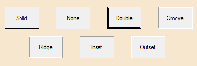
Define style of button border: Controls the type of border that will be used when drawing a button or button-style check box or radio button.
Possible values and formats are Solid, None, Double, Groove, Ridge, Inset and Outset.
If not set, it will have the value of "Default" (or ""), which indicates that the system should use the system default button styling.
Used By: BUTTON • CHECK_BOX • RADIO_BUTTON • TRISTATE_BOX
Define color(s) of button border: Controls the color of the border for any button or button-style check box or radio button whose border style (see Border$ property) is other than the system default. For information on valid color names and color specifications, see Color Properties.
This property can include either one or two colors separated by a / (slash). If only a single color is provided, then this color is used for all four borders. If two colors are supplied, the first color is used to define the Top/Left borders, while the second color is used to define the Bottom/Right borders.
The value can be set to either a numeric or a string value. If setting a numeric value, the value set is the internal color number for the desired color. If setting a string value, any form of color specification may be used (color name, RGB, HSL, or HTML color code).
Used By: BUTTON • CHECK_BOX • RADIO_BUTTON • TRISTATE_BOX
Define width of button border: Controls the width of the border (in pixels) for any button or button-style check box or radio button whose border style (see Border$ property) is other than the system default. This property can only contain a numeric integer.
Used By: GRID
Bottom border of cell (thickness): 0 to 3 pixels
Default: 0
Used By: GRID
Bottom left tick: When set to a color, this property displays a tick in the bottom left corner of the cell. For information on valid color names and color specifications, see Color Properties.
Default: "DEFAULT"
Used By: BUTTON • CHART • CHECK_BOX • DROP_BOX • GRID • H_SCROLLBAR • LIST_BOX • LIST_VIEW • MULTI_LINE • RADIO_BUTTON • REPORT_VIEW • TREE_VIEW • TRISTATE_BOX • VARDROP_BOX • VARLIST_BOX • V_SCROLLBAR
Force control to top of display order: This property, when set to any value, will cause the control to be moved to the top of the display order. Once at the top of the display order, the control will appear visually on top of any other control on the window.
Default: Not Applicable (Always returns 0)
Used By: DROP_BOX • VARDROP_BOX
Background color of the Drop Box button: For information on valid color names and color specifications, see Color Properties.
(The ButtonBackColor$ property was added in PxPlus 2024.)
Used By: GRID
Background color for buttons in grid: Background color for system-generated buttons in a grid, including Drop Box buttons and Query buttons. For information on valid color names and color specifications, see Color Properties.
This property will also be applied to cells with the 'Lock property set to 1 only when creating a "Button" cell type, providing that the BackColor$ property has not been set specifically for that cell.
(The ButtonColor$ property was added in PxPlus 2020.)
Used By: DROP_BOX • VARDROP_BOX
Background color of the Drop Box button when control is disabled: For information on valid color names and color specifications, see Color Properties.
(The ButtonDisableBackColor$ property was added in PxPlus 2024.)
Used By: DROP_BOX • VARDROP_BOX
Background color of the Drop Box button while hovering over it: Defaults to the Windows hover color if no drop button colors are set; otherwise, it defaults to the drop button background color but is 25% lighter. For information on valid color names and color specifications, see Color Properties.
(The ButtonHoverBackColor$ property was added in PxPlus 2024.)
Used By: DROP_BOX • VARDROP_BOX
Color of the down arrow/tick on the Drop Box button while hovering over it: Defaults to the Windows tick color if no drop button colors are set; otherwise, it defaults to the drop button tick color but is 25% lighter.
For information on valid color names and color specifications, see Color Properties.
(The ButtonHoverTickColor$ property was added in PxPlus 2024.)
Used By: DROP_BOX • VARDROP_BOX
Color of the down arrow/tick on the Drop Box button: For information on valid color names and color specifications, see Color Properties.
(The ButtonTickColor$ property was added in PxPlus 2024.)
Used By: MULTI_LINE
Invoke month calendar control: For parameters, see Calendar Feature as described in the MULTI_LINE directive.
Used By: TREE_VIEW
Control cascading of states: Controls the automatic cascading of states between parents and children in a tree view.
If the 'CascadeState property is set to non-zero, the system automatically cascades parent states to their children and correspondingly makes parent states representative of all of their children. Setting a parent state, either under program control or using the 'AutoState property in the tree view definition, will result in all subordinate children being set to the same state.
When a child state is set, its parent state will be set according to the state of all of the child's siblings; i.e. if all children are in a consistent state, the parent will be set to the same state. If a parent has children of various states (some on, some off), the parents state will be set to the value set in the 'CascadeState property. See State Indicators.
Used By: CHECK_BOX • TRISTATE_BOX
Check box corner radius: This property is used to set the corner radius for check boxes that look like check boxes (no bitmap defined), not for check boxes that look like normal buttons. Works only in 4D mode.
Possible values are:
|
|
(Null) |
Property is not set. |
|
|
Round |
Sets the default radius of 3 for round corners. |
|
|
Square |
Sets the default radius of 0 for square corners. |
|
|
(Value) |
Enter a value from 0 to 255 inclusive. |
To set the corner radius for check boxes created as buttons (when a bitmap is added), use the CornerRadius$ property.
Example:
CbCornerRadius$ set to Round:
CHECK_BOX 100,@(12,12,20,10)="Accept Terms"
y=100
y'CBCornerRadius$="round"
CbCornerRadius$ set to Square:
CHECK_BOX 100,@(12,12,20,10)="Accept Terms"
y=100
y'CBCornerRadius$="square"
CbCornerRadius$ set to a value of 7:
CHECK_BOX 100,@(12,12,20,10)="Accept Terms"
y=100
y'CBCornerRadius$="7"
(The CbCornerRadius$ property was added in PxPlus 2026.)
Used By: CHECK_BOX
Color of disabled check box frame: Applies only to check boxes that look like check boxes (no bitmap defined), not for check boxes that look like normal buttons.
For information on valid color names and color specifications, see Color Properties.
(The CbDisableFrameColor$ property was added in PxPlus 2025.)
Used By: CHECK_BOX
Color of check mark or X in the disabled check box: Applies only to check boxes that look like check boxes (no bitmap defined), not for check boxes that look like normal buttons.
For information on valid color names and color specifications, see Color Properties.
(The CbDisableMarkColor$ property was added in PxPlus 2025.)
Used By: CHECK_BOX
Color of check box frame: Applies only to check boxes that look like check boxes (no bitmap defined), not for check boxes that look like normal buttons.
For information on valid color names and color specifications, see Color Properties.
(The CbFrameColor$ property was added in PxPlus 2024.)
Used By: CHECK_BOX
Check box hover color: Color of the hover rectangle in the check box when the mouse is over the control. Applies only to check boxes that look like check boxes (no bitmap defined), not for check boxes that look like normal buttons.
For information on valid color names and color specifications, see Color Properties.
(The CbHoverColor$ property was added in PxPlus 2024.)
Used By: CHECK_BOX • GRID
Color of check mark or X in check box: Can also be applied to grid check boxes. For check boxes not in a grid, this property applies only to check boxes that look like check boxes (no bitmap defined), not for check boxes that look like normal buttons.
For information on valid color names and color specifications, see Color Properties.
(The CbMarkColor$ property was added in PxPlus 2024.)
(Support for Grid Check Boxes was added in PxPlus 2025.)
Used By: GRID
Generates ctl_id to signal Auto Complete: Ctl_id to signal that the list of entries for the Auto Complete drop box is to be loaded via the AutoValue$ property.
Used By: GRID
Display cell as blank when zero: When this property is set and cell contents are displayed, if the cell contains no non-zero numeric characters (1-9), the cell will be displayed as if null although the actual contents will be preserved.
(The CellBlankWhenZero property was added in PxPlus 2020.)
Used By: GRID
Cell double click: Possible values are:
|
|
0 |
Enter Edit mode when cell is double clicked. |
|
|
1 |
Does not enter Edit mode when cell is double clicked. Returns $02$ in _eom$. |
Default: 0 (Off)
Used By: GRID
Cell format mask: See FMT= option in the MULTI_LINE directive.
Default: Null
Used By: GRID
Cell selection highlight: Possible values are:
|
|
0 |
Cell is not highlighted. |
|
|
1 |
Cell has focus rectangle. |
|
|
2 |
Cell is highlighted (appears selected). |
|
|
3 |
Cell is highlighted and has focus rectangle. |
Default: 1
Used By: GRID
Help reference for a grid cell.
Used By: GRID
Cell implied decimal: Controls implied decimal input on cell-by-cell basis.
Used By: GRID
Apply an iNomads class to a grid cell: The iNomads class contains class attribute references used when defining the control in the HTML code generated in iNomads.
An iNomads class reference must start with an alpha character (A-Z or a-z), followed by any combination of A-Z, a-z, 0-9, underscore or dash. Multiple references may be entered, separated by a space. For a list of pre-defined classes, see iNomads Classes.
(The CelIiNomadsClass property was added in PxPlus 2018.)
Used By: GRID
Force cell to only accept numeric data: When set, this property forces a cell to only accept numeric data. When exiting the cell after it is edited, if the cell contains no numbers (0-9), it will be set to "0".
(The CellIsNumeric property was added in PxPlus 2020.)
Used By: GRID
Cell left position: Relative X position for cell.
Used By: GRID
Tag for cell: This property provides the ability to place an application defined "Tag" on a specific cell. The contents of the tag string is application dependent and not used by the system. It can be used to store any cell related information required by the application.
Used By: GRID
Translation table for cell: This property controls the translation of the values selected in the cell and how the value will be passed to/from the application. Generally, it contains a table of single-character values representing selections from the controls with each character representing each of values in the control in sequence. The size of each entry can be changed using the 'CellTblWidth property.
Used By: GRID
Translation table width for cell: This property can be used to set the length of each of the items in the 'CellTbl$ property. It can be set to any positive value (Default: 1). Setting 'CellTblWidth to zero indicates that 'CellTbl$ contains a delimited string, with the last character of the string being the delimiter character.
Default: 1
Used By: GRID
Tip for cell: Tip message.
Used By: GRID
Cell top position: Relative Y position for cell.
Used By: GRID
Grid cell type: For a list of available cell type values, see Cell Types as described in the GRID directive.
Default: "Normal"
Used By: GRID
List of supported cell types: See CellType$ property.
Used By: TREE_VIEW
Number of direct descendant children for current item set by 'Item.
Used By: GRID
Apply data class to grid cell: The Class property can also be set in Grid Presets Definition when using the NOMADS Panel Designer. See Data Classes.
Used By: BUTTON • CHART • CHECK_BOX • DROP_BOX • GRID • H_SCROLLBAR • LIST_BOX • LIST_VIEW • MULTI_LINE • RADIO_BUTTON • REPORT_VIEW • TREE_VIEW • TRISTATE_BOX • VARDROP_BOX • VARLIST_BOX • V_SCROLLBAR
Screen position (column) of control.
Used By: GRID • LIST_VIEW • REPORT_VIEW
Column number of grid, list view or report view: This property is fundamentally the same as referring to the 'Column property, however, is included to allow a numeric column number to be specified as a string with accessing the properties.
Example: If the application references 'Column$ in a grid, it will receive the logical column name as opposed to its number. Referencing 'Colno$ will return the column number as a string.
Used By: BUTTON • CHART • CHECK_BOX • DROP_BOX • GRID • H_SCROLLBAR • LIST_BOX • LIST_VIEW • MULTI_LINE • RADIO_BUTTON • REPORT_VIEW • TREE_VIEW • TRISTATE_BOX • VARDROP_BOX • VARLIST_BOX • V_SCROLLBAR
Width of control in column units.
Used By: GRID • LIST_VIEW • REPORT_VIEW
Currently referenced column number of grid, list view or report view: This property does not contain the current column number of the control, but rather the column number being referenced when used in conjunction with other properties.
For instance, in a grid, setting 'Column to 2 and 'Row to 3 will allow the application to reference the 'Text$ value for the cell in column 2, row 3. It will not change the current position within the grid.
Used By: GRID • LIST_VIEW • REPORT_VIEW
Column name in a grid, list view or report view.
Used By: LIST_VIEW • REPORT_VIEW
Column number last clicked in list view or report view: This property contains the column number of the column where the last mouse click occurred in the list view or report view. It is set automatically by the system when the user clicks the mouse on a line within the list view or report view. It is reset to 0 (zero) if the user positions/selects items in the list view or report view using the keyboard.
Used By: LIST_VIEW • REPORT_VIEW
Column header tip for list view or report view: This property is used to control the tip to display below the column header in a list view or report view control. To set/reference the tip, you must first set the 'Column property for the list view or report view to identify the column you are referencing. By default, if no column tip is defined, the standard list view or report view tip will be displayed.
Used By: GRID
Comma-separated list of grid column names.
Used By: GRID
Width of column in pixels.
Used By: GRID • REPORT_VIEW
Column resizing by user: This property controls the ability of the user to resize the width of a column by dragging the column header. If set to 0, the column may not be resized. If set to 1, the column is resizable.
When used with the grid, this property is only valid when the grid itself is deemed resizable (the Resizable property > 0).
Default:
For GRID: 0 (fixed size)
For REPORT_VIEW: 1 (resizable)
Used By: GRID • LIST_VIEW • REPORT_VIEW
Number of columns.
Used By: GRID • LIST_VIEW • REPORT_VIEW
Width of column in column units.
Used By: BUTTON • CHECK_BOX • DROP_BOX • LIST_BOX • LIST_VIEW • MULTI_LINE • RADIO_BUTTON • TREE_VIEW • TRISTATE_BOX • VARDROP_BOX
Corner radius: This property is used to set the corner radius for a control. Works only in 4D mode.
Possible values are:
|
(Null) |
Property is not set. | ||||||||||||||||||||||
|
Round |
Sets the default radius of 3 for round corners. | ||||||||||||||||||||||
|
Square |
Sets the default radius of 0 for square corners. | ||||||||||||||||||||||
|
(Value) |
Enter a value within the range shown below (based on control type).
Note: |
Example:
Button CornerRadius$ set to Round:
BUTTON 100,@(10,10,12,3)="{!Stop}"
y=100
y'CornerRadius$="round"
Button CornerRadius$ set to Square:
BUTTON 100,@(10,10,12,3)="{!Stop}"
y=100
y'CornerRadius$="square"
Button CornerRadius$ set to a value of 10:
BUTTON 100,@(10,10,12,3)="{!Stop}"
y=100
y'CornerRadius$="10"
(The CornerRadius$ property was added in PxPlus 2026.)
Used By: BUTTON • CHART • CHECK_BOX • DROP_BOX • GRID • H_SCROLLBAR • LIST_BOX • LIST_VIEW • MULTI_LINE • RADIO_BUTTON • REPORT_VIEW • TREE_VIEW • TRISTATE_BOX • VARDROP_BOX • VARLIST_BOX • V_SCROLLBAR
Control type: This value can be one of the following:
|
|
"BUTTON" |
See BUTTON directive. |
|
|
"CHART" |
See CHART directive. |
|
|
"CHECK_BOX" |
See CHECK_BOX directive. |
|
|
"DROP_BOX" |
See DROP_BOX directive. |
|
|
"GRID" |
See GRID directive. |
|
|
"H_SCROLLBAR" |
See H_SCROLLBAR directive. |
|
|
"LIST_BOX" |
See LIST_BOX directive. |
|
|
"LIST_VIEW" |
See LIST_BOX directive. |
|
|
"MULTI_LINE" |
See MULTI_LINE directive. |
|
|
"RADIO_BUTTON" |
See RADIO_BUTTON directive. |
|
|
"TREE_VIEW" |
See LIST_BOX directive. |
|
|
"TRISTATE_BOX" |
See TRISTATE_BOX directive. |
|
|
"VARDROP_BOX" |
See VARDROP_BOX directive. |
|
|
"VARLIST_BOX" |
See VARLIST_BOX directive. |
|
|
"V_SCROLLBAR" |
See V_SCROLLBAR directive. |
Used By: GRID
Background color for current cell: For information on valid color names and color specifications, see Color Properties.
Used By: GRID
Text color for current cell: For information on valid color names and color specifications, see Color Properties.
(The CurrentCellTextColor$ property was added in PxPlus 2024.)
Used By: GRID
Current column number with focus: This property contains the same information as 'CurrentColumn; however, regardless of whether referenced as a string or numeric property, only the column number is reflected. (The 'CurrentColumn property reflects the column name when referenced as a string). It is recommended that this property be used when accessing the control using Pseudo Properties.
Current column with focus: When this property is referenced as a numeric ('CurrentColumn), it returns the column number. When referenced as a string ('CurrentColumn$), it will return the logical column name.
Used By: DROP_BOX • LIST_BOX • LIST_VIEW • REPORT_VIEW • TREE_VIEW • VARDROP_BOX • VARLIST_BOX
Current item with focus/selected.
Default: 1 (0 if no data)
Used By: CHART
Current data point.
Default: 1 (0 if no data)
Used By: GRID
Current row with focus.
Default: 1
Used By: CHART
Current data set.
Default: 1 (0 if no data)
Used By: GRID
Value of current cell in grid: This property is used to access the value of the current cell within a grid. Using the CurrentValue$ property avoids the application from having to set the 'Row and 'Colno properties for a grid prior to reading the value in the grid.
Used By: BUTTON • CHECK_BOX • RADIO_BUTTON • TRISTATE_BOX
Cursor to display over control: The 'Cursor property is used to control the type of cursor to display whenever the mouse moves over the specified control.
Possible values are:
|
|
0 = Arrow |
7 = Rabbit in Hat |
|
|
1 = Wait (Hourglass) |
8 = Happy Face |
|
|
2 = I-Beam |
9 = Sad Face |
|
|
3 = Movement Arrows |
10 = Resize Vertical Up/Down Arrow |
|
|
4 = Sizing Arrow |
11 = Resize Horizontal Left/Right Arrow |
|
|
5 = Hand |
12 = Not Allowed (Diagonal line across circle) |
|
|
6 = Hand in Crossed Circle ("No" hand) |
-1 = Default Cursor |
Default: -1 (Default Cursor)
Used By: BUTTON • CHECK_BOX • DROP_BOX • LIST_BOX • LIST_VIEW • MULTI_LINE • MULTI_LINE (RTF word processing style) • RADIO_BUTTON • REPORT_VIEW • TREE_VIEW • TRISTATE_BOX • VARDROP_BOX • VARLIST_BOX
Background color when control is disabled: If the check box or radio button is drawn as a button, which occurs when a bitmap is added, then two colors can be specified for the check box or radio button by using the / (slash) as a separator (i.e. RGB:100 100 100/Light Blue).
For information on valid color names and color specifications, see Color Properties.
(List Box, List View, Multi-Line, Report View, Tree View, VarDrop Box and VarList Box support was added in PxPlus 2019.)
(RTF Multi-Line support was added in PxPlus 2024.)
(Support for standard Check Boxes and standard Radio Buttons was added in PxPlus 2025.)
Used By: BUTTON • CHECK_BOX • RADIO_BUTTON • TRISTATE_BOX
Button border color when button is disabled: Two colors can be specified for buttons, check boxes, radio buttons and tristate boxes by using the / (slash) as a separator (i.e. RGB:100 100 100/Light Blue).
For information on valid color names and color specifications, see Color Properties.
Border colors are applied only if a Border$ property is specified for the button.
Used By: DROP_BOX • LIST_BOX • LIST_VIEW • REPORT_VIEW
Auto-disable list when empty: This property can be set to have the system automatically disable a list style control (list box, list view, report view or drop box) if the list contents are empty -- that is, there are no potential selections for the user to select.
Once the list is populated (with at least one entry), the list box will be re-enabled. This setting is independent of the 'Enabled property; that is, if the list box is already forcibly disabled, adding entries to the list will not cause the list to be re-enabled.
Default: 0 - The list will not be automatically disabled.
Used By: BUTTON • CHECK_BOX • DROP_BOX • LIST_BOX • MULTI_LINE • MULTI_LINE (RTF word processing style) • RADIO_BUTTON • REPORT_VIEW • TREE_VIEW • TRISTATE_BOX
Foreground text color when control is disabled: For information on valid color names and color specifications, see Color Properties.
(List Box, Multi-Line, Report View and Tree View support was added in PxPlus 2019.)
(RTF Multi-Line support was added in PxPlus 2024.)
(Support for standard Check Boxes and standard Radio Buttons was added in PxPlus 2025.)
Used By: GRID
Column number dragged from: This property indicates the column number (cell) where dragging started. See Drag and Drop.
Default: 0
Used By: GRID
Row number dragged from: This property indicates the row number (cell) where dragging started. See Drag and Drop.
Default: 0
Used By: DROP_BOX • LIST_BOX • LIST_VIEW • REPORT_VIEW • TREE_VIEW • VARDROP_BOX • VARLIST_BOX
Index number in list box: This property indicates the index number that dragged items were dropped onto; if items are not dropped onto a specific line, 0 is returned.
Used By: GRID
Column number where dropped: This property indicates the column number (cell) where the mouse was released/items dropped. See Drag and Drop.
Used By: GRID
Row number where dropped: This property indicates the row number (cell) where the mouse is released/items dropped. See Drag and Drop.
Used By: TREE_VIEW
Control direct editing by user: This property enables the automatic editing of item text; i.e. the user can double click on an item to change its value. See OPT="E" as described in Tree View List Boxes.
Possible values are:
|
1 |
Allow editing. |
|
0 |
No editing. |
|
-1 |
Force current item into edit mode. |
Default: 0
Used By: BUTTON • CHART • CHECK_BOX • DROP_BOX • GRID • H_SCROLLBAR • LIST_BOX • LIST_VIEW • MULTI_LINE • RADIO_BUTTON • REPORT_VIEW • TREE_VIEW • TRISTATE_BOX • VARDROP_BOX • VARLIST_BOX • V_SCROLLBAR
Enabled indicator: 1 = True; 0 = False
Default: 1
Used By: MULTI_LINE
Apply encryption on input: The 'Encrypt$ property for multi-lines can be set on fields that are to be kept confidential by the user (such as a password) and that the system only needs to verify that the user has entered the same value as opposed to knowing what the user entered. When the 'Encrypt$ property is set, the control will return the SHA1 hash key of the value set in 'Encrypt$ followed by the value in the field. This is an industry standard hashing algorithm that is generally acceptable for security purposes.
Example: If the input field contains the value "MyPassword", then setting the 'Encrypt$ property to "Hide the Password:" -- When you read the field, it will return the value of HSH ("Hide the Password:MyPassword",-1), which is its SHA1 value. This is a one-way encrypt into a 40 byte (20 Hex characters or 160 bit) value -- visit https://en.wikipedia.org/wiki/SHA-1.
This feature allows the system to store a user input such as a password and validate against the SHA1 of a prior entry without ever knowing what the password is. For increased security, you cannot read back the 'Encrypt property. If you do read, this property will return the following string:
D:n,L:n,U:n,S:n
Where:
Each of the 'n' values indicates the number of Digits, Lowercase, Uppercase and Special characters in the field. This can be used to determine general password characteristics so the developer can impose restrictions on the password such as must be > 6 characters, contain a number and at least one special character.
'SelectText$ will be disabled while 'Encrypt$ has a value, and this property is only valid on regular multi-lines -- not Rich Text multi-lines. Once set, this will allow for secure interaction for password fields with a WindX connection without having to resort to using SSL for communications.
Used By: GRID • MULTI_LINE • MULTI_LINE (RTF word processing style)
Set logic for ENTER key: This property is used to define how the ENTER key will be processed with the control. It is available for either the grid or the multi-line control.
For the Grid: Possible values are:
|
|
0 |
Normal processing (edits cell). |
|
|
1 |
Move right across a grid by column, exit on last column. |
|
|
2 |
Move right across a grid by column, wrap to first column of next row, exit on last column of last row. |
|
|
3 |
Move down by row, hold on last row. |
|
|
4 |
Move down by row, return to column 1, hold on last row. |
For the Multi-line: The EnterMode property defines whether the ENTER key is to be allowed within the control or considered a TAB to exit the control. When 0 (zero), it indicates that the ENTER key will not be considered as a TAB; thus, depending on the type of multi-line, it will signal the input complete for a 1-line field or insert a line feed on a control with multiple input lines.
Default:
For GRID: The default setting is 0.
For MULTI_LINE: The default setting reflects the '+E' mnemonic setting.
Used By: BUTTON • CHART • CHECK_BOX • DROP_BOX • GRID • LIST_BOX • LIST_VIEW • MULTI_LINE • MULTI_LINE (RTF word processing style) • RADIO_BUTTON • REPORT_VIEW • TREE_VIEW • TRISTATE_BOX • VARDROP_BOX • VARLIST_BOX
Last change terminator: Refer to each control directive for specific eom$ character value.
Used By: GRID • REPORT_VIEW
Excel style display: This property is used to control the display of grid lines in either the grid or the report view controls.
Possible values are:
|
|
0 |
No grid lines appear. (Default for Report View) |
|
|
1 |
Grid lines appear both between the columns and between each line in the output. (Default for Grid) |
|
|
2 |
Vertical grid lines will be shown between columns. |
|
|
3 |
Horizontal grid lines will be shown between lines/row. |
Default:
For GRID: 1
For REPORT_VIEW: 0
Used By: TREE_VIEW
Node expanded: Possible values are:
|
-2 |
Collapse selected level and all subordinates |
|
-1/0 |
Collapsed |
|
1 |
Expanded |
|
2 |
Expand selected level and all subordinates |
When read, this property will only return 0 or 1 to indicate whether the tree is collapsed or expanded. This property can be set to -2 or 2 to collapse or expand all nodes; however, these values will not be returned when reading the property.
Default: 0
Used By: CHART
Color for background face: For information on valid color names and color specifications, see Color Properties.
Default: "DEFAULT"
Used By: CHART
Color for bottom face (3D chart): For information on valid color names and color specifications, see Color Properties.
Default: "DEFAULT"
Used By: CHART
Color for left face (3D chart): For information on valid color names and color specifications, see Color Properties.
Default: "DEFAULT"
Used By: DROP_BOX • VARDROP_BOX
Height of Drop Box Input Area and Drop Section: Defines the height (in pixels) of the drop box input area and drop section.
When set, the same height is applied to each line in the drop section, and the overall height of the expanded control is affected. Text is centered vertically within the control.
Example:
The following three examples show the results when the FieldHeight property is set to 20, 30 and 40:
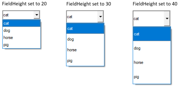
(The FieldHeight property was added in PxPlus 2026.)
Used By: GRID
Grid fill color: This property defines the color to be used to fill in the empty regions of a grid (blank space to the right and below the grid).
Any valid PxPlus color or RGB specification can be used. For information on valid color names and color specifications, see Color Properties.
A value of DEFAULT indicates that the system is to use the default 'Windows' background color as selected by the user.
Used By: GRID • REPORT_VIEW
FindItemText column number: This property is used to control which column the 'FindItemText will search. If not set, the search encompasses all rows/columns within the grid or report view. See FindItemText$ and FindOptions$ properties.
Default: 0 (No column specified - searches all columns)
Used By: DROP_BOX • GRID • LIST_BOX • LIST_VIEW • REPORT_VIEW • TREE_VIEW • VARDROP_BOX • VARLIST_BOX
Search list and set item property: This property, when set, causes the system to search the list box or grid for the text supplied. If the text is found, the system will set the 'Column and 'Item (or 'Row) properties for the control to the entry where the match was found. If no match is found, the 'Column and 'Item ('Row for the grid) properties are set to zero.
A typical use of this property would be to locate a value in the list box and then change or delete it. It can also be used to validate that an entry exists in the list box. This property is generally only written to. Reading this value will return the same as reading the 'ItemText$ property.
Controlling the Search (List View/Grid Only): The search is controlled by the settings found in 'FindOptions$. These options are provided as a series of characters in 'FindOptions$:
|
Char. |
Function |
|
C |
Search is case insensitive. |
|
A |
Accents will be ignored when comparing data. |
|
W |
Search should start from current position and wrap around. |
|
* |
Match is for data anywhere in the text (cannot be used with Sort option). |
|
S |
Data is sorted. |
|
R |
Search backwards. |
Search Range (List View/Grid Only): When searching, if the "W"rap option is not specified, the search will start from the beginning of the data in the control and proceed through the end. If the "R"everse option is set, the search starts at the end and proceeds to the beginning. If the "W"rap option is set, the search will start from the position immediately after that specified in the 'Item ('Row for Grid) and 'Column and search through all the data wrapping around the end/start back to the starting point.
If the property 'FindColNo (or 'Column for Grid) is set, only data in that column will be searched. If the "S"ort option is specified, only the column specified in the 'Sort property will be checked and its setting (Ascending/Descending) will be used to determine the assumed sort sequence. If 'Sort is not set, the system will assume that the column specified in 'FindColNo has been pre-sorted in Ascending order. If 'FindColNo is not set, then the system will assume the first column is to be used and is in ascending sequence.
If both "W"rap and "S"ort options are specified, the system will use the starting point set in 'Item ('Row on Grid) and 'Column and determine the search direction based on the value at the starting point. If the value at the start point matches that of the search value, the "R" option will determine the search direction.
See 'FindColNo and 'FindOptions$ properties.
Example 1: Changing item text in a list box
To change the value of the list box entry of "CAT" to "DOG" for list box "LIST1", you could do the following:
List1'FindItemText$="CAT" ! Locate the item
List1'ItemText$ = "DOG" ! Change the value
Example 2: Locate and delete an item from a list box
To locate and delete a value from a list box:
List1'FindItemText$="CAT" ! Locate the item to delete
LIST_BOX LOAD List1, List1'Item, *
Example 3: Validate the existence of an item in a list
To search a list box to find a specific value, set the 'FindItemText$ to the desired search value then read 'Item. If zero, the item does not exist.
List1'FindItemText$=X$ ! Locate the item
IF List1'Item=0 THEN MSGBOX X$+" is not found"
Used By: GRID • REPORT_VIEW
FindItemText control settings: This property is used to control how the 'FindItemText will search the data in the grid or report view.
It can have one of the following characters specified in its value:
|
Char. |
Function |
|
C |
Search is case insensitive. |
|
A |
Accents will be ignored when comparing data. |
|
W |
Search should start from current position and wrap around. |
|
* |
Match is for data anywhere in the text (cannot be used with Sort option). |
|
S |
Data is sorted. |
|
R |
Search backwards. |
|
I |
(Uppercase "i") In a list box with a bitmap, include the name of the bitmap in the search. |
See 'FindItemText$ and 'FindColNo properties.
Default: Default value is "" (no options specified).
(The "I" option was added in PxPlus 2023.)
Used By: MULTI_LINE (RTF word processing style)
Control RTF word processor Find option: This property controls access to the Find text dialogue box within the RTF word processor control. When this control is set to 1, the user can press CTRL-F to initiate a find within the control. Setting the control to 0 disables CTRL-F.
This property also controls the F3 key for Find Next. If desired, the property can be set to 2, which will cause the Find dialogue box to be initiated under program control.
Default: 1 (CTRL-F enabled)
Used By: CHART • GRID • LIST_BOX • LIST_VIEW • MULTI_LINE • REPORT_VIEW • TREE_VIEW
Control format definition: Refer to the FMT= option as described for the associated control directive; e.g. CHART directive.
Used By: BUTTON • CHECK_BOX • DROP_BOX • GRID • LIST_BOX • LIST_VIEW • MULTI_LINE • MULTI_LINE (RTF word processing style) • RADIO_BUTTON • REPORT_VIEW • TREE_VIEW • TRISTATE_BOX • VARDROP_BOX • VARLIST_BOX
Focus indicator: 1 = Control has focus.
Default: 0
Used By: BUTTON • CHECK_BOX • DROP_BOX • LIST_BOX • LIST_VIEW • MULTI_LINE • RADIO_BUTTON • REPORT_VIEW • TREE_VIEW • TRISTATE_BOX • VARDROP_BOX • VARLIST_BOX
Background color when control has focus: Two colors can be specified for buttons, check boxes, radio buttons and tristate boxes by using the / (slash) as a separator (i.e. RGB:100 100 100/Light Blue).
For information on valid color names and color specifications, see Color Properties.
(List Box, List View, Multi-Line, Report View, Tree View, VarDrop Box and VarList Box support was added in PxPlus 2018.)
Used By: BUTTON • CHECK_BOX • RADIO_BUTTON • TRISTATE_BOX
Color(s) of button border when button has focus: Two colors can be specified for buttons, check boxes, radio buttons and tristate boxes by using the / (slash) as a separator (i.e. RGB:100 100 100/Light Blue). For information on valid color names and color specifications, see Color Properties.
Border colors are applied only if a Border$ property is specified for the button.
Used By: BUTTON • CHECK_BOX • DROP_BOX • LIST_BOX • LIST_VIEW • RADIO_BUTTON • REPORT_VIEW • TREE_VIEW • TRISTATE_BOX
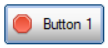
Focus Rectangle: This property controls whether a dotted rectangle displays when the control has focus. Default is On.
Possible values are:
|
|
0 |
No focus rectangle is shown. |
|
|
1 |
Focus rectangle is shown. |
Example:
To turn Button focus Off:
BUTTON 100,@(40,12,10,2)="{!Stop}Button 1"
y=100
y'FocusRect=0
To turn Button focus back On:
BUTTON 100,@(40,12,10,2)="{!Stop}Button 1"
y=100
y'FocusRect=1
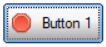
(The FocusRect property was added in PxPlus 2026.)
Used By: BUTTON • CHECK_BOX • DROP_BOX • LIST_BOX • LIST_VIEW • MULTI_LINE • RADIO_BUTTON • REPORT_VIEW • TREE_VIEW • TRISTATE_BOX • VARDROP_BOX • VARLIST_BOX
Foreground text color when control has focus: For information on valid color names and color specifications, see Color Properties.
(List Box, List View, Multi-Line, Report View, Tree View, VarDrop Box and VarList Box support was added in PxPlus 2018.)
Used By: BUTTON • CHART • CHECK_BOX • DROP_BOX • GRID • LIST_BOX • LIST_VIEW • MULTI_LINE • RADIO_BUTTON • REPORT_VIEW • TREE_VIEW • TRISTATE_BOX • VARDROP_BOX • VARLIST_BOX
Font for control/cell: This property is used to reference the font for a control/cell. It will contain (or can be set to) a string containing three comma-separated fields of the font name, size and attributes.
Example: To set the font to Arial, 1.5 times normal size, and Bold, the format would be xxx'Font$="Arial,1.5,B".
When setting the 'Font$ property on a grid for all columns/rows ('Column=0 and 'Row=0), the system will check that the current default Row Height is large enough to accommodate the font selected. If the default row height is too small, the system will automatically adjust the default and all existing row heights to a size large enough to accommodate the font size.
See 'FONT' mnemonic.
(Support for the automatic adjustment of row height was added in PxPlus 2019.)
Chart footer.
Used By: GRID
Foreground text color for buttons in grid: Foreground text color for system-generated buttons in a grid, including drop box buttons and query buttons.
For information on valid color names and color specifications, see Color Properties.
(The ForegroundButtonColor$ property was added in PxPlus 2024.)
Used By: DROP_BOX • LIST_BOX • LIST_VIEW • MULTI_LINE • MULTI_LINE (RTF word processing style) • REPORT_VIEW • TREE_VIEW • VARDROP_BOX • VARLIST_BOX
Color of the frame/border around the control. For information on valid color names and color specifications, see Color Properties.
(The FrameColor$ property was added in PxPlus 2024.)
Used By: BUTTON • CHECK_BOX • RADIO_BUTTON • TRISTATE_BOX
Controls how the image on the button will display when the button is disabled: Applicable only when there is a bitmap on the button.
Possible values are:
|
0 |
Images on the disabled buttons will display only as shadows. This means that only the shadow left by the outline of the image will be seen. |
|
1 |
Images on the disabled buttons will be converted to gray scale. |
|
-1 |
Default gray disabled BMP setting. (Default) |
(The GrayDisabledBmp property was added in PxPlus 2024.)
Used By: GRID • REPORT_VIEW
Background color for the grid top row or report view header.
For the Grid: This property sets the background color for the top row only of the grid (Row -1) and does not affect the leading left column (Colno -1).
For the Report View: This property sets the background color for the report view header.
For information on valid color names and color specifications, see Color Properties.
(The HdrBackColor$ (or HdrBackColour$) property was added for Report Views in PxPlus 2016 and for Grids in PxPlus 2018.)
Used By: GRID • REPORT_VIEW
Font for the grid top row or report view header.
For the Grid: This property defines the font for the top row only of the grid (Row -1) and does not affect the leading left column (Colno -1).
For the Report View: This property defines the font for the report view header.
(The HdrFont$ property was added for Report Views in PxPlus 2016 and for Grids in PxPlus 2018.)
Used By: GRID • REPORT_VIEW
Height of the header in the grid or report view in pixels: This property can be used to control the height of the header in the grid or report view in pixels.
Setting this property to -1 restores the height to its default size. Setting this property to 0 results in no header.
(The HdrHeight property was added in PxPlus 2020.)
Used By: GRID
Border line color for grid top row: This property sets the color of the border lines drawn between columns when the 'ExcelStyle property is set for the top row only of the grid (Row -1) and does not affect the leading left column (Colno -1).
For information on valid color names and color specifications, see Color Properties.
(The HdrLineColor$ property was added in PxPlus 2025.)
Used By: GRID • REPORT_VIEW
Text color for the grid top row or report view header.
For the Grid: This property sets the color of the text for the top row only of the grid (Row -1) and does not affect the leading left column (Colno -1).
For the Report View: This property sets the color of the text for the report view header.
For information on valid color names and color specifications, see Color Properties.
(The HdrTextColor$ (or HdrTextColour$) property was added for Report Views in PxPlus 2016 and for Grids in PxPlus 2018.)
Used By: REPORT_VIEW
Disable header: This property controls the ability of the user to click on or drag the header of a report view.
If set to 0 (zero), the column header is not locked. If set to 1, the column header is locked and mouse clicks or dragging of the column header is not accepted.
Default: 0
Height of control in pixels.
Used By: GRID
Hide grid cell buttons: This property hides query buttons or drop box icons associated with grid cells if there is a bitmap (thus, the bitmap is all that shows on a transparent background).
The StdGridHideButtons option (in the 'OPTION' mnemonic or SETDEV directive) can be used to set the default 'HideButtons property for all subsequent grids.
(The HideButtons property was added in PxPlus 2020.)
Used By: REPORT_VIEW
Text color of a hotlink column: This color is applied to the text of a column defined as a hotlink in the report view to provide a visual cue.
For information on valid color names and color specifications, see Color Properties.
(The HotLinkColor$ property was added in PxPlus 2018.)
Used By: BUTTON • CHECK_BOX • DROP_BOX • MULTI_LINE • MULTI_LINE (RTF word processing style) • RADIO_BUTTON • TRISTATE_BOX • VARDROP_BOX
Background color when mouse is over the control: If the check box or radio button is drawn as a button, which occurs when a bitmap is added, then two colors can be specified for the check box or radio button by using the / (slash) as a separator (i.e. RGB:100 100 100/Light Blue).
This property can also be used to define the background color when the mouse is over a report view row.
For information on valid color names and color specifications, see Color Properties.
(Report View support was added in PxPlus 2018.)
(Support for standard Check Boxes and standard Radio Buttons, Drop Boxes, Variable Drop Boxes, Multi-lines and RTF Multi-lines was added in PxPlus 2025.)
Used By: BUTTON • CHECK_BOX • DROP_BOX • MULTI_LINE • MULTI_LINE (RTF word processing style) • RADIO_BUTTON • TRISTATE_BOX • VARDROP_BOX
Color of border when mouse is over the control: If the check box or radio button is drawn as a button, which occurs when a bitmap is added, then two colors can be specified for the check box or radio button by using the / (slash) as a separator (i.e. RGB:100 100 100/Light Blue).
For information on valid color names and color specifications, see Color Properties.
(Support for standard Check Boxes and standard Radio Buttons, Drop Boxes, Variable Drop Boxes, Multi-lines and RTF Multi-lines was added in PxPlus 2025.)
Used By: BUTTON • CHECK_BOX • LIST_BOX • LIST_VIEW • RADIO_BUTTON • REPORT_VIEW • TRISTATE_BOX
Hover color: If applied to a button, the button is highlighted when the mouse moves over its location.
For information on valid color names and color specifications, see Color Properties.
Default: "DEFAULT"
Used By: BUTTON • CHECK_BOX • DROP_BOX • MULTI_LINE • MULTI_LINE (RTF word processing style) • RADIO_BUTTON • TRISTATE_BOX • VARDROP_BOX
Foreground text color when mouse is over the control: For information on valid color names and color specifications, see Color Properties.
(Support for standard Check Boxes and standard Radio Buttons, Drop Boxes, Variable Drop Boxes, Multi-lines and RTF Multi-lines was added in PxPlus 2025.)
Windows handle for control.
Radio button index to reference.
Used By: BUTTON • CHECK_BOX • RADIO_BUTTON • TRISTATE_BOX
Number of images contained in a bitmap button: 1 to 4.
Default: 0
Used By: GRID • MULTI_LINE
Implied decimal: Controls implied decimal input in grids and multi-lines.
Used By: CHART
Set Index mode: This allows additional views of existing chart types to be opened; e.g. for a 2D column chart, setting IndexMode to 1 creates a clustered column chart.
|
|
1 |
Natural number (1 .. n) indexing |
|
|
2 |
Integer (0 .. i) indexing |
|
|
3 |
Arbitrary x value indexing |
Used By: GRID
Cell editing keys: 0 = Off; 1 = On. This enables use of Insert to begin cell editing and Delete for clearing the contents of a cell.
Default: 0 (Off)
Used By: DROP_BOX • LIST_BOX • LIST_VIEW • REPORT_VIEW • TREE_VIEW • VARDROP_BOX • VARLIST_BOX
Index number of item in list.
Used By: DROP_BOX • LIST_BOX • LIST_VIEW • REPORT_VIEW • TREE_VIEW • VARDROP_BOX • VARLIST_BOX
Number of items in list: See Load on Demand.
Used By: LIST_BOX • LIST_VIEW • REPORT_VIEW
Signal/CTL event number to generate when items are loaded in the list.
Used By: LIST_BOX • LIST_VIEW • REPORT_VIEW
Number of items whose text value is still undefined when using Load on Demand for lists.
Example: You can define a list box to contain 1000 items but only supply the item values (display text) as the user scrolls them into view. The 'ItemNeededCnt is the number of items whose value has still not been loaded.
Used By: LIST_BOX • LIST_VIEW • REPORT_VIEW
Signal/CTL event number to generate when items are requested from the list box: This property must be set prior to pre-declaring the number of items the list box is to have by setting the 'ItemCount property. See Load on Demand.
Used By: LIST_BOX • LIST_VIEW • REPORT_VIEW
Index number of the items requested: The 'ItemNeededFrom and 'ItemNeededTo properties are set once the user scrolls the list box to request more items to be loaded. See Load on Demand.
Used By: LIST_BOX • LIST_VIEW • REPORT_VIEW
Index number of the items requested: See Load on Demand.
Used By: TREE_VIEW
Numeric value indicating the state of the item: This property is used in conjunction with 'StateBitmaps$, which defines the state bitmaps. Once the state bitmaps are set, each item/row/entry may set its 'ItemState property to determine what image is to appear next to the row text depending on the state. A maximum of 15 states can be assigned - 1 through 15. A state of 0 (zero) causes no state indicator to be displayed.
Example: Assuming the list box is defined with 3 images, the first image will appear if the item state is 1, the second image will appear if the item state is 2 and the third image will appear if the item state is 3.
See State Indicators.
Used By: TREE_VIEW
Maintain hidden tag string on item set by 'Item: This tag can hold internal user-defined information about the item such a file keys, etc.
Used By: DROP_BOX • LIST_BOX • LIST_VIEW • REPORT_VIEW • TREE_VIEW • VARDROP_BOX • VARLIST_BOX
Value of the current item set by 'Item.
Used By: TREE_VIEW
Control text color for current tree view item: Controls the text color for the current tree view item identified by the 'Item property.
For information on valid color names and color specifications, see Color Properties.
(The ItemTextColor$ (or ItemTextColour$) property was added in PxPlus 2020.)
Used By: GRID
Merge two or more columns (left to right): Set this property in the column that starts the join (leftmost) to the total number of joined columns - that number of columns will be merged into one. For columns belonging to an existing join, this property returns a negative integer indicating the column's current position within the join.
Used By: GRID
Merge two or more rows (downward): Set this property in the row that starts the join (uppermost) to the total number of joined rows - that number of rows will be merged into one. For rows belonging to an existing join, this property returns a negative integer indicating the row's current position within the join.
Used By: BUTTON • CHECK_BOX • DROP_BOX • GRID • H_SCROLLBAR • LIST_BOX • LIST_VIEW • MULTI_LINE • RADIO_BUTTON • REPORT_VIEW • TREE_VIEW • TRISTATE_BOX • VARDROP_BOX • VARLIST_BOX • V_SCROLLBAR
Hot key to jump to control.
Used By: CHART
Custom positioning of chart labels: Use syntax "column:line" or "AUTOMATIC" (to set label locations to the default mode).
Example: x'LabelLocation$="10:15"
Left margin for control in pixels.
Used By: GRID
Left border of cell (thickness): 0 to 3 pixels
Default: 0
Used By: CHART
Location of chart legend: Values include TopLeft, Left, BottomLeft, TopRight, Right and BottomRight.
Legend text for a data set.
Used By: GRID • MULTI_LINE • MULTI_LINE (RTF word processing style) • VARDROP_BOX • VARLIST_BOX
Input length of cell or line.
Screen position of control.
Used By: GRID • REPORT_VIEW • TREE_VIEW
Line color for grid, report view and tree view controls.
For the Grid and Report View: This property contains the color of the lines drawn between rows and columns when the 'ExcelStyle property is set.
For the Tree View: This property contains the color of the lines drawn between entries on a tree view.
For information on valid color names and color specifications, see Color Properties.
Default: DEFAULT (normally BLACK)
(The LineColor$ (or LineColour$) property for Grids and Report Views was added in PxPlus 2020.)
Used By: LIST_VIEW • REPORT_VIEW
Returns the height of a row in a list view or report view in pixels. (Read Only)
(The LinePixels property was added in PxPlus 2017.)
Height of control in number of lines.
Used By: LIST_VIEW • REPORT_VIEW
Define the number of lines each list box row contains: This property is used to define the number of lines that each entry on a list box contains. When set to a value > 1, the system will apply word wrap to the text in the list box and support line breaks with the line feed ($0a$) character.
Default: 1 - Each row in the list box is one line high.
Used By: GRID
'LoadList$ in compiled IOList format: This property contains the list of columns that will be returned in 'RowData in compiled IOList format. See Loading/Accessing by Row and the 'LoadList$ property.
Default: By default, the list of columns will contain the column names starting from the first column (far left) through the end of the grid. It can be altered by setting either the 'LoadList$ or 'LoadIOList$ property.
Used By: GRID
List of columns loaded: This property contains the list of columns that will be returned in 'RowData as a string of column names separated by a delimiter (last character of string). See Loading/Accessing by Row.
Default: By default, the list of columns will contain the column names starting from the first column (far left) through the end of the grid. It can be altered by setting either the 'LoadList$ or 'LoadIOList$ property.
Used By: DROP_BOX • LIST_BOX • LIST_VIEW • REPORT_VIEW • VARDROP_BOX • VARLIST_BOX
Insertion point for list/drop box loads: This property controls where the data loaded to a list_box, drop_box, varlist_box or vardrop_box will be inserted. When a list/drop box LOAD directive is issued with no index, the current contents of the control will first be cleared and the new data will replace it. Setting the 'LoadPoint property to a non-zero value alters this behavior.
If 'LoadPoint is set to -1, the data included with the list/drop box LOAD directive will be appended to the list box contents.
If 'LoadPoint is set to -2, the data included with the list/drop box LOAD directive will replace the current contents of the list starting at the item number set in the 'Item property, which will be updated to the next item number once the load is complete (new items will be added, if required).
If 'LoadPoint is set to a value > 0, the data will be inserted into the list at the point specified and the value in 'LoadPoint will be reset.
This functionality allows drop boxes to be loaded a block of records at a time.
(The LoadPoint setting of -2 was added in PxPlus 2019.)
Used By: GRID • MULTI_LINE • MULTI_LINE (RTF word processing style)
Lock status: Possible values are:
|
0 |
Unlock |
|
1 |
Lock |
|
2 |
Lock (cell contents can be selected/copied) (Grid Only) |
|
-1 |
Permanently locked (Multi-Line Only) |
Default: 0 - Unlock
(The Lock status of 2 was added in PxPlus 2019.)
Used By: GRID • MULTI_LINE • MULTI_LINE (RTF word processing style)
Background color when the grid cell or multi-line control is locked: For information on valid color names and color specifications, see Color Properties.
(The LockBackColor$ property was added in PxPlus 2024.)
Used By: GRID • REPORT_VIEW
Number of rows at the bottom of the grid or report view to exclude from sorting.
See LockTop.
Used By: GRID
Background color for locked buttons in grid: Background color for locked system-generated buttons in a grid, including drop box buttons and query buttons.
For information on valid color names and color specifications, see Color Properties.
(The LockButtonColor$ property was added in PxPlus 2025.)
Number of columns to lock into position: This property is used to set the number of leftmost columns that will remain fixed and will not be resized when the display is scrolled horizontally.
Used By: GRID
Foreground text color for locked buttons in grid: Foreground text color for locked system-generated buttons in a grid, including drop box buttons and query buttons.
For information on valid color names and color specifications, see Color Properties.
(The LockForegroundButtonColor$ property was added in PxPlus 2025.)
Used By: GRID
Number of rows to lock into position, starting from row 1.
Used By: GRID • MULTI_LINE • MULTI_LINE (RTF word processing style)
Foreground text color when the grid cell or multi-line control is locked: For information on valid color names and color specifications, see Color Properties.
(The LockTextColor$ property was added in PxPlus 2024.)
Used By: GRID • REPORT_VIEW
Number of rows at the top of the grid or report view to exclude from sorting.
See LockBottom property.
(The LockTop property was added in PxPlus 2019.)
Used By: BUTTON • CHART • CHECK_BOX • DROP_BOX • GRID • H_SCROLLBAR • LIST_BOX • LIST_VIEW • MULTI_LINE • RADIO_BUTTON • REPORT_VIEW • TREE_VIEW • TRISTATE_BOX • VARDROP_BOX • VARLIST_BOX • V_SCROLLBAR
Define control style: This property is used to define how a control will look.
Possible values are:
|
2 |
Old Windows 3.1 2D look. |
|
3 |
Windows 95/98 3D look. |
|
4 |
Windows XP/Vista/Windows 7 look. |
Used By: CHART
Set line number for bottom chart margin.
Used By: CHART
Set column number for left chart margin.
Used By: CHART
Set column number for right chart margin.
Used By: CHART
Set line number for top chart margin.
Used By: CHART
Set all chart margins: Use syntax "top:bottom:left:right" or "AUTOMATIC" to set margins to the automatic (Default) mode.
Example: X'MARGINS$="10:10:20:10"
Used By: GRID
Control drop list size in grid: This property is used to control the number of lines that will appear in a drop down list in the grid. This property affects all cells in the grid.
By default, this property will be set to zero where the drop down list size is determined by the height of the grid and the number of options in the list.
Setting this property to a positive non-zero value defines the maximum number of options to show in the drop down list in the grid.
Setting this property to a negative value will result in an Error #60: Invalid control argument value.
(The MaxListItems property was added in PxPlus 2020.)
Used By: BUTTON (sizer) • H_SCROLLBAR • V_SCROLLBAR
Maximum value that the control will return: For a button (sizer) control, this property can be set to the highest location (line or column) that the control will allow itself to be dragged.
On a scroll bar, the value set in the MaxValue is used to determine the value returned when the scrollbar is slid to its highest position.
Used By: GRID
Column number on right-click: This property indicates the column number of a selected cell on a right-click of the mouse.
Used By: BUTTON • CHART • CHECK_BOX • DROP_BOX • GRID • LIST_BOX • LIST_VIEW • MULTI_LINE • MULTI_LINE (RTF word processing style) • RADIO_BUTTON • REPORT_VIEW • TREE_VIEW • TRISTATE_BOX • VARDROP_BOX • VARLIST_BOX
CTL value on right-click: This property reports/sets the CTL value to generate when an object is selected on a right-click of the mouse.
Used By: GRID
Row number on right-click: This property indicates the row number of a selected cell on a right-click of the mouse.
Used By: BUTTON (sizer)
Minimum value that the control will return: For a button (sizer) control, this property can be set to the lowest location (line or column) that the control will allow itself to be dragged.
Used By: LIST_BOX • LIST_VIEW • REPORT_VIEW • TREE_VIEW
Item number on mouse-over: This property returns the item number of an object when the mouse pointer is over it. If the mouse is not over an object, -1 is returned. 0 is returned if the cursor is over an area in the control with no data.
Used By: BUTTON
Drag/move button to a new position: This property controls whether a button can be dragged/moved to a new position.
If set to 1, the button can be dragged/moved. This movement will not be saved. If set to 0 (Default), the button location is fixed.
Its initial value is determined by the presence of the "M" option. See BUTTON OPT= Settings in the BUTTON Create directive.
Default: 0
(The Moveable property was added in PxPlus 2018 Update 1.)
Message line text for the control.
Used By: GRID
Select multiple cells: 1 = On; 0 = Off
Default: 1
Used By: TREE_VIEW
Detect expand/collapse requests: This property is used to control the generation of tree view expand/collapse signals. When this property is 0 (Default), no signal is sent to the application when the user expands or collapses any entry in the tree view. Setting this property to a non-zero causes a tree view to generate an event with EOM code of "+" (indicating the level was expanded) or "-" (indicating collapse).
Use of this property can allow the developer to speed up the loading of large tree views. By only loading one level at a time in a tree view and detecting when the user attempts to expand a level, you can reduce the amount of processing required to view a large number of items.
Example: Suppose that your tree view contains invoice information with the first level being the division, the second being the client, and the final being the invoice number. Your load items would look like: ABC Corp/Client 1/Inv#001234.
Loading all the invoices into the tree view could take a while, so instead, load only load the first item (client/invoice) for each division and set the 'NotifyExpand property to non-zero. When the user requests to expand the division, the application will receive an expansion signal (EOM = '+' or EOM='-' for collapse). Upon receipt of this signal, the application can add to the tree view one invoice record for each client in division except the first one, which will have already loaded during initial. When it receives an expansion signal for a client, it can load all its invoices (again except for the first).
The application should keep a memory file with a list of which levels have already been filled in so that a subsequent expand signal for the same item can be ignored. This method of tree view loading means that the tree view will only load the items that the user is specifically interested in viewing, which will reduce the system load and make the application more responsive.
Default: 0
String text to display when the value of the multi-line field or grid cell is empty. If a numeric format string has been assigned, then the text is displayed when the value is 0 (zero).
Largest number of data points within data set.
Total number of data sets.
Used By: BUTTON • CHART • CHECK_BOX • DROP_BOX • GRID • H_SCROLLBAR • LIST_BOX • LIST_VIEW • MULTI_LINE • RADIO_BUTTON • REPORT_VIEW • TREE_VIEW • TRISTATE_BOX • VARDROP_BOX • VARLIST_BOX • V_SCROLLBAR
User object method: The 'ObjectID property allows applications to intercept property values and add methods to controls. When set to a valid Object ID by the application, you can add methods and add/override property logic for any control in the system. When set in the system, it allows the application to logically request methods against the control that, in turn, will be performed by the related Object ID. It will also first check the object for any property requests and, if the property is defined in the object, set or get that property instead of the controls.
To allow the specified object to get true access to the control, while executing within the object identified by the 'ObjectID property, the system will direct any property requests directly to the control.
Sample used to add a GetValue$ and SetValue method to a grid
Grid Object definition (GRID.PVC):
0010 DEF CLASS "grid"
0020 LOCAL _CTLNO
0030 FUNCTION GETVALUE$(COL,ROW)
0040 ENTER C,R
0050 LET _CTLNO'COLUMN=C
0060 LET _CTLNO'ROW=R
0070 RETURN _CTLNO'VALUE$
0080 FUNCTION SETVALUE(COL,ROW,VALUE$)
0090 ENTER C,R,V$
0100 LET _CTLNO'COLUMN=C
0110 LET _CTLNO'ROW=R
0120 LET _CTLNO'VALUE$=V$
0130 RETURN 1
0140 END DEF
0150 ON_CREATE:
0160 ENTER CTLNO
0170 LET _CTLNO=CTLNO
0180 LET _CTLNO'OBJECTID=_OBJ
0190 RETURN
Test program to create the grid and assign the Object to the grid control:
0010 GRID 10,@(30,2,40,15)
0020 GRID ADD 10,10,10
0030 LET X=10
0040 LET O=NEW("grid",X)
0050 FOR I=1 TO 3
0060 X'SETVALUE(I,I,"Hi there")
0070 NEXT
0080 PRINT X'GETVALUE$(2,2)
0090 ESCAPE
Default: 0 (No object specified)
Used By: MULTI_LINE
Generate CTL event when multi-line double clicked: This multi-line property controls the generation of a CTL event when the control is double clicked. The value is ignored if the control is disabled, but will be generated if the control is locked. It can be set to a non-zero CTL value, which will be generated if the user double clicks the control.
(The OnDoubleClick property was added in PxPlus 2022 Update 1.)
Used By: DROP_BOX • VARDROP_BOX
CTL event to fire when drop box opened: This property controls the CTL event that will be fired when the drop list of a DROP box (normal or variable) is opened/displayed. If the value of this property is non-zero, the system will use its value of a CTL event to fire. Setting this to zero (Default) disables the CTL event from being sent.
Default: 0
Used By: MULTI_LINE
On focus, resize columns: Returns to defined size when focus leaves. Assign 0 to reset.
Used By: BUTTON • CHECK_BOX • DROP_BOX • GRID • LIST_BOX • LIST_VIEW • MULTI_LINE • MULTI_LINE (RTF word processing style) • RADIO_BUTTON • REPORT_VIEW • TREE_VIEW • TRISTATE_BOX • VARDROP_BOX • VARLIST_BOX
On focus CTL event: 0 is returned if no on focus CTL value is set up for the control.
Used By: MULTI_LINE
On focus, resize lines: Returns to defined size when focus leaves. Assign 0 to reset.
Used By: DROP_BOX • GRID • LIST_BOX • LIST_VIEW • REPORT_VIEW • VARDROP_BOX • VARLIST_BOX
CTL event to fire when contents change: This property, when set to a non-zero value, causes the system to generate an internal CTL event following any changes to a list box or grid. It can be used to monitor changes to a list style control so that external action (such as updating screen or files) can be performed. If the value of this property is non-zero, the system will use its value as a CTL event to generate; if zero (default state), no event will be generated. To avoid multiple signals being generated, the system will defer the generation for approximately 1/2 second following the last update. This means that when multiple rows/cells are being updated, the event will generally only occur once the updating is complete.
Default: 0
Used By: BUTTON • CHART • CHECK_BOX • DROP_BOX • GRID • H_SCROLLBAR • LIST_BOX • LIST_VIEW • MULTI_LINE • RADIO_BUTTON • REPORT_VIEW • TREE_VIEW • TRISTATE_BOX • VARDROP_BOX • VARLIST_BOX • V_SCROLLBAR
CTL event to fire before showing tip: This property controls the CTL event that will be fired prior to the system displaying the Tip for any control. If the value of this property is non-zero, the system will use its value of a CTL event to fire and will defer the display of the tip until the application changes the value in 'Tip$. If the value in 'Tip$ is not changed, no tip will be displayed.
Setting this to zero (Default) disables the event from being sent and the current 'Tip$ will be displayed.
Default: 0
Used By: GRID
Allow cells to overlap: 1 = Yes; 0 = No
Default: 1
Parent window handle.
Used By: MULTI_LINE
Password mask data: If this property is set to 1, the multi-line will have its contents replaced with the PxPlus defined password character (default $). Setting this property to 0 (zero) removes the masking.
(Read/Write support for the Password property was added in PxPlus 2023.)
Used By: GRID • MULTI_LINE
Strip non-printing characters from pasted data: When the filter is enabled, it strips leading/trailing non-printing characters, such as line feeds or tabs, from data that is copied/pasted into a grid or multi-line control and replaces any internal sequence of non-printing characters with a single space.
Possible values are 0 = Off and 1 = On.
Example:
Data that is copied as …
123 Main Street
Markham
Ontario
… will be pasted as:
123 Main Street Markham Ontario
The Clipboard will reflect the actual data pasted in case the user wants to paste the data elsewhere.
Default: 1 (except for multi-lines that are >1 line high and accept multiple lines of input, which default to 0)
(The PasteFilter property was added in PxPlus 2020 Update 1.)
Used By: CHART
Point label values: Single string of point label values where the last character is the delimiter.
Used By: TREE_VIEW
Control prefix on data loaded into tree view.
Possible values are:
|
|
0 |
No prefix on the data - data has bitmap option Off. |
|
|
1 |
Data loaded in the tree view can be prefixed with curly braces containing a bitmap, state value, and tag value (separated with semi-colons) - data has bitmap option On. |
|
|
2 |
Returns same prefix with curly braces when data is read and can be supplied when the data is written (as above). |
Used By: GRID • MULTI_LINE
Grid cell or multi-line value last returned: This property contains the value last returned when the grid cell or multi-line was read.
(The PriorValue$ property was added in PxPlus 2018.)
Used By: CHART
Depth to width: Sets percentage of chart depth to chart width for altering depth proportions of three-dimensional charts. Assigning a 0 (zero) forces default values according to chart type.
Default: ProportionDW=100 for Pie charts; ProportionDW=50 for other chart types
Used By: CHART
Height to width: Sets percentage of chart height to chart width for altering proportions of two-dimensional charts. Assigning a 0 (zero) forces default values according to chart type.
Default: ProportionHW=5 for Pie charts; ProportionHW=100 for other chart types
Used By: CHART
Proportions to margins: 0 = Off; 1 = On. Sets the chart to the variable-proportion mode, which means that it is proportional to the current height-to-width ratio of the chart window that contains the chart.
Default: 0
Used By: MULTI_LINE
Contains the CTL value for a query button that is to be placed within an input multi-line control. Button position, size and visibility are controlled by the multi-line. Transparency fills the button with the multi-line background color.
Used By: GRID
Assign a query to a grid cell: The expression should include the query definition name and library in the following format: "QueryName,Library".
When defined, the grid cell will display a lookup button with a bitmap, if a bitmap has been set; otherwise, the lookup button will display a ? (question mark) by default.
The Query property can also be set in Grid Presets Definition when using the NOMADS Panel Designer.
Used By: CHART
Set ceiling value of the Y-axis: The chart view will be adjusted according to RangeMin and RangeMax values.
Used By: CHART
Set floor value of the Y-axis: The chart view will be adjusted according to RangeMin and RangeMax values.
Used By: CHART
Text of custom label for Stack Chart (one point per data set): Labels are placed on the right side. Labels must be added sequentially, starting from 1, up to the number of sets.
Example: X'CURRENTSET =1, X'CURRENTPOINT=1, X'RANGETEXT$="Label One"
Used By: RADIO_BUTTON
Color of the disabled radio button frame: Applies only to radio buttons that look like radio buttons (no bitmap defined), not for radio buttons that look like normal buttons.
For information on valid color names and color specifications, see Color Properties.
(The RbDisableFrameColor$ property was added in PxPlus 2025.)
Used By: RADIO_BUTTON
Color of the circle in the disabled radio button: Applies only to radio buttons that look like radio buttons (no bitmap defined), not for radio buttons that look like normal buttons.
For information on valid color names and color specifications, see Color Properties.
(The RbDisableMarkColor$ property was added in PxPlus 2025.)
Used By: RADIO_BUTTON
Color of the radio button frame: Applies only to radio buttons that look like radio buttons (no bitmap defined), not for radio buttons that look like normal buttons.
For information on valid color names and color specifications, see Color Properties.
(The RbFrameColor$ property was added in PxPlus 2024.)
Used By: RADIO_BUTTON
Radio button hover color: Color of the hover circle in the radio button when the mouse is over the control. Applies only to radio buttons that look like radio buttons (no bitmap defined), not for radio buttons that look like normal buttons.
For information on valid color names and color specifications, see Color Properties.
(The RbHoverColor$ property was added in PxPlus 2024.)
Used By: RADIO_BUTTON
Color of the circle in the radio button: Applies only to radio buttons that look like radio buttons (no bitmap defined), not for radio buttons that look like normal buttons.
For information on valid color names and color specifications, see Color Properties.
(The RbMarkColor$ property was added in PxPlus 2024.)
Used By: GRID
Enable grid resize by user: Possible values are:
|
0 |
Neither row or columns are resizable. |
|
1 |
Both columns and rows are resizable. |
|
2 |
Columns are resizable, rows are not. |
|
3 |
Rows are resizable, columns are not. |
Default: 1
Used By: GRID
Right border of cell (thickness): 0 to 3 pixels.
Grid row reference.
Used By: GRID
Row data based on: Row data based on cell columns identified in the 'LoadList$ or 'LoadIOList$ property. Each value will be separated by the column separator as defined for the grid. Reading this property will return the contents cells within the row identified in the 'Row property. Writing it will update the cells.
See Loading/Accessing by Row, 'LoadList$ property and 'LoadIOList$ property.
Used By: GRID
Background color for leading left column of grid: Sets the background color for the leading left column only of the grid (Colno -1) and does not affect the grid top row (Row -1).
For information on valid color names and color specifications, see Color Properties.
(The RowHeaderBackColor$ property was added in PxPlus 2024.)
Used By: GRID
Border line color for leading left column of grid: Sets the color of the border lines drawn between rows when the 'ExcelStyle property is set for the leading left column only of the grid (Colno -1) and does not affect the grid top row (Row -1).
For information on valid color names and color specifications, see Color Properties.
(The RowHeaderLineColor$ property was added in PxPlus 2025.)
Used By: GRID
Text color for leading left column of grid: Sets the text color for the leading left column only of the grid (Colno -1) and does not affect the grid top row (Row -1).
For information on valid color names and color specifications, see Color Properties.
(The RowHeaderTextColor$ property was added in PxPlus 2024.)
Height of current row in lines.
Used By: GRID
Row selection highlight: 1 = Row highlight; 0 = Cell highlight. This enables selection of a full row rather than limited to cells. Only locked cells are highlighted. One side effect is that when the cells are locked, the grid becomes a fancy list view.
The SelectCount property returns the number of selected cells; however, when the RowHiLight property is set, SelectCount returns the number of rows:
Example:
0010 BEGIN
0020 LET G=10
0030 GRID G,@(20,10,50,12)
0040 GRID ADD G,5,9
0050 LET G'ROWHILIGHT=1
0060 GRID SELECT G,0,0
0070 PRINT G'SELECTCOUNT
0080 INPUT *
Height of row in pixels.
Number of rows defined in grid.
Used By: MULTI_LINE
Set scrollbar types: Possible values are:
|
0 |
No scrollbars. |
|
1 |
Vertical scrollbars. |
|
2 |
Horizontal scrollbars. |
|
3 |
Both scrollbars. |
Used By: DROP_BOX • GRID • H_SCROLLBAR • LIST_BOX • LIST_VIEW • MULTI_LINE • REPORT_VIEW • TREE_VIEW • VARDROP_BOX • VARLIST_BOX • V_SCROLLBAR
Set scroll wheel increment: This property is used to define how many lines each click of the scroll wheel will move a list box or grid.
Possible values are:
|
0 |
Scroll wheel support (all events go to parent window). |
|
1 |
Scroll only if the control has focus (mouse can hover on or off control). |
|
2 |
Scroll only if the control has focus (mouse must be hovered over control). |
|
3 |
If control does not have focus, then scroll when mouse hovers over this control (otherwise, same as 1). |
|
4 |
If control does not have focus, then scroll when mouse hovers over this control (otherwise, same as 2). |
Used By: MULTI_LINE (RTF word processing style)
RTF word processor Alignment: This property controls the font for the currently selected text in a RTF word processor multi-line style control. If no text is currently selected, the current text entry will be affected. Paragraph alignment: "R"ight, "L"eft, "C"entered.
Default: The default setting is the control font.
Used By: MULTI_LINE (RTF word processing style)
RTF word processor BOLD setting: This property reflects whether the text will be bold for the currently selected text in a RTF word processor multi-line style control. If no text is currently selected, the current text entry will be affected. 0 if not bold, 1 if bold.
Default: The default setting is the control font.
Used By: MULTI_LINE (RTF word processing style)
RTF word processor Bullet Number setting: This property reflects the bullet number for the current text in a RTF word processor multi-line style control. Changing this number will change the current bullet sequence number and those following.
Default: The default setting starts at 1 and increments by 1 for each paragraph.
Used By: MULTI_LINE (RTF word processing style)
RTF word processor Bullets setting: This property reflects whether the text will be bulleted for the currently selected text in a RTF word processor multi-line style control (0 = None, 1 = Yes, 2 = Numbers).
Used By: MULTI_LINE (RTF word processing style)
RTF word processor Bullet Style setting: This property reflects the bullet style for the current text in a RTF word processor multi-line style control.
Used By: MULTI_LINE (RTF word processing style)
RTF word processor Font selector: This property controls access to the Font selection dialogue box within the RTF word processor multi-line style control. When this control is set to 1, the user can press Ctrl-Shift-Insert to initiate a Font selector within the control. Setting the control to 0 disables Ctrl-Shift-Insert. If desired, the property can be set to 2, which will cause the Font selection dialogue box to be initiated under program control.
Default: The default setting is 1 (Ctrl-Shift-Insert enabled).
Used By: GRID
Column number of selected cell: (Read Only). See Multiple Selections.
Used By: GRID • LIST_BOX • LIST_VIEW • REPORT_VIEW • TREE_VIEW
Number of items/cells selected: See Multiple Selections.
This property returns the number of selected cells; however, when the RowHiLight property is set, SelectCount returns the number of rows:
Example:
0010 BEGIN
0020 LET G=10
0030 GRID G,@(20,10,50,12)
0040 GRID ADD G,5,9
0050 LET G'ROWHILIGHT=1
0060 GRID SELECT G,0,0
0070 PRINT G'SELECTCOUNT
0080 INPUT *
Set the SelectCount property to zero to deselect all items.
Used By: TREE_VIEW
Number of child items: Used in conjunction with 'SelectStateMask to return the number of child items with the desired state (children being entries on the tree that have no subordinates). See Multiple Selections.
Used By: CHART • GRID • LIST_BOX • LIST_VIEW • REPORT_VEW • TREE_VIEW
Index to 'SelectItem: Set this property to point to a selected element; e.g. 1 points to the first item selected, 2 points to the second item selected, etc. See Multiple Selections.
Used By: LIST_BOX • LIST_VIEW • REPORT_VIEW • TREE_VIEW
Item number in list selected: This returns the sequential location within the list of the item being pointed to by 'SelectIndex property. See Multiple Selections.
Used By: MULTI_LINE • MULTI_LINE (RTF word processing style) • VARDROP_BOX • VARLIST_BOX
Length of selected item: This reports the number of characters currently highlighted. This allows for cut, copy and paste within a graphical user interface input region.
Used By: MULTI_LINE • MULTI_LINE (RTF word processing style) • VARDROP_BOX • VARLIST_BOX
Position where highlight/cursor begins: This indicates where the highlight begins within the data or, if nothing is highlighted, the current cursor location. This allows for cut, copy and paste within a graphical user interface input region.
Used By: GRID
Row number of selected cell: (Read Only). See Multiple Selections.
Used By: TREE_VIEW
State filter to apply: See State Indicators.
Used By: GRID • MULTI_LINE • MULTI_LINE (RTF word processing style) • VARDROP_BOX • VARLIST_BOX
Text contained within the highlight: This allows for cut, copy and paste within a graphical user interface input region. See Multiple Selections.
Used By: GRID
Value within selected field: See Multiple Selections.
Used By: MULTI_LINE (RTF word processing style)
RTF word processor EMBOSS setting: This property reflects whether the text will be Embossed for the currently selected text in a RTF word processor multi-line style control. If no text is currently selected, the current text entry will be affected. 0 if not Embossed, 1 if Embossed.
Default: The default setting is the control font.
Used By: MULTI_LINE (RTF word processing style)
RTF word processor FONT setting: This property reflects the Font to be used for the currently selected text in a RTF word processor multi-line style control. If no text is currently selected, the current text entry will be affected.
Example: To set the font to Arial, 1.5 times normal size, and Bold, the format would be xxx'Font$="Arial,1.5,B" (comma-separated).
See 'FONT' mnemonic.
Default: The default setting comes from the control's default Font specification.
Used By: MULTI_LINE (RTF word processing style)
RTF word processor FONT SIZE setting: This property reflects the Font Size to be used for the currently selected text in a RTF word processor multi-line style control.
Used By: MULTI_LINE (RTF word processing style)
RTF word processor INDENTATION setting: This property reflects the Indentation to be used for the currently selected paragraph(s) in a RTF word processor multi-line style control. If no paragraph is currently selected, the current text entry will be affected. The indentation is measured in TWIPS, which is 1/1440 of an inch (or 1/20th of a POINT). To create an indentation of 1/2 an inch, use 720.
Default: 0
Used By: MULTI_LINE (RTF word processing style)
RTF word processor ITALICS setting: This property reflects whether the text will be in Italics for the currently selected text in a RTF word processor multi-line style control. If no text is currently selected, the current text entry will be affected. 0 if not in italics, 1 if in italics.
Default: The default setting is the control font.
Used By: MULTI_LINE (RTF word processing style)
RTF word processor PARAGRAPH UNDENT setting: This property reflects the amount of indentation to be eliminated from the contents of the currently selected paragraph(s) in a RTF word processor multi-line style control. If no paragraph is currently selected, the current text entry will be affected. The indentation is measured in TWIPS, which is 1/1440 of an inch (or 1/20th of a POINT). To create an indentation of 1/2 an inch, use 720.
The Undentation only affects the body of the paragraph that follows the first line.
Example: If you wanted to indent the first line by 1/2 an inch yet leave the rest of the paragraph un-indented, you would set both the 'Indent and 'ParaUndent properties to 720.
Default: 0
Used By: MULTI_LINE (RTF word processing style)
RTF word processor RIGHT INDENTATION setting: This property reflects the right side Indentation to be used for the currently selected paragraph(s) in a RTF word processor multi-line style control. If no paragraph is currently selected, the current text entry will be affected. The indentation is measured in TWIPS, which is 1/1440 of an inch (or 1/20th of a POINT). To create an indentation of 1/2 an inch, use 720.
Default: 0
Used By: MULTI_LINE (RTF word processing style)
RTF word processor STRIKEOUT setting: This property reflects whether the text will be "Striked Out" for the currently selected text in a RTF word processor multi-line style control. If no text is currently selected, the current text entry will be affected.
Default: 0 (No Strikeout)
Used By: MULTI_LINE (RTF word processing style)
RTF word processor TEXT COLOR setting: This property reflects the color of the text that is currently selected in a RTF word processor multi-line style control. If no text is currently selected, the current text entry will be affected.
For information on valid color names and color specifications, see Color Properties.
Default: The default setting is "DEFAULT" (normally BLACK).
Used By: MULTI_LINE (RTF word processing style)
RTF word processor UNDERLINE setting: This property reflects whether the text will be underlined for the currently selected text in a RTF word processor multi-line style control. If no text is currently selected, the current text entry will be affected. 0 if not underlined, 1 if underlined.
Default: The default setting is the control font.
Separator character between each field, column or data point.
Separator character for each row or data set.
Used By: LIST_VIEW • REPORT_VIEW
Separator character for Sort value: This property is used to define a character, which will separate the contents of a list view or report view column that is to be displayed from the values of the column as it will be used for column sorting.
Often when displaying data in a list view or report view, it is desirable to have what is displayed be different from how the value should be sorted. For instance, the display value of a list view or report view may be a bitmap or some other graphical information, which is not able to be sorted. If you define a SepSort$ value, any data in the column before the specified character will define what will be displayed, and data following the character will be used for the purposes of sorting.
Used By: DROP_BOX • VARDROP_BOX
Control drop box drop down: This property controls the displaying of the drop down list of selections for a drop box. Setting it to 1 causes the drop list to expand/display. Setting it to 0 (zero) causes the drop list to be collapsed. It can be read to determine the current status of the drop box.
Used By: GRID
Control color of locked cells: This property applies to the entire grid and controls the color of locked cells.
When set to 1 (Default), locked cells are shown with a gray background. Setting this property to 0 (zero) does not change the color of locked cells. This allows background colors to be set on alternating lines in a grid (see BackHilight1$ and BackHilight2$), regardless if cells are locked.
Default: 1 (Locked cells are shown with a gray background.)
(The ShowLocked property was added in PxPlus 2019.)
Used By: DROP_BOX • GRID • LIST_BOX • LIST_VIEW • MULTI_LINE • MULTI_LINE (RTF word processing style) • REPORT_VIEW • TREE_VIEW • VARDROP_BOX • VARLIST_BOX
Signal event on exit: This property controls whether a 'Change' signal will be generated when the control (or region of a grid control) is exited regardless of whether the control's value changes. Normally, controls only signal changes when the control loses focus and the contents have changed. Setting SignalOnExit allows a change signal to also be generated whenever focus leaves the control (or region for grid).
|
|
0 |
No signal on exit unless control value has changed. |
|
|
1 |
Signal on exit regardless of whether value has changed (on grid, signals whenever changing cell). |
|
|
2 |
Signal when changing row or on exit of grid (sets column value to 0 and row value to last row exited). (Grid Only) |
|
|
3 |
Signal when exiting the grid (sets column and row values to zero). (Grid Only) |
Used By: BUTTON • CHECK_BOX • RADIO_BUTTON • TRISTATE_BOX
Signal only - Do not get focus: 0 = Off; 1 = On. This property can also be read, returning 1 or 0 to indicate if the control is to signal only and not get focus.
Default: 0
Used By: GRID
Skip over locked cells. Possible values are:
|
|
0 |
Do not skip over locked cells. |
|
|
1 |
Skip over locked cells when advancing horizontally (Left/Right arrow). (Default) |
|
|
2 |
Skip over locked cells when advancing vertically (Up/Down arrow). |
|
|
3 |
Skip over locked cells both vertically and horizontally. |
Default: 1 (Skip over locked cells when advancing horizontally (Left/Right arrow))
Used By: H_SCROLLBAR • V_SCROLLBAR
Scrollbar small jump value.
Used By: GRID • REPORT_VIEW • TREE_VIEW
Column sorting: Sorts the contents of the control.
For the Grid and Report View: This property sets the number of the column on which the data is to be sorted. Positive integers indicate normal ascending sort order; negative integers indicate descending order. When using the grid sort on numeric data, the currency sign, thousands separator, and decimal point are ignored. The values used to represent these characters are established when the grid is first created.
For the Tree View: Sorting values indicate the following:
|
1 |
Automatically sort data in ascending order. |
|
0 |
Reset sort indicators. |
|
-1 |
Causes the current 'Item to be sorted. |
|
-2 |
Causes the current 'Item and its descendants to be sorted. |
Default:
For GRID and REPORT_VIEW: 0
For TREE_VIEW: 1
Used By: GRID
Sort by column name: This sets a column name (inside quotes) by which to sort. A minus sign indicates descending order.
Example: x'Sort$ = "- col_name" (Locked rows are included in the sort.)
Used By: GRID
Control case sensitivity on sort: This property is used to control whether the case of the data will be ignored when sorting data within the grid. If this property is On (Default: 1), then values will be sorted as such that uppercase data will be placed before lowercase data. If this property is Off (0), then the case of the data will be ignored.
Default: 1 (Data is sorted with uppercase before lowercase.)
Used By: GRID
Grid column sorting format: This property is used to control the sorting of grid columns when a sort by date is required. Normally, when the grid sorts columns, it does so by either a numeric value comparison or a string compare. If the column contains a date, you need to tell the system the format of the date being provided so it can determine which value is the year, month or day respectively.
The SortColFmt$ property is used to control the sorting of date columns. This property can be set from one to three characters long where each character can be a '#', 'S', 'Y', 'M' or 'D' as follows:
Example: If the date is of the form day, month, then year, the 'SortColFmt$ property should be set to "DMY".
If this field is not set, the column will be pre-scanned to determine if all values are numeric. If all the column data is numeric, then a numeric sort will be performed; otherwise, a string sort will be used.
The 'SortColFmt property works in conjunction with the 'Column or 'Colno property to identify the column to which the sort format will be applied.
Default: Default value is "" (no sorting definition).
SortColno has been replaced by the 'Sort property.
Used By: GRID
Lines per entry for grid sort: This property is used to control the sorting of a grid by defining the number of lines that make up a logical group within the grid.
Example: If each logical entry in the grid contained two lines, you would set 'SortGrouping to 2. This will cause the sort to keep each pair of lines together when sorting.
In terms of the values being sorted, only the data in sort column from the first line are considered when sorting. The contents of the secondary lines within the group will not be considered.
Default: 1 (Each line is independent.)
Used By: GRID
Sort nulls last: This property is used to control how null entries will be sorting within the grid.
If this property is set to Off (Default: 0), then null values will be sorted first. If this property is set to On (1), then null values will be placed at the end of the sorted data.
Default: 0 (Null values occur first in the sort sequence.)
Used By: GRID • REPORT_VIEW
User-initiated column sorting: This property is used to control the sorting of grid or report view columns based on the user clicking the column header.
For the Grid: The property exists both for the complete grid and on each column. To reference the grid settings, set 'Column to zero prior accessing to the property. To reference a column, set the 'Column property to the desired column prior to access.
Possible values are:
|
0 |
Disable sorting on click of column header. |
|
1 |
Enable sorting on click of column header. |
|
-1 |
Use grid default setting. (Column Only) |
When setting the property for a specific column, you can specify a value of -1, which forces the column to adhere to the current grid default setting.
For the Report View: This property is used to enable/disable the column sorting options.
Possible values are:
|
0 |
Disable sorting - column does not sort on click of column header. |
|
1 |
Enable sorting - column will sort on click of column header. (Default) |
|
-1 |
Clicking the header generates a CTL event and places an EOM code of "H" in the READ queue. The 'ColumnClicked property will have the column number of the column whose header was clicked. Application can respond accordingly. |
Default:
For GRID: 0 (Column sorting is disabled on the grid and all columns.)
For REPORT_VIEW: 1 (Column sorting is enabled; column will sort on click of column header.)
(Value of -1 for Report Views was added in PxPlus 2017.)
Used By: GRID • REPORT_VIEW
Sorting control settings: This property is used to control how column data will be sorted in the grid or report view. It can have one of the following values or be set to Null, which indicates the sort order is defined by the system StdSortOrder setting using the SETDEV SET directive or the 'OPTION' mnemonic.
|
|
Null |
Uses StdSortOrder setting (if StdSortOrder not set, uses raw sort). |
|
|
R |
Raw binary sort. |
|
|
C |
Case insensitive sort. |
|
|
A |
Sort ignores accents. |
|
|
N |
Null values at end of sort. |
|
|
CA |
Ignore case and accents. |
|
|
CN |
Ignore case/Null values last. |
|
|
AN |
Ignore accents/Null values last. |
|
|
CAN |
Ignore case and accents/Null values last. |
Alternatively, this property can be accessed as a string comprising the characters C, A or N. An empty string is used to indicate all settings are Off.
Default: Default value is Null. (Data is sorted using the StdSortOrder setting.)
Used By: GRID
Sort without nulls: Determines if cells with null values are to be included in the sort.
SortStyle values indicate the following:
|
|
0 |
Null values are sorted. |
|
|
1 |
Null values are excluded and cells will remain at the bottom of the grid (Excel-like style). |
Used By: GRID • MULTI_LINE
Enable spell checking: For a multi-line and grid cell, set this property to non-zero to enable spell checking on the input field. Reading this property will determine whether spell checking is enabled.
Default: 0
(The SpellCheck property was added in PxPlus 2019.)
Used By: TREE_VIEW
List of images used to display states: Separated by vertical bars; e.g. "!Stop|!Print". A maximum of 15 images can be applied to this property. See State Indicators.
Used By: GRID
Suppress grid headers: Possible values are:
|
|
0 |
Headers not suppressed. |
|
|
1 |
Row header suppressed (left side). |
|
|
2 |
Column header suppressed (top). |
|
|
3 |
Both headers suppressed. |
Suppression is done by setting the header height/width to 0. When not suppressed, the height/width will return to the last value.
(The SuppressHdr property was added in PxPlus 2020.)
Used By: GRID
Column swap enabled: 1 = Yes; 0 = No
Default: 0
Used By: GRID
Set logic for TAB key: This property is used to define how the TAB key will be processed with the grid control. Possible values are:
|
0 |
Normal processing (exits grid). |
|
1 |
Move right across a grid by column, exit on last column. |
|
2 |
Move right across a grid by column, wrap to first column. |
|
3 |
Move down by row, hold on last row. |
|
4 |
Move down by row, return to column 1, hold on last row. |
Default: 0
Used By: CHECK_BOX • DROP_BOX • LIST_BOX • LIST_VIEW • RADIO_BUTTON • REPORT_VIEW • TRISTATE_BOX• VARDROP_BOX • VARLIST_BOX
Translation table: This property controls the translation of the values selected in a control and how the value will be passed to/from the application. Generally, it contains a table of single-character values representing selections from the controls with each character representing each of the values in the control in sequence. The size of each entry can be changed using the 'TblWidth property.
Used By: DROP_BOX • LIST_BOX • LIST_VIEW • REPORT_VIEW • VARDROP_BOX • VARLIST_BOX
Translation table entry width: This property can be used to set the length of each of the items in the 'Tbl$ property. It can be set to any positive value (Default is 1). Setting 'TblWidth to 0 (zero) indicates that 'Tbl$ contains a delimited string with the last character of the string being the delimiter character.
Default: 1
Used By: BUTTON • CHECK_BOX • GRID • MULTI_LINE (RTF word processing style) • RADIO_BUTTON • TRISTATE_BOX
Text of item or label: In a grid, this property applies to the following cell types: "BarChart", "Button", "DropBox" and ""DropBoxHideBtn", "UseTextEllipsis", "UseTextNormal" and "UseTextSingleLine", "VarDropBox" and VarDropBoxHideBtn".
See Cell Types as described in the GRID directive.
Used By: BUTTON • CHART • CHECK_BOX • DROP_BOX • GRID • LIST_BOX • LIST_VIEW • MULTI_LINE • MULTI_LINE (RTF word processing style) • RADIO_BUTTON • REPORT_VIEW • TREE_VIEW • TRISTATE_BOX • VARDROP_BOX • VARLIST_BOX
Foreground text color: For information on valid color names and color specifications, see Color Properties.
Default: "DEFAULT"
(RTF Multi-Line support was added in PxPlus 2024.)
Used By: H_SCROLLBAR • V_SCROLLBAR
Scrollbar slider/thumb size: This property defines the size of the slider in terms of the total size of scrollbar.
Example: If the scrollbar represents 100 records and the application is displaying 10 records, the application could set the ThumbSize to 10, resulting in the system displaying a slider approximately 1/10th the size of the scrollbar.
If this property is not set (Default), the standard slider size will be shown.
Default: 0 - Show a default size slider
Used By: GRID
Display units in grid "ruler": This property sets the number of ruler-style "ticks" between numbers (units) displayed in the header cells (row and column) of the grid. Ruler numbers begin at 0 (zero) and count upwards by whole numbers but will be reset to 0 (zero) again if the header cell contains a 'Value$ greater than null.
Example: 'TickPerUnit=8 will display a number every 8 ticks on the ruler and cause median points (at 'TickPerUnit/2) to appear slightly larger.
Default: 0
Used By: GRID
Pixels between ticks in grid "ruler": This sets the space in pixels between ruler-style "ticks" (marker lines) displayed in the header cells of the grid.
Tip message for control.
Used By: GRID
Column number for the cell that is requesting its tip: In response to an OnTipCtl event, the program can read this property and set the appropriate cell tip value. See 'TipRow property.
Used By: GRID
Row number for the cell that is requesting its tip: In response to an OnTipCtl event, the program can read this property and set the appropriate cell tip value. See 'TipColno property.
Primary chart title.
Secondary chart title.
Top of control in pixels.
Used By: GRID
Top border of cell (thickness): 0 to 3 pixels
Default: 0
Used By: GRID
Top left tick: When set to a color, this displays a tick in the top left corner of the cell. For information on valid color names and color specifications, see Color Properties.
Default: "DEFAULT"
Used By: LIST_BOX • LIST_VIEW • REPORT_VIEW
Control item/line visibility in list: This property is used to access the item number that is currently displayed at the top of the list. It can be used to determine/control vertical scrolling of the data.
If set, it must be set to a value between 1 and the number of items in the list. Setting this property to a row near the bottom of the list contents does not always guarantee that the row identified will be the first line within the control. The system will attempt to leave the bottom few lines visible; however, it will assure that the item indicated is visible.
Default: 1
Used By: GRID
Control row visibility in grid: This property is used to access the row number that is currently displayed at the top of the grid. It can be used to determine/control vertical scrolling of the data.
If set, it must be set to a value between 1 and the number of rows in the grid. Setting this property to a row near the bottom of the grid contents does not always guarantee that the row identified will be the first row on the grid. The system will attempt to leave the bottom few rows visible; however, it will assure that the row indicated is visible.
Default: Not Applicable
Used By: GRID
Cell tracking color: Header cells corresponding to a cell that currently has focus are switched to the color set by this property as the user moves around the grid. This provides a visual cue to the user for which column and row they are on currently.
Only header cells that use their default color will change to the tracking color. For information on valid color names and color specifications, see Color Properties.
Default: "DEFAULT"
Used By: BUTTON • CHECK_BOX • RADIO_BUTTON • TRISTATE_BOX
Underline button text.
Used By: GRID • MULTI_LINE
Force text to uppercase: 1 = On; 0 = Off
Default: 0
Used By: BUTTON • CHART • CHECK_BOX • DROP_BOX • GRID • H_SCROLLBAR • LIST_BOX • LIST_VIEW • MULTI_LINE • MULTI_LINE (RTF word processing style) • RADIO_BUTTON • REPORT_VIEW • TREE_VIEW • TRISTATE_BOX • VARDROP_BOX • VARLIST_BOX • V_SCROLLBAR
Current item or grid cell value.
Used By: LIST_BOX • LIST_VIEW • MULTI_LINE • REPORT_VIEW • TREE_VIEW •VARDROP_BOX • VARLIST_BOX
Change control's value without generating OnChange event: Same as 'Value$; however, when used to change the value in the control, no OnChange event will occur. Normally, on list style or input controls which have Signal All Changes enabled, changing the control value under either program control or by user input will generate an OnChange event. Changing the value of a control using the ValueNoSignal$ property allows the control's value to change without generating the OnChange event.
Used By: BUTTON • CHART • CHECK_BOX • DROP_BOX • GRID • H_SCROLLBAR • LIST_BOX • LIST_VIEW • MULTI_LINE • RADIO_BUTTON • REPORT_VIEW • TREE_VIEW • TRISTATE_BOX • VARDROP_BOX • VARLIST_BOX • V_SCROLLBAR
Control visible flag: 1 = Yes; 0 = No
Default: 1
Used By: BUTTON • CHART • CHECK_BOX • DROP_BOX • GRID • H_SCROLLBAR • LIST_BOX • LIST_VIEW • MULTI_LINE • RADIO_BUTTON • REPORT_VIEW • TREE_VIEW • TRISTATE_BOX • VARDROP_BOX • VARLIST_BOX • V_SCROLLBAR
Width of control in pixels.
Used By: CHART
X-Axis location: Back or Bottom
Default: "Bottom"
X-Axis title.
Used By: CHART
Y-Axis location: Back or Left
Default: "Left"
Used By: CHART
Y-Axis maximum value.
Used By: CHART
Y-Axis minimum value.
Used By: CHART
Y-Axis title.
Used By: CHART
Z-Axis location: Bottom or Left
Default: "Left"
Z-Axis title.
Used By: BUTTON • CHART • CHECK_BOX • DROP_BOX • GRID • H_SCROLLBAR • LIST_BOX • LIST_VIEW • MULTI_LINE • RADIO_BUTTON • TREE_VIEW • TRISTATE_BOX • VARDROP_BOX • VARLIST_BOX • V_SCROLLBAR
Contains list of properties: Controls the list of properties to be returned in '_PropValues$. Each value is separated by the value in '_PropSep$. This property can be used to speed up the processing of multiple property accesses but reducing the number of interactions with the control. See Multi-Property Access.
Used By: BUTTON • CHART • CHECK_BOX • DROP_BOX • GRID • H_SCROLLBAR • LIST_BOX • LIST_VIEW • MULTI_LINE • RADIO_BUTTON • TREE_VIEW • TRISTATE_BOX • VARDROP_BOX • VARLIST_BOX • V_SCROLLBAR
Separator between values: Controls the separator used between each of the values of the properties returned in '_PropValues$ as defined by '_PropList$. This property can be used to speed up the processing of multiple property accesses but reducing the number of interactions with the control. See Multi-Property Access.
Used By: BUTTON • CHART • CHECK_BOX • DROP_BOX • GRID • H_SCROLLBAR • LIST_BOX • LIST_VIEW • MULTI_LINE • RADIO_BUTTON • TREE_VIEW • TRISTATE_BOX • VARDROP_BOX • VARLIST_BOX • V_SCROLLBAR
Accesses property values: Accesses the values of the properties defined in '_PropList$. Each value is separated by the value in '_PropSep$. This property can be used to speed up the processing of multiple property accesses but reducing the number of interactions with the control. See Multi-Property Access.
Color Properties
'COLOUR' & '_COLOUR' Mnemonic
Using Property Names
Compound Properties
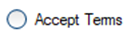


