|
Presets Definition |
|
To aid in the development of grid applications, the NOMADS toolkit supports preset definition records. These presets allow the designer to build a table of properties that can be assigned to columns, rows or individual cells. These are assigned to the grid after it has been created and prior to the execution of the Post Create logic.
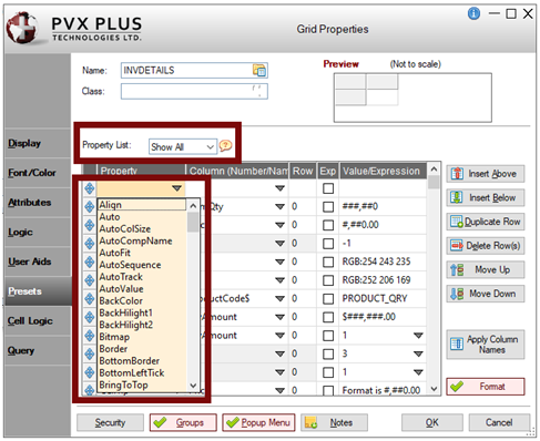
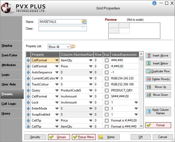
To define presets, select the Presets tab of the Grid Properties dialogue. The Presets tab allows you to define a maximum of 999 preset records, consisting of Property, Column (Number or Name), Row number and Value/Expression.
The Presets tab consists of the following:
|
Property List |
Determines the contents for the Property drop box list (in Presets grid). The selection (if different from the default) is not saved. Click the drop-down arrow for a list of selections:
Example:
(The Property List drop box was added in PxPlus 2019.) | ||||||||||||
|
(Drag and Drop) |
Four-headed arrow button used to drag and drop an individual row to a different location within the Presets grid to change the order of the rows entered. (The Drag and Drop button was added in PxPlus 2019.) | ||||||||||||
|
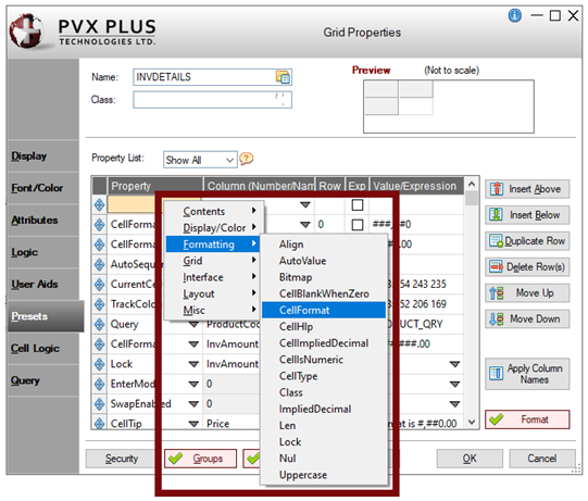
Property |
Use either of the following methods to select a property for formatting specific columns, rows or individual cells:
For selections specific to NOMADS, see Data Classes, Popup Menus, Queries and Auto Complete. (The Property column right-click popup menu was added in PxPlus 2019.) | ||||||||||||
|
Column (Number/Name) |
(Available only if applicable for the selected Property) Value to be placed in the 'Column or 'Column$ property (string or numeric). If 0 (zero) is entered, the defined preset is assigned to all columns. If no column names are assigned in Grid Format Definition (Format button on Attributes tab), then Column (in the Presets tab) uses a "Normal" cell type. If column names are assigned in Grid Format Definition, then Column (in the Presets grid) uses a Variable drop box that is loaded with the assigned column names. Select a column name from the drop box, type a column name, or enter a numeric value. If the column name is not a valid variable, a message is displayed, and you must enter a value. If the column name is a valid variable but does not match any of the known column names, a warning message informs you of the mismatch, and the value is considered valid. Warning messages are displayed only when the column value is initially entered or changed. | ||||||||||||
|
Row |
(Available only if applicable for the selected Property) Value to be placed in the 'Row property. It must be numeric. If 0 (zero) is entered, the defined preset is assigned to all rows. If -1 is entered, the defined preset is assigned to the header row only. | ||||||||||||
|
Exp |
Check box to indicate that the content of the Value/Expression column is an expression. The default (Off) indicates literal/fixed. | ||||||||||||
|
Value/Expression |
Value that will be assigned to the property. If the value is not marked as an expression, click the drop-down arrow to access defaults for the selected property (if applicable). The cell type for this column is determined by the selected property. If a color property, such as BackColor, LineColor, etc., is selected, click the Query button to access Color Selections. | ||||||||||||
|
| |||||||||||||
|
Insert Above |
Adds a blank row above or below the currently selected row for entering a property. (The Insert Above/Insert Below buttons were added in PxPlus 2019.) | ||||||||||||
|
Duplicate Row |
Creates a duplicate of the currently selected row and inserts it below the current row. (The Duplicate Row button was added in PxPlus 2019.) | ||||||||||||
|
Delete |
Removes the currently selected row (i.e. removes the preset record). | ||||||||||||
|
Move Up |
Changes the order of the existing rows entered in the Presets grid. | ||||||||||||
|
Apply Column Names |
(Available only if Column Names exist in Grid Format Definition) If column names are assigned in Grid Format Definition, clicking this button will replace column number settings (Presets grid) with the column name in the Column (Number/Name) column. If no column names are assigned, this button will be disabled. (The Apply Column Names button was added in PxPlus 2019.) | ||||||||||||
|
Format |
Button that launches the Grid Format Definition dialogue for defining grid columns, including Title, Width, Alignment, Cell Type, Column Name and Column Separator. (The Format button was added to the Presets tab in PxPlus 2019.) | ||||||||||||
Using the Presets tab, data classes can be assigned to an entire grid or to individual cells (each is for different purposes) by selecting Class from the Property drop box. The data class assigned to an entire grid is used for NOMADS Object-Oriented Programming, and it is not validated. When assigning a data class to a cell, the data class is selected from the data classes file (providex.dcl) for determining the cell type and properties. See Data Classes.
If the assigned data class is for a Drop Box or a List Box control, the cell will be created as a drop box with information from the data class. If the data class was defined with Load From File functionality, at run time, the drop box will be populated from the pre-defined data source. See Populate from Data Source for information on defining the Load From File functionality.
If the assigned data class is for a Multi-Line control, the cell will be created as a "Normal" text containing one line of data. If a query exists in the data class definition, the cell will be created as a "LookupHideBtn" with a query button that will be hidden except when the cell is selected. If the data class was defined with Extended Class Validation, at run time, when a value is entered, additional table validation will be provided.
(Support for Load From File functionality in Grids was added in PxPlus 2019 Update 1.)
(Support for Extended Class Validation in Grids was added in PxPlus 2019 Update 1.)
A Popup Menu can be assigned to an entire grid or to individual cells through the Presets tab. Select Popup from the Property drop box. Existing popup objects can be assigned.
Assigning an Existing Popup Menu
|
1. |
In the Presets tab, select Popup from the Property drop box, and then enter a Column (Number or Name) and a Row. |
|
2. |
To assign a popup menu, click the magnifying glass button to the right of the Value/Expression cell to launch the Assign Popup Menu dialogue. The value is passed back to the Value/Expression cell once the dialogue is closed. |
A query object can be assigned to an entire grid or to individual cells through the Presets tab. Select Query from the Property drop box. If a query is assigned to a cell, the cell will be created as a "LookupHideBtn" with a default bitmap. This bitmap can be overridden during the query assignment. The existing query objects can be easily assigned to a cell.
Assigning a Cell Query
|
1. |
On the Presets tab, select Query from the Property drop box, and then enter a Column (Number or Name) and a Row. |
|
2. |
To assign a query object, click the magnifying glass button to the right of the Value/Expression cell to launch the Query Display dialogue. This dialogue allows you to assign a Panel or Query Program as the cell query. Regular and Drop queries are supported when assigning a Panel. See Assigning a Query. |
|
3. |
At run time, the query value is passed back to the Value/Expression cell when the query is closed. |
Invoking a Query
The query is invoked by clicking the magnifying glass button to the right of the cell or by pressing Shift - F2. If a cell does not have a designated query, the default query assigned to the grid is invoked. After the query window is closed, the query return value is loaded into the cell and the On Change logic executes (if defined). See Invoking a Query.
The 'TabMode and 'EnterMode properties allow you to control the behavior of these keys within the grid. See Grid Properties.
In NOMADS, these properties can be set through the Presets tab. The following values can be assigned to these properties:
|
|
0 - Normal processing (Tab = exit grid, Enter = edit cell). |
|
|
1 - Move across grid horizontally (exit on last column). |
|
|
2 - Move across grid and wrap to next line. Last cell wraps to first. |
|
|
3 - Move down a row on grid - hold on last row. |
|
|
4 - Move down a row on grid and return to column 1 - hold on last row. |
Holding the Shift key while pressing the Tab or Enter key forces movement in the opposite direction.
Grid Auto Complete allows you to preload individual cells with text entry suggestions. This content is assigned via the Presets tab of the Grid Properties dialogue.
See Assigning Auto Complete Entries.