|
Popup Menu |
|
Popup menus are designed to "pop up" over the current window when you right-click on selected panel controls (buttons, multi-lines, list boxes, etc.). They are much like the drop-down menus appearing on a menu bar, except that they can be placed anywhere on the panel and are only visible when invoked.
The definition of a popup menu is similar to other menus in that you can provide a list of items where each one triggers a different event. While a Menu Bar contains multiple menus and has a fixed location along the top of a panel, popups remain invisible until the user right-clicks on a popup-enabled control.
A system popup menu consisting of extraction, search and print options can also be added to any grid or list box (except Tree Views). See List Box and Grid System Popup Menu.
Unlike standard menus, popup menus do not belong to a specific panel and are considered separate library objects (listed in Library Object Selection with a Type P designation).
The Menu Bar Definition dialogue is used to create and edit popup menu objects. It is invoked from Library Object Selection in a few ways: by clicking the Menu button (if using Toolbar View), by selecting Objects > Popup Menu Object on the menu bar, or by double clicking on a listed popup menu object.
You can also select the Menu Bar Definition task on the IDE Main Launcher.
(The Menu Bar Definition task on the IDE was added in PxPlus 2023 Update 1.)
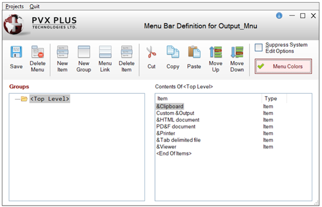
A sample popup menu definition is displayed below:
This dialogue consists of the following:
|
Groups |
Lists the currently defined groups or menu levels. This shows existing <Top Level> menu definitions, if any. If subordinates are added to a menu item, a menu expansion symbol (+) appears next to the menu item. Example: A "&Sales" menu item with the subordinate "&Commissions" would display in the Groups list box as "+ &Sales". |
|
Contents Of |
Lists the sub-menus that belong to a menu's group. This allows you to add subordinates to menu groups (up to eight levels). Double-click on an existing item or group to edit its properties. |
The toolbar consists of the following:
|
Save |
Saves the current menu definition. | ||||||||||
|
Delete Menu |
Deletes the entire menu definition currently selected. | ||||||||||
|
New Item |
Invokes Menu Item/Group Definition for defining a new item. | ||||||||||
|
New Group |
Invokes Menu Item/Group Definition for defining a new group. | ||||||||||
|
Menu Link |
Invokes Menu Link Definition for defining a menu link. | ||||||||||
|
Delete Item |
Deletes a selected menu item or group (same as pressing the Delete key). If selecting a group, its subordinate groups and items are also deleted. | ||||||||||
|
Cut |
Cuts the selected menu item or group (all subordinates included). | ||||||||||
|
Copy |
Copies the selected menu item or group (all subordinates included). | ||||||||||
|
Paste |
Pastes a copied/cut item or group to the highlighted position. Items or groups can be pasted to another level in the same menu bar or to a menu bar on a different panel. If pasting a copied/cut item or group with an Alt key that is currently assigned to an existing item or group, a Duplicate Alt Key dialogue will display to allow a different Alt key to be selected. (The Duplicate Alt Key dialogue was added in PxPlus 2019.) | ||||||||||
|
Move Up/Down |
Changes the order of the selected item or group within the Item list box. | ||||||||||
|
Suppress System Edit Options |
(Multi-Lines Only) Check box to suppress system edit options (i.e. Cut, Copy, Paste, etc.) from the right-click popup menu. | ||||||||||
|
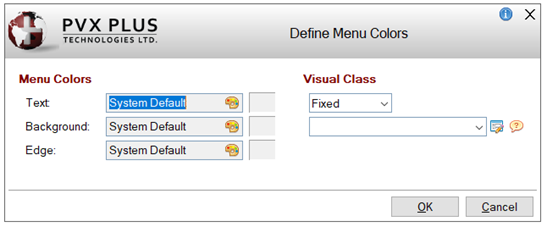
(NOMADS Only) Click this button to invoke the Define Menu Colors dialogue to define menu colors specific to this menu. (The Menu Colors button was added in PxPlus 2024.) See Menu Colors to determine how to define colors and how the various colors are applied at run time. This dialogue consists of the following:
|
Many of these same options and properties are used to create standard menus. To define the menu bar attributes for a panel, see Menu Bar Definition.
You can also create and edit a popup menu via the Panel Designer. See Applying a Popup Menu.
Adding a Popup Menu to a Project
You can also select to add the popup menu to a new or existing project by selecting Projects from the menu bar. The following options are available:
|
Create New Project |
Launches the Create Project dialogue for entering a new project for the current working directory. Click the Query button to select a different working directory. |
|
Add to Project |
Launches the Add to Project dialogue for adding the current task to an existing project that is selected from the Project drop box. To manage all the tasks within a project, see Project Maintenance. For information on adding tasks to a project from other locations, see Adding Tasks to Projects from Other Locations. |
List Box and Grid System Popup Menu