|
Menu Bar Definition |
|
The Menu Bar Definition dialogue is used to define the attributes for a menu bar that will be added along the top of a panel. It is invoked from the Panel Designer by selecting Panel > Menus on the menu bar.
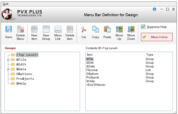
A sample menu bar definition is displayed below:
This dialogue consists of the following:
|
Groups |
Lists the currently defined groups or menu levels. This shows existing <Top Level> menu definitions, if any. If subordinates are added to a menu item, a menu expansion symbol (+) appears next to the menu item. Example: A "&Sales" menu item with the subordinate "&Commissions" would display in the Groups list box as "+ &Sales". |
|
Contents Of |
Lists the sub-menus that belong to a menu's group. This allows you to add subordinates to menu groups (up to eight levels). Double click on an existing item or group to edit its properties. |
The toolbar consists of the following:
|
Save |
Saves the current Menu Bar definition. If the Menu Bar attribute has not been set in the Panel Header definition, a message will prompt you to set this attribute. | ||||||||||||||||||
|
Delete Menu |
Deletes the entire Menu Bar definition currently selected. | ||||||||||||||||||
|
New Item |
Invokes Menu Item/Group Definition for defining a new item. | ||||||||||||||||||
|
New Group |
Invokes Menu Item/Group Definition for defining a new group. | ||||||||||||||||||
|
Menu Link |
Invokes Menu Link Definition for defining a menu link. | ||||||||||||||||||
|
Delete Item |
Deletes a selected menu item or group (same as pressing the Delete key). If selecting a group, its subordinate groups and items are also deleted. | ||||||||||||||||||
|
Cut |
Cuts the selected menu item or group (all subordinates included). | ||||||||||||||||||
|
Copy |
Copies the selected menu item or group (all subordinates included). | ||||||||||||||||||
|
Paste |
Pastes a copied/cut item or group to the highlighted position. Items or groups can be pasted to another level in the same Menu Bar or to a Menu Bar on a different panel. If pasting a copied/cut item or group with an Alt key that is currently assigned to an existing item or group, a Duplicate Alt Key dialogue will display to allow a different Alt key to be selected. (The Duplicate Alt Key dialogue was added in PxPlus 2019.) | ||||||||||||||||||
|
Move Up/Down |
Changes the order of the selected item or group within the Item list box. | ||||||||||||||||||
|
Suppress Help |
Check box to remove the Help menu from the Menu Bar. If not set, NOMADS will use the Help file defined in the Panel Header. | ||||||||||||||||||
|
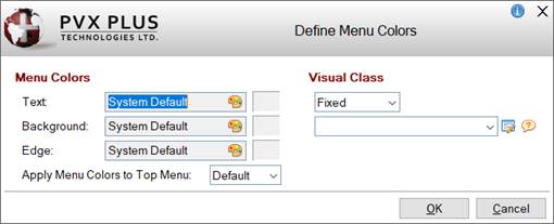
(NOMADS Only) Click this button to invoke the Define Menu Colors dialogue to define menu colors specific to this menu. (The Menu Colors button was added in PxPlus 2024.) See Menu Colors to determine how to define colors and how the various colors are applied at run time. This dialogue consists of the following:
|
After saving a new Menu Bar definition, select the Menu Bar check box on the Attributes tab in the Panel Header definition (if not already selected) to display the menu on the panel.