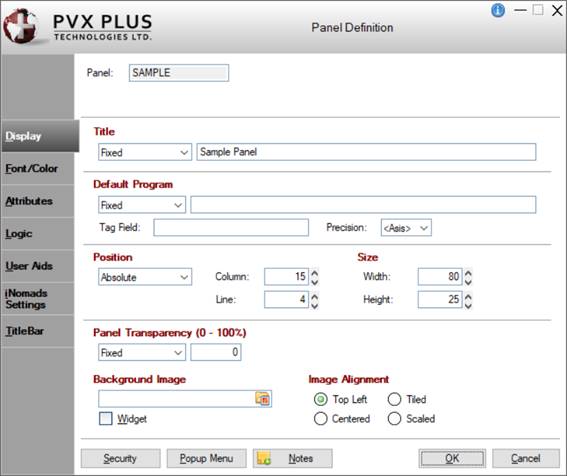
The panel itself can be selected for editing from the Panel Designer by clicking the Header option on the toolbar or selecting Panel > Header from the menu bar. The Panel Definition dialogue (pictured below using the
Folder Style version of the NOMADS Panel Designer) is displayed.
The design properties displayed on each folder panel are explained below.
|
Panel |
Display-only field that contains the name of the panel object. |
|
Last update |
Display-only information consisting of a date stamp and User ID. This information is shown when editing an existing panel. |
|
Display |
|
|
Title |
Panel title to be displayed (Fixed value, string Expression or Message Library Reference). |
|
Default Program |
Default program name to be used for panel and control events (Fixed value or string Expression).
|
Tag Field |
Free-form information field (Fixed value or string Expression). |
|
Precision |
Current precision for panel. If value is set to <Asis>, NOMADS will use the value set by the
Precision directive. | |
|
Position |
Determines where the panel is placed on the desktop.
NOMADS provides the capability for the system to remember where a panel was last placed and will attempt to restore it to the same position. See
Panel Persistence.
Click the drop-down arrow for a list of selections: Absolute, Relative, Centered.
|
Absolute |
(Default) The panel will be positioned on the current monitor at the Column and Line specified. The current monitor will be the main monitor for the initial screen or the monitor in use if you currently have a panel/window being displayed. |
|
Relative |
The panel will be positioned using the Column and Line values as relative positions based on the current panel/window being displayed. If no window is displayed, then the position will be relative top of the screen. Note:
There is almost always a window logically present even if it is minimized, as PxPlus creates a main window during start up and preserves its last location automatically. |
|
Centered |
The Column and Line values are ignored. The panel is displayed as centered on the current display. |
Specify the starting Column and Line values of the panel:
|
Column |
Starting column for the top left corner of the panel - numeric expression. Format mask is -##0. Valid entries are -620 to 620. |
|
Line |
Starting line for the top left corner of the panel - numeric expression. Format mask is -##0. Valid entries are -255 to 255. |
(Support for increased Column and Line maximums was added in PxPlus 2021.) |
|
Size |
|
Width |
Width of the panel in number of columns - numeric expression. Format mask is ##0. Valid entries are 2 to 620. |
|
Height |
Height of the panel in number of lines - numeric expression. Format mask is ##0. Valid entries are 3 to 255. | Note:
If adding an Info message to the panel to display pertinent user information, the height and/or width will need to be adjusted to accommodate this.
To view a video presentation on how to add an informational message to a panel, go to
How to Add an Info Message.
(Support for increased Width and Height maximums was added in PxPlus 2021.) |
|
Panel Transparency (0 - 100%) |
(NOMADS Only)
Percentage transparency for the current window. A value of "0" indicates completely opaque. A value of "100" is completely transparent. |
|
Background Image |
(NOMADS Only)
Name of the picture (Fixed or string Expression). Click the Bitmap Library button to select a bitmap from the Bitmaps dialogue.
|
Widget |
Panel is to be used as a Widget with the panel's defined background color transparent. Generally, a bitmap is associated with the panel. | |
|
Image Alignment |
Alignment options for the background image. Available selections are Top Left, Centered, Tiled, Scaled. |
|
Font/Color |
|
|
Font Specification |
|
Font
Size |
Click the drop-down arrow for a list of selections. | |
|
Alignment |
Sets the defaults for Fonted Text on the panel.
|
Align |
Alignment for Fonted Text objects on the current panel. Selections are Left Justify, Center, Right Justify. |
|
Word Wrap |
Wraps text. Sets the Word Wrap option for Fonted Text. |
Note:
Alignment, Word Wrap and Attributes such as Bold, Italics, Underline All Characters and Underline &'d Characters will apply to controls on the panel that are currently defined with default settings (i.e. Left Justify, no Word Wrap and ANSI Characters). These settings will also override the settings in
Library Defaults. | |
|
Color |
(NOMADS Only)
|
Foreground
Background |
Click the Query button to access
Color Selections. Valid formats for color selections include predefined system colors (e.g. Light Red), Custom (RGB codes), HTML Hex Color Codes, User Defined colors (e.g. Color17) and string Expressions. |
(The Color Selections Query button and dialog were added in PxPlus 2020.) |
|
Attributes |
Optional attributes for Bold, Italics, etc. |
|
Mnemonics |
Sets the character-based attributes for Standard Text on the panel.
|
Inverse Video ('BR') |
See
'BR' mnemonic. |
|
Underscore ('BU') |
See
'BR' mnemonic. |
|
Background ('SB') |
See
'BR' mnemonic. | |
|
Theme |
Assign a Theme to be applied to the panel. The Theme can be defined as a Fixed value or string Expression.
Click the Theme Maintenance button to launch the
Themes Maintenance utility for creating and editing Themes.
Click the drop down arrow to select an existing Theme. Theme names that begin with an "*" (asterisk) are predefined Themes used by PVX Plus and may be subject to change without notice. Note:
A Theme applied at the Panel level overrides the General level Theme set in %NOMADS'Theme$ and the Library level Theme assigned in Library Defaults.
A Theme assigned to the %NOMADS'ThemeOverride$ property overrides all other Theme settings but does not override the NOMADS
Toolkit Theme. See Applying a Theme to Your Application.
(Theme support was added in PxPlus 2017.)
(The Theme Maintenance button was added in PxPlus 2019.)
(The ability to select a predefined PxPlus Theme was added in PxPlus 2024.) |
|
Attributes |
|
|
Attributes |
|
Dialogue |
Default type when a new panel object is created. The panel object is created as a freestanding dialogue box and is not constrained by the main PxPlus window. See
Note at the bottom of this page. |
|
Child Window |
Window is a child of the current window. See
Note at the bottom of this page. |
|
Suppress.VAL |
If this option is Off, a suffix of .VAL$ or .VAL (numeric controls) will be added to all control names. |
|
Always on Top |
Panel is displayed on top of any other open windows. |
|
Menu Bar |
Panel has a menu bar. To define a menu bar, see
Menu Bar Definition. |
|
No Windows Title Bar |
Panel is drawn with no Windows title bar displayed. |
|
Status Bar |
Panel will be created with a status line/message bar. |
|
Status Bar Segments |
(NOMADS Only - Available when Status Bar check box is selected)
Define up to three additional (optional) status bar segments for the current panel by clicking the button next to the input control and entering the starting column number for the segment. The default segment (0) starts at column 0. Additional segments can be defined with a positive column number to specify the starting column from the left, or a negative column number to specify the start of a segment from the right. Display text in the individual segments using the
'MESSAGE' mnemonic.
Example:
PRINT 'MESSAGE'(text$,segnum)
Where:
The first segment number is 0.
If the Status Bar attribute is checked and no segments are defined, the system status bar will be used. If segments are defined for the panel, they will override the system definition. Note:
Use the
'MESSAGE' mnemonic to define a system status bar. |
|
Minimize Box |
Enables the minimize box in the top right corner of the window. |
|
Maximize Box |
Enables the maximize box in the top right corner of the panel. |
|
Close Box |
Enables the Windows close button at the top right corner of the panel. |
|
Synchro-Lock |
Snap position to match top lines when moved close to the top corners of the current panel. |
|
Auto Refresh |
The screen display is refreshed automatically when any control values are changed by the application. |
|
Auto Close Files |
If enabled, all non-global files opened by the application are closed automatically when the panel terminates. |
|
Size Adjustment |
Input objects (Multi-Lines, Drop Boxes, List Boxes and Grids) can be resized at run time by dragging their edges. See
Resizing Input Controls. Note:
Size Adjustment is not compatible with Full Screen Drag (see below). |
|
Full Screen Drag |
(Applicable to "Dialogue" Panels)
If selected, a panel can be moved by clicking anywhere on the panel outside of the controls (as well as on the title bar) and dragging the panel to the desired location. This setting overrides the
%NOMADS'Full_Screen_Drag property and the Full Screen Drag setting in
Library Defaults.
Available selections are:
|
Default |
Use the default setting based on the
%NOMADS'Full_Screen_Drag property and the Full Screen Drag setting in
Library Defaults. |
|
Always on |
The panel will always have the Full Screen Drag feature turned On, regardless of default settings. |
|
Always off |
The panel will always have the Full Screen Drag feature turned Off, regardless of default settings. | Note:
Full Screen Drag is not compatible with Size Adjustment (above).
(The Full Screen Drag option was added in PxPlus 2016 and enhanced in PxPlus 2017.) |
|
Panel Persistence |
Controls the ability to suppress
Panel Persistence at the panel level. Available selections are:
|
Default |
Panel persistence is based on
%NOMADS'Panel_Info_Prog$ and
%NOMADS'RelPnl_Suppress_Persistence settings. Note:
The %NOMADS'RelPnl_Suppress_Persistence property applies only to panels with Position set to Relative. |
|
Suppress persistence (location & size) |
Persistence for the panel is turned Off. |
|
Suppress location persistence only |
If panel persistence is turned On, this setting causes the size of the panel to persist but places the panel in a location based on the original panel definition. |
(The Panel Persistence option was added in PxPlus 2019.) | |
|
Parameters |
|
Sizing |
Determines whether the panel will remain fixed in size or can be resized at run time by dragging the edges of the window. Click the drop-down arrow for a list of selections: Fixed, Resizable, Resizable/Auto Scroll, Resizable/Auto Size, Resizable/Custom. Note:
To make it possible for users to resize a panel larger than the defined size while still maintaining a minimum panel size, select the Maximize Box attribute and set the Sizing parameter to Resizable/Custom. |
|
Frame Style |
(NOMADS Only)
Controls the type of frame or border for the current window. Click the drop-down arrow for a list of selections:
|
Default |
Uses current settings. The standard Windows title bar is displayed. |
|
Thick border with caption |
Adds a thick border and a caption to the current window. The standard Windows title bar is displayed. |
|
Thick with no caption |
Adds a thick border to the current window but no caption. The standard Windows title bar is not displayed. |
|
Thin with no caption |
Adds a thin border to the current window but no caption. The standard Windows title bar is not displayed. |
|
No frame or caption |
Does not add a border or a caption. The standard Windows title bar is not displayed. |
For information on the use of the Frame Style parameter when creating a custom title bar, see
Custom Title Bars. |
|
Enter = Tab |
Determines behaviour of the <Enter> key. Click the drop-down arrow for a list of selections:
|
Default - Use %NOMAD_ENTER_TAB |
|
On - <Enter> key behaves like <Tab> key (Focus moves to the next control and 'On Change' only fires if the value has changed.) |
|
Off - <Enter> fires 'On change' and maintains focus | | |
|
Logic |
|
|
Default Program |
(NOMADS+ and Folder Style)
Displays the name of the
Default Program (from the Display tab).
(The Default Program on the Logic tab was added for display in PxPlus 2019.) |
|
Pre-Display |
Logic to process before the panel is drawn. Click the drop-down arrow for a list of selections. See
Events Logic.
Click the Program Logic button beside the Perform or Call action to launch the default program editor, which is typically the
*IT - Integrated Toolkit. To make
Ed+ the default program editor, change the setting for the
%NOMADS'Program_Editor property to Ed+.
(The ability to set Ed+ as the default program editor was added in PxPlus 2023.) |
|
Post-Display |
Logic to be processed after the panel and all the controls are drawn. Click the drop-down arrow for a list of selections. See
Events Logic.
Click the Program Logic button beside the Perform or Call action to launch the default program editor, which is typically the
*IT - Integrated Toolkit. To make
Ed+ the default program editor, change the setting for the
%NOMADS'Program_Editor property to Ed+.
(The ability to set Ed+ as the default program editor was added in PxPlus 2023.) |
|
On Exit |
Logic to be executed before the panel is closed. Click the drop-down arrow for a list of selections. See
Events Logic.
Click the Program Logic button beside the Perform or Call action to launch the default program editor, which is typically the
*IT - Integrated Toolkit. To make
Ed+ the default program editor, change the setting for the
%NOMADS'Program_Editor property to Ed+.
(The ability to set Ed+ as the default program editor was added in PxPlus 2023.) |
|
On Timer |
Implement a timer to run while the panel is active. Select the Define button to enter a definition that consists of a timer duration (in seconds) and logic to execute when the timer event occurs. When another panel, msgbox, etc. is invoked, the timer is suspended until the original panel is active again. Note:
The existing timer logic using the %NOMAD_Timeout variable and User CTL -1900 is still supported. |
|
User Aids |
|
|
Help Reference |
|
Type |
Available selections are: |
|
|
External |
Standard windows Help system consisting of a Help file name and an optional keyword or reference number (Fixed or Expression). |
|
|
Internal |
Application supplied message text (Fixed value, string Expression or Message Library Reference). |
|
|
Wiki |
Generates Help documentation directly from a NOMADS panel and displays it in the PxPlus Wiki. See
NOMADS Wiki Help. In the Wiki Page field, enter a title for the Wiki page (defaults to the name of the panel). Can be a Fixed value or a string Expression. |
(The Wiki option was added in PxPlus 2023.) |
|
Message Bar |
Text to be displayed in the panel's status bar when focus is on the control (Fixed value, string Expression or Message Library Reference). |
|
iNomads Settings |
|
|
iNomads Class |
The iNomads class contains class attribute references associated with the panel in the HTML code generated in iNomads. An iNomads class reference must start with an alpha character (A-Z or a-z), followed by any combination of A-Z, a-z, 0-9, underscore or dash. Multiple references may be entered, separated by a space.
For a list of predefined classes, see
iNomads Classes.
(The iNomads Class option was added in PxPlus 2016.) |
|
iNomads Template |
If specified, the iNomads template will be applied to the panel, overriding the template specified for the session. See
iNomads Templates.
(The iNomads Template option was added in PxPlus 2016.) |
|
TitleBar |
|
|
TitleBar Option |
(NOMADS Only)
Set the TitleBar option for the panel. See
Custom Title Bars.
Available selections are:
|
Default |
Use the current default Title Bar setting for the panel based on the
%NOMADS'TitleBar$ and
Library Defaults settings. |
|
TitleBar |
Use the panel defined in Panel Information as the title bar for the panel. |
|
None |
The panel will not have a title bar. | Note:
The TitleBar and None settings override the system-wide setting in %NOMADS'TitleBar$ and the Library setting in Library Defaults.
(TitleBar Option was added in PxPlus 2017.) |
|
Panel Information |
(Available when TitleBar Option is TitleBar)
|
Fixed or Expression |
The Custom Title Bar panel information can be entered as a Fixed value or as an Expression:
|
|
If Fixed, enter the Library and Panel information (see below). |
|
|
If the information is an Expression, select Expression from the drop-down list and enter an expression that can be evaluated to a value consisting of the panel name and library, separated by a comma; e.g. PanelName,LibraryName. | |
|
Library |
Enter the path to the library containing the Title Bar panel definition. Click the drop-down arrow for a list of recently used libraries. Click the Browse button to look through the directory structure to find the library. Be sure to use the simplest form of the path for your application. Note:
The Library name may be a specific or generic reference. See Cascading Language Suffixes. |
|
Panel |
Name of the panel definition to use as the Title Bar for the panel. Click the drop-down arrow for a list of all panels in the library. |
(Panel Information was added in PxPlus 2017.) |
|
|
|
|
Security |
Assign security classifications and access levels for the panel header. See
Restricting Access for information on Object Security Definition. |
|
Popup Menu |
Associate a floating menu that will appear when right clicking the mouse over a control or a blank area on a panel. Valid formats are a NOMADS popup object or a user-supplied program (Fixed value or string Expression). See
Popup Menu. |
|
Notes |
Add notes/comments for the panel. Maximum 1024 characters. These notes also display in the Wiki Help documentation for the panel. See
NOMADS Wiki Help. |