NOMADS Graphical Application
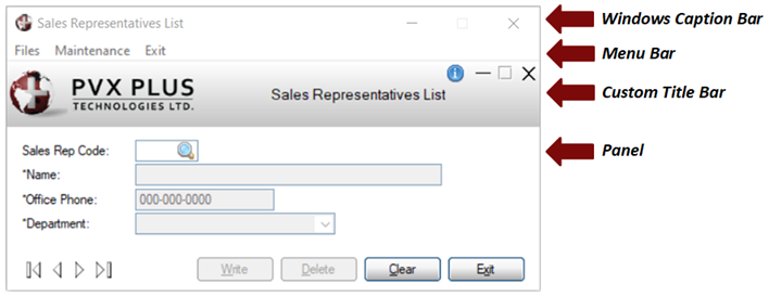
The standard Windows title bar is a horizontal bar located at the top of a panel that displays the panel title. It may also provide an application icon to access the system menu, as well as buttons to minimize, maximize/restore and close the application. Title bars are also draggable, allowing the panel to be moved by clicking and dragging the title bar.
The NOMADS Custom Title Bar feature, added in PxPlus 2017, allows you to design your own title bar to customize the look and feel of your application. It can be a simple header with logos, text, shapes and special controls added at the top of your panel below the Windows title bar and menu. You can suppress the Windows title bar entirely and create your own system menu, minimize, maximize/restore and close buttons. You can specify different custom title bars for different modules in your application or even for different panels. You can also specify which modules or panels should not use the custom title bar.
Title bars can be added system wide, to a library or to a panel. You can suppress the title bar at the library and panel levels. See
Assigning Custom Title Bars.
For information on creating a custom title bar, see
Creating a Custom Title Bar.
|
|
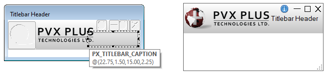
Panel with Custom Title Bar (Frame Style = Thin with no caption)
(Custom Title Bar feature was added in PxPlus 2017) |
This is an example of a custom title bar that suppresses the Windows title bar by using a Thin with no caption frame style, displays the company logo and panel caption on a gradient background, and provides its own Minimize, Maximize/Restore and Close buttons.
The image of the globe is on a button that invokes the system menu.
An information button has been added to provide Help.
The title bar is automatically stretched horizontally to fit the current panel being displayed.
Because there is no Windows title bar, full screen dragging is turned On to allow the panel to be moved using the mouse.
Like Windows, the panel caption that is displayed will also show in the Windows task bar. |
Custom title bars can be easily added to all panels that meet the required criteria. Title bars will not be displayed on panels that:
- have been defined as Widgets.
- have Auto-Scroll Resizing set.
- are concurrent windows.
- are not wide enough to display the title bar or have been specified to not display a title bar.
Title bars can be added system wide, to a library or to a panel. You can suppress the title bar at the library and panel levels. See
Assigning Custom Title Bars.
Note:
The Custom Title Bar feature is exclusive to NOMADS. iNomads makes use of
Templates to create a similar appearance.
A custom title bar consists of a panel similar to an
Embedded Panel with its contents placed at the top of the panel being displayed. Unlike the embedded panel, however, it does not have to be physically included in the definition of the panel on which it is displayed. At run time, all the controls on the title bar panel will appear at the top of the current active panel.
Creating a custom title bar is much like defining any panel. When defining a title bar panel, you can specify a default program and logic events in the panel header. The controls on the title bar can include any of the
Control Types available in the NOMADS Panel Designer (Button, Multi-Line, Drop Box, etc.). Some special considerations need to be observed when defining the custom title bar panel, as not all features are applicable, e.g. menu bars, status bars, etc.
The following sections outline the details to consider when defining the Panel Header,
Controls and
Resizing aspects of the custom title bar.
Panel Header
Many of the settings in the
Panel Header are ignored, as these are supplied at run time by the current panel being displayed.
The table below describes the Panel Header settings that are used. Special note should be taken regarding the use of the Frame Style parameter on the
Attributes tab.
|
Display |
|
Default Program |
Name of program to supply logic for events triggered by controls on the title bar. |
|
Attributes |
|
Parameters |
|
Frame Style |
The Frame Style of the title bar panel determines the frame style for all panels on which the title bar is displayed.
The exception is if the current panel being displayed is defined as a Window and not as a Dialogue. In this case, the standard Windows title bar with a caption will be used, as a Window does not support full screen dragging, and the captioned Windows title bar is required to move the panel.
Available selections are:
|
Default |
Uses current settings. The standard Windows title bar is displayed. In addition, full screen drag is implemented in non-WindX environments. |
|
Thick border with caption |
Adds a border and a caption to the current window. The standard Windows title bar is displayed. |
|
Thick with no caption |
Adds a thick border to the current window but no caption. The standard Windows title bar is not displayed. See
Custom Title Bar Display. |
|
Thin with no caption |
Adds a thin border to the current window but no caption. The standard Windows title bar is not displayed. See
Custom Title Bar Display. |
|
No frame or caption |
Does not add a border or a caption. The standard Windows title bar is not displayed. See
Custom Title Bar Display. | Note:
If a Frame Style with no caption is selected, the standard Windows title bar will not display. However, special control names and logic are available to process the minimize, maximize/restore, close and system menu buttons. See
Controls.
In addition, when no caption is selected, full screen drag is used, which is not recommended in a WindX environment. | |
|
Logic |
|
Pre-Display |
Executes after the Pre-Display logic for the current panel and prior to the controls on the title bar being drawn. |
|
Post-Display |
Executed after the controls on the title bar are drawn and before the controls on the current panel are drawn. |
|
On Exit |
Executes prior to the On Exit logic of the current panel. |
Controls
The controls on the title bar can include any of the
Control Types available in the NOMADS Panel Designer. They must have unique names to avoid any confusion with duplicate control names.
Important Note:
The names below must be used with your buttons so that they will be processed automatically by the system. The system will also determine which of the buttons should be hidden/shown/enabled/disabled based on the settings for the current panel being displayed.
Special control names are available, which are listed below, to process the minimize, maximize/restore, close, and system menu buttons, as well as a special Fonted Text control name to display the panel caption. When the specified names are used for the buttons, they will be processed automatically by the system, which supplies the logic to process them and determines which of the buttons should be hidden/shown/enabled/disabled based on the settings for the current panel being displayed.
(Support to automatically set the logic for Custom title bar standard variables was added in PxPlus 2019.)
|
Control Name |
Control Type |
Description |
|
Px_TitleBar_Caption |
Fonted Text |
Automatically sets and updates the panel caption. |
|
Px_TitleBar_Close |
Button |
Panel Close button. |
|
Px_TitleBar_Max |
Button |
Maximize/Restore button. Unlike the standard Windows button that changes images based on the window state, this button supports only one image. |
|
Px_TitleBar_Min |
Button |
Panel Minimize button. |
|
Px_TitleBar_SysMenu |
Button |
System Menu button. The system menu consists of the Restore/Move/Size/Minimize/Maximize/Close options that are usually associated with the Application icon in the upper left corner of the standard Windows title bar. |
Note:
While offering all the standard title bar buttons makes it easier for the end user, the system menu contains all the options offered by the minimize, maximize/restore and close buttons, making it possible to eliminate these buttons in your title bar design.
Furthermore, the system menu button could even be eliminated, as the system menu is available by using the Alt-Spacebar keyboard shortcut, making all the options accessible without using a mouse.
If you use your own names for the standard controls, you will have to supply your own logic for processing. In addition, you will have to hide/show/enable/disable the appropriate buttons, depending on the settings for the panel being displayed.
If you want to use a colored background on your title bar with transparent buttons, be sure to use the 4D Visual Effect for your application. This can be set in
Library Defaults (Display tab), or you can set the
%NOMADS'Visual_Override property to 4.
Resizing
At run time, the title bar will be stretched horizontally to span the panel being displayed. Therefore, the title bar panel should be defined as Custom Resize, and the various controls that should be extended horizontally should be set to Stretch. The other Fixed Size controls can be anchored to a side or left to float. The title bar will not grow vertically.
Important Note:
Due to the method used to implement the Stretch logic on embedded panels and title bar panels, extra care must be taken as to the location of the start and end points of any control you want to stretch.
A control whose start/end points span the halfway point of the title bar panel behaves differently than if its start/end points are contained wholly within the left or right half. In the first case, the control will stretch with the start/end points remaining relative to the sides of the panel.
Custom title bars can be assigned at several hierarchical levels within an application, which allows you to customize different aspects of your application and give each one its own unique look and feel. You can also use the same hierarchical levels to prevent panels from displaying the title bar.
These hierarchical levels are:
|
Level |
Description |
|
General |
Assign a title bar panel to the
%NOMADS'TitleBar$ property to apply the title bar system wide. The title bar is assigned by specifying the panel name and library name, separated by a comma.
Example:
%NOMADS'TitleBar$="TitleBarHdr,mylib" |
|
Library |
Assign a title bar in
Library Defaults to apply a specified title bar to all panels in the library. This allows you to have a different look and feel for different aspects of your application. You can also set the Library option to prevent the panels in that library from displaying title bars set at the General level. Note:
The Library title bar setting overrides the General title bar setting. |
|
Panel |
Assign a title bar in the
Panel Header to apply a specified title bar to that panel or to prevent the panel from displaying any title bar. Note:
A Panel title bar setting overrides General and Library title bar settings. |
Important Note:
If a title bar has been assigned using any of the above methods, it will not be displayed on panels that:
have been defined as Widgets.
have Auto-Scroll Resizing set.
are concurrent windows.
are not wide enough to display the title bar. |
When a custom title bar is used, it is displayed above the contents of the current panel being displayed. The title bar is stretched horizontally to fill the width of the panel.
If a standard Windows title bar with a caption is used, this will be displayed at the very top of the panel, followed by the menu bar (if one has been defined for the current panel), followed by the custom title bar, and finally, the contents of the current panel.
Example:
If the standard Windows title bar is replaced using a caption-less
Frame Style, certain Windows behaviours that are dependent on the caption bar will no longer be available or will be available in a different format. For example, the custom title bar will have no indication to show which panel is active, unlike the Windows caption bar that is dimmed when inactive. In addition, double-clicking the custom title bar will not maximize/restore the panel, nor will moving the panel against the top of the screen. Finally, moving the panel by clicking and dragging the Windows caption bar will be replaced by implementing
Full Screen Drag, which allows you to move the panel by clicking and dragging any blank area of the panel.
Note:
The position of the menu bar also changes when a caption-less frame style is used. In this case, the menu bar is the displayed at the top above the custom title bar. To move the panel, you can click and drag the empty area to the right of the menu bar.