|
Creating Panel Controls |
|
Controls are the graphical components within a panel that allow users to interact with an application. Below is a list of the Types of Controls that can be added to a panel using the NOMADS Panel Designer. Various attributes, settings and logic can also be applied to controls in the Panel Designer.
The number of controls that can be placed on a panel is limited and can range from 1 to 999, depending on various factors. See Maximum Number of Controls.
The Panel Designer can be invoked from the Library Object Selection window. Use the Designer menu to select which version of the Panel Designer to use when creating and modifying panels: NOMADS+ Toolbar, Folder Style or Property Sheets.
The Panel Designer includes a Controls toolbar, which is a collection of creation tools that can be used when adding controls to any panel. For a description of each tool, see Controls Toolbar.
To create a control:
|
|
1. |
Click the appropriate tool in the Controls Toolbar or select the Controls menu. |
|
|
2. |
Draw the control on the panel by holding down the left mouse button, dragging the dotted outline to the desired size and releasing the mouse button. The control's Properties window displays. |
|
|
3. |
Enter the associated logic and set other design properties as needed. |
Dynamic Control Properties
PxPlus 2018 introduces the capability to create dynamic control properties for individual controls. When combined with Data Classes, dynamic control properties are ideally suited for data elements with similar properties in an application (i.e. dates, numeric codes, descriptions or lists of values).
Dynamic control properties are available for Multi-Lines, Drop Boxes, List Boxes and Check Boxes.
See Dynamic Control Properties for information and examples.
The table below lists the types of controls that can be created. Use the links provided to access details on how to define a specific control type.
|
Control Type |
Description |
|
Creates a box or frame that is used to visually group sections of a panel (e.g. to draw a frame around all the controls used for shipping data). | |
|
Creates a button that is usually defined to send a signal to the application to perform a specific action. | |
|
Used to define two- and three-dimensional chart illustrations from the following available chart types: Area, Bar, Column, Line, Pie, Ribbon, Scatter, Stack, Donut and Gauge. | |
|
Creates a button-type control that allows users to toggle between two states (i.e. On/Off), as well as an optional third state (Tri-State control). | |
|
Creates a control that allows you to integrate external components produced by third-party vendors into your Windows-based PxPlus application (e.g. progress bar, spreadsheet, browser or calendar). The types of external controls that can be created are Chromium Browser, ActiveX Controls, PVX Plus Controls and .NET Controls. (The Chromium Browser Object was added in PxPlus 2017.) | |
|
Displays initially as a single line control with a down arrow that, when clicked, presents a drop down list with predefined items for selection. | |
|
Similar to a Drop Box control but with the added capability of allowing variable input, which means that users can either click on the down arrow to select from the drop down list or manually enter a different value not in the list. | |
|
Allows the contents of a different panel to be placed at a location within the current panel. For example, you may have a common format for a set of First, Prior, Next and Last navigation buttons. Rather than recreating these controls on multiple panels, you can create them once in one panel, and then embed the contents of that panel into all the panels that need them. You only need to edit the source panel to have the changes occur wherever those controls are embedded. | |
|
Allows panels to be set up so that they appear as layered file folders to give users easy access to different sub-panels within the window. | |
|
Used to create labels or titles to describe how controls are to be used in your panel. | |
|
Creates a grid control with a spreadsheet-style input format. | |
|
Used to insert a bitmap or multimedia image in a panel (e.g. company logo, product diagram or photograph). | |
|
Creates a control that allows users to make a selection from a displayed predefined list. | |
|
Similar to a Standard List Box control but with the added capability of allowing variable input, which means that users can either select from the list box or manually enter a different value not in the list. | |
|
Creates a menu bar that lists user options/controls or provides quick access to other areas or modules in the application. | |
|
Creates a control that is used to enter one or more lines of text. | |
|
Creates a popup menu that is designed to "pop up" over the current window when you right-click on selected panel controls. | |
|
Creates a group of related radio button controls, each representing one possible value for the variable the group represents; however, only one button can be selected at a time. | |
|
Creates slider controls that can be used to create a spinner control, progress bar or volume slide for a panel object. | |
|
Used to draw basic graphics, such as Arc, Circle, Line, Pie, Polygon and Rectangle, directly on a panel. |
Data Classes can be placed as controls on a panel. When the control is drawn, the control properties are loaded with information from the selected data class. After that, adjustments can be made to particular properties, if necessary.
To create a control from a data class, use either of the following methods:
Method 1:
(Use with Multi-Lines, Drop Boxes, List Boxes and Check Boxes)
|
|
1. |
Click the appropriate tool in the Controls Toolbar or select the Controls menu. |
|
|
2. |
Draw the control on the panel. |
|
|
3. |
In the control's Properties window, enter a defined data class in the Class field by clicking the Query button (binoculars), typing the name of an existing data class for the control type, or creating a data class on the fly by entering a new Class name. |
|
|
4. |
The control's properties are loaded with the information from the data class. |
Method 2:
(Use with Multi-Lines, Drop Boxes, List Boxes, Radio Buttons and Check Boxes)
|
|
1. |
In the Controls Toolbar, click the Class button (or Query down arrow) to display a list of defined data classes. |
|
|
2. |
Select a data class. |
|
|
3. |
Draw the control on the panel. See Radio Button Data Class Controls below. |
|
|
4. |
The control's properties are automatically loaded with information from the data class. |
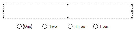
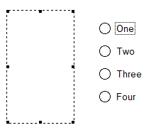
Radio Button Data Class Controls
When drawing a Radio Button data class control in the Panel Designer, the placement of the radio buttons is determined by the height and width of the control when it is drawn.
If the height of the control is greater than its width, the radio buttons will be stacked vertically.
If the width of the control is greater than its height, the radio buttons will be placed horizontally side by side.
(Radio buttons placement was added in PxPlus 2018.)
Data Elements can be placed as controls on a panel. When the control is drawn, the control properties are loaded with information from the selected data element. After that, adjustments can be made to particular properties, if necessary.
To generate a fonted text label for a data dictionary Element control (except Check Boxes and Radio Buttons) when the control is drawn on the panel, select the Incl. Label check box (if using NOMADS+ toolbar, select Include Element Label check box) or the Create Label For Dictionary Element menu option.
(The Incl. Label check box was added in PxPlus 2018 Update 0001.)
To create a control from a data element, use either of the following methods:
Method 1:
|
|
1. |
In the Controls Toolbar, click the Element button (or Query down arrow) to display a list of all elements for all dictionary files. |
|
|
2. |
Select an element. |
|
|
3. |
Draw the control on the panel. See Note below. |
|
|
4. |
The control's properties are automatically loaded with information from the element. |
Method 2:
(Similar to Method 1 except a dictionary file is selected first)
|
|
1. |
In the Controls Toolbar, click the File button (or Query down arrow) to display a list of dictionary files. |
|
|
2. |
Select the dictionary file containing the desired element. |
|
|
3. |
Click the Element button (or Query down arrow) to display a list of the elements in the selected file. |
|
|
4. |
Select an element. |
|
|
5. |
Draw the control on the panel. See Note below. |
|
|
6. |
The control's properties are automatically loaded with information from the element. |
A simple panel can have a maximum of 999 interactive controls. Interactive controls include Buttons, Check Boxes, Radio Buttons, List Boxes, Drop Boxes, Scrollbars, Grids, Charts, Folders and External Controls.
Non-interactive controls, such as Fonted Text, Images, Shapes and Frames, are not counted in the maximum limits.
If the panel has a Folder control, the maximum of 999 applies to both the controls on the main panel plus the controls on the currently active Folder panel. Any controls on an Embedded Panel or Title Bar are also included.
Concurrent Panels can have a maximum of 199 interactive controls per panel. If the parent panel has less than 200 controls, a maximum of four active concurrent panels is allowed. Between 200 and 399 controls on the main panel reduces the maximum number of active concurrent panels to 3, and so on such that a main panel with over 800 controls supports no active concurrent panels.
The invocation of a concurrent panel reduces the maximum number of controls allowed on the main panel by 200 for each concurrent panel that is active. With no active concurrent panels, the main panel, in conjunction with an active Folder, can have a maximum of 999 interactive controls. With one active concurrent window, the maximum is reduced to 799. With two active concurrent windows, the maximum is reduced to 599, and so on until four active concurrent windows reduce the maximum number of controls allowed on the main panel to 199.
(Support to increase the maximum number of controls on a panel was added in PxPlus 2021.)