|
List Box Type |
|
The style of the List Box is determined by selecting a List Box Type:
|
|
Used to review and access a single column of data. | |
|
|
Used to define multiple columns, line breaks and other formatting. | |
|
|
Produces vertically wrapping columns (with optional bitmaps) where only the first element of each record is displayed. | |
|
|
Displays multiple data elements in a tabular list with the use of headings and other attributes. | |
|
|
Provides a tree-like structure view with optional bitmaps. |
Depending on the type selected, the contents of the List Box Properties dialogue changes to represent the options available for that particular style of List Box.
A system popup menu consisting of extraction, search and print options can also be added to any Grid or List Box except Tree Views. See List Box and Grid System Popup Menu.
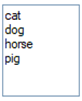
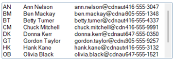
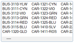
For the List Box Type, select Standard. The Standard List Box allows users to review and access a single column of data.
Example:
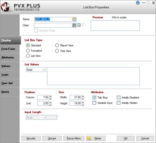
When creating or editing a Standard List Box control, the List Box Properties dialogue (pictured below using the Folder Style version of the NOMADS designer) is displayed:
Dynamic Control Properties
PxPlus 2018 introduces the capability to create dynamic control properties for List Box controls when combined with Data Classes. Dynamic data classes are created by selecting the Dynamic check box in Data Class Definitions maintenance. At run time, dynamic control properties are evaluated and automatically populated with values based on what is defined in the data class.
When a data class is entered for the List Box control, information from the data class is loaded into the List Box properties. If the data class is dynamic, the dynamic control properties are automatically set to Dynamic initially and assigned a %NOMADS'class' variable that corresponds to a data class field (i.e. %NOMADS'class'length).
List Box control properties designated as dynamic can be manually switched to dynamic or non-dynamic. A List Box control can have a combination of dynamic and non-dynamic control properties only when a data class is entered.
See Dynamic Control Properties for information and examples.
This dialogue is divided into the following tabbed panels for viewing and/or changing List Box properties: Display, Font/Color, Attributes, Values, Logic, User Aid and Query.
|
Name |
Unique name of the List Box control (NOMADS provides a default). Naming conventions for variables apply. Click the Browse Library button to copy parameters from an existing object (via the Library Browse dialogue). Note:
| ||||||||||||||||||||||
|
Class |
Enter a Data Class to load the information from the data class definition into the control's properties. If using Property Sheets, click the Data Class button and enter a data class in the Data Class Options dialogue. (The Data Class Options dialogue was added in PxPlus 2018.) To enter a data class, use any of the following methods:
If the data class is changed, a message will display prior to overwriting any information. This works similar to using the Reapply Data Class button. If the data class assigned to the control is deleted in Data Class Definitions, the text ** Class not on File ** will display (will be a message box if using Property Sheets). (Dynamic data classes and properties were added in PxPlus 2018.) | ||||||||||||||||||||||
|
(Data Class Maintenance) |
Click this button to launch Data Class Definitions for creating or editing a data class. If using Property Sheets, click the Data Class button, then click the Data Class Maintenance button in the Data Class Options dialogue. (The Data Class Options dialogue was added in PxPlus 2018.) | ||||||||||||||||||||||
|
(Available when a data Class is entered) Click this button to update control properties with current information from the selected data class. A message displays before any control properties are overwritten. If using Property Sheets, click the Data Class button and select the Reapply Class check box in the Data Class Options dialogue. (The Data Class Options dialogue was added in PxPlus 2018.) Important Note:
| |||||||||||||||||||||||
|
Dynamic Class |
(Display Only) Indicates whether the selected data Class is Dynamic. See Dynamic Control Properties. If using Property Sheets, click the Data Class button to display the Dynamic Class check box in the Data Class Options dialogue. (The Data Class Options dialogue was added in PxPlus 2018.) | ||||||||||||||||||||||
|
Preview |
Displays how the visible properties of the control will appear at run time. | ||||||||||||||||||||||
|
Display ( * indicates a Dynamic property) | |||||||||||||||||||||||
|
List Box Type |
Select the style of List Box:
If the List Values drop box (on Display tab) is set to Dynamic, List Box Type will be locked. (Dynamic data classes and properties were added in PxPlus 2018.) | ||||||||||||||||||||||
|
*List Values |
List of values that NOMADS uses to preload the List Box. Can be Fixed value, string Expression or Dynamic. (Dynamic is available only when a data Class is entered.) If a dynamic data class is entered, this property will be automatically set to Dynamic and assigned a %NOMADS'class' variable, which is locked. Note:
| ||||||||||||||||||||||
|
Position |
(Support for increased Column and Line maximums was added in PxPlus 2021.) | ||||||||||||||||||||||
|
Size |
Note:
| ||||||||||||||||||||||
|
Attributes |
Optional attributes for Tab Stop, Variable Input, Initially Disabled and Initially Hidden. See Attributes. | ||||||||||||||||||||||
|
*Input Length |
(Applicable when List Box Type is Standard and Variable Input check box is selected) Maximum input characters. Can be Fixed, numeric Expression or Dynamic. (Dynamic is available only when a data Class is entered.) If a dynamic data class is entered, this property will be automatically set to Dynamic and assigned a %NOMADS'class' variable, which is locked. Note:
| ||||||||||||||||||||||
|
Font/Color ( * indicates a Dynamic property) | |||||||||||||||||||||||
|
Font Specification |
| ||||||||||||||||||||||
|
For each of the following Color options, click the Query button to access Color Selections. Valid formats for color selections include predefined system colors (e.g. Light Red), Custom (RGB codes), HTML Hex Color Codes, User Defined colors (e.g. Color17) and string Expressions. The "Demo" list box to the right provides a preview of your color selections.
(The Line Color property, the Color Selections Query button and Color Selections dialog were added in PxPlus 2020.) | |||||||||||||||||||||||
|
Attributes |
Optional attributes. See Attributes below. | ||||||||||||||||||||||
|
*Visual Class |
Assign a visual class to the control. Can be Fixed, Expression or Dynamic. (Dynamic is available only when a data Class is entered.) Click the Visual Class Maintenance button to launch the Visual Classes Maintenance utility for creating or editing visual classes. To assign visual classes to controls at the library level, see Visual Class Assignment. If a dynamic data class is entered, this property will be automatically set to Dynamic and assigned a %NOMADS'class' variable, which is locked. Note:
| ||||||||||||||||||||||
|
*iNomads Class |
Assign an iNomads class to the control. Can be Fixed, Expression or Dynamic. (Dynamic is available only when a Class is entered.) If a dynamic data class is entered, this property will be automatically set to Dynamic and assigned a %NOMADS'class' variable, which is locked. Note:
| ||||||||||||||||||||||
|
Attributes ( * indicates a Dynamic property) | |||||||||||||||||||||||
|
Attributes |
| ||||||||||||||||||||||
|
Standard Listbox Attributes |
| ||||||||||||||||||||||
Note: | |||||||||||||||||||||||
|
Other |
(Dynamic data classes and properties were added in PxPlus 2018.) | ||||||||||||||||||||||
|
Values ( * indicates a Dynamic property) | |||||||||||||||||||||||
|
*Default Setting |
Initial value to be highlighted when the List Box is drawn (Fixed value or string Expression). If a dynamic data class is entered, this property will be automatically set to Dynamic and assigned a %NOMADS'class' variable, which is locked. See Dynamic Control Properties. If the List Values drop box (on Display tab) is set to Dynamic, the Default Setting property will be set to Dynamic and locked. (Dynamic data classes and properties were added in PxPlus 2018.) | ||||||||||||||||||||||
|
*Translation |
Click the Translate check box to set up a table of values representing List Box selections. Definition consists of a Table Value Length (length of each of the items in the table) and the Translation value (Fixed or string Expression). If a dynamic data class is entered, this property will be automatically set to Dynamic and assigned a %NOMADS'class' variable, which is locked. See Dynamic Control Properties. If the dynamic data class was defined with Load From File functionality, the Table Value Length will be set to 0 and locked. If the List Values drop box (on Display tab) is set to Dynamic, the Translation properties and values will be locked. (Dynamic data classes and properties were added in PxPlus 2018.) | ||||||||||||||||||||||
|
Default Program |
Displays the name of the Default Program used in the Panel Header definition. (The Default Program was added for display in PxPlus 2019.) | ||||||||||||||||||||||
|
Post Create |
Logic to be processed after the control is drawn. Click the drop-down arrow for a list of selections. See Events Logic. Click the Program Logic button beside the Perform or Call action to launch the default program editor, which is typically the *IT - Integrated Toolkit. To make Ed+ the default program editor, change the setting for the %NOMADS'Program_Editor property to Ed+. (The ability to set Ed+ as the default program editor was added in PxPlus 2023.) | ||||||||||||||||||||||
|
When Receiving Focus |
Logic to execute when the control receives focus. Click the drop-down arrow for a list of selections. See Events Logic. Click the Program Logic button beside the Perform or Call action to launch the default program editor, which is typically the *IT - Integrated Toolkit. To make Ed+ the default program editor, change the setting for the %NOMADS'Program_Editor property to Ed+. (The ability to set Ed+ as the default program editor was added in PxPlus 2023.) | ||||||||||||||||||||||
|
When Entry is Selected from List Box |
Logic to be executed when focus leaves the control or the state of the control has changed. Click the drop-down arrow for a list of selections. See Events Logic. Click the Program Logic button beside the Perform or Call action to launch the default program editor, which is typically the *IT - Integrated Toolkit. To make Ed+ the default program editor, change the setting for the %NOMADS'Program_Editor property to Ed+. (The ability to set Ed+ as the default program editor was added in PxPlus 2023.) | ||||||||||||||||||||||
|
User Aid ( * indicates a Dynamic property) | |||||||||||||||||||||||
|
Dynamic (from Data Class) |
(Available when a data Class is entered) If selected, identifies which Help Reference properties are dynamic. If a dynamic data class is entered, this check box is automatically selected. If the data class is not dynamic, this check box can be manually selected. Note:
| ||||||||||||||||||||||
|
*Help Reference |
Help text to be invoked at run time by pressing Shift - F1 while focus is on a control.
If the Dynamic (from Data Class) check box is selected, the Help Reference properties will be dynamic and locked. See Dynamic Control Properties. (Dynamic data classes and properties were added in PxPlus 2018.) | ||||||||||||||||||||||
|
*Floating Tip |
Mouse pointer message for the control. Can be a Fixed value, string Expression, Message Library Reference or Dynamic. (Dynamic is available only when a data Class is entered.) If a dynamic data class is entered, this property will be automatically set to Dynamic and assigned a %NOMADS'class' variable, which is locked. Note:
| ||||||||||||||||||||||
|
*Message Bar |
Text to be displayed in the panel's status bar when focus is on the control. Can be a Fixed value, string Expression, Message Library Reference or Dynamic). (Dynamic is available only when a data Class is entered.) If a dynamic data class is entered, this property will be automatically set to Dynamic and assigned a %NOMADS'class' variable, which is locked. Note:
| ||||||||||||||||||||||
|
Query ( * indicates a Dynamic property) | |||||||||||||||||||||||
|
Dynamic (from Data Class) |
(Available when a data Class is entered) If selected, identifies which Query Type and its associated properties are dynamic. If a dynamic data class is entered, this check box is automatically selected. If the data class is not dynamic, this check box can be manually selected. Note:
| ||||||||||||||||||||||
|
*Query Type |
Type of query to associate to the control: Panel, Query Program, Non-Query Logic. Valid formats include a NOMADS query object or query list, a custom query panel, or user-supplied query program. Depending on the Query Type selected, different information is entered. For an explanation of each type and the information to enter, see Query Type. For information on assigning a query to a control, see Assigning a Query. If setting up the List Box as a Smart control (see Smart Load attribute), you can define a query for the Smart control. See Defining Smart Controls. If the Dynamic (from Data Class) check box is selected, the Query Type and its associated properties will be dynamic and locked. See Dynamic Control Properties. (Dynamic data classes and properties were added in PxPlus 2018.) | ||||||||||||||||||||||
|
Security |
Security restrictions. See Restricting Access for information on Object Security Definition. | ||||||||||||||||||||||
|
Groups |
Assign the control to a group. See Group Assignment. | ||||||||||||||||||||||
|
Popup Menu |
Associate a popup menu that will appear when you right-click the mouse over the selected control. To define a popup menu, see Popup Menu. To add a system popup menu to any List Box (except Tree View), see List Box and Grid System Popup Menu. | ||||||||||||||||||||||
|
Notes |
Add notes/comments for the control. Maximum 1024 characters. These notes also display in the Wiki Help documentation for the panel. See NOMADS Wiki Help. (The Notes button was added in PxPlus 2023.) | ||||||||||||||||||||||
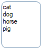
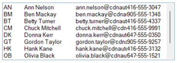
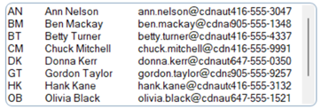
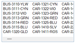
For the List Box Type, select Formatted. The Formatted List Box includes the ability to define multiple columns, line breaks and other formatting.
Example:
Colors can also be displayed if color mnemonics are embedded in the List Box data. Most of the properties for a Formatted List Box are identical to those required for defining a Standard List Box, except for the Allow Variable Input attribute.
On the Attributes panel, a Format button is also available:
|
Attributes ( * indicates a Dynamic property) | |||||||||
|
Formatted Listbox Attributes |
(Dynamic data classes and properties were added in PxPlus 2018.) | ||||||||
The Formatted List Box Definition dialogue displays the following options and buttons:
|
Width |
Width of the column, either a Fixed value or an Expression. To modify the Width value, click the dotted button to invoke a separate dialogue. | ||||||
|
Alignment |
Select one of the text alignment options from the drop-down list: Left, Right, Center, Numeric, Blanks (justify using blanks). | ||||||
|
Special Options |
Click the drop-down arrow for a list of selections:
| ||||||
|
Column Separator |
Click the drop-down arrow to select a Hex or ASCII string value as the default column separator character. | ||||||
|
Insert Above |
Adds a blank row above or below the currently selected row for creating a new column. | ||||||
|
Delete Row |
Removes the currently selected row (i.e. removes the column from the List Box). | ||||||
|
Move Up |
Changes the order of the existing columns in the List Box. |
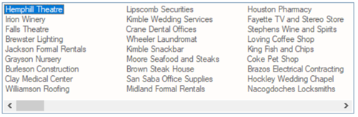
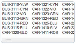
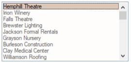
For the List Box Type, select List View. The List View List Box produces vertically wrapping columns (with optional bitmaps) where only the first element of each record is displayed.
Example:
Most of the properties for a List View List Box are identical to those required for defining a Standard List Box, except for the Allow Variable Input and No Height Adjustment attributes.
On the Attributes panel, Partial Match and Full Line Highlight attributes, as well as a Format button, are available, as described below:
|
Attributes ( * indicates a Dynamic property) | |||||||||
|
ListView Attributes |
(Dynamic data classes and properties were added in PxPlus 2018.) | ||||||||
|
Other |
| ||||||||
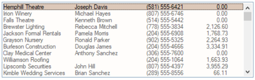
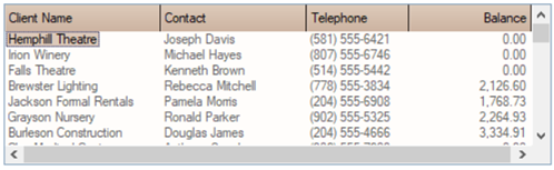
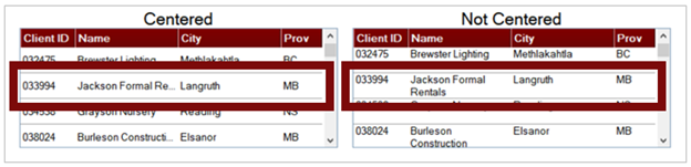
For the List Box Type, select Report View. The Report View List Box displays multiple data elements in a tabular list (as with a Formatted List Box) but with the use of headings and other attributes.
Example:
When defining a Report View List Box, the following attributes are available:
|
Attributes ( * indicates a Dynamic property) | |||||||||||||||||||||||||||||||||||||||||
|
ReportView Attributes |
(Dynamic data classes and properties were added in PxPlus 2018.) | ||||||||||||||||||||||||||||||||||||||||
|
Other |
| ||||||||||||||||||||||||||||||||||||||||
The List/Report View Format Definition dialogue is launched by selecting the Format button on the Attributes panel when defining List View and Report View List Box types. This dialogue consists of the following:
|
Title |
Title appearing above each column. Click the dotted button to invoke a separate dialogue with the following drop-down selections:
| ||||||
|
Width |
Width of the column, either a Fixed value or an Expression. To modify the Width value, click the dotted button to invoke a separate dialogue. | ||||||
|
Alignment |
Select a text alignment option from the drop-down list: Left, Right, Center. No numeric alignment is available, since this is a standard Windows control. | ||||||
|
Bitmap |
Indicates that a bitmap is to be displayed to the left of the data. | ||||||
|
Hotlink |
Displays the column as a hotlink. Columns with a hotlink are displayed in the color defined by the 'OPTION'("StdLvueHotlinkClr",color$) setting and are underlined while hovering over the column. See the 'OPTION' mnemonic and the HotLinkColor$ property. (The Hotlink property was added in PxPlus 2018.) | ||||||
|
UpperCase Sort |
Sorts the column based on the PxPlus lower/uppercase character translation tables. (The UpperCase Sort property was added in PxPlus 2018.) | ||||||
|
Column Sort |
Click the drop-down arrow for a list of selections for numeric sorting: None, Date, Format numerics, Unformat numerics. If Column Sort is set to Date, click the Date Formats drop box to select the date format where D = day, M = month, Y = year; e.g. MD, DMY, MDY. | ||||||
|
Date Format |
Click the drop-down list to select a date format, where D = day, M = month, Y = year. | ||||||
|
Column Separator |
Click the drop-down list to select a Hex or ASCII string value as the default column separator character. | ||||||
|
Insert Above |
Adds a blank row above or below the currently selected row for creating a new column. | ||||||
|
Delete |
Removes the currently selected row (i.e. removes the column from the List Box). | ||||||
|
Up |
Changes the order of the existing columns in the List Box. |
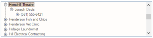
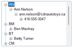
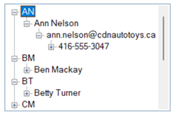
For the List Box Type, select Tree View. The Tree View provides a tree-like structure view with optional bitmaps. See State Indicators. This format is the same as used by Windows Explorer.
Example:
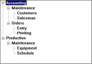
Each entry in a Tree View consists of a series of strings or values separated by a delimiter, similar to a directory structure. Duplicates at each level are grouped together:
|
Given |
Yields |
|
Accounting/Maintenance/Customers |
|
When defining a Tree View List Box type, the following attributes are available:
|
Attributes ( * indicates a Dynamic property) | |||||||||||||||||
|
TreeView Attributes |
(Dynamic data classes and properties were added in PxPlus 2018.) | ||||||||||||||||
The Tree View Format Definition dialogue is used to describe the default bitmaps and the column separator. PxPlus automatically selects the bitmap based on the existence of subordinates and current focus. You can click the bitmap query button to the right of each field to launch the Bitmaps dialogue and browse for existing internal and external bitmaps.
State indicators are basically images that will appear in front of a Tree View entry that can be used to indicate whether the item has been selected or not. These images are set up in NOMADS via the State Indicators dialogue. See Defining State Indicators.
A maximum of 15 images can be assigned to the List Box; NOMADS stores these images in the PxPlus control object property 'StateBitmaps$. All images must be of the same size/format and may specify transparency options. The image can be external or internal. Internal bitmaps contain an ! (exclamation point) preceding the bitmap name.
To toggle between different images or states, the 'ItemState property needs to be set in your application. The numeric value in 'ItemState determines what image will appear next to the row text. This property is 1-based, a value of 0 indicates no state indicator.
Example:
If a Tree View control is defined with three images, the first image will appear if the item state is one, the second image will appear if the item state is two and the third image will appear if the item state is three.
'AutoState is a numeric property used to control auto toggling of states. This can be set up in NOMADS via the State Indicators dialogue. See Defining State Indicators. If this is set to a non-zero value, state indicators will automatically be toggled without generating a CTL event with EOM = "S". This code is returned in the NOMADS variable _EOM$ in the On Change logic.
The number of states that the system will toggle through will be determined by the value set in this property, or if the property is set to 1, the number of bitmaps assigned to the Tree View. In addition, when the user toggles a state indicator while holding the Shift key down, all entries between the current entry and the last entry will be toggled to the new state of the current entry -- in effect allowing for group select/deselect.
'CascadeState is a numeric property used to control cascading of states. This property allows states to be cascaded from parent to children and vice-versa. This can be set up in NOMADS via the State Indicators dialogue. See Defining State Indicators.
If 'CascadeState is set to non-zero, the system will automatically cascade parent states to their children and correspondingly make parent states representative of all of their children. Setting a parent's state, either under program control or using the 'AutoState property in the Tree View definition, will result in all subordinate children to be set to the same state. When a child's state is set, its parent state will be set according to the state of all of the child's siblings - that is, if all children are in a consistent state, the parent will be set to the same state. If a parent has children of various states (some on, some off), the parent's state will be set to the value set in the 'CascadeState property.
Example:
You could have three state indicators - Off (state 1), On (state 2) and Partial (state 3). 'AutoState needs to be set to 2 and 'CascadeState to 3 to have children that automatically toggle off/on and parents that will be On (if all children are on), Off (if all children are off), and Partial (state 3 - children that are not in a consistent state).
When cascading, only items with states will be affected. In addition, items without states will not affect their parent's states nor will changing the parent of an item without a state affect the children of that item.
The following steps outline how to set up state indicators for a Tree View control:
|
Step |
Description |
|
Step 1: Open State Indicators Dialogue |
With a Tree View control selected in your panel, access the List Box Properties dialogue. Select the Attributes tab and then click the States button to launch the State Indicators dialogue. |
|
Step 2: Assign State Images |
In the State Indicators dialogue, enter the name of a bitmap in the State Images box. You can also click the bitmap library button to display the Bitmaps dialogue and browse for existing internal and external bitmaps. For internal bitmaps, an ! (exclamation point) must prefix the bitmap name (!Stop). A maximum of 15 images can be assigned in the State Images box. To change the order of the images, drag and drop a numbered cell in the leftmost column to its new destination. |
|
Step 3: Set 'AutoState and 'CascadeState |
Set the values for the 'AutoState and 'CascadeState properties by selecting a value from the drop-down list. Note: |
The 'NotifyExpand property can be used (set by your application) to detect Tree View expand/collapse requests.
If this property is set to non-zero, a standard CTL event with an EOM code of '+' (expand) or '-' (collapse) will be generated whenever a tree view node is expanded or collapsed. This code is returned in the NOMADS variable _EOM$ in the On Change logic. The application can also read the 'Expanded property to determine the new state of the node. If this property is set to the default 0 (zero), no notification of the tree view expanding or collapsing is sent to the application.
'Expanded values include:
|
1 |
|
Expand level |
|
0 |
|
Collapse level |
|
+ |
|
Expand level and all subordinates |
|
-2 |
|
Collapse level and all subordinates |
Notifications are only sent when the expand/collapse is done by the user, not by the application accessing the 'Expanded property.
'Edit is a numeric property to allow automatic editing of Tree View items. This property can contain three possible values:
|
0 |
|
Item cannot be edited (Default) |
|
1 |
|
Item can be edited |
|
-1 |
|
Force item into edit mode (Must be set directly in application) |
For the Tree View control, select the Direct Edit check box on the Attributes panel to turn direct editing On or Off (0/1).
If the Direct Edit check box is selected, then a double click on an item will put the item into edit mode. When the value changes, a CTL event will be generated with an EOM code of "C", indicating that the item has changed. (No event occurs should the user cancel out of the edit mode.) This code is returned in the NOMADS variable _EOM$ in the On Change logic.
LIST_BOX Properties
LIST_BOX Directive