* Indicates properties that can be Dynamic
![]()

Dynamic control properties automatically set to "Dynamic"
|
Dynamic Control Properties |
As end users' priorities and requirements change, having the ability to quickly modify control properties or create new ones is crucial. To simplify panel design and streamline control definitions, PxPlus 2018 introduces the capability to create dynamic control properties. When combined with data classes, dynamic control properties are ideally suited for data elements with similar properties in an application (i.e. dates, numeric codes, descriptions or lists of values).
By using dynamic control properties, changes to existing panels and controls are minimized since only the data class needs to be changed. At run time, dynamic control properties are evaluated and automatically populated with values based on what is defined in the data class.
When a data class is entered for the control, information from the data class is loaded into the control's properties. If the data class is dynamic, the dynamic control properties are automatically set to Dynamic initially and assigned a %NOMADS'class' variable that corresponds to a data class field (i.e. %NOMADS'class'length). Dynamic data classes are created by selecting the Dynamic check box in Data Class Definitions maintenance.
Control properties designated as dynamic can be manually switched to dynamic or non-dynamic. A control can have a combination of dynamic and non-dynamic control properties only when a data class is entered.
See How to Use Dynamic Control Properties.
Dynamic control properties are available for Multi-Lines, Drop Boxes, List Boxes and Check Boxes.
When working with Grids in the NOMADS Panel Designer, a data class can be assigned in Grid Presets Definition by selecting the Class property.
For a list of the dynamic control properties for each of these control types, see Dynamic Control Properties.
Extended Validation is used to provide additional table validation and allow access to data elements for creating display-only Multi-Line controls when designing NOMADS panels.
See Extended Class Validation for information on defining Extended Validation for Multi-Line Data Classes that can be assigned to Multi-Line and Grid controls.
(Extended Validation for Multi-Line Data Classes was added in PxPlus 2019.)
When creating data classes for Drop Boxes and List Boxes, a Load From File check box (on Display tab) can be selected, which allows a data table/file to be defined as the source when populating a drop box or list box at run time.
See Populate from Data Source for information on defining the Load From File functionality for Drop Box and List Box data classes, which can also be assigned to Grid controls.
(The Load From File functionality was added in PxPlus 2019.)
The examples below show how to create, apply and use dynamic data classes, as well as how to manually set dynamic properties:
|
|
Creating and Applying a Dynamic Data Class | |
|
|
Manually Setting Dynamic Properties | |
|
|
Using Dynamic Data Classes | |
|
|
Applying a Dynamic Data Class Using Property Sheets |
Example 1: Creating and Applying a Dynamic Data Class
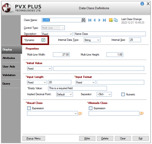
This example shows that the dynamic data class, NAME, is created for a Multi-Line control type in Data Class Definitions maintenance. The Dynamic check box is selected, which defines this as a dynamic data class.
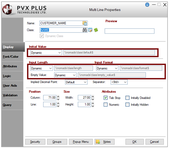
The NAME data class is applied to the CUSTOMER_NAME Multi-Line control. Information from the NAME data class is loaded into the control's properties. The Dynamic Class check box indicates that the selected data class is dynamic. Dynamic control properties are automatically set to Dynamic initially and assigned a %NOMADS'class' variable.
|
|
|
|
|
Example 2: Manually Setting Dynamic Properties
When a data class that is not dynamic is entered for a control, dynamic control properties (i.e. Initial Value, Input Length, Input Format) can be manually set to Dynamic.
In this example, the NAME data class is not dynamic, as indicated by the Dynamic check box, which is not selected.
When the NAME data class is applied to the CUSTOMER_NAME multi-line control, information from the NAME data class is loaded into the control's properties.
Because NAME is not a dynamic data class, the dynamic control properties are not automatically set to Dynamic, but they can be manually set. This is indicated by the Dynamic option in the Initial Value drop box in the screenshot below.
|
|
|
|
|
Example 3: Using Dynamic Data Classes
For this example, suppose your application contains a drop box control named CREDIT_CARD, which is used for selecting a credit card type. This control exists in multiple panels throughout your application. Creating a dynamic data class will make subsequent changes to this drop box significantly easier.
To begin, create a dynamic data class for a drop box control. Enter CREDIT for the Class Name, along with the following List Values: American Express, MasterCard and Visa.
Next, apply the CREDIT data class to the CREDIT_CARD drop box control. Information from the CREDIT data class is loaded into the control's properties. Dynamic control properties are automatically set to Dynamic initially and assigned a %NOMADS'class' variable. In this example, List Values is set to Dynamic and assigned a %NOMADS'class'values$ variable.
|
|
|
|
|
At run time, the CREDIT_CARD drop box is automatically populated with the List Values entered for the CREDIT data class.
|
|
|
Now, suppose that the end user requests the addition of two more selections to this drop box: CitiBank and Discover.
To do this requires one change - adding the two selections to the List Values for the CREDIT data class. No other panels need to be changed.
At run time, because the List Values property is dynamic, this drop box is automatically populated with the two additional selections entered for the CREDIT data class.
|
|
|
|
|
Example 4: Applying a Dynamic Data Class Using Property Sheets
The example below shows the dynamic data class NAME applied to the Customer_Name Multi-Line control using Property Sheets.
|
|
|
|
The table below lists the dynamic control properties for Multi-Lines, Drop Boxes, List Boxes and Check Boxes.
|
Control Type |
Name of Folder Tab | ||||||
|
Display |
Font/Color |
Attributes |
Values |
User Aid |
Validation |
Query | |
|
Multi-Line |
Initial Value |
Visual Class |
User-Defined Tag Field |
N/A |
Help Reference |
Data Validation/Display Logic |
Query Type |
|
Drop Box |
List Values |
Visual Class |
User Tag Field |
Default Setting |
Help Reference |
N/A |
Query Type |
|
List Box |
List Values |
Visual Class |
User Tag Field |
Default Setting |
Help Reference |
N/A |
Query Type |
|
Check Box |
Text |
Visual Class |
User-Defined Tag Field |
Default Setting |
Help Reference |
N/A |
N/A |
(Tree View States were added to Dynamic Data Classes in PxPlus 2019.)