|
LIST_BOX |
Create/Control List Box |
|
LIST_BOX ctl_id, @(col,ln,wth,ht)[, ctrlopt] | |
|
2. Delete: |
LIST_BOX REMOVE ctl_id [,ERR=stmtref] |
|
3. Disable/Enable: |
LIST_BOX {DISABLE | ENABLE} ctl_id[,ERR=stmtref] |
|
4. Set Focus: |
LIST_BOX GOTO ctl_id [,ERR=stmtref] |
|
LIST_BOX LOAD ctl_id,dlm_list$ [,ERR=stmtref] | |
|
LIST_BOX LOAD ctl_id,array_name$ {ALL} [,ERR=stmtref] Note: | |
|
LIST_BOX LOAD ctl_id,index,{element$ | * }[,ERR=stmtref] | |
|
8. Find Element: |
LIST_BOX FIND ctl_id,index,var$ [,ERR=stmtref] |
|
LIST_BOX READ ctl_id,var$ [, mode$][,ERR=stmtref] | |
|
LIST_BOX READ ctl_id,var [, mode$][,ERR=stmtref] | |
|
LIST_BOX WRITE ctl_id,element$ [,ERR=stmtref] | |
|
12. Write Current Index: |
LIST_BOX WRITE ctl_id,index [,ERR=stmtref] |
|
LIST_BOX WRITE ctl_id, ""[,ERR=stmtref] | |
|
LIST_BOX SET_FOCUS ctl_id, alt_ctl,[,ERR=stmtref] | |
|
15. Report All Changes: |
LIST_BOX AUTO ctl_id [,ERR=stmtref] |
|
16. Hide/Show: |
LIST_BOX {HIDE | SHOW} ctl_id[,ERR=stmtref] |
|
@(col,ln,wth,ht) |
Position and size of the list box region. Numeric expressions. Column and line coordinates for top left corner, width in number of columns and height in number of lines. Note that width and height are for the total area (box plus text/description). Use line value -1 to display the check box on the tool bar. | ||||||||||||||||||
|
alt_ctl |
CTL value to generate when the list box gains focus. | ||||||||||||||||||
|
array_name$ |
Name of array to load into list box. String variable followed by {ALL}. | ||||||||||||||||||
|
ctl_id |
Unique logical identifier for the list box (any integer -32000 to +32000). Avoid integers that conflict with keyboard definitions (e.g. 4 cancels CTL=4 for the F4 key) or Negative CTL Definitions. Use this value with the Apostrophe Operator to access various Dynamic Properties. | ||||||||||||||||||
|
ctrlopt |
Control options. Supported options for LIST_BOX include:
| ||||||||||||||||||
|
dlm_list$ |
Delimited list of elements to load. String expressions. | ||||||||||||||||||
|
element$ |
Single element to load. Maximum string size 8kb. The * (asterisk) can be used instead to delete an element (e.g. list_box load 86,4,* removes element 4 from a list_box whose ctl_id is 86). | ||||||||||||||||||
|
index |
Position of the element in the list box. Numeric expression. Integers: the index of the first element is 1. | ||||||||||||||||||
|
mode$ |
String variable. PxPlus returns a single-character Hex value in this variable to report the last method/keystroke the user chose to toggle the list box ($01$ for MOUSE-CLICK or $0D$ for Enter). | ||||||||||||||||||
|
stmtref |
Program line number or statement label to which to transfer control. | ||||||||||||||||||
|
var[$] |
Receives the value of the selected element (string variable) or index (numeric variable). |
Use the LIST_BOX directive to create and control list boxes on the screen. A list box is used to display a pre-set series of selections or elements from which the user can choose. Depending on the implementation of OPT= and FMT= control options, the LIST_BOX directive can be used to create standard list boxes, as well as the following list box types:
Users can select any element from a list of items you assign to the list box; however, variable input is not allowed; that is, the user can only select, not enter, values.
If you need a list box that allows both variable input and selection from a list, see VARLIST_BOX Create/Control Variable List Box.
The Apostrophe Operator can be used with the unique logical identifier (ctl_id) to dynamically read and alter a wide variety of control attributes (properties) directly from the programming language.
For the properties available for manipulating the different list box types, see the following:
|
|
For List Box: |
|
|
|
For List View: |
|
|
|
For Report View: |
|
|
|
For Tree View: |
The following single character OPT= settings are used to refine list box definitions and to establish List View controls (OPT="r" for Report Style or OPT="l" for List Style) and Tree View controls (OPT="e"):
|
"!" |
(Tree View Controls Only) Exclamation Mark. Data has bitmaps or icons.
If the OPT= setting includes "!", you can use LIST_BOX LOAD statements to define bitmaps or icons for individual elements of a Tree View. PxPlus displays the bitmap or icon to the left of the related element. Include the image filename in LIST_BOX WRITE statements to select (highlight) a Tree View element with a bitmap or icon:
Bitmaps or icons you define for individual elements using LIST_BOX LOAD statements will override any default bitmaps or icons (defined using FMT=). See Tree View Format Options. |
|
(Not Supported for Tree View Controls) Pound Sign. Users can select more than one entry from the list box. If OPT="#" and items were loaded in a single string, then when you read/write the element(s) highlighted in the list box, the item(s) will be separated by the delimiter character defined in the 'SepLoad$ property. This property defaults to $00$ or is set whenever a multi-item LIST_BOX LOAD statement is executed. Example:
| |
|
"|" |
(Tree View Controls Only) Pipe. Show connecting lines.
If OPT="|", the Tree View displays connecting lines between various nodes of the tree. |
|
"~" |
Tilde. No height adjustment. Normally, a list box displays an integral number of lines. If OPT="|", the list box will not be forced to show only complete lines. PxPlus will truncate the last line horizontally (i.e. displaying a partial line to ensure that the height of the list box matches the size you defined). |
|
"A" |
Auto signal is On. PxPlus returns a signal on all changes in the list box. |
|
"b" |
(List View (Report Style) and Tree View Controls Only) Suppress column heading or expansion and collapse buttons. In List View (Report Style), "b" suppresses the column header buttons. Example:
When you use "b" for a Tree View, the "+" and "-" buttons (for the expansion and collapse of the tree) are suppressed. Example:
|
|
"B" |
List box has no border or frame. |
|
"d" |
List box is permanently disabled (cannot be enabled). |
|
"D" or "1" |
List box is initially disabled. |
|
"e" |
Define Tree View Control object. By default, a Tree View shows the data as a tree with tree level {+} and {-} buttons (for the expansion and collapse of the tree). A Tree View displays and maintains the data in sorted order. When you add elements to a Tree View list box, PxPlus automatically creates and inserts the elements. Bitmaps or icons are optional. See Tree View List Boxes. |
|
"E" |
(Tree View Controls Only) Edit Mode. This enables automatic editing; i.e. the user can double click on an item to change its value. The editing of items does not support the following input options:
|
|
"h" |
List box is permanently hidden (cannot be shown). |
|
"H" |
List box is initially hidden. |
|
"l" |
Lowercase "L". Define List View (List Style) control object. This is a simple multi-column list of the first element of data. It lists a series of data columns as items from which the user can select. (Columns wrap from the bottom of one to the top of the next column.) You can include an optional bitmap or an icon in the first column (i.e. as the first piece of data in the row/line). See List View List Boxes. |
|
"L" |
List box is initially locked. |
|
"p" |
(List View Controls Only) Highlight partial match(es). If OPT="p", WRITE directives with strings are interpreted as selecting/highlighting those items whose leading characters match the data you are writing. Example: If you write "ABC", then the first item that starts with "ABC" is highlighted (or all items that start with "ABC" if OPT="#" is also set to allow users to make multiple selections):
|
|
"q" |
(List View (Report Style) and Tree View Controls Only) Disable sorting. In List View (Report Style), that suppresses the use of the column header button to sort data. Example:
In Tree View, items added to the list are always added at the end of their respective trees. Example:
|
|
"r" |
(Lowercase "R") Define List View (Report Style) control object. This has column headings and variable column widths and alignments. Each column of data has an optional {column-header} button for sorting data. You can include an optional bitmap or an icon for the first column (i.e. as the first piece of data in the row/line). See List View List Boxes. |
|
"s" |
List box will scroll in a 'Scrollable' window. |
|
"T" |
Strip trailing spaces when reading or writing data for a list box. |
|
"v" |
(List View (Report Style) Controls Only) First column highlight. Example:
Use OPT='v' to control the highlight style for individual list boxes and override any system-wide use of the print mnemonic '+V'. If OPT='v', the user can only click in the first column to highlight a row in the list box. See '+V' & '-V' mnemonics. |
|
"V" |
(List View (Report Style) Controls Only) Full row highlight. Example:
Use OPT='V' to control the highlight style for individual list boxes and override any system-wide use of the print mnemonic '-V'. If OPT='V', the user can click in any column to highlight a row in the list box. See '+V' & '-V' mnemonics. |
|
"X" |
Signal when focus exits from the list box. |
|
"Z" |
Cursor changes to resize pointer if within 4 pixels from the edge of the control. |
Define/Create List Box
LIST_BOX ctl_id, @(col,ln,wth,ht)[,ctrlopt]
Use this format to define or create a list box and give it a unique identifier in ctl_id. When a user selects an item from a list box, the item's associated ctl_id is used in generating a CTL value. Use an integer or numeric expression between -32000 and +32000 for the ctl_id.
Depending on the implementation, the list box may also require some control options:
|
FNT= |
FNT= sets the font for the list box. If you omit the font option, PxPlus uses the system default font. Use FNT="*" (asterisk) to set the font to the standard text-mode fixed font. |
|
FMT= |
FMT= defines columns and/or rows, titles and images depending on the type of list box required. For specific format definitions, see Formatted List Boxes, List View List Boxes or Tree View List Boxes. |
|
OPT= |
OPT= expands the definition. See LIST_BOX OPT= Settings. |
Note: | |
Example:
The example below creates a list box that generates a CTL=100 when an item is selected from it and uses FNT= text mode fixed font. The list box is loaded with the items Dog, Cat, and Pig. The programmer writes Cat as the initial/highlighted selection and removes Dog from the top of the list.
print 'CS';
list
list_box 100,@(2,14,12,6),fnt="*"
list_box load 100,"Dog/Cat/Pig/";
wait 1
list_box write 100,"Cat";
wait 1
list_box load 100,1,*;
wait 1
end
LIST_BOX REMOVE ctl_id [,ERR=stmtref]
Use the LIST_BOX REMOVE format to delete a list box. (To delete an individual element, use the LIST_BOX LOAD directive instead.)
LIST_BOX {DISABLE | ENABLE} ctl_id [,ERR=stmtref]
Use the LIST_BOX DISABLE format to gray out a list box so that it will be visible but inaccessible to users. To reactivate it, use LIST_BOX ENABLE.
LIST_BOX GOTO ctl_id [,ERR=stmtref]
Use the LIST_BOX GOTO format to set the focus on a list box, ready for the next user action.
Use the LIST_BOX LOAD formats below to add or delete the elements in a list box. The formats set up the elements using a delimited string, an array of string elements or individually.
LIST_BOX LOAD ctl_id,dlm_list$ [,ERR=stmtref]
When you load elements into a list box from a delimited string, the last character in the string must be a delimiter. That ending delimiter must be identical to the separator between the elements in the string:
list_box load 11000,"Fox/Cat/Dog/Cow/Sheep/Horse/Pig/Elephant/Ant/"
list_box load 15000,"Fox"+sep+"Cat"+sep+"Dog"+sep
If loading data with images:
List View
When you load a List View list box, you can include an optional bitmap or icon to be displayed to the left of the row/line. Enclose the bitmap or icon path and filename in {curly braces} as the first piece of data in the row.
Tree View
If you create a Tree View with OPT="!", then you can use LIST_BOX LOAD statements to define optional bitmaps or icons for individual elements of a Tree View.
Place the bitmap or icon filename in the data, enclosing the path and filename in {curly braces}. Use a leading ! (exclamation point) to identify the image as internal, or specify the relative path and filename to access an image file that is external.
For information on internal/external images and recognized image file types, see Displaying Bitmaps/Icons.
list_box load 100,"{cat.ico}Cat/{dog.bmp}Dog/{hog.bmp}Pig/"
PxPlus displays these images to the left of the related elements in the Tree View. Bitmaps or icons you define for the individual elements in LIST_BOX LOAD statements will override any default FMT= images in a LIST_BOX definition.
See LIST_BOX OPT= Settings and Tree View List Boxes.
LIST_BOX LOAD ctl_id,array_name$ {ALL} [,ERR=stmtref]
Load Via Array
When an array is loaded into a list box, the curly braces in {ALL} must be included in the syntax.
LIST_BOX LOAD ctl_id,index,{element$ | * } [,ERR=stmtref]
Load/Delete Index Element
When a list box is loaded one element at a time, the index value refers to the index before the element to be inserted. (Use a value of 1 to insert an element at the start of the list. If the value of the index is 0 (zero), the element will be appended to the end of the list.)
If you have more elements on the data list than the physical screen size of the list box can display at one time, PxPlus automatically supplies vertical scrollbars. To remove or delete individual elements from the box, use LIST_BOX LOAD with an * (asterisk) instead of the element string:
list_box load 86,4,* ! * deletes element 4 from a list_box whose ctl_id is 86
LIST_BOX FIND ctl_id,index,var$ [,ERR=stmtref]
Use a string variable to get the specific element's text from a list box. By passing a specific element number, you can retrieve the text of that element into a string variable
LIST_BOX FIND ctl_id,0,var$ [,ERR=stmtref]
If the index value of 0 (zero) is used, PxPlus will return the complete contents of the list box.
(The ability to issue a FIND 0 was added in PxPlus v7.10.)
Use LIST_BOX READ formats to read which element in the list box has been selected. The string variable mode$ returns a Hex value showing how the element was selected. Possible values are described below:
$01$ for MOUSE-CLICK
$02$ for DOUBLE MOUSE-CLICK
$0D$ for Enter
Once this value is read, it is reset to $00$.
PxPlus returns an EOM value and event when the user hits the Insert or Delete keys, Insert returns $2D$, Delete returns $2E$.
LIST_BOX READ ctl_id,var$ [, mode$][,ERR=stmtref]
Read Current Selection
When you use LIST_BOX READ with a string variable, you can return the value of the currently selected element and the method used to make the selection (mode$).
LIST_BOX READ ctl_id,var [, mode$][,ERR=stmtref]
Read Current Index
If you use LIST_BOX READ with a numeric variable, you can return the element by index and the user's method of selection (mode$) from the list box.
Use the LIST_BOX WRITE formats to make the element the current selection, highlighted in the list box.
LIST_BOX WRITE ctl_id,element$ [,ERR=stmtref]
Write Selection
The string expression to write an element to a list box as the current selection must exactly match the value of one of the elements in the list box; otherwise, PxPlus returns Error #11: Record not found or Duplicate key on write.
Writing Tree View Data with Bitmaps or Icons
If you create a Tree View with OPT="!", then you can use LIST_BOX LOAD statements to define optional bitmaps or icons for individual elements of a Tree View. PxPlus displays the image to the left of the element. When you write the current selection, enclose the image filename in {curly braces}, preceding the individual data element:
list_box write 100,"{Cat.ico}Cat"
Bitmaps and icons you define for individual elements in LIST_BOX LOAD statements will override any FMT= images. See Format 1: Define/Create List Box and Tree View Format Options.
LIST_BOX WRITE ctl_id,index [,ERR=stmtref]
Write Index
You can write the current selection to a list box by using its index.
LIST_BOX WRITE ctl_id, "" [,ERR=stmtref]
Use this format to clear the currently selected entry in a list box.
LIST_BOX SET_FOCUS ctl_id, alt_ctl,[,ERR=stmtref]
Use the SET_FOCUS format to set an alternate CTL value to be generated whenever focus shifts to the list box.
LIST_BOX AUTO ctl_id [,ERR=stmtref]
Use the LIST_BOX AUTO format to have PxPlus generate a CTL value automatically whenever the current selection is changed. Use this to track changes to the highlighted selection in a list box.
LIST_BOX {HIDE | SHOW} ctl_id[,ERR=stmtref]
With the LIST_BOX HIDE format, the list box remains active but is not displayed. It is still accessible programmatically. Use the SHOW format to restore the display and user access.
Formatted list boxes are created using the format definition option in the LIST_BOX definition. The information in the FMT= def$ string expression describes each of the columns and/or rows. Each column is formatted with an alignment code, usually followed by a width in column units. The list of columns is a space-separated string enclosed in quotation marks. Each new row is delineated by a / (slash).
list_box 10000,@(5,5,35,10),fmt="L15 R5.00 N12 C3/B5 L25"
The width in the format definition is the display/window width, not the number of characters in the text.
Load the contents of the columns in a formatted list box from a delimited data string (positional data for the entries in the list box). The default delimiter is the SEP character (e.g. $8A$). To change this, use the SEP= option.
Example:
For the previous example "1123 East Main"+SEP+"Ont"+SEP+" 123.45"+SEP+SEP+" *"+SEP+"North Bay"+SEP+$0A$:
Position
Width
Contents
Alignment
Col 1, Line 1
15
1123 East Main
L = Left
Col 2, Line 1
5.00
Ont
R = Right
Col 3, Line 1
12
123.45
N = Numeric/Decimal
Col 4, Line 1
3
*
C = Centered
Col 1, Line 2
5
<spaces>
B = Insert Blanks (5=Length)
Col 2, Line 2
25
North Bay
L = Left
For data you want hidden, use S (with no length) as the alignment character to indicate that a column is to be skipped. (The data is present but not displayed. The user cannot see or gain access to the column.)
To change the color of any field in a formatted list box, simply prefix the data with one of the mnemonics in the following chart.
Color
Foreground Mnemonic
Background Mnemonic
Black
Blue
Cyan
Green
Light Gray
Magenta
Red
White
Yellow
Normally, background colors are dimmer than their respective foreground colors. If you want to use the background (dimmer) color for foreground text, prefix the color with the 'SB' (Set Background) mnemonic. If you want to use foreground color brightness for the background, prefix the color with the 'SF' (Set Foreground) mnemonic. All colors are reset to LIST_BOX default standards at the end of each column.
Example:
The following example creates a formatted list box using the standard definition elements:
0010 open (1)"INVOICE",(2)"CUST"
0020 list_box 10,@(10,10,60,10),fmt="L8 B2 L20 C10 N15 C3"
0030 read (1,end=1000)INV_ID$,INV_CUST$,INV_DATE$,INV_AMT,INV_STS$
0040 read (2,key=INV_CUST$)CST_NAME$
0050 let L$=INV_ID$ ! 1st column
0060 let L$+=sep+CST_NAME$ ! 2nd column
0070 let L$+=sep+INV_DATE$ ! 3rd column
0080 let X$=str(INV_AMT:"$###,##0.00-")
0090 if INV_AMT<0 then let X$='RED'+X$ ! Column is red if negative
0100 let L$+=sep+X$
0120 let X$='SF'+tbl(pos(INV_STS$="ISP"),"",'_GREEN','_BLUE','_RED')+INV_STS$
0130 let L$+=sep+X$
0140 list_box load 10,0,L$
0150 goto 0030
1000 close (1),(2)
1010 input *; if ctl<>4 then goto *SAME
List View list boxes are created by setting OPT=char$ in the definition. See Format 1: Define/Create List Box.
Two List View styles are supported:
|
OPT="l" (lowercase L) defines a simple multi-column list of the first element of data. List Style lists a series of data columns as elements from which the user can select. (Columns wrap from the bottom of one to the top of the next column.) When loading the List View (List Style) list box, you can include an optional bitmap or icon to be displayed as the first piece of data in the row/line. | |||||||||||||
|
Report Style |
OPT="r" defines a list with column headings and variable column widths and alignments. In a Report Style list box, each column of data has an optional {column-header} button, which can be used to select the column for sorting. When loading the Report Style List View list box, you can include optional bitmaps or icons in the first column, as the first piece of data in the row or line. The following settings (OPT= values) can also be used to refine the definition of a Report Style List View:
| ||||||||||||
Example:
This example shows definitions for both List View styles:
0200 list_box 100,@(2,14,12,6),fnt="*",opt="l"
...
0500 list_box 15000,@(10,10,20,10),opt="r",err=2000
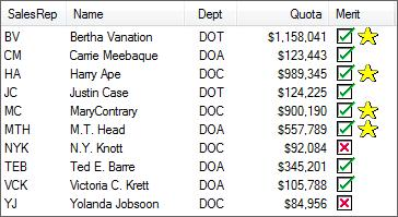
The List View control also allows for the inclusion of multiple bitmaps within the data along with a number of new properties. When a column starts with a 'PICTURE' mnemonic, the system inserts the image associated with the mnemonic into the List View row.
Example:
The list box above was generated by the program shown below. It displays a check mark for those sales reps making over 100K and a star for those over $500K.
Text and bitmaps may be interspersed through the field contents allowing text to appear before and after the images.
begin
FORMAT$="[SalesRep]10 [Name]18 [Dept]C8 [Quota]R14 [Merit]10"
list_box 10,@(5,5,60,15),opt="rV",fmt=FORMAT$,fnt="*guifont"
while 1
read ("/users/mike king/demo/data/salesrep",end=*break)
if YTDSALES>=100000 \
then QUOTA$="!checkedbox" \
else QUOTA$="!xinbox"
QUOTA$='picture'(0,0,0,0,QUOTA$)
if YTDSALES>500000 \
then QUOTA$+='picture'(0,0,0,0,"!Star")
list_box load 10,0,SALESREPCODE$+sep+NAME$+sep+DEPARTMENT$+sep+str(YTDSALES:"$#,###,##0")+sep+QUOTA$+sep
wend
input *
(The ability to insert multiple images in a List View was added in PxPlus v9.00.)
Use FMT= to define List View column widths, titles and the placement of an optional bitmap or icon. You can include a series of space-separated column definitions with an optional column title in [square brackets], alignment code and width specification:
list_box 10000,@(5,5,35,10),fmt="[Company]L10 [Vendor]C6 [Amount]#R12",opt="r"
List View FMT= settings can include the following:
|
Column Title |
Enclosed in square brackets, the column title is placed ahead of the column alignment and width. Example: | |||||||||
|
Column Alignment and Width |
Alignment codes for left, right and center (L, R, C) are used as prefixes to the width (in columns). The first column is always left aligned, and setting it to right or center alignment has no effect. | |||||||||
|
Hotlink |
(List View (Report Style) Controls Only) The "H" option defines the column as a hotlink column. Columns with a hotlink are displayed in the color defined by the 'OPTION'("StdLvueHotlinkClr",color$) setting and are underlined while hovering over the column. See StdLvueHotlinkClr in the OPTION mnemonic. Note:
| |||||||||
|
To include a bitmap or icon to the left of a line, place the image filename in the format to identify the column. Enclose the image name in {curly braces}. Use a leading (!) exclamation point to identify the image as internal, or specify the relative path and filename to access an image file that is external. For more information on internal/external images and recognized image file types, see Displaying Bitmaps/Icons. If you use internal bitmaps, PxPlus converts the background light gray to match the background color of the LIST_BOX entries. Note:
|
|
|
1. |
All images will take on the size of the first image defined for the List View control: |
|
|
2. |
Once the size has been set: |
|
|
3. |
If the
LinesPerRow property is set and images are used, the system will use the smaller of the height of the row (based on LinesPerRow) or the first image if the image size is not overridden. |
To find out the height of a List View row in pixels, use the LinePixels property (Read Only).
(The LinePixels property was added in PxPlus 2017.)
(Support for Image Scaling was added in PxPlus 2017.)
UpperCase Sort
(List View and Report View List Boxes)
A "U" code can be added as a prefix to the width for a column to sort the column based on the PxPlus lower/uppercase character translation tables.
Example:
[Company]UL10
(The UpperCase Sort property was added in PxPlus 2018.)
Numerical Column Sorting Code
Specialized codes for a List View column that indicate the column data should be considered as numeric data and sorted according to the logical numerical value. The possible codes are as follows:
|
# |
A # (pound sign) indicates that the data has been formatted using the
STR( ) function and contains a consistent number of decimal places as applied by a format mask. Since the data is formatted, PxPlus recognizes the character you assign in the
'DP' system parameter as the decimal point for sorting. Default is 'DP'=46 or 'DP'=ASC("."). list_box 100,@(5,5,35,10),fmt="[Amount]#R12" |
|
N |
An N indicates that the data is unformatted may contain the default ASC(".") decimal point followed by varying numbers of digits. list_box 100,@(5,5,35,10),fmt="[Amount]NC6" |
|
Y, M, D |
The format codes Y, M or D indicate Date columns for a List View control. The codes indicate that a column contains data that is to be treated as a date for sorting purposes, include up to three characters showing the order of the date as it appears in the data (MD, DMY, MDY, YMD ...). The system does not translate or format the data, but recognizes and sorts it as date values. The data must contain some sort of alpha separator (dashes or slashes, etc.) between the individual values. list_box 100,@(5,5,35,10),fmt="[Sent]DMYL11" The column data is parsed into a maximum of three fields and treats any alpha field it encounters as a month name. Month names must match those currently in use by the DTE( ) function. If the column contains additional data beyond the date, up to 10 of these additional characters are included in a secondary sort for the column. |
Load List View data into the columns from SEP -delimited data strings. See Format 6: Load via Delimited String.
Example:
In the following example, PxPlus automatically supplies a horizontal scrollbar where the total width of the data columns is greater than the list box display width:
0100 let X$="[Custno]L10 [Name]L20 [Address]L20 [Category]C10 [Amount]R10"
0110 list_box 10000,@(10,10,50,10),opt="r",fmt=X$,fnt="Arial,1"
0120 print "Scroll to see columns"; wait 5
0130 list_box remove 10000; end
The following chart describes FMT= settings for line 0100 in this example:
|
Header Title |
Position |
Width |
Alignment |
|
Custno |
Col. 1, Line 1 |
10 |
Left |
|
Name |
Col. 2, Line 1 |
20 |
Left |
|
Address |
Col. 3, Line 1 |
20 |
Left |
|
Category |
Col. 4, Line 1 |
10 |
Centered |
|
Amount |
Col. 5, Line 1 |
10 |
Right |
Color in List View (Report Style)
List View (Report Style) list box supports colors on a per column basis. Color mnemonics can precede the data in the column or be intermixed with the data itself so more than one foreground/background color can be set up per column. If a background color mnemonic precedes all the data in a column, then the entire background of the column will be set to that color. See Color in a Formatted List Box.
Row Highlighting in List View (Report Style)
List View (Report Style) list box supports first column highlight (where the user must click on the first column to highlight the row) and full-line highlight (where the user can click on any column to highlight the row). You can set highlighting style for individual list boxes by using OPT= either "v" or "V" when you create the control object or you can control the highlighting style system-wide by setting the print mnemonics ' -V' and ' +V'. See Format 1: Define/Create List Box and '+V' & '-V' mnemonics.
Example: List View (Report Style)
open (1)"."
set_param 'SD'
list_box 10,@(5,5,25,10),opt="r",fmt="[Name]L15 {} [Size]R7"
LOOP:
read (1,end=0150)F$
if mid(F$,-1)=dlm \
then B$="!File",SZ$="<dir>";
goto LOADIT
B$=""
open input (2,isz=-1)F$
X$=fin(2)
close (2)
SZ$=str(dec(X$(1,4)))
LOADIT:
list_box load 10,0,F$+sep+B$+sep+SZ$+sep
goto LOOP
close (1)
escape
Horizontal Bar Charts in List Views
The List View control can also be used to display horizontal bar charts using the 'FILL' mnemonic. This mnemonic, when included in the text of a List View field, will generate a horizontal bar. (Horizontal bar chart support in List Views was added in PxPlus 2017.)
The length of the bar and fill color are defined by the parameters passed with the 'FILL' mnemonic. The first parameter defines the length of the bar as a percentage of the List View column. A value of 100 results in the bar covering the complete column, 50 will cover half of the column, etc. If the column is resized, the bar length will be adjusted accordingly. The second and optional third parameters define the color of the bar with the second parameter representing the color for the top of the bar and the third parameter, if present, the bottom of the bar. If the third parameter is omitted, the bottom of the bar will be automatically generated by the system to make the bar appear slightly three-dimensional.
Multiple 'FILL' mnemonics may be supplied to create multiple bars within the column. Any portion of the bars that exceeds the total column width will be truncated.
Example:
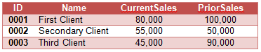
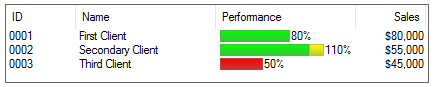
For this example, let us assume that we are dealing with client information that is comparing CurrentYTDSales against PriorYTDSales with the following data:
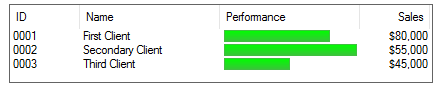
If we want to present a simple graph in the List View, we might code something like this:
0010 begin
0020 print 'CS'
0030 let lv=10
0040 list_box lv,@(5,5,60,5),fmt="[ID]10L [Name]20 [Performance]20 [Sales]10R",opt="r"
0050 while 1
0060 read data id$,name$,CurrentSales,PriorSales,end=*break
0070 let sales$=str(CurrentSales:"$##,##0")
0080 let pct=(100*CurrentSales)/PriorSales
0090 let bar$='fill'(pct,"Green")
0100 list_box load lv,0,id$+sep+name$+sep+bar$+sep+sales$+sep
0110 wend
0120 input *
0130 data "0001","First Client",80000,100000
0140 data "0002","Secondary Client",55000,50000
0150 data "0003","Third Client",45000,90000
This would result in a List View something like this:
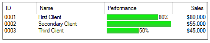
If we want to include the percentage as a number following the bar, we could make the following change:
0090 let bar$='fill'(pct,"Green")+str(pct)+"%"
This would result in the following:
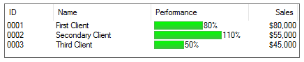
Notice that the percentage does not show on the second line because the bar completely fills the column width. In fact, the percentage for ID 0002 is 110%. To resolve this, we need to adjust the bar display percentage to allow for both the full bar and the text. This can be done by factoring the bar percentage itself:
0090 let bar$='fill'(pct/1.5,"Green")+str(pct)+"%"
This would result in the following:
Let us assume we want to enhance this as follows:
If the Percentage is < 70%, display the bar in Red, and for any percentage over 100%, display the bar in Yellow.
To do this, we could change line 90 and add 95 as follows:
0090 let bar$='fill'(min(pct,100)/1.5,tbl(pct<70,"Green","Red"))
0095 let bar$+='fill'(max(pct-100,0)/1.5,"Yellow")+str(pct)+"%"
This would result in the following:
A Tree View control object can be created by setting OPT="e" in the definition of a list box. See Format 1: Define/Create List Box. Tree Views provide a hierarchical view of the data using a collapsible tree structure to represent a list box. As items are loaded into the Tree View, PxPlus automatically parses the entries based on your given delimiter and creates all intervening tree levels required.
Example:
If you use a slash as your delimiter and load the single entry aaa/bbb/ccc, PxPlus will generate three entries in the Tree View:
aaa
aaa/bbb
aaa/bbb/ccc
If you then load aaa/bbb/ddd, PxPlus only creates one new entry for aaa/bbb/ddd (since aaa and aaa/bbb already exist). If you add aaa/xxx/iiid, PxPlus creates two new entries: one for aaa/xxx and one for aaa/xxx/iii. When an item from a branch is selected, the list box READ returns the item, including its parent branches. In the example above, selecting ccc would return "aaa/bbb/ccc/".
When loading a Tree View with lots of data, it is often advisable to pre-sort the data and load the Tree View without the sort option enabled.
OPT="e" establishes a Tree View definition. Several other OPT = settings can be used to refine the definition:
|
|
"!" |
Bitmaps or icons |
|
|
"|" |
Show connecting lines |
|
|
"b" |
Suppress expansion/collapse buttons |
|
|
"E" |
Enable automatic editing |
|
|
"q" |
Disable sorting |
Use FMT= settings to define default images to be displayed in the tree (optional). When adding bitmaps and icons, enclose the image name in {curly braces}. Use a leading exclamation point ( ! ) to identify the image as internal or specify the relative path and filename to access an image file that is external. For more information on internal/external images and recognized image file types, see Displaying Bitmaps/Icons.
Filenames are mandatory in FMT={images$} clauses. Place them inside {curly braces} in a pipe ( | ) separated list:
list_box A,@(x,y,10,10),opt="e",fmt="{Cat.ico|Dog.bmp|Pig.bmp}"
Null values in FMT={images$} are not allowed. For instance, FMT={||Pig.bmp} generates an Error #23: Missing/Invalid variable.
When using bitmaps in Tree View list boxes, ensure that all bitmaps/icons in the same Tree View LIST_BOX control are the same size (mandatory). If you include different sizes, PxPlus treats the size of the first bitmap/icon as the size of all subsequent images for a give Tree View LIST_BOX.
Generally, all PVX Plus internal bitmaps are 20 pixels wide by 16 pixels high. If you are going to make your own bitmaps to be used in conjunction with the internal images, you should use the same size.
If you use internal bitmaps, PxPlus converts the background light gray to match the background color of the LIST_BOX entries. You can define up to six default bitmaps or icons in Tree Views. The order of the images determines when they are used:
1. Default overall bitmap or icon: always used with any listed entries that do not have subordinates.
2. Default bitmap or icon for items with subordinates.
3. Default bitmap or icon for items with subordinates if the tree level is expanded (i.e. shown) in Tree View.
4. Bitmap or icon for entries that do not have any subordinates when the item is selected.
5. Bitmap or icon for entries that have subordinates when selected.
6. Bitmap or icon for entries that have subordinates when selected and level is expanded.
Example: Tree View
list_box 10,@(5,5,25,10),opt="e|",fmt="{!diskette|!File|!File_open}",sep=dlm
F=1,D$="."
NXTDIR:
set_param 'SD'=1
open (F)D$
NXTFILE: \
read (F,end=ENDDIR)F$
if F$(1,1)="." \
then goto NXTFILE
if mid(F$,-1)<>dlm \
then list_box load 10,0,pth(F)+dlm+F$;
goto NXTFILE
D$=pth(F)+dlm+F$
F++
goto NXTDIR
ENDDIR: \
close (F)
F--
if F>0 \
then goto NXTFILE
escape
LIST_BOX Properties
LIST_VIEW Properties
REPORT_VIEW Properties
TREE_VIEW Properties