Property
Description
When set, the control will generate a 'Change' event whenever its value changes as opposed to the default Off state where the control will only generate the change event when losing focus.
Possible values are:
|
0 |
Only signal change when exiting the control or on special event such as double click/Enter. (Default) |
|
1 |
Signal all changes to the value of the control regardless of why the change occurred. |
|
2 |
Signal all changes done by the user but not done by the program. |
Controls the automatic toggling of states in a tree view. The toggling occurs whenever a user clicks on the state indicator in the tree view. The number of states that the system will toggle through is determined by the value set in this property or, if the property is set to 1, the number of bitmaps assigned to the tree view.
In addition, when the user toggles a state indicator while holding down the Shift key, all entries between the current entry and the last will be toggled to the new state of the current entry (in effect, allowing for group select/deselect). See State Indicators.
Background color. For information on valid color names and color specifications, see Color Properties. (Default: "DEFAULT")
Numeric value indicating whether the text for the selected item in the tree view will be shown Bold. Setting this property to 1 causes the display to use bold text; zero (0) causes normal text to be used.
This property is used in conjunction with 'Item property, which defines the item whose bold state is to be referenced.
This property, when set to any value, will cause the control to be moved to the top of the display order. Once at the top of the display order, the control will appear visually on top of any other control on the window. (Default: Not Applicable - Always returns 0)
This property controls the automatic cascading of states between parents and children in a tree view.
If the 'CascadeState property is set to non-zero, the system automatically cascades parent states to their children and correspondingly makes parent states representative of all of their children. Setting a parent state, either under program control or using the 'AutoState property in the tree view definition, will result in all subordinate children being set to the same state.
When a child state is set, its parent state will be set according to the state of all of the child's siblings; i.e. if all children are in a consistent state, the parent will be set to the same state. If a parent has children of various states (some on, some off), the parents state will be set to the value set in the 'CascadeState property. See State Indicators.
Number of direct descendant children for current item set by 'Item.
Screen position (column) of control.
Width of control in column units.
Sets the radius for the list box corners. This property is available for all types of List Box controls except Report View and Variable List Boxes. Works only in 4D mode.
Possible values are:
|
|
(Null) |
Property is not set. |
|
|
Round |
Sets the default radius of 3 for round corners. |
|
|
Square |
Sets the default radius of 0 for square corners. |
|
|
(Value) |
Enter a value from 0 to 8 inclusive. |
Example:
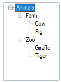
CornerRadius$ set to Round:
LIST_BOX 100,@(10,15,16,10),opt="e|"
y=100
y'sep$="/"
contents$="Animals/Farm/Cow"+sep+"Animals/Farm/Pig"+sep+"Animals/Zoo/Giraffe"+sep+"Animals/Zoo/Tiger"+sep
LIST_BOX LOAD 100,contents$
y'CornerRadius$="round"
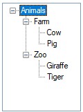
CornerRadius$ set to Square:
LIST_BOX 100,@(10,15,16,10),opt="e|"
y=100
y'sep$="/"
contents$="Animals/Farm/Cow"+sep+"Animals/Farm/Pig"+sep+"Animals/Zoo/Giraffe"+sep+"Animals/Zoo/Tiger"+sep
LIST_BOX LOAD 100,contents$
y'CornerRadius$="square"
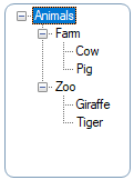
CornerRadius$ set to a value of 8:
LIST_BOX 100,@(10,15,16,10),opt="e|"
y=100
y'sep$="/"
contents$="Animals/Farm/Cow"+sep+"Animals/Farm/Pig"+sep+"Animals/Zoo/Giraffe"+sep+"Animals/Zoo/Tiger"+sep
LIST_BOX LOAD 100,contents$
y'CornerRadius$="8"
Note:
Corner rounding is limited based on the control type and/or the control size.
(The CornerRadius$ property was added in PxPlus 2026.)
Control type ("TREE_VIEW"). See LIST_BOX directive.
Current item with focus/selected. (Default: 1; 0 if no data)
Background color when the control is disabled. For information on valid color names and color specifications, see Color Properties.
(Tree View support was added in PxPlus 2019.)
Foreground text color when the control is disabled. For information on valid color names and color specifications, see Color Properties.
(Tree View support was added in PxPlus 2019.)
This property indicates the index number that dragged items were dropped onto; if items are not dropped onto a specific line, 0 is returned.
This property enables the automatic editing of item text; i.e. the user can double click on an item to change its value. (Default: 0)
Possible values are:
|
1 |
Allow editing. |
|
0 |
No editing. |
|
-1 |
Force current item into edit mode. |
See OPT="E" as described in Tree View List Boxes.
Enabled indicator: 1 = True; 0 = False (Default: 1)
Last change terminator. See also LIST_BOX directive.
Node expanded. Possible values are:
|
-2 |
Collapse selected level and all subordinates |
|
-1/0 |
Collapsed (Default: 0) |
|
1 |
Expanded |
|
2 |
Expand selected level and all subordinates |
When read, this property will only return 0 or 1 to indicate whether the tree is collapsed or expanded. This property can be set to -2 or 2 to collapse or expand all nodes; however, these values will not be returned when reading the property.
This property, when set, causes the system to search the list box or grid for the text supplied. If the text is found, the system will set the 'Column and 'Item (or 'Row) property for the control to the entry where the match was found. If no match is found, the 'Column and 'Item ('Row for the grid) property is set to zero.
A typical use of this property would be to locate a value in the list box and then change or delete it. It can also be used to validate that an entry exists in the list box. This property is generally only written to. Reading this value will return the same as reading the 'ItemText$ property.
Controlling the Search (List View/Grid Only): The search is controlled by the settings found in 'FindOptions$. These options are provided as a series of characters in 'FindOptions$:
|
Char. |
Function |
|
C |
Search is case insensitive. |
|
A |
Accents will be ignored when comparing data. |
|
W |
Search should start from current position and wrap around. |
|
* |
Match is for data anywhere in the text (cannot be used with Sort option). |
|
S |
Data is sorted. |
|
R |
Search backwards. |
Search Range (List View/Grid Only): When searching, if the "W"rap option is not specified, the search will start from the beginning of the data in the control and proceed through the end. If the "R"everse option is set, the search starts at the end and proceeds to the beginning. If the "W"rap option is set, the search will start from the position immediately after that specified in the 'Item ('Row for Grid) and 'Column and search through all the data wrapping around the end/start back to the starting point.
If the property 'FindColNo (or 'Column for Grid) is set, only data in that column will be searched. If the "S"ort option is specified, only the column specified in the 'Sort property will be checked and its setting (Ascending/Descending) will be used to determine the assumed sort sequence. If 'Sort is not set, the system will assume that the column specified in 'FindColNo has been pre-sorted in Ascending order. If 'FindColNo is not set, then the system will assume the first column is to be used and is in ascending sequence.
If both "W"rap and "S"ort options are specified, the system will use the starting point set in 'Item ('Row on Grid) and 'Column and determine the search direction based on the value at the starting point. If the value at the start point matches that of the search value, the "R" option will determine the search direction.
See also 'FindColNo and 'FindOptions$ properties.
Note:
Prior to PxPlus v11, this property and functionality was not available on the grid. In addition, the 'Column was not set nor were the 'FindOptions$ and 'FindColNo (list view only) supported.
Example 1: Changing item text in a list box
To change the value of the list box entry of "CAT" to "DOG" for list box "LIST1", you could do the following:
List1'FindItemText$="CAT" ! Locate the item
List1'ItemText$ = "DOG" ! Change the value
Example 2: Locate and delete an item from a list box
To locate and delete a value from a list box:
List1'FindItemText$="CAT" ! Locate the item to delete
LIST_BOX LOAD List1, List1'Item, *
Example 3: Validate the existence of an item in a list
To search a list box to find a specific value, set the FindItemText$ to the desired search value then read 'Item. If zero, the item does not exist.
List1'FindItemText$=X$ ! Locate the item
IF List1'Item=0 THEN MSGBOX X$+" is not found"
Control format definition. Refer to the FMT= option as described in the LIST_BOX directive.
Focus indicator: 1 = Control has focus. (Default: 0)
Background color when the control has focus. For information on valid color names and color specifications, see Color Properties.
(Tree View support was added in PxPlus 2018.)
Controls whether a dotted focus rectangle displays around the selected text. Default is On.
Possible values are:
|
|
0 |
No focus rectangle is shown. |
|
|
1 |
Focus rectangle is shown. |
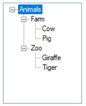
Example:
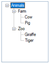
To turn Tree View focus Off:
LIST_BOX 100,@(10,15,16,10),opt="e|"! Tree View Example
y=100
y'sep$="/"
contents$="Animals/Farm/Cow"+sep+"Animals/Farm/Pig"+sep+"Animals/Zoo/Giraffe"+sep+"Animals/Zoo/Tiger"+sep
LIST_BOX LOAD 100,contents$
y'FocusRect=0
To turn Tree View focus back On:
LIST_BOX 100,@(10,15,16,10),opt="e|"! Tree View Example
y=100
y'sep$="/"
contents$="Animals/Farm/Cow"+sep+"Animals/Farm/Pig"+sep+"Animals/Zoo/Giraffe"+sep+"Animals/Zoo/Tiger"+sep
LIST_BOX LOAD 100,contents$
y'FocusRect=1
(The FocusRect property was added in PxPlus 2026.)
Foreground text color when the control has focus. For information on valid color names and color specifications, see Color Properties.
(Tree View support was added in PxPlus 2018.)
This property is used to reference the font for a control. It will contain (or can be set to) a string containing three comma-separated fields of the font name, size and attributes. See 'FONT' mnemonic.
Example:
To set the font to Arial, 1.5 times normal size, and Bold, the format would be xxx'Font$="Arial,1.5,B".
Color of the frame/border around the control. For information on valid color names and color specifications, see Color Properties.
(The FrameColor$ property was added in PxPlus 2024.)
Height of control in pixels.
Windows handle for control.
Index number of item in list.
Number of items in list. See Load on Demand.
Numeric value indicating the state of the item: This property is used in conjunction with 'StateBitmaps$, which defines the state bitmaps. Once the state bitmaps are set, each item/row/entry may set its 'ItemState property to determine what image is to appear next to the row text depending on the state. A maximum of 15 states can be assigned - 1 through 15. A state of 0 (zero) causes no state indicator to be displayed.
Example:
Assuming the list box is defined with 3 images, the first image will appear if the item state is 1, the second image will appear if the item state is 2 and the third image will appear if the item state is 3.
See State Indicators.
Maintain hidden tag string on item set by 'Item: This tag can hold internal user-defined information about the item such a file keys, etc.
Value of the current item set by 'Item.
Controls the text color for the current tree view item identified by the 'Item property. For information on valid color names and color specifications, see Color Properties.
Note:
On Windows, when setting the text color for a tree view item, the system only supports 15 bits of color (3 * 5 bits). RGB colors will be automatically converted to this resolution; however, this will mean that the value returned when this property is read may be slightly different from the value to which the item was set. Generally, the color difference will not be noticeable to the end user.
(The ItemTextColor$ (or ItemTextColour$) property was added in PxPlus 2020.)
Hot key to jump to control.
Left margin for control in pixels.
Screen position of control.
This property contains the color of the lines drawn between entries on a tree view. For information on valid color names and color specifications, see Color Properties. (Default: DEFAULT (normally BLACK))
Height of control in number of lines.
Defines how a control will look. Possible values are:
|
2 |
Old Windows 3.1 2D look. |
|
3 |
Windows 95/98 3D look. |
|
4 |
Windows XP/Vista/Windows 7 look. |
This property reports/sets the CTL value to generate when an object is selected on a right-click of the mouse.
This property returns the item number of an object when the mouse pointer is over it. If the mouse is not over an object, -1 is returned. 0 is returned if the cursor is over an area in the control with no data.
Message line text for the control.
This property is used to control the generation of tree view expand/collapse signals. When this property is 0 (Default), no signal is sent to the application when the user expands or collapses any entry in the tree view. Setting this property to a non-zero causes a tree view to generate an event with EOM code of "+" (indicating the level was expanded) or "-" (indicating collapse).
Note:
When an expand/collapse signal is captured by the application through a READ request, the value in the
'Item property will be set to the item Expanded/Collapsed (may be different that current item).
Use of this property can allow the developer to speed up the loading of large tree views. By only loading one level at a time in a tree view and detecting when the user attempts to expand a level, you can reduce the amount of processing required to view a large number of items.
Example:
Suppose that your tree view contains invoice information with the first level being the division, the second being the client, and the final being the invoice number. Your load items would look like: ABC Corp/Client 1/Inv#001234.
Loading all the invoices into the tree view could take a while, so instead, load only load the first item (client/invoice) for each division and set the 'NotifyExpand property to non-zero. When the user requests to expand the division, the application will receive an expansion signal (EOM = '+' or EOM='-' for collapse). Upon receipt of this signal, the application can add to the tree view one invoice record for each client in division except the first one, which will have already loaded during initial. When it receives an expansion signal for a client, it can load all its invoices (again except for the first).
The application should keep a memory file with a list of which levels have already been filled in so that a subsequent expand signal for the same item can be ignored. This method of tree view loading means that the tree view will only load the items that the user is specifically interested in viewing, which will reduce the system load and make the application more responsive.
User object method. (Default: 0 - No object specified)
The 'ObjectID property allows applications to intercept property values and add methods to controls. When set to a valid Object ID by the application, you can add methods and add/override property logic for any control in the system. When set in the system, it allows the application to logically request methods against the control that, in turn, will be performed by the related Object ID. It will also first check the object for any property requests and, if the property is defined in the object, set or get that property instead of the controls.
To allow the specified object to get true access to the control, while executing within the object identified by the 'ObjectID property, the system will direct any property requests directly to the control.
Note:
When a control is deleted from the system, any object identified by an 'ObjectID property will be automatically dropped.
On Focus CTL event. 0 is returned if no On Focus CTL value is set up for the control.
This property, when set to a non-zero value, causes the system to generate an internal CTL event following any changes to a list box. It can be used to monitor changes to a list style control so that external action (such as updating screen or files) can be performed. (Default: 0)
If the value of this property is non-zero, the system will use its value as a CTL event to generate. If zero (default state), no event will be generated.
To avoid multiple signals being generated, the system will defer the generation for approximately 1/2 second following the last update. This means that when multiple rows are being updated, the event will generally only occur once the updating is complete.
This property controls the CTL event that will be fired prior to the system displaying the Tip for any control. If the value of this property is non-zero, the system will use its value of a CTL event to fire and will defer the display of the tip until the application changes the value in 'Tip$. If the value in 'Tip$ is not changed, no tip will be displayed.
Setting this to zero (Default) disables the event from being sent and the current 'Tip$ will be displayed.
Parent window handle.
Control prefix on data loaded into tree view. Possible values are:
|
0 |
No prefix on the data - data has bitmap option Off. |
|
1 |
Data loaded in the tree view can be prefixed with curly braces containing a bitmap, state value, and tag value (separated with semi-colons) - data has bitmap option On. |
|
2 |
Returns same prefix with curly braces when data is read and can be supplied when the data is written (as above). |
Set scroll wheel increment. This property is used to define how many lines each click of the scroll wheel will move a list box or grid.
Possible values are:
|
0 |
Scroll wheel support (all events go to parent window). |
|
1 |
Scroll only if the control has focus (mouse can hover on or off control). |
|
2 |
Scroll only if the control has focus (mouse must be hovered over control). |
|
3 |
If control does not have focus, then scroll when mouse hovers over this control (otherwise, same as 1). |
|
4 |
If control does not have focus, then scroll when mouse hovers over this control (otherwise, same as 2). |
Number of items selected: Set this property to zero to deselect all items. See Multiple Selections.
Used in conjunction with 'SelectStateMask to return the number of child items with the desired state (children being entries on the tree that have no subordinates). See Multiple Selections.
Index to 'SelectItem: Set this property to point to a selected element; e.g. 1 points to the first item selected, 2 points to the second item selected, etc. See Multiple Selections.
Item number in list selected: This property returns the sequential location within the list of the item being pointed to by 'SelectIndex property. See Multiple Selections.
State filter to apply. See State Indicators.
Separator character between each field, column or data point.
Separator character for each row or data set.
This property controls whether a 'Change' signal will be generated when the control (or region of a grid control) is exited regardless of whether the control's value changes. Normally, controls only signal changes when the control loses focus and the contents have changed. Setting 'SignalOnExit allows a change signal to also be generated whenever focus leaves the control (or region for grid).
|
0 |
No signal on exit unless control value has changed. |
|
1 |
Signal on exit regardless of whether value has changed (on grid, signals whenever changing cell). |
|
2 |
Signal when changing row or on exit of grid (sets column value to 0 and row value to last row exited). (Grid Only) |
|
3 |
Signal when exiting the grid (sets column and row values to zero). (Grid Only) |
Column sorting: Sorts the contents of the control. In tree views, sorting values indicate the following:
|
1 |
Automatically sort data in ascending order. |
|
0 |
Reset sort indicators. |
|
-1 |
Causes the current 'Item to be sorted. |
|
-2 |
Causes the current 'Item and its descendants to be sorted. |
(Default for Tree View: 1)
List of images used to display states, separated by vertical bars; e.g. "!Stop|!Print". A maximum of 15 images can be applied to this property. See State Indicators.
Foreground text color: For information on valid color names and color specifications, see Color Properties. (Default: "DEFAULT")
Tip message for control.
Top of control in pixels.
Current item value.
Change control's value without generating OnChange event: Same as 'Value$; however, when used to change the value in the control, no OnChange event will occur.
Normally, on list style or input controls which have Signal All Changes enabled, changing the control value under either program control or by user input will generate an OnChange event. Changing the value of a control using the ValueNoSignal$ property allows the control's value to change without generating the OnChange event.
Control visible flag: 1 = Yes; 0 = No (Default: 1)
Width of control in pixels.
Controls the list of properties to be returned in '_PropValues$. Each value is separated by the value in '_PropSep$.
This property can be used to speed up the processing of multiple property accesses but reducing the number of interactions with the control. See Multi-Property Access.
Controls the separator used between each of the values of the properties returned in '_PropValues$ as defined by '_PropList$.
This property can be used to speed up the processing of multiple property accesses but reducing the number of interactions with the control. See Multi-Property Access.
Accesses the values of the properties defined in '_PropList$. Each value is separated by the value in '_PropSep$.
This property can be used to speed up the processing of multiple property accesses but reducing the number of interactions with the control. See Multi-Property Access.