Creating Panel Controls
List Box controls allow users to select items from a displayed list. By default, users make one selection from a preassigned list of items. A predefined
Data Class can also be applied to a List Box control.
When creating a List Box control, the style of the List Box is determined by the List Box Type property. When a List Box Type is selected, the design properties to be specified for that particular style of List Box are displayed. See
List Box Type.
The List Box types that are supported in NOMADS are:
|
List Box Type |
Description |
Example |
|
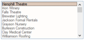
Standard |
Lists a single column of data, with no formatting options.
A
Drop Box uses a similar format. |
 |
|
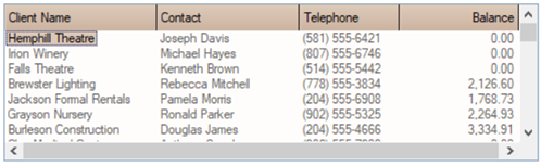
Formatted |
Displays multiple data elements over multiple columns with formatting and color. |
 |
|
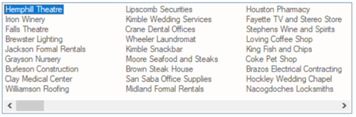
List View |
Displays a single element of data over multiple columns (optionally may include bitmaps). |
 |
|
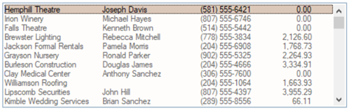
Report View |
Displays multiple data elements in different columns (similar to a Formatted List Box) and allows column headings, sorting, bitmaps and other formatting attributes. |
 |
|
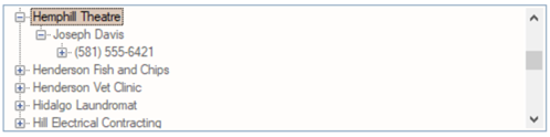
Tree View |
Displays data grouped into a tree-like structure that optionally may include + (plus) and - (minus) buttons to expand tree levels, dotted lines and
State Indicators. |
 |
Creating a List Box
To draw a new List Box on your panel, select the List Box control tool from the
Controls Toolbar. Hold down the left-mouse button and drag the mouse to create a rectangle to the desired size. Release the mouse button to create the new object.
A List Box control can also be created from a data class or a data dictionary element. See
Data Class Controls and
Data Element Controls.
For making other adjustments, see
Modifying Objects.
A system popup menu consisting of extraction, search and print options can also be added to any Grid or List Box (except Tree Views). See
List Box and Grid System Popup Menu.
Different functionality is available depending on the List Box Type. For example, a Standard List Box could allow users to input their own values if the Allow Variable Input attribute is set. To allow more than one selection in a List Box, select the Multiple Selections check box. To define the specific attributes for the new control, see
List Box Type.
For information and examples on the use of dynamic data classes and dynamic control properties, see
Dynamic Control Properties.
Loading Data Elements
Once a List Box is created, it can be loaded using LIST_BOX LOAD syntax in your program code.
Smart Controls can also be used to simplify this process by auto-loading data based on query definitions. Use the Auto Load property to set this feature (if activated).
You can programmatically retrieve or set a selected item in a List Box, using the variable with the same name as the control. See
Accessing and Manipulating Controls.
See Also
Variable List Box
LIST_BOX Directive