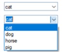
 The illustration on the left shows the same Drop Box control, first in its default state and then in its expanded state to show all the elements.
|
Drop Box Control |
|
A Drop Box control is similar to a Standard List Box; however, the default state only displays a single line of text. The remaining list is available by clicking the drop-down arrow.
 The illustration on the left shows the same Drop Box control, first in its default state and then in its expanded state to show all the elements.
By default, users can make one selection from a pre-assigned list of items. To allow users to input their own values, select the Allow Variable Input attribute. See Drop Box Properties.
A Drop Box takes a smaller amount of space on the screen than a comparable List Box. In addition, PxPlus automatically supplies vertical scrollbars if the number of elements overflows the size of the Drop Box.
Combine these features to optimize the screen design, particularly when display space is at a premium. A predefined Data Class can also be applied to a Drop Box control.
To draw a new Drop Box on your panel, select the Drop Box control tool from the Controls Toolbar. Hold down the left mouse button and drag the mouse to create a rectangle to the desired size. Release the mouse button to create the new object.
A Drop Box control can also be created from a data class or a data dictionary element. See Data Class Controls and Data Element Controls.
For making other adjustments, see Modifying Objects.
To define the specific attributes for the new control, see Drop Box Properties.
For information and examples on the use of dynamic data classes and dynamic control properties, see Dynamic Control Properties.
Once created, a Drop Box can be loaded using DROP_BOX LOAD syntax in your program code. Smart Controls can also be used to simplify this process by auto-loading data based on query definitions. Use the Auto Load property to set this feature (if activated).
You can programmatically retrieve or set a selected item in a Drop Box, using the variable with the same name as the control. See Accessing and Manipulating Controls.
Variable Drop Box
DROP_BOX Directive