|
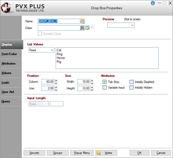
Drop Box Properties |
|
When creating or editing a Drop Box control, the Drop Box Properties dialogue (pictured below using the Folder Style version of the NOMADS designer) is displayed.
Dynamic Control Properties
PxPlus 2018 introduces the capability to create dynamic control properties for Drop Box controls when combined with Data Classes. Dynamic data classes are created by selecting the Dynamic check box in Data Class Definitions maintenance. At run time, dynamic control properties are evaluated and automatically populated with values based on what is defined in the data class.
When a data class is entered for the Drop Box control, information from the data class is loaded into the Drop Box properties. If the data class is dynamic, the dynamic control properties are automatically set to Dynamic initially and assigned a %NOMADS'class' variable that corresponds to a data class field (i.e. %NOMADS'class'length).
Drop Box control properties designated as dynamic can be manually switched to dynamic or non-dynamic. A Drop Box control can have a combination of dynamic and non-dynamic control properties only when a data class is entered.
See Dynamic Control Properties for information and examples.
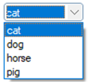
Multiple Character Search
Drop Boxes provide a multiple character search capability that makes it easier to search for an exact match in a Drop Box list. To use this capability effectively, the characters must be entered within a ½ second of one another and must exactly match the start of an item in the Drop Box.
Example:
Suppose that a Drop Box contains the following items:
C10000
C30000
C50000
Typing the character "c" followed within ½ second by the number "3" would select the "C30000" item.
(Multiple character search in Drop Boxes was added in PxPlus 2019.)
This dialogue is divided into the following tabbed panels for viewing and/or changing Drop Box properties: Display, Font/Color, Attributes, Values, Logic, User Aid and Query.
|
Name |
Unique name of the Drop Box control (NOMADS provides a default). Naming conventions for variables apply. Click the Browse Library button to copy parameters from an existing object (via the Library Browse dialogue). Note:
| ||||||||||||||||||||||
|
Class |
Enter a Data Class to load the information from the data class definition into the control's properties. If using Property Sheets, click the Data Class button and enter a data class in the Data Class Options dialogue. (The Data Class Options dialogue was added in PxPlus 2018.) To enter a data class, use any of the following methods:
If the data class is changed, a message will display prior to overwriting any information. This works similar to using the Reapply Data Class button. If the data class assigned to the control is deleted in Data Class Definitions, the text ** Class not on File ** will display (will be a message box if using Property Sheets). (Dynamic data classes and properties were added in PxPlus 2018.) | ||||||||||||||||||||||
|
(Data Class Maintenance) |
Click this button to launch Data Class Definitions for creating or editing a data class. If using Property Sheets, click the Data Class button, then click the Data Class Maintenance button in the Data Class Options dialogue. (The Data Class Options dialogue was added in PxPlus 2018.) | ||||||||||||||||||||||
|
(Available when a data Class is entered) Click this button to update control properties with current information from the selected data class. A message displays before any control properties are overwritten. If using Property Sheets, click the Data Class button and select the Reapply Class check box in the Data Class Options dialogue. (The Data Class Options dialogue was added in PxPlus 2018.) Important Note:
| |||||||||||||||||||||||
|
Dynamic Class |
(Display Only) Indicates whether the selected data Class is Dynamic. See Dynamic Control Properties. If using Property Sheets, click the Data Class button to display the Dynamic Class check box in the Data Class Options dialogue. (The Data Class Options dialogue was added in PxPlus 2018.) | ||||||||||||||||||||||
|
Preview |
Displays how the visible properties of the control will appear at run time. | ||||||||||||||||||||||
|
Display ( * indicates a Dynamic property) | |||||||||||||||||||||||
|
*List Values |
List of values that NOMADS uses to preload the Drop Box. Can be a Fixed value, string Expression or Dynamic). (Dynamic is available only when a data Class is entered.) If a dynamic data class is entered, this property will be automatically set to Dynamic and assigned a %NOMADS'class' variable, which is locked. Note:
| ||||||||||||||||||||||
|
Position |
(Support for increased Column and Line maximums was added in PxPlus 2021.) | ||||||||||||||||||||||
|
Size |
Note:
| ||||||||||||||||||||||
|
Attributes |
Optional attributes for Tab Stop, Variable Input, Initially Disabled and Initially Hidden. See Attributes. | ||||||||||||||||||||||
|
*Input Length |
(Applicable when Allow Variable Input check box is selected) Maximum input characters. Can be a Fixed value, numeric Expression or Dynamic. (Dynamic is available only when a data Class is entered.) If a dynamic data class is entered, this property will be automatically set to Dynamic and assigned a %NOMADS'class' variable, which is locked. Note:
| ||||||||||||||||||||||
|
Font/Color ( * indicates a Dynamic property) | |||||||||||||||||||||||
|
Font Specification |
| ||||||||||||||||||||||
|
Color |
(The Color Selections Query button and dialog were added in PxPlus 2020.) | ||||||||||||||||||||||
|
Attributes |
Optional attributes. See Attributes. | ||||||||||||||||||||||
|
*Visual Class |
Assign a visual class to the control. Can be Fixed, Expression or Dynamic. (Dynamic is available only when a data Class is entered.) Click the Visual Class Maintenance button to launch the Visual Classes Maintenance utility for creating or editing visual classes. To assign visual classes to controls at the library level, see Visual Class Assignment. If a dynamic data class is entered, this property will be automatically set to Dynamic and assigned a %NOMADS'class' variable, which is locked. Note:
| ||||||||||||||||||||||
|
*iNomads Class |
Assign an iNomads class to the control. Can be Fixed, Expression or Dynamic. (Dynamic is available only when a data Class is entered.) If a dynamic data class is entered, this property will be automatically set to Dynamic and assigned a %NOMADS'class' variable, which is locked. Note:
| ||||||||||||||||||||||
|
Attributes ( * indicates a Dynamic property) | |||||||||||||||||||||||
|
Attributes |
| ||||||||||||||||||||||
|
DropBox Attributes |
| ||||||||||||||||||||||
Note: | |||||||||||||||||||||||
|
Other |
(Dynamic data classes and properties were added in PxPlus 2018.) | ||||||||||||||||||||||
|
Values ( * indicates a Dynamic property) | |||||||||||||||||||||||
|
*Default Setting |
Initial value to be highlighted when the Drop Box is drawn. Can be a Fixed value or string Expression. If a dynamic data class is entered, this property will be automatically set to Dynamic and assigned a %NOMADS'class' variable, which is locked. See Dynamic Control Properties. If the List Values drop box (on Display tab) is set to Dynamic, the Default Setting property will be set to Dynamic and locked. (Dynamic data classes and properties were added in PxPlus 2018.) | ||||||||||||||||||||||
|
*Translation |
Click the Translate check box to set up a table of values representing Drop Box selections. Definition consists of a Table Value Length (length of each of the items in the table) and the Translation value (Fixed or string Expression). If a dynamic data class is entered, this property will be automatically set to Dynamic and assigned a %NOMADS'class' variable, which is locked. See Dynamic Control Properties. If the dynamic data class was defined with Load From File functionality, the Table Value Length will be set to 0 and locked. If the List Values drop box (on Display tab) is set to Dynamic, the Translation properties and values will be locked. (Dynamic data classes and properties were added in PxPlus 2018.) | ||||||||||||||||||||||
|
Default Program |
Displays the name of the Default Program used in the Panel Header definition. (The Default Program was added for display in PxPlus 2019.) | ||||||||||||||||||||||
|
Post Create |
Logic to be processed after the control is drawn. Click the drop-down arrow for a list of selections. See Events Logic. Click the Program Logic button beside the Perform or Call action to launch the default program editor, which is typically the *IT - Integrated Toolkit. To make Ed+ the default program editor, change the setting for the %NOMADS'Program_Editor property to Ed+. (The ability to set Ed+ as the default program editor was added in PxPlus 2023.) | ||||||||||||||||||||||
|
When Receiving Focus |
Logic to execute when the control receives focus. Click the drop-down arrow for a list of selections. See Events Logic. Click the Program Logic button beside the Perform or Call action to launch the default program editor, which is typically the *IT - Integrated Toolkit. To make Ed+ the default program editor, change the setting for the %NOMADS'Program_Editor property to Ed+. (The ability to set Ed+ as the default program editor was added in PxPlus 2023.) | ||||||||||||||||||||||
|
When Entry is Selected |
Logic to be executed when focus leaves the control or the state of the control has changed. Click the drop-down arrow for a list of selections. See Events Logic. Click the Program Logic button beside the Perform or Call action to launch the default program editor, which is typically the *IT - Integrated Toolkit. To make Ed+ the default program editor, change the setting for the %NOMADS'Program_Editor property to Ed+. (The ability to set Ed+ as the default program editor was added in PxPlus 2023.) | ||||||||||||||||||||||
|
User Aid ( * indicates a Dynamic property) | |||||||||||||||||||||||
|
Dynamic (from Data Class) |
(Available when a data Class is entered) If selected, identifies which Help Reference properties are dynamic. If a dynamic data class is entered, this check box is automatically selected. If the data class is not dynamic, this check box can be manually selected. Note:
| ||||||||||||||||||||||
|
*Help Reference |
Help text to be invoked at run time by pressing Shift - F1 while focus is on a control.
If the Dynamic (from Data Class) check box is selected, the Help Reference properties will be dynamic and locked. See Dynamic Control Properties. (Dynamic data classes and properties were added in PxPlus 2018.) | ||||||||||||||||||||||
|
*Floating Tip |
Mouse pointer message for the control. Can be a Fixed value, string Expression, Message Library Reference or Dynamic. (Dynamic is available only when a data Class is entered.) If a dynamic data class is entered, this property will be automatically set to Dynamic and assigned a %NOMADS'class' variable, which is locked. Note:
| ||||||||||||||||||||||
|
*Message Bar |
Text to be displayed in the panel's status bar when focus is on the control. Can be a Fixed value, string Expression, Message Library Reference or Dynamic. (Dynamic is available only when a data Class is entered.) If a dynamic data class is entered, this property will be automatically set to Dynamic and assigned a %NOMADS'class' variable, which is locked. Note:
| ||||||||||||||||||||||
|
Query ( * indicates a Dynamic property) | |||||||||||||||||||||||
|
Dynamic (from Data Class) |
(Available when a data Class is entered) If selected, identifies which Query Type and its associated properties are dynamic. If a dynamic data class is entered, this check box is automatically selected. If the data class is not dynamic, this check box can be manually selected. Note:
| ||||||||||||||||||||||
|
*Query Type |
Type of query to associate to the control: Panel, Query Program, Non-Query Logic. Valid formats include a NOMADS query object or query list, a custom query panel, or user-supplied query program. Depending on the Query Type selected, different information is entered. For an explanation of each type and the information to enter, see Query Type. For information on assigning a query to a control, see Assigning a Query. If setting up the Drop Box as a Smart control (see Smart Load attribute), you can define a query for the Smart control. See Defining Smart Controls. If the Dynamic (from Data Class) check box is selected, the Query Type and its associated properties will be dynamic and locked. See Dynamic Control Properties. (Dynamic data classes and properties were added in PxPlus 2018.) | ||||||||||||||||||||||
|
| |||||||||||||||||||||||
|
Security |
Security restrictions. See Restricting Access for information on Object Security Definition. | ||||||||||||||||||||||
|
Groups |
Assign the control to a group. See Group Assignment. | ||||||||||||||||||||||
|
Popup Menu |
Associate a popup menu that will appear when you right-click the mouse over the selected control. See Popup Menu. | ||||||||||||||||||||||
|
Notes |
Add notes/comments for the control. Maximum 1024 characters. These notes also display in the Wiki Help documentation for the panel. See NOMADS Wiki Help. (The Notes button was added in PxPlus 2023.) | ||||||||||||||||||||||
DROP_BOX Properties
DROP_BOX Directive