Property
Description
When set, the control will generate a 'Change' event whenever its value changes as opposed to the default Off state where the control will only generate the change event when losing focus.
Possible values are:
|
0 |
Only signal change when exiting the control or on special event such as double click/Enter. (Default) |
|
1 |
Signal all changes to the value of the control regardless of why the change occurred. |
|
2 |
Signal all changes done by the user but not done by the program. |
Background color. For information on valid color names and color specifications, see Color Properties. (Default: "DEFAULT")
This property, when set to any value, will cause the control to be moved to the top of the display order. Once at the top of the display order, the control will appear visually on top of any other control on the window. (Default: Not Applicable - Always returns 0)
Background color of the Drop Box button. For information on valid color names and color specifications, see Color Properties.
(The ButtonBackColor$ property was added in PxPlus 2024.)
Background color of the Drop Box button when control is disabled. For information on valid color names and color specifications, see Color Properties.
(The ButtonDisableBackColor$ property was added in PxPlus 2024.)
Background color of the Drop Box button while hovering over it. Defaults to the Windows hover color if no drop button colors are set; otherwise, it defaults to the drop button background color but is 25% lighter. For information on valid color names and color specifications, see Color Properties.
(The ButtonHoverBackColor$ property was added in PxPlus 2024.)
Color of the down arrow/tick on the Drop Box button while hovering over it. Defaults to the Windows tick color if no drop button colors are set; otherwise, it defaults to the drop button tick color but is 25% lighter.
For information on valid color names and color specifications, see Color Properties.
(The ButtonHoverTickColor$ property was added in PxPlus 2024.)
Color of the down arrow/tick on the Drop Box button. For information on valid color names and color specifications, see Color Properties.
(The ButtonTickColor$ property was added in PxPlus 2024.)
Screen position (column) of control.
Width of control in column units.
Sets the radius for the drop box corners. Works only in 4D mode.
Possible values are:
|
|
(Null) |
Property is not set. |
|
|
Round |
Sets the default radius of 3 for round corners. |
|
|
Square |
Sets the default radius of 0 for square corners. |
|
|
(Value) |
Enter a value from 0 to 3 inclusive. |
Example:
CornerRadius$ set to Round:
DROP_BOX 100,@(10,15,12,8)
DROP_BOX LOAD 100,"cat/dog/horse/pig/"
y=100
y'CornerRadius$="round"

CornerRadius$ set to Square:
DROP_BOX 100,@(10,15,12,8)
DROP_BOX LOAD 100,"cat/dog/horse/pig/"
y=100
y'CornerRadius$="square"

CornerRadius$ set to a value of 3:
DROP_BOX 100,@(10,15,12,8)
DROP_BOX LOAD 100,"cat/dog/horse/pig/"
y=100
y'CornerRadius$="3"

Note:
Corner rounding is limited based on the control type and/or the control size.
(The CornerRadius$ property was added in PxPlus 2026.)
Control type ("DROP_BOX"). See DROP_BOX directive.
Current item with focus/selected. (Default: 1; 0 if no data)
This property can be set to have the system automatically disable a list style control (list box, list view, report view or drop box) if the list contents are empty -- that is, there are no potential selections for the user to select. Once the list is populated (with at least one entry), the list box will be re-enabled.
This setting is independent ofthe 'Enabled property; that is, if the list box is already forcibly disabled, adding entries to the list will not cause the list to be re-enabled.
(Default: 0 - The list will not be automatically disabled.)
Background color when the control is disabled. For information on valid color names and color specifications, see Color Properties.
Foreground text color when the control is disabled. For information on valid color names and color specifications, see Color Properties.
This property indicates the index number that dragged items were dropped onto; if items are not dropped onto a specific line, 0 is returned.
Enabled indicator: 1 = True; 0 = False (Default: 1)
Last change terminator.
Defines the height (in pixels) of the drop box input area and drop section.
When set, the same height is applied to each line in the drop section, and the overall height of the expanded control is affected. Text is centered vertically within the control.
Example:
The following three examples show the results when the FieldHeight property is set to 20, 30 and 40:
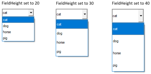
(The FieldHeight property was added in PxPlus 2026.)
This property, when set, causes the system to search the list box or grid for the text supplied. If the text is found, the system will set the 'Column and 'Item (or 'Row) property for the control to the entry where the match was found. If no match is found, the 'Column and 'Item ('Row for the grid) property is set to zero.
A typical use of this property would be to locate a value in the list box and then change or delete it. It can also be used to validate that an entry exists in the list box. This property is generally only written to. Reading this value will return the same as reading the 'ItemText$ property.
Controlling the Search (List View/Grid Only): The search is controlled by the settings found in 'FindOptions$. These options are provided as a series of characters in 'FindOptions$:
|
Char. |
Function |
|
C |
Search is case insensitive. |
|
A |
Accents will be ignored when comparing data. |
|
W |
Search should start from current position and wrap around. |
|
* |
Match is for data anywhere in the text (cannot be used with Sort option). |
|
S |
Data is sorted. |
|
R |
Search backwards. |
Search Range (List View/Grid Only): When searching, if the "W"rap option is not specified, the search will start from the beginning of the data in the control and proceed through the end. If the "R"everse option is set, the search starts at the end and proceeds to the beginning. If the "W"rap option is set, the search will start from the position immediately after that specified in the 'Item ('Row for Grid) and 'Column and search through all the data wrapping around the end/start back to the starting point.
If the property 'FindColNo (or 'Column for Grid) is set, only data in that column will be searched. If the "S"ort option is specified, only the column specified in the 'Sort property will be checked and its setting (Ascending/Descending) will be used to determine the assumed sort sequence. If 'Sort is not set, the system will assume that the column specified in 'FindColNo has been pre-sorted in Ascending order. If 'FindColNo is not set, then the system will assume the first column is to be used and is in ascending sequence.
If both "W"rap and "S"ort options are specified, the system will use the starting point set in 'Item ('Row on Grid) and 'Column and determine the search direction based on the value at the starting point. If the value at the start point matches that of the search value, the "R" option will determine the search direction.
See also 'FindColNo and 'FindOptions$ properties.
Note:
Prior to PxPlus v11, this property and functionality was not available on the grid. In addition, the 'Column was not set nor were the 'FindOptions$ and 'FindColNo (list view only) supported.
Example 1: Changing item text in a list box
To change the value of the list box entry of "CAT" to "DOG" for list box "LIST1", you could do the following:
List1'FindItemText$="CAT" ! Locate the item
List1'ItemText$ = "DOG" ! Change the value
Example 2: Locate and delete an item from a list box
To locate and delete a value from a list box:
List1'FindItemText$="CAT" ! Locate the item to delete
LIST_BOX LOAD List1, List1'Item, *
Example 3: Validate the existence of an item in a list
To search a list box to find a specific value, set the FindItemText$ to the desired search value then read 'Item. If zero, the item does not exist.
List1'FindItemText$=X$ ! Locate the item
IF List1'Item=0 THEN MSGBOX X$+" is not found"
Focus indicator: 1 = Control has focus (Default: 0)
Background color when the control has focus. For information on valid color names and color specifications, see Color Properties.
Controls whether a dotted focus rectangle displays around the Drop Box selected text. Default is On.
Possible values are:
|
|
0 |
No focus rectangle is shown. |
|
|
1 |
Focus rectangle is shown. |
Example:
To turn Drop Box focus Off:
DROP_BOX 100,@(10,15,12,8)
DROP_BOX LOAD 100,"cat/dog/horse/pig/"
y=100
y'FocusRect=0
To turn Drop Box focus back On:
DROP_BOX 100,@(10,15,12,8)
DROP_BOX LOAD 100,"cat/dog/horse/pig/"
y=100
y'FocusRect=1
(The FocusRect property was added in PxPlus 2026.)
Foreground text color when the control has focus. For information on valid color names and color specifications, see Color Properties.
This property is used to reference the font for a control. It will contain (or can be set to) a string containing three comma-separated fields of the font name, size and attributes. See 'FONT' mnemonic.
Example:
To set the font to Arial, 1.5 times normal size, and Bold, the format would be xxx'Font$="Arial,1.5,B".
Color of the frame/border around the control. For information on valid color names and color specifications, see Color Properties.
(The FrameColor$ property was added in PxPlus 2024.)
Height of control in pixels.
Background color when mouse is over the control. For information on valid color names and color specifications, see Color Properties.
(Drop Box support was added in PxPlus 2025.)
Color of border when mouse is over the control. For information on valid color names and color specifications, see Color Properties.
(Drop Box support was added in PxPlus 2025.)
Foreground text color when mouse is over the control. For information on valid color names and color specifications, see Color Properties.
(Drop Box support was added in PxPlus 2025.)
Windows handle for control.
Index number of item in list.
Number of items in list. See Load on Demand.
Value of the current item set by 'Item.
Hot key to jump to control.
Left margin for control in pixels.
Screen position of control.
Height of control in number of lines.
Insertion point for list/drop box loads. This property controls where the data loaded to a list_box, drop_box, varlist_box or vardrop_box will be inserted. When a list/drop box LOAD directive is issued with no index, the current contents of the control will first be cleared and the new data will replace it. Setting the 'LoadPoint property to a non-zero value alters this behavior.
If 'LoadPoint is set to -1, the data included with the list/drop box LOAD directive will be appended to the list box contents.
If 'LoadPoint is set to -2, the data included with the list/drop box LOAD directive will replace the current contents of the list starting at the item number set in the 'Item property, which will be updated to the next item number once the load is complete (new items will be added, if required).
If 'LoadPoint is set to a value > 0, the data will be inserted into the list at the point specified and the value in 'LoadPoint will be reset.
Note:
A positive value in the 'LoadPoint property is reset to 0 (zero) when a list/drop box LOAD directive is executed. A value of -1, which indicates 'append', is not reset by the LOAD directive.
This functionality allows drop boxes to be loaded a block of records at a time.
(The LoadPoint setting of -2 was added in PxPlus 2019.)
Defines how a control will look. Possible values are:
|
2 |
Old Windows 3.1 2D look. |
|
3 |
Windows 95/98 3D look. |
|
4 |
Windows XP/Vista/Windows 7 look. |
This property reports/sets the CTL value to generate when an object is selected on a right-click of the mouse.
Message line text for the control.
User object method. (Default: 0 - No object specified)
The 'ObjectID property allows applications to intercept property values and add methods to controls. When set to a valid Object ID by the application, you can add methods and add/override property logic for any control in the system. When set in the system, it allows the application to logically request methods against the control that, in turn, will be performed by the related Object ID. It will also first check the object for any property requests and, if the property is defined in the object, set or get that property instead of the controls.
To allow the specified object to get true access to the control, while executing within the object identified by the 'ObjectID property, the system will direct any property requests directly to the control.
Note:
When a control is deleted from the system, any object identified by an 'ObjectID property will be automatically dropped.
Controls the CTL event that will be fired when the drop list of a DROP box (normal or variable) is opened/displayed. If the value of this property is non-zero, the system will use its value of a CTL event to fire. Setting this to zero disables the CTL event from being sent. (Default: 0)
On Focus CTL event: 0 is returned if no On Focus CTL value is set up for the control.
This property, when set to a non-zero value, causes the system to generate an internal CTL event following any changes to a list box. It can be used to monitor changes to a list style control so that external action (such as updating screen or files) can be performed. (Default: 0)
If the value of this property is non-zero, the system will use its value as a CTL event to generate. If zero (default state), no event will be generated.
To avoid multiple signals being generated, the system will defer the generation for approximately 1/2 second following the last update. This means that when multiple rows/cells are being updated, the event will generally only occur once the updating is complete.
This property controls the CTL event that will be fired prior to the system displaying the Tip for any control. If the value of this property is non-zero, the system will use its value of a CTL event to fire and will defer the display of the tip until the application changes the value in 'Tip$. If the value in 'Tip$ is not changed, no tip will be displayed.
Setting this to zero (Default) disables the event from being sent and the current 'Tip$ will be displayed.
Parent window handle.
Set scroll wheel increment. This property is used to define how many lines each click of the scroll wheel will move a list box or grid.
Possible values are:
|
0 |
Scroll wheel support (all events go to parent window). |
|
1 |
Scroll only if the control has focus (mouse can hover on or off control). |
|
2 |
Scroll only if the control has focus (mouse must be hovered over control). |
|
3 |
If control does not have focus, then scroll when mouse hovers over this control (otherwise, same as 1). |
|
4 |
If control does not have focus, then scroll when mouse hovers over this control (otherwise, same as 2). |
Separator character between each field, column or data point.
Separator character for each row or data set.
Controls the displaying of the drop down list of selections for a drop box. Setting it to 1 causes the drop list to expand/display. Setting it to 0 (zero) causes the drop list to be collapsed. It can be read to determine the current status of the drop box.
This property controls whether a 'Change' signal will be generated when the control (or region of a grid control) is exited regardless of whether the control's value changes. Normally, controls only signal changes when the control loses focus and the contents have changed. Setting 'SignalOnExit allows a change signal to also be generated whenever focus leaves the control (or region for grid).
|
0 |
No signal on exit unless control value has changed. |
|
1 |
Signal on exit regardless of whether value has changed (on grid, signals whenever changing cell). |
|
2 |
Signal when changing row or on exit of grid (sets column value to 0 and row value to last row exited). (Grid Only) |
|
3 |
Signal when exiting the grid (sets column and row values to zero). (Grid Only) |
Controls the translation of the values selected in a control and how the value will be passed to/from the application.
Generally, it contains a table of single-character values representing selections from the controls with each character representing each of the values in the control in sequence. The size of each entry can be changed using the 'TblWidth property.
This property can be used to set the length of each of the items in the 'Tbl$ property. It can be set to any positive value. (Default: 1).
Setting 'TblWidth to 0 (zero) indicates that 'Tbl$ contains a delimited string with the last character of the string being the delimiter character.
Foreground text color. For information on valid color names and color specifications, see Color Properties. (Default: "DEFAULT")
Tip message for control.
Top of control in pixels.
Current item value.
Control visible flag: 1 = Yes; 0 = No (Default: 1)
Width of control in pixels.
Controls the list of properties to be returned in '_PropValues$. Each value is separated by the value in '_PropSep$.
This property can be used to speed up the processing of multiple property accesses but reducing the number of interactions with the control. See Multi-Property Access.
Controls the separator used between each of the values of the properties returned in '_PropValues$ as defined by '_PropList$.
This property can be used to speed up the processing of multiple property accesses but reducing the number of interactions with the control. See Multi-Property Access.
Accesses the values of the properties defined in '_PropList$. Each value is separated by the value in '_PropSep$.
This property can be used to speed up the processing of multiple property accesses but reducing the number of interactions with the control. See Multi-Property Access.