(NOMADS+ and Property Sheets)
Use the Pointer Tool (default) for selecting either a single control or for drawing a selection box around multiple controls in a group so that the same function (i.e. copying/pasting, moving, deleting) can be applied to them at the same time.
(The Pointer tool and Default to Pointer option in NOMADS+ were added in PxPlus 2019.)
Standard button control familiar to all graphical user interface users.
Radio buttons typically appear in a group of two or more circular buttons, where only one button in the group may be activated (set to On) at any time.
Users can toggle check boxes between states: On to select an option, Off to disable it. An optional third state may be defined (for a Tri-State control).
List box controls allow users to select items from a displayed list. The different list box styles available in NOMADS include Standard, Formatted, List View, Report View and Tree View.
A drop box is similar to a list box, but it only displays a single line of text and provides a drop-down arrow button for access to other items in the list.
A multi-line control is an input field used primarily for entering one or more lines of text.
Provides headings and labels for controls in a panel. Fonted text provides several style options. Fixed (standard) text is for fixed PxPlus font only.
Places a graphic on the panel. Does not respond to events.
Draws a box/frame around a selected group of controls on the panel. Does not respond to events.
Draws graphics on a panel. Does not respond to events.
Vertical and horizontal scrollbars provide slider controls.
Panels can be set up to appear as a layered file folder to provide access to tabbed sub-panels.
The grid is a two-dimensional array of cells (similar to a spreadsheet) that may comprise a combination of different panel components.
Creates a chart-style illustration on the panel.
Creates a control that allows you to integrate external components produced by third-party vendors into your Windows-based PxPlus application (e.g. progress bar, spreadsheet, browser or calendar).
The types of external controls that can be created are Chromium Browser, ActiveX Controls, PVX Plus Controls and .NET Controls.
(The Chromium Browser Object was added in PxPlus 2017.)
(Support for .NET controls was added in PxPlus 2025.)
Allows you to place the contents of another panel onto the current panel.
(NOMADS+ and Folder Style)
Used for selecting multiple controls in a group so that the same function (i.e. copying/pasting, moving, deleting) can be applied to them at the same time. When this tool is selected, use the mouse to draw a selection box around the controls to be grouped. (Similar functionality to the Pointer Tool.)
Suppress Groups
Click the text portion of this button to launch the Suppress Groups utility that is used for choosing which group(s) of controls to display or temporarily suppress from displaying on the current panel in the NOMADS Panel Designer.
Click the drop down arrow to access a Display All Groups option for displaying all groups on the current panel.
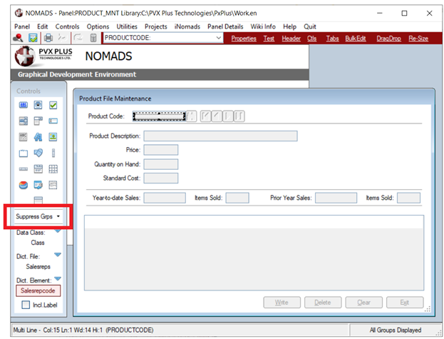
(The Suppress Groups utility was added in PxPlus 2021.)
(Available only if Data Class Definitions file exists)
This button (or the Query down arrow) displays a list of defined data classes stored in the providex.dcl file. For information on creating data classes, see Data Classes.
Select a data class for the type of control to be placed on the panel. When selected, the text Class is replaced with the name of the selected class, and the button color changes to dark red. When the control is drawn, the Properties window is automatically loaded with information from the selected class.
(Available only if Data Dictionary file exists)
This button (or the Query down arrow) displays a list of dictionary files stored in the providex.ddf file. Select the dictionary file that contains the element(s) to be placed on the panel, and then use the Element button to select an element from the selected file. When a file is selected, the text File is replaced with the name of the selected file, and the button color changes to dark red.
(Available only if Data Dictionary file exists)
If a dictionary File was selected previously, this button (or the Query down arrow) displays a list of the elements in the selected file only. If no dictionary File was selected, this button displays a list of all the elements in all dictionary files (sorted by Table Name). Elements are stored in the providex.dde file. For information on defining elements, see Element Description.
Select an element to be placed on the panel. When selected, the text Element is replaced with the name of the selected element. If a dictionary File was not selected previously, then the text File is replaced with the name of the dictionary file containing the selected element. The Element button color changes to dark red. When the control is drawn, the Properties window is displayed for the selected element.
Note:
When drawing a data element control:
● If the element was defined with a data class that is not dynamic, the element values will be written to the control properties.
● If the element was defined with a dynamic data class, a message will ask if the element values are to overwrite data class values for corresponding properties. Respond Yes to apply the element values or No to apply the data class values. See
Dynamic Control Properties.
(Dynamic data classes and properties were added in PxPlus 2018.)
(Available only when a Data Dictionary element is selected)
When selected, this option generates a fonted text label for a data dictionary Element control (see Data Element Controls) when the control is drawn on the panel. At the same time, the Create Label For Dictionary Element option (Options menu) is selected. Both of these options remain selected until either one is deselected or the panel designer is exited.
Note:
This option has no effect on Check Box and Radio Button element controls and will be ignored if selected. These controls will be created as normal.
To apply this option:
|
1. |
Select an Element to be placed on the panel. The Element button changes to dark red and displays the name of the selected element. At the same time, the Incl. Label check box displays. (If using NOMADS+, the Include Element Label check box displays above the Controls Toolbar.) |
|
2. |
Click the Incl. Label check box. |
|
3. |
Draw the element control. (At this point, a message displays only if the selected element is associated with a Dynamic Data Class.) |
|
4. |
A Fonted Text Properties window displays for the generated element label. By default, the label is positioned to the left of the control but can be adjusted if needed. |
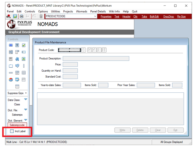
(The Incl. Label check box was added in PxPlus 2018 Update 0001.)