When a user clicks a Button in a graphical application, it is usually defined to send a signal to the application to perform a specific action. NOMADS allows you to customize the Button's appearance and various other characteristics; i.e. use graphics that correspond to object states, create a tool bar-style appearance that looks 3-D on a mouse-over, or add hover text similar to links on a Web page.
To draw a new Button control on a panel, select the Button control tool from the
Controls Toolbar. Hold down the left mouse button and drag the mouse to create a rectangle to the desired size. Release the mouse button to create the new object.
|
Name |
Unique name of the Button control (NOMADS provides a default). Naming conventions for variables apply. Click the Browse Library button to copy parameters from an existing object (via the
Library Browse dialogue). Note:
When a new control name is entered, it will be checked against the
Reserved Words list to determine if it is restricted for use as a NOMADS control name. If it is found, a warning message will display.
(User Reserved Words Maintenance was added in PxPlus 2020.) |
|
Class |
Associate a data class for preloading information (e.g. size, description, input methodology, default values, etc.). Click the Query button (binoculars) to select a predefined class. |
|
Preview |
Displays how the visible properties of the control will appear at run time. |
|
Display |
|
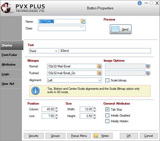
Text |
Sets the Button text. Click the drop-down arrow for a list of selections: Fixed, Expression, Message Library Reference. |
|
Bitmaps |
Sets the Button bitmap. Click the Bitmap Library button to select a bitmap from the Bitmaps dialogue.
|
Normal |
Bitmap shown when the Button is released. |
|
Pushed |
Bitmap shown when the Button is pressed. |
|
Alignment |
Sets the bitmap alignment. Click the drop-down arrow for a list of selections: Left, Right, Top, Bottom, Center/Scale. Selecting Center/Scale alignment also forces the selection of the Scale bitmap option. |
|
Scale bitmap |
Scales the bitmap to fit the Button size. Any Button text is forced to be aligned Center/Scale. Note:
Top, Bottom and Center/Scale alignments and the Scale bitmap option only work in 4D mode. |
(The Center/Scale alignment and Scale bitmap options were added in PxPlus 2019 Update 1.) |
|
Image Options |
(Available when Bitmaps for Normal/Pushed are selected)
Sets advanced image options for the bitmap. Click the Additional Image Options button to the right of the Image Options multi-line to invoke the Image Options dialogue.
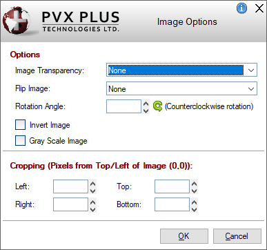
This dialogue consists of the following:
|
Options |
|
Image Transparency |
Bitmap transparency option. Click the drop-down arrow for a list of selections: None, Pixel sets transparency or 'Light Gray' is transparent. |
|
Flip Image |
Flips the image. Click the drop-down arrow for a list of selections: None, Flip horizontally (left/right), Flip vertically (up/down) or Flip horizontally and vertically. |
|
Rotation Angle |
Counter clockwise rotation angle at which to display the image. Valid entries are 0 to 359. |
|
Invert Image |
Displays the image with inverted colors. |
|
Gray Scale Image |
Converts the image to gray scale. | |
|
Cropping (Pixels from
Top/Left of Image (0,0)) |
Define the cropped image in terms of Left, Right, Top and Bottom where these values are the number of pixels from the top left corner (0,0) of the image. | Note:
Image Transparency and Cropping are not supported in
iNomads.
(The Image Options dialogue was added in PxPlus 2019.) |
|
Position |
|
Column |
Starting column for the top left corner of the control - numeric expression. Format mask is ##0.00. Valid entries are 0 to 620. |
|
Line |
Starting line for the top left corner of the control - numeric expression. Format mask is ##0.00. Valid entries are 0 to 255. |
(Support for increased Column and Line maximums was added in PxPlus 2021.) |
|
Size |
|
Width |
Width of the control in number of columns - numeric expression. Format mask is ##0.00. Valid entries are 0 to 620. |
|
Height |
Height of the control in number of lines - numeric expression. Format mask is ##0.00. Valid entries are 0 to 255. |
(Support for increased Width and Height maximums was added in PxPlus 2021.) |
|
General Attributes |
Optional attributes for Tab Stop, Initially Disabled and Initially Hidden. (See
Attributes.) |
|
Font/Color |
|
Font Specification |
|
Font
Size |
Click the drop-down arrow for a list of selections. | |
|
Color |
|
Foreground
Background |
Click the Query button to access
Color Selections. Valid formats for color selections include predefined system colors (e.g. Light Red), Custom (RGB codes), HTML Hex Color Codes, User Defined colors (e.g. Color17) and string Expressions. |
(The Color Selections Query button and dialog were added in PxPlus 2020.) Note:
If a background color has been assigned to a transparent Button, the background color will be ignored.
(Transparency precedence for Buttons with background colors was added in PxPlus 2019 Update 1.) |
|
Attributes |
Optional attributes. |
|
Alignment |
Sets the text alignment on the Button. Defaults to Center when defining a Button control with text only or with both text and bitmap(s), but this can be changed. |
|
Visual Class |
Assign a visual class to the control.
Click the Visual Class Maintenance button to launch the
Visual Classes Maintenance utility for creating or editing visual classes.
To assign visual classes to controls at the library level, see
Visual Class Assignment. Note:
Visual class names that begin with an "*" (asterisk) are pre-defined visual classes used by PVX Plus and may be subject to change without notice.
(The Visual Class Maintenance button was added in PxPlus 2019.) |
|
iNomads Class |
Assign an iNomads class to the control. The iNomads class contains class attribute references used when defining the control in the HTML code generated in iNomads. An iNomads class reference must start with an alpha character (A-Z or a-z), followed by any combination of A-Z, a-z, 0-9, underscore or dash. Multiple references may be entered, separated by a space.
For a list of pre-defined classes, see
iNomads Classes. |
|
Attributes |
|
Attributes |
|
Tab Stop |
Adds the control to the tab order list. Allows use of the Tab key for moving to the control. |
|
Auto Tab Skip |
Control is skipped when tabbing forward but is still accessible via Shift - Tab or the mouse. |
|
Initially Disabled |
Control region is grayed out and is not accessible to the user for input. The control is accessible programmatically. |
|
Initially Hidden |
Control is not displayed but is accessible programmatically. |
|
Adjacent |
When the Button is drawn, it is lined up to the control at its immediate left. |
|
Enable Scrolling |
Allows control to scroll in a resizable/scrollable dialogue box. See
Panel Resizing. |
|
Default Push Button |
Defines Button as default. Pressing the Enter key will execute the On Change logic for this Button. There can only be one default push button per panel. |
|
Signal Only (No Focus) |
PxPlus generates a CTL value but does not shift focus to the Button automatically (default) unless focus is explicitly passed. |
|
Moveable |
Button can be moved by dragging it with the mouse. This movement will not be saved.
(The Moveable property was added in PxPlus 2019.) |
|
Hover Cursor |
Controls the type of cursor to display whenever the mouse moves over the control. Options are: Default, Arrow, Wait, Insert, Movement arrow, Sizing arrow, Hand, Crossed hand, Rabbit in hat, Happy face, Sad face, Up/down arrow, Left/right arrow and Not allowed. |
|
Hyperlink (Web Page Style Link) |
Generates a Web-link style Button (no frame, underscored, and hover). Enables the ability to control text placement. |
|
Flat Button |
Button shows no raised outline unless the mouse is over the Button or the Button is pressed. This option is hidden if the Hyperlink (Web Page Style Link) check box is selected. |
|
Flat No Border |
Button has no border and shows no raised outline unless the Button is pushed. This option is hidden if the Hyperlink (Web Page Style Link) check box is selected. |
|
Transparent |
Button is transparent; i.e. the window contents behind the Button show through. This style can be used to place Buttons onto bitmaps. This option is hidden if the Hyperlink (Web Page Style Link) check box is selected. Note:
Setting a background color is not compatible with transparency. If a background color is specified, it will be ignored. |
|
Underscore Text |
Text on the Button is underscored. This option is hidden if the Hyperlink (Web Page Style Link) check box is selected. |
|
Dynamic Text |
When set, the system will define a string variable based on the name of the control that, when changed and the screen is refreshed, will control the text shown on the button. Typical use might be a button that works as a hyperlink to a Web site where the text in the related string variable changes between records currently being displayed.
This option is hidden if the Hyperlink (Web Page Style Link) check box is selected.
(The Dynamic Text property was added in PxPlus 2024.) |
|
Hover Color |
Text on the Button is highlighted whenever the mouse is over the Button area. The default color is controlled by the
'CH' system parameter that defaults to 'Light Blue'. This option is hidden if the Hyperlink (Web Page Style Link) check box is selected. |
|
Drop-List Button |
Extra button with an arrow bitmap is attached to the right of the main Button. When the arrow bitmap Button is clicked, the associated popup menu is displayed. This option is hidden if the Hyperlink (Web Page Style Link) check box is selected. |
|
Special Button Style |
Click the drop-down arrow for a list of Button styles. Defaults to None for a new button or for a button that did not have any of these attributes previously set. This option is hidden if the Hyperlink (Web Page Style Link) check box is selected.
Available selections are:
|
None |
No special button style. |
|
Bitmap Button |
Button has a bitmap whose width is divided into four images. Use this to custom design Buttons with any color, style or shape by controlling the image that appears. |
|
Plus Rocker Button |
Button is a rocker style that provides Left, Right, Up and Down arrows in a plus sign layout over whatever image exists in the Button. |
|
Sizer Button |
Creates narrow horizontal or vertical Button (depending on its dimensions) that can slide vertically or horizontally. Can be used between other controls to control for sizing purposes. |
|
Spinner Button |
Button will work as a spinner button with Up and Down arrows displayed on the Button. Clicking on an arrow will not only result in the button firing but will also set the EOM to U or D, depending on the arrow clicked.
(The Spinner Button option was added in PxPlus 2024.) |
|
System Tray |
Assigns control to be a Windows system tray icon and places a Button in the system tray. The Button should contain icons only. |
(The Special Button Style drop box was added in PxPlus 2024.) |
|
Corner Radius |
Sets the radius for the button corners. Works only in 4D mode. Possible values are Null (blank), Round, Square or a value from 0 to 255 inclusive. See
CornerRadius$ property.
Example:
Corner Radius set to Round:

Corner Radius set to Square:

Corner Radius set to a value of 10:
 Note:
Corner rounding is limited based on the control type and/or the control size.
(The Corner Radius property was added in PxPlus 2026.) | |
|
User-Defined Tag Field |
For controls, data/tag field which can be used to pass information on such things as formatting, error messages or validation rules. Field contents are placed in a variable using the control name with a .TAG$ extension. |
|
Logic |
|
Default Program |
Displays the name of the
Default Program used in the Panel Header definition.
(The Default Program was added for display in PxPlus 2019.) |
|
Prior Button Display |
Logic to be processed prior to creation of the Button. Click the drop-down arrow for a list of selections. See
Events Logic.
Click the Program Logic button beside the Perform or Call action to launch the default program editor, which is typically the
*IT - Integrated Toolkit. To make
Ed+ the default program editor, change the setting for the
%NOMADS'Program_Editor property to Ed+.
(The ability to set Ed+ as the default program editor was added in PxPlus 2023.) |
|
When Receiving Focus |
Logic to execute when the control receives focus. Click the drop-down arrow for a list of selections. See
Events Logic.
Click the Program Logic button beside the Perform or Call action to launch the default program editor, which is typically the
*IT - Integrated Toolkit. To make
Ed+ the default program editor, change the setting for the
%NOMADS'Program_Editor property to Ed+.
(The ability to set Ed+ as the default program editor was added in PxPlus 2023.) |
|
When Button Pressed |
Logic to be executed when focus leaves the control or the state of the control has changed. Click the drop-down arrow for a list of selections. See
Events Logic.
Click the Program Logic button beside the Perform or Call action to launch the default program editor, which is typically the
*IT - Integrated Toolkit. To make
Ed+ the default program editor, change the setting for the
%NOMADS'Program_Editor property to Ed+.
(The ability to set Ed+ as the default program editor was added in PxPlus 2023.) |
|
User Aid |
|
Help Reference |
Help text to be invoked at run time by pressing Shift - F1 while focus is on a control.
|
Type |
Select from External or Internal help types:
|
External |
(Default) Standard Windows help system consisting of a help File Name (.html, .hlp, .doc, etc.) and an optional Keyword or Reference number (Fixed value or string Expression). |
|
Internal |
Application supplied message text (Fixed value, string Expression or Message Library Reference). | |
|
File Name |
Name of the help file. |
|
Keyword |
Indicates that the text in the adjacent field is the index entry for the topic in the indicated help file. |
|
Reference |
Indicates that the adjacent field contains the reference number for a specific topic in the context sensitive help. |
|
Popup |
Select this check box to display the help topic as a popup rather than as an independent window. |
|
Test |
Tests the current help settings. | |
|
Floating Tip |
Mouse pointer message for the control (Fixed value, string Expression or Message Library Reference).
You can customize the floating tip by adding a tip title, descriptive tip text and a hyperlink. These features enhance the visual display and functionality of the tip by providing users with much needed information at their fingertips. You can define either a Standard tip or an HTML tip that provides a simplified HTML Editor for customizing the tip text. To do this, click the button to the right of the Floating Tip multi-line input to invoke the Define Info Tip dialogue. See
Defining an Info Tip. Note:
The Floating Tip drop box and multi-line input cannot be changed once an
HTML tip has been defined.
NOMADS Wiki Help
The floating tip text can be used when displaying the
Wiki Help. Info tips, however, are not supported and will be ignored.
(Support for customizing Floating Tips was added in PxPlus 2016.)
(Support for the use of Floating Tip text in the Wiki Help was added in PxPlus 2023.) |
|
Message Bar |
Text to be displayed in the panel's status bar when focus is on the control (Fixed value, string Expression or Message Library Reference). |
|
|
|
Security |
Security restrictions. See
Restricting Access for information on Object Security Definition. |
|
Groups |
Assign the control to a group. See
Group Assignment. |
|
Popup Menu |
Associate a popup menu that will appear when you right-click the mouse over the selected control. See
Popup Menu. |
|
Notes |
Add notes/comments for the control. Maximum 1024 characters. These notes also display in the Wiki Help documentation for the panel. See
NOMADS Wiki Help.
(The Notes button was added in PxPlus 2023.) |