Directives
|
BUTTON |
Create/Control Button |
|
1. Define/Create: |
BUTTON [*] ctl_id, @(col,ln,wth,ht)=contents$[,ctrlopt] |
|
2. Delete: |
BUTTON REMOVE [*] ctl_id[,ERR=stmtref] |
|
3. Disable/Enable: |
BUTTON {DISABLE | ENABLE}[*] ctl_id[,ERR=stmtref] |
|
4. Set Focus To: |
BUTTON GOTO [*] ctl_id[,ERR=stmtref] |
|
5. Logical Push, Release: |
BUTTON {ON | OFF} [*] ctl_id[,ERR=stmtref] |
|
6. READ Activation Mode: |
BUTTON READ [*] ctl_id,mode$[,ERR=stmtref] |
|
7. Hide/Show: |
BUTTON {HIDE | SHOW} [*] ctl_id[,ERR=stmtref] |
Where:
|
* |
Optional. Use a leading asterisk to denote a global button. |
|
@(col,ln,wth,ht) |
Position and size of the button region. Numeric expressions. Column and line coordinates for top left corner, width in number of columns and height in number of lines. Use line value -1 to display the button on the tool bar. |
|
contents$ |
Text/images to appear on the button. See
BUTTON Contents$. |
|
ctl_id |
Unique logical identifier for the button (any integer -32000 to +32000). Avoid integers that conflict with keyboard definitions (e.g. 4 cancels CTL=4 for the F4 key) or Negative CTL Definitions. Use this value with the apostrophe operator to access various BUTTON Properties. |
|
ctrlopt |
Control options. Supported options for BUTTON include:
|
ERR=stmtref |
Error transfer |
|
FNT="font,size[ ,attr]" |
Font name, size, optional properties (See 'FONT' mnemonic) |
|
MSG=text$ |
Message line. In addition,
Balloon Text can be assigned to an icon placed in the system tray. |
|
MNU=ctl |
CTL value associated with right-click menu event |
|
OPT=char$ |
Single character parameter/option (See BUTTON OPT= Settings) |
|
TIP=text$ |
Mouse pointer message. To change the color, see 'TC'= system parameter. If desired, a bold title can also be added to the tip:
Example:
BUTTON 4000,@(2,14,12,2)="{!Stop}Exit",tip="*Bold*"+$0A$+"Not bold" | |
|
mode$ |
String variable. PxPlus returns a single-character Hex value in this variable to report the last method/keystroke the user chose to activate the button ($01$ for MOUSE-CLICK or $0D$ for Enter). |
|
stmtref |
Program line number or statement label to which to transfer control. |
Use the BUTTON directive to create/control buttons on the screen. The ctl_id is used to generate a CTL whenever the button is pressed. If ctl_id is prefixed by an asterisk (*), the button is considered global and not tied to a specific window. By default, non-global buttons are deleted when a window is removed/dropped or when the application issues a BEGIN. Global buttons can be removed manually or cleared by a START.
Button Properties
The
Apostrophe Operator can be used with the unique logical identifier (ctl_id) to dynamically read and alter a wide variety of control attributes (properties) directly from the programming language.
See
BUTTON Properties for the list of properties available for manipulating a button object.
BUTTON OPT= Settings
The single character parameters for OPT=char$ are listed below:
|
Opt. |
Description |
|
"<" |
Bitmap Left. Places bitmap left of text. |
|
">" |
Bitmap Right. Places bitmap right of text. |
|
"_" |
Bitmap Below. Places bitmap below text. |
|
"~" |
Bitmap Above. Places bitmap above text. |
|
"^" |
Dropdown. Creates a drop-down style button. When the drop-down portion of the button is clicked, the system will generate the CTL value associated with the MNU=ctl option. Generally, the program (or NOMADS) will then display a POPUP_MENU associated with the button. |
|
"=" |
Sizer. Creates a special sizer style button. This button is capable of being dragged across or up/down the screen to enable resizing of window's regions. See
Sizer Buttons.
(Sizer buttons were added in PxPlus v7.10, build 9170.) |
|
"#" |
Drawing tool. Creates a special drawing tool style button. This button is capable of being moved and/or resized on the screen to enable placement of controls. See
Drawing Tool Buttons.
(Sizer buttons were added in PxPlus v11.00). |
|
"*" |
Default. Defines button as default. |
|
"A" |
Default Font Settings. The default font settings of the control will be used. Since the default font setting of a button control is left justified, the "A" setting will result in left justification in most cases.
To force a right, left or center justification, use the
FNT= setting and make sure that you have a
'4D' mnemonic enabled. Right justification of buttons with a graphic are possible only with the
'4D' mnemonic turned On.
See
'2D' and
'3D' mnemonics.
Example:
print '2D';
button 10,@(60,5,20,1.5)="{!Stop}Test",opt="A",fnt="Arial,,R"
print '3D';
button 11,@(60,7,20,1.5)="{!Stop}Test",opt="A",fnt="Arial,,R"
print '4D';
button 12,@(60,9,20,1.5)="{!Stop}Test",opt="A",fnt="Arial,,R"
escape
Right justification works in '2D' or '3D' mode if the graphic is removed from the button.
Example:
print '2D';
button 10,@(60,5,20,1.5)="Test",opt="A",fnt="Arial,,R"
print '3D';
button 11,@(60,7,20,1.5)="Test",opt="A",fnt="Arial,,R"
escape |
|
"B" |
Bitmap Button. Has a bitmap whose width is divided into four images. Use this attribute to custom design buttons of any color, style or shape by controlling the bitmap image that appears. Each of the four divisions represents what a button will look like in a particular state:
|
1st quarter |
Bitmap image when button is disabled. |
|
2nd quarter |
Bitmap image when button is in normal (released) state. |
|
3rd quarter |
Bitmap image when the mouse is over the button. |
|
4th quarter |
Bitmap image when the button is pressed. | Note:
Quarters are horizontal quarters, meaning that if a bitmap is 100 pixels wide, the first quarter of the image is the first 25 pixels wide full height, as in [1][2][3][4], rather than as top left/right and bottom left/right, as in
 . . |
|
"C" |
Bitmap Centered. Places the bitmap centered and scaled to fill the button. Button text, if present, will be centered and overlay the image.
(The "C" option was added in PxPlus 2018 Update 1.) |
|
"D" |
Disabled. Button is grayed out and is not accessible to the user. |
|
"d" |
Button is permanently disabled (cannot be enabled). |
|
"F" |
Flat. Button shows no raised outline unless the mouse is over the button or the button is pushed. |
|
"f" |
Flat - No Border. Same as "F" but has no border. |
|
"H" |
Hide. Button is not displayed but is accessible programmatically. |
|
 |
Spinner. Indicates that the button will work as a spinner button with up and down chevrons displayed on the button for incrementing or decrementing an associated value.
Clicking the up or down chevron will not only result in the button firing but will also set the EOM to either "U" or "D", depending on the chevron that was clicked.
The color of the up and down chevrons can be controlled by using the
TextColor$ and
HoverTextColor$ button properties.
(The "I" option was added in PxPlus 2024.) |
|
"M" |
Moveable. Indicates that the button can be moved by the user.
To move a button, the user clicks and holds the mouse button down, drags the control to its new position, and then releases the button. When the button is released, it will generate a standard BUTTON press event; however, the EOM will be "M" to indicate that the button was moved as opposed to simply being pressed. This movement will not be saved.
See
Moveable property.
(The "M" option was added in PxPlus 2018 Update 1.) |
|
"O" |
Steal Focus. Button will steal focus from other controls when the mouse moves over the button. |
|
"S" |
Signal Only. The system generates a CTL value and does not shift focus to the button automatically (the default), but only when focus is explicitly passed to it. Use this to have a button act like a function key. |
|
"s" |
Scroll. Button can scroll within a resizable/scrollable dialogue box. |
|
"T" |
Transparent. Button is "see-through" to window contents below button area. |
|
"U" |
Hyperlink - Underscore. Text is underscored, displayed in hyperlink color, and highlighted on mouse-over. |
|
"u" |
Hyperlink - No Underscore. Same as "U" but without the underscore. |
|
"V" |
Hovertext. Indicates that text will change color when mouse is over the button. |
|
"W" |
Web link. This style of button emulates standard Web page text hyperlinks. The button consists of underscored text aligned to the top left corner that highlights when the mouse is positioned over the button. The button font may contain "C" or "R" to center/right justify the text.
(Web style buttons were added in PxPlus v7.00.) |
|
"Y" |
System Tray. Indicates that the button will actually appear in the System Tray. Note:
PxPlus provides the capability to add balloon text to an icon placed in the System Tray. See Balloon Text.
(System tray buttons were added in PxPlus v7.10.) |
|
"x" |
Tab Close Button. OPT="x" can be used to add a tab close button to a Button.
Example:
PRINT 'OPTION'("TabBtnCloseIcon","c:\sample\ico\btn_x.ico")
PRINT 'OPTION'("TabBtnCloseHoverIcon","c:\sample\ico\zilla.ico")
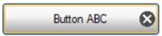
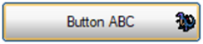
BUTTON 100,@(10,10,20,2)="Button ABC",opt="x"
This button shows the tab close icon:
This button shows the tab close hover icon:
(Support for customizing the tab close button was added in PxPlus 2026.) |
|
"+" |
Plus Rocker. Indicates that the button will work as a rocker button with Up, Down, Left and Right chevrons displayed on the axes of any bitmap contained in the button. Clicking on a chevron will not only result in the button firing but will also set the EOM to "U", "D", "L" or "R", depending on the chevron that was clicked.
(Plus Rocker buttons were added in PxPlus v11.00.) |
Options can be combined to create several different button types. The "f", "T", "U", "u" and "O" options provide the ability to turn buttons into hotspots. This allows for clickable areas on bitmaps or items such as HTTP URL links on dialogues.
Example:
|
"VTf" |
Creates a general hotspot. |
|
"VUTf" |
Creates an HTML-like hotspot. |
|
"F^" |
Creates a word-style toolbar with drop list. |
BUTTON Contents$
The contents$ string expression defines the text or picture to appear on the button. In the text, you can use an & (ampersand) preceding a character to identify it as a hot key that the user can press in conjunction with the Alt key to activate the button from the keyboard.
Bitmaps and Icons
When adding an image to a button, enclose the image name in curly braces. Use a leading ! (exclamation point) to identify the image as internal or specify the relative path and filename to access an image file that is external. A number of bitmaps are included in the executable. In addition, the system supports retrieving icons from either resource libraries or other system DLLs/executables.
For more information on the options available for displaying internal/external images and the recognized image file types, see Displaying Bitmaps/Icons.
Note:
PxPlus supports alpha channel transparency processing of bitmap images for buttons (for console output only, not printer and PDF).
(Alpha channel support was added in PxPlus 2017.)
When you use text as well as images, the relative positions of the image and the text set their relative placement. The following are example contents$ expressions:
Example:
"{!Add}Add" ! Displays the {!Add} bitmap in front of the text "Add"
"Delete{!Del}" ! Displays the {!Del} bitmap after the text "Delete"
If the string expression includes two images separated by a vertical bar inside a single set of curly braces, the first is displayed when the button is released (normal state), the second when the button is pressed:
"{!Stop |C:\MYBMP\Go}
You can also use the OPT="B" clause for a Bitmap Button to display different images for different states. See BUTTON OPT= Settings.
Processing a Manually Created Button in NOMADS
If you want to create a button on the fly and have NOMADS assign it to a statement label/perform, assign it to a set CTL value, and then using the CTL's definition option in NOMADS, define the logic you want executed.
Example:
In your program, you can create the button with:
BUTTON 100,@(10,10,10,2)="My Button"
In the NOMADS panel designer, select Ctls from the toolbar or select Utilities > User CTLS from the menu bar to invoke the
User Defined CTL Values utility and define your logic for CTL 100.
Define/Create
BUTTON [*] ctl_id, @(col,ln,wth,ht)=contents$[, ctrlopt]
Use this format to create a button control object, and give it a unique identifier in ctl_id. The ctl_id is used to generate a CTL value whenever the user presses the button:
rem Create button: CTL=4000 when pressed, 'Stop Sign' picture, "Exit" text
button 4000,@(2,14,12,2)="{!Stop}Exit"
If the ctl_id has a leading asterisk, the button is considered global (not tied to a specific window):
rem To add a global button to the Toolbar with the text "Help":
button *1000,@(0,-1,10,1)="Help"
Delete
BUTTON REMOVE [*] ctl_id[, ERR=stmtref]
Use BUTTON REMOVE to delete a button; e.g. to remove the button created previously:
button remove 4000
By default, non-global buttons are deleted when a window is removed/dropped or when the application issues a BEGIN. Global buttons can be removed using BUTTON REMOVE syntax or cleared using the
START directive.
Disable/Enable
BUTTON {DISABLE | ENABLE}[*] ctl_id[, ERR=stmtref]
Use the BUTTON DISABLE format to gray out a button so that it will be visible but inaccessible to users. To reactivate it, use BUTTON ENABLE:
button disable 4000
...
button enable 4000
Set Focus To
BUTTON GOTO [*] ctl_id[, ERR=stmtref]
Use BUTTON GOTO to set the focus on a button:
button goto 4000
Logical Push, Release
BUTTON {ON | OFF}[*] ctl_id[, ERR=stmtref]
Use BUTTON ON/OFF to make it look like the button was pressed/released though no signal is generated:
button on 4000
READ Activation Mode
BUTTON READ [*] ctl_id,mode$[, ERR=stmtref]
Use BUTTON READ to receive the user's method of selecting the button. The system returns a Hex value in the mode$ variable to tell you what keystroke last activated the button. Once read, this field is reset to $00$. Possible values are:
$01$ for MOUSE-CLICK
$02$ for DOUBLE MOUSE-CLICK
$0D$ for Enter
$20$ for SPACEBAR (and keyboard hot key, as in the BUTTON Example below)
$09$ for Tab to go to the button
$00$ when the user exits the button control
Other specific characters include: $81$ for F1 $82$ for F2 ...
You must read the user's selection(s) to make them available to your applications. In the example below, the STROKE$ variable returns the user's method of selection (by mouse, carriage return or space bar).
The value returned for keyboard strokes (the hot key Alt-B and the SPACEBAR) for the following example is $20$:
0010 ! BUTTON Example
0020 print 'CS'
0030 list
0040 button 2000,@(24,17,7,3)="{!BUG|!STOP}it the &Bug"
0050 let BTN=2000
0060 setctl BTN:READ_BOX
0070 button goto BTN
0080 print @(24,24),"HotKey=<Alt-B>. Try mouse and keyboard too. END=<F4>"
0090 obtain (0,siz=1,err=0090)@(0,0),'cursor'("off"),'ME',IN_VAR$,'MN'
0100 if ctl=4 then goto END
0110 READ_BOX:
0120 button read BTN,STROKE$
0130 print @(24,20),"Your HTA(selection)=",hta(STROKE$),",CTL=",ctl:"#####"
0150 goto 0090
0160 END:
0170 button remove BTN; print 'CS'
Hide/Show
BUTTON {HIDE | SHOW}[*] ctl_id[, ERR=stmtref]
Use the BUTTON HIDE format to hide the display of an active button. The user cannot see or use the button when it is hidden.
Use the BUTTON SHOW format to restore the button's display and access.
A Sizer button is a control that can be dragged either vertically or horizontally, usually used to resize or affect the layout of a screen. Sizers are defined as a style of BUTTON using the equal sign in the OPT= string.
When a Sizer button is used, the system will generate the button CTL signal only at the end of the drag operation. At that point, the application can read the controls line or column to determine where the drag terminated. The determination of whether a sizer can be dragged vertically or horizontally is based on the size of the Button. If the button is wider than it is high, the control can be dragged vertically (up/down). If the button is higher than it is wide, the control can be dragged horizontally (left/right).
By default, a Sizer control can be dragged the full width or height of the window. The range can be narrowed by using the 'MaxValue and 'MinValue properties.
Another use of a Sizer style button is as a control bar in a slider control that could be used to adjust a value such as a volume control.
(Sizer buttons were added in PxPlus v7.10, build 9170.)
A Drawing Tool button is a control that can be moved and/or resized, generally used in design utilities. Drawing Tool buttons are defined as a style of BUTTON using the hash tag (#) in the OPT= string.
When a Drawing Tool button is used, the system will generate the button CTL signal after any resize or movement operation is made to the button. The button itself will have resize points in the four corners and in the middle of the four external edges. The button itself can also be dragged (moved) to another spot on the screen. Once a resize or move operation is complete and the mouse is released, the buttons will generate an OnPress event at which point the application can read the revised button size/location.
(Drawing Tool buttons were added in PxPlus v11.00.)
BUTTON Properties
RADIO_BUTTON Create/Control Radio Button
CHECK_BOX Create/Control Check Box
TRISTATE_BOX Create/Control Tristate Box