Directives
|
RADIO_BUTTON |
Create/Control Radio Button |
|
1. |
Define/Create: |
RADIO_BUTTON [*]ctl_id:sub_id,@(col,ln,wth,ht)=contents$[,ctrlopt] |
|
2. |
Delete: |
RADIO_BUTTON REMOVE [*]ctl_id:sub_id[,ERR=stmtref] |
|
3. |
Disable: |
RADIO_BUTTON {DISABLE} [*]ctl_id:sub_id[,ERR=stmtref] |
|
4. |
Enable: |
RADIO_BUTTON {ENABLE} [*]ctl_id:sub_id[,ERR=stmtref] |
|
5. |
Set Focus: |
RADIO_BUTTON GOTO [*]ctl_id:sub_id[,ERR=stmtref] |
|
6. |
Logical Push/Release: |
RADIO_BUTTON {ON | OFF} [*]ctl_id:sub_id[,ERR=stmtref] |
|
7. |
Read Activation Mode: |
RADIO_BUTTON READ [*]ctl_id,var,mode$[,ERR=stmtref] |
|
8. |
Hide/Show: |
RADIO_BUTTON {HIDE | SHOW} [*]ctl_id:sub_id[,ERR=stmtref] |
Where:
|
* |
Optional. Use a leading asterisk to denote a global radio button. |
|
@(col,ln,wth,ht) |
Position and size of individual radio button. Numeric expressions. Column and line coordinates for top left corner, width in number of columns and height in number of lines are for total area (box plus text/description). Use line value -1 to display radio button on the tool bar. |
|
contents$ |
Text/pictures to appear on the radio button. PxPlus supports both {bitmap} and {icon} images (as of PxPlus v4.20). String expression. See
RADIO BUTTON Contents$. |
|
ctl_id |
Unique logical identifier for the radio button (any integer -32000 to +32000). Avoid integers that conflict with keyboard definitions (e.g. 4 cancels CTL=4 for the F4 key) or
Negative CTL Definitions. Use this value with the
Apostrophe Operator to access various
RADIO_BUTTON Properties. |
|
ctrlopt |
Control options. Supported options for RADIO_BUTTON include:
|
ERR=stmtref |
Error transfer |
|
FNT="font,size[,attr]" |
Font name, size, optional properties (See
'FONT' mnemonic) |
|
MSG=text$ |
Message line |
|
MNU=ctl |
CTL value associated with right-click menu event |
|
OPT=char$ |
Single character parameter/option (See
RADIO_BUTTON OPT= Settings) |
|
TIP=text$ |
Mouse pointer message (To change the colour, see
'TC'= system parameter) | |
|
mode$ |
String variable. PxPlus returns a single-character Hex value in this variable to report the last method/keystroke the user chose to activate the button ($01$ for MOUSE-CLICK or $0D$ for Enter). |
|
sub_id |
Unique individual index. Integer, range from 1 to 127. Used in applications to identify which radio button the user selects. |
|
stmtref |
Program line number or statement label to which to transfer control. |
|
var |
Numeric variable. Receives sub_id of currently activated radio button. |
Use the RADIO_BUTTON directive to create and control a group of radio button control objects on the screen. A radio button group is a series of related circular/radio-knob buttons (akin to check boxes) of which only one button can be active at a time. When a user selects one of the radio buttons, that selection is activated (On) and all other related radio buttons are automatically reset to Off.
Radio Button Properties
The
Apostrophe Operator can be used with the unique logical identifier (ctl_id) to dynamically read and alter a wide variety of control attributes (properties) directly from the programming language.
See
RADIO_BUTTON Properties for the list of properties available for manipulating a radio button control object.
RADIO_BUTTON OPT= Settings
The single character parameters for OPT=char$ are:
|
Opt. |
Description |
|
"^" |
Dropdown. Creates a drop-down style button. |
|
"*" |
Default. Defines button as default. |
|
"A" |
Default Font Settings. The default font settings of the control will be used. Since the default font setting of a button control is left justified, the "A" setting will result in left justification in most cases.
To force a right, left or center justification, use the
FNT= setting and make sure that you have a
'4D' mnemonic enabled. Right justification of buttons with a graphic are possible only with the
'4D' mnemonic turned On.
See
'2D' and
'3D' mnemonics.
Example:
print '2D';
radio_button 100:1,@(60,5,20,1.5)="{!Stop}Test",opt="A",fnt="Arial,,R"
print '3D';
radio_button 100:2,@(60,7,20,1.5)="{!Stop}Test",opt="A",fnt="Arial,,R"
print '4D';
radio_button 100:3,@(60,9,20,1.5)="{!Stop}Test",opt="A",fnt="Arial,,R"
escape
Right justification works in '2D' or '3D' mode if the graphic is removed from the button.
Example:
print '2D';
radio_button 100:1,@(60,5,20,1.5)="Test",opt="A",fnt="Arial,,R"
print '3D';
radio_button 100:2,@(60,7,20,1.5)="Test",opt="A",fnt="Arial,,R"
escape |
|
"B" |
Bitmap Button. Has a bitmap whose width is divided into four images. Use this attribute to custom design buttons of any color, style or shape by controlling the bitmap image that appears. Each of the four divisions represents what a button will look like in a particular state:
|
1st quarter |
Bitmap image when button is disabled. |
|
2nd quarter |
Bitmap image when button is in normal (released) state. |
|
3rd quarter |
Bitmap image when the mouse is over the button. |
|
4th quarter |
Bitmap image when the button is pressed. | Note:
Quarters are horizontal quarters, meaning that if a bitmap is 100 pixels wide, the first quarter of the image is the first 25 pixels wide full height, as in [1][2][3][4], rather than as top left/right and bottom left/right, as in
 . . |
|
"C" |
Bitmap Centered. Places the bitmap centered and scaled to fill the button. Button text, if present, will be centered and overlay the image.
(The "C" option was added in PxPlus 2018 Update 1.) |
|
"D" |
Disabled. Button is grayed out and is not accessible to the user. |
|
"d" |
Button is permanently disabled (cannot be enabled). |
|
"F" |
Flat. Button shows no raised outline unless the mouse is over the button or the button is pushed. |
|
"f" |
Flat - No Shift. Same as "F" but will not shift when pressed. |
|
"H" |
Hide. Button is not displayed but is accessible programmatically. |
|
"K" |
Keyboard. Pass back keyboard input. |
|
"o" |
Mouse Over. Button steals focus on mouse over. Focus returns to normal location when mouse moves off region. |
|
"S" |
Signal Only. PxPlus generates a CTL value but does not shift focus to the button automatically (the default), but only when focus is explicitly passed to it. Use this to have a button act like a function key. |
|
"s" |
Scroll. Button can scroll within a resizable/scrollable dialogue box. |
|
"T" |
Transparent. Button is "see-through" to window data below button area. |
|
"U" |
Hyperlink - Underscore. Text is underscored, displayed in hyperlink colour, and highlighted on mouse-over. |
|
"u" |
Hyperlink - No Underscore. Same as "U" but without the underscore. |
|
"V" |
Hovertext. Indicates that text will change color when mouse is over the button. |
|
"x" |
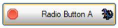
Tab Close Button. OPT="x" can be used to add a tab close button to a Radio Button with an image.
Example:
PRINT 'OPTION'("TabBtnCloseIcon","c:\sample\ico\btn_x.ico")
PRINT 'OPTION'("TabBtnCloseHoverIcon","c:\sample\ico\zilla.ico")
RADIO_BUTTON 100:1,@(10,12,20,2)="{!Stop}Radio Button A",opt="x"
This button shows the tab close icon:

This button shows the tab close hover icon:
(Support for customizing the tab close button was added in PxPlus 2026.) |
Options can be combined to create several different button types. The "f", "T", "U", "u", and "o" options provide the ability to turn buttons into hotspots. This allows for clickable areas on bitmaps, or items such as HTTP URL links on dialogues.
Example:
|
|
"VTf" |
Creates a general hotspot. |
|
|
"VUTf" |
Creates an HTML-like hotspot. |
|
|
"F^" |
Creates a word-style toolbar with drop list. |
RADIO BUTTON Contents$
The contents$ string expression defines the text/picture (bitmap or icon) to appear on the radio button. In the text, you can use an "&" (ampersand) preceding a character to identify it as a hot key that the user can press in conjunction with the Alt key to activate the radio button from the keyboard. Add a : (colon) to the end of the text field to force the text to display to the left side.
Example:
radio_button 100:1,@(2,14,12,2)="&Daily"
radio_button 100:2,@(2,16,12,2)="&Weekly"
radio_button 100:3,@(2,18,12,2)="&Monthly"
This would create a group of three radio buttons that will each generate a CTL=100 when pressed. Their individual sub_ids are 1, 2 and 3. Their respective hot keys are Alt-D, Alt-W and Alt-M.
Bitmaps and Icons
When adding an image to a radio button, enclose the image name in curly braces. Use a leading exclamation point (!) to identify the image as internal, or specify the relative path and filename to access an image file that is external. There are no icons in the PxPlus executable but it does support retrieving icons from either resource libraries or other system DLLs /executables.
For more information on internal/external images and recognized image file types, see
Displaying Bitmaps/Icons.
Note:
PxPlus supports alpha channel transparency processing of bitmap images for radio buttons (for console output only, not printer and PDF).
(Alpha channel support was added in PxPlus 2017.)
When you use text as well as images, the relative positions of the image and the text set their relative placement. The following are example contents$ expressions:
"{!Add}Add" ! Displays the {!Add} bitmap in front of the text "Add"
"Delete{!Del}" ! Displays the {!Del} bitmap after the text "Delete"
If a string expression includes two images separated by a vertical bar inside a single set of curly brackets, the first will be displayed when the radio button is Off (normal state), the second while the radio button is On.
Example:
"{!Stop|C:\MYBMP\Go}
Define/Create
RADIO_BUTTON [*]ctl_id:sub_id,@(col,ln,wth,ht)=contents$[,fileopt]
Use this format to create a radio button. Unlike most other controls, related radio buttons share the same ctl_id; that is, to group common radio buttons together, you define each member of the group using the same ctl_id and a different sub_id (index). When the user makes a selection, other radio button sub_ids in the same ctl_id group are turned Off or lose focus.
The group ctl_id value generates a CTL value whenever any radio button in the group is pressed and must be unique. Use an asterisk [*] as a prefix for ctl_id to identify the group of radio buttons as global (not tied to a specific window).
Note:
When drawing check boxes and radio buttons, the system does not use the same font (STDGRAPHICFONT) that is used within buttons and list boxes to draw the text. Instead, the system uses the current graphical text font (the font used with the
'TEXT' mnemonic) so that the text portion of these controls is consistent with other prompts/text on the screen.
Delete
RADIO_BUTTON [*]ctl_id:sub_id[,ERR=stmtref]
Use the RADIO_BUTTON REMOVE format to delete a radio button. By default, all local radio buttons are deleted when a window is removed/dropped or the application issues a BEGIN.
Global radio buttons can be removed manually or cleared with a
START directive.
Disable
RADIO_BUTTON {DISABLE}[*]ctl_id:sub_id[,ERR=stmtref]
Use the RADIO_BUTTON DISABLE format to gray out a radio button and make it inaccessible to the user.
Enable
RADIO_BUTTON {ENABLE}[*]ctl_id:sub_id[,ERR=stmtref]
Use the RADIO_BUTTON ENABLE format to restore a disabled radio button.
Set Focus To
RADIO_BUTTON GOTO [*]ctl_id:sub_id[,ERR=stmtref]
Use the RADIO_BUTTON GOTO format to set the focus on the radio button, ready for the user's next action.
Logical Push, Release
RADIO_BUTTON {ON | OFF}[*]ctl_id:sub_id[,ERR=stmtref]
Use the RADIO_BUTTON ON format as a logical push to make it appear that the radio button has been pressed.
Use RADIO_BUTTON OFF to make it appear that the radio button has been released.
Read Activation Mode
RADIO_BUTTON READ [*]ctl_id,var,mode$[,ERR=stmtref]
The RADIO_BUTTON READ format returns the sub_id for the currently active radio button in your numeric variable. (The value is 0 if none are active.) PxPlus returns a single-character Hex value for the mode/keystroke the user chose to activate the last radio button.
Possible values returned in mode$ can include:
$01$ for MOUSE-CLICK
$0D$ for Enter
$20$ for SPACEBAR (and keyboard hot key)
$00$ when the user exits the button control
To determine which RADIO_BUTTON sub_id has been pressed and the mode used:
radio_button read 1000,which,how$
Hide/Show
RADIO_BUTTON {HIDE | SHOW}[*]ctl_id:sub_id[,ERR=stmtref]
With the RADIO_BUTTON HIDE format, the radio button remains active but is not displayed. It is still accessible programmatically.
Use the SHOW format to restore the display and user access.
RADIO_BUTTON Properties
BUTTON Create/Control Button
CHECK_BOX Create/Control Check Box
TRISTATE_BOX Create/Control Tristate Box