|
Themes |
|
Themes and Visual Classes provide the easiest way in NOMADS and iNomads to define and maintain a unified look and feel to panel controls within your application. With the Theme Maintenance and Visual Classes Maintenance utilities, you can define default settings for various display properties based on a selected control type and then save each definition with a unique name so that they can be applied or modified when needed.
Themes are used to define a set of display properties for all controls based on the control type (i.e. all "Button" types), which can then be applied at different hierarchical levels that cascade to lower levels. They can be applied system wide, to specific libraries, to specific panels and to iNomads templates. For example, you can define a Theme for all "Button" controls to set the Background property to "Light Red". As a result, all Button controls within your application will have a "Light Red" background.
Visual Classes are used to define a set of display properties for applying to specific controls on selected panels (i.e. all buttons with text only), thereby overriding Theme settings. Visual Classes are particularly useful in cases where unique settings are required (i.e. that do not conform to the applied Theme).
Themes can be defined for the following Control Types:
|
|
|||||
|
|
|||||
|
|
|||||
|
|
(The ability to define Themes and Visual Classes for Shapes (Circles, Lines, Rectangles) and Menus was added in PxPlus 2024.)
To apply a Theme, see Applying a Theme to Your Application.
In addition, the Copy Theme utility provides the ability to copy Themes and related Visual Classes from one directory to another. This utility can also be used to create new Themes and Visual Classes.
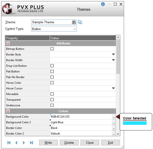
The Themes Maintenance Utility is used to define the display properties for creating a Theme. Themes created with this utility are stored in the providex.dfs file.
To invoke this utility, use one of the following methods:
|
Location |
Method |
|
From the PxPlus IDE Main Launcher |
Expand the Graphical Application Builder (NOMADS) category. Then expand the Setup category and select Themes. |
|
Select Themes Maintenance from the Utilities menu. (Themes Maintenance was added to the Library Object Selection Utilities menu in PxPlus 2019.) | |
|
From the NOMADS Session Manager |
From the Options menu, select Themes. |
The Themes Maintenance Utility is displayed below with a sample entry:
This window consists of the following:
|
Theme |
Name of the Theme. Maximum 30 characters. Create a new name to be associated with current property values. To select an existing Theme to modify, click the Query button (binoculars) or use the Browse buttons. If any unsaved changes are detected, you will be prompted to save the changes. Theme names are not case sensitive. This allows a different case to be used when typing the same Theme name to refer to the same record (providing that the Control Type also matches). When an existing Theme is recalled, the name will be in the case that was entered when the Theme was first created. Example: Suppose that a Theme named "ButtonRed" exists for Button controls. Other case variations of this name can be entered to refer to the same Theme; e.g. "BUTTONRED", "buttonred" or "BUTTONred". (Support for case insensitive Theme name was added in PxPlus 2020.) |
|
Copy Theme Record |
(Available when an existing Theme is selected) Button used to copy settings from an existing Theme/Control Type to a new Theme. Once it is created, the new Theme must be saved, as the Copy process does not do this. (The Copy Theme button was added in PxPlus 2020.) |
|
Control type to be associated with the name of the Theme. Click the drop-down arrow for a list of available control types: Default, Button, Chart, Check_Box, Drop_Box, Folder, Fonted_Text, Frame, Grid, List_Box, Menu_Bar, Multi_Line, Popup_Menu, Radio_Button, Shape-Circle, Shape-Line, Shape-Rectangle, Tristate_Box, VarDrop_Box and VarList_Box. The control type Default is used to set basic overall properties (Background and Foreground colors, Font) for any control types that do not have these properties defined under their own control record in the current Theme. (The ability to define Themes for Circle, Line and Rectangle shapes was added in PxPlus 2024.) | |
|
Property |
A two-column table that lists a sub-set of the properties normally displayed in the design window for a control type, as well as selected properties that are not available in the design window. The list of properties varies depending on the Control Type selected. The properties are grouped into categories (i.e. Attributes, Colors, Font, etc.) and sorted alphabetically within each group by default. These categories can be expanded/collapsed by clicking the + (plus) or - (minus) button adjacent to the category name. Only the categories that apply to the selected Control Type are displayed. The method for entering or displaying property values is dependent on the property type. Some fields are intended for entering free-form values; e.g. for height and width. Drop box style cells are identified by a down arrow button, which indicates that pre-set selections are available. Query style cells are identified by a three-dotted button. These cells are often associated with more than one field, and clicking the button invokes a separate dialog for entering/changing field values. The dialog that is invoked varies depending on the property. Double clicking inside the cell either invokes the same dialog as the dotted button or allows values to be entered directly into the cell. (The ability to double click inside a Query style cell was added in PxPlus 2023.) |
|
Write |
Adds/updates the current record. |
|
Delete |
Removes the current record. |
|
Clear |
Clears the current record. |
|
Exit |
Closes the Themes window. If any unsaved changes are detected, you will be prompted to save the changes. (Same applies when using the X (Close) button.) |
Once Themes have been defined, they can be applied at several hierarchical levels within an application. This allows different aspects of your application to be customized with their own unique look and feel.
Applying a Theme does not impact the Toolkit Theme, which is the Theme used by the development system, but it does impact the following user facing applications: Report Writer, Views, Query and Customizer.
This table describes the different hierarchical levels:
|
Level |
Description |
|
Assign a Theme to the %NOMADS'Theme$ property at run time to apply a Theme system wide. This can be done in your START_UP program or the Maintain NOMADS Environment utility, and is applicable for NOMADS and iNomads environments. Note: | |
|
Library |
Assign a Theme in the Library Defaults window (Font/Color tab) to apply a Theme to all panels in a selected library. The Library Bulk Edit and Search Utility can also be used to apply a Theme simultaneously to multiple panels either in a single library or in multiple libraries within a specified directory. Note:
|
|
Panel |
Assign a Theme in the NOMADS Panel Header window (Font/Color tab) when creating/editing a panel to apply a Theme to the controls on a selected panel. The Library Bulk Edit and Search Utility can also be used to apply a Theme simultaneously to multiple panels either in a single library or in multiple libraries within a specified directory. Note:
|
|
iNomads Template |
In the iNomads environment, assign a Template Theme from the iNomads Setup window, which allows access to System Administration Functions such as Template Settings. In this window, select the Options button to invoke Template Configuration Maintenance. In the Overrides tab, enter a Theme in the Assign a Theme field. Note: |
|
Assign a Theme to the %NOMADS'ThemeOverride$ property at run time to apply a Theme system wide. This can be done in your START_UP program or the Maintain NOMADS Environment utility, and is applicable for NOMADS and iNomads environments. Note: |
When testing your application within the NOMADS development system, your Theme settings will be used when displaying your application panels.
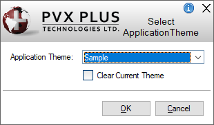
When working within the NOMADS Session Manager to develop your application, you can apply an existing Theme at the General level by using the Select Application Theme window.
This window is invoked from the NOMADS Session Manager, which is launched from the PxPlus Command line by entering nom. Then, on the Options menu, choose Select Application Theme.
This window consists of the following:
|
Theme |
Click the drop-down arrow to select an existing Theme. |
|
Clear Current Theme |
Select this check box to clear a Theme that is currently in use. This option only clears the Theme but does not delete it. |