Property
Description
Attributes
Borderless
Control has no border or frame.
Sets the radius for the multi-line corners. Works only in 4D mode.
Possible values are Null (blank), Round, Square or a value from 0 to 7 inclusive. See CornerRadius$ property.
Example:
Note:
Corner rounding is limited based on the control type and/or the control size.
(Corner Radius property was added in PxPlus 2026.)
Text is centered horizontally in the multi-line input field.
(Center Text property was added in PxPlus 2018.)
(The renaming of "Center Text" to "Horizontally Center Text" was added in PxPlus 2026.)
Locked
User can set focus but cannot change the multi-line input region. Associated query button is disabled.
(Locked property was added in PxPlus 2018.)
Right Justify
Text is right aligned in the multi-line input field.
(Right Justify property was added in PxPlus 2018.)
Transparent Background
Multi-line background and border are transparent; i.e. the window contents behind the multi-line show through.
(Transparent Background property was added in PxPlus 2018.)
Uppercase
Converts text from lowercase to uppercase automatically.
(Uppercase property was added in PxPlus 2018.)
Text is centered vertically in the multi-line input field.
(Vertically Center Text property was added in PxPlus 2026.)
Colors
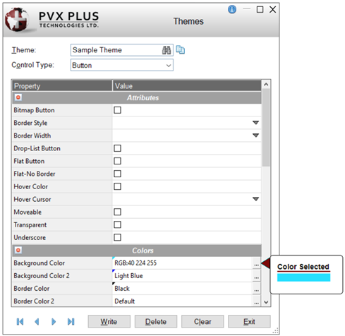
Click the dotted Query button or double click inside the cell to access Color Selections. Valid formats for color selections include predefined system colors (e.g. Light Red), Custom (RGB codes), HTML Hex Color Codes, User Defined colors (e.g. Color17) and string Expressions.
After a color property is set, a tick in the selected color displays in the top left corner. A floating tip with a sample of the selected color displays when hovering the mouse over the color setting.
(The color tick and color tip were added in PxPlus 2018.)
(The Color Selections Query button and dialog were added in PxPlus 2020.)
Background
Background color of the control in its default state. When a multi-line control is disabled, it retains the background color that has been set instead of showing the standard disabled color.
Foreground
Foreground text color of the control in its default state.
Color of the frame/border around the control.
(Frame Color property was added in PxPlus 2024.)
Disable Background Color
Background color when the control is disabled.
(Disable Background Color property was added in PxPlus 2022.)
Disable Text Color
Foreground text color when the control is disabled.
(Disable Text Color property was added in PxPlus 2022.)
Focus Background Color
Background color when the control has focus.
(Focus Background Color property was added in PxPlus 2019.)
Focus Text Color
Text color when the control has focus.
(Focus Text Color property was added in PxPlus 2019.)
Background color when the mouse is over the control. See Hover Background Color 2 below.
(Hover Background Color property was added in PxPlus 2025.)
Border color when the mouse is over the control.
(Hover Border Color property was added in PxPlus 2025.)
Foreground text color when the mouse is over the control.
(Hover Text Color property was added in PxPlus 2025.)
Background color when the control is locked.
(Lock Background Color property was added in PxPlus 2024.)
Foreground text color when the control is locked.
(Lock Text Color property was added in PxPlus 2024.)
Font
Font
Click the dotted Query button or double click inside the cell to specify font properties and attributes such as Bold, Italics, etc.
See Font Properties.
(The Use 'Font Name' only check box option was added in PxPlus 2025.)
Click the dotted Query button or double click inside the cell to invoke the Query Button Attributes window to set attributes for the query button.
Options are:
|
Suppress Query Button |
Suppresses the query button on the multi-line. |
|
Flat Button |
Button shows no raised outline unless the mouse is over the button or the button is pushed. |
|
Flat - No Border |
Button has no border and shows no raised outline when the mouse hovers or the button is pushed. |
|
Embedded |
Button is displayed within the multi-line, rather than shortening the multi-line and displaying the query button to its right. |
|
Transparent |
Button is "see-through" to the window contents behind the button area. |
|
Bitmap Button |
Button is a bitmap button. |
Important Note:
The height of a multi-line control with an associated query must be set to 1; otherwise, NOMADS will not draw the query button.
(Query Button Attributes property was added in PxPlus 2023.)
Click the dotted Query button or double click inside the cell to invoke the Query Button Bitmap window to define the bitmap for the query button (Fixed or string Expression). Click the Bitmap Library button to select a bitmap from the Bitmaps dialog.
(Query Button Bitmap property was added in PxPlus 2023.)
Enter the width of the query button (in number of columns).
(Query Button Width property was added in PxPlus 2023.)
Spinner Arrow Color
Color of the chevrons in a spinner button.
(Spinner Arrow Color property was added in PxPlus 2024.)
Spinner Background Color
Color of the background of a spinner button. If the Transparent button attribute is used, this is ignored.
(Spinner Background Color property was added in PxPlus 2024.)
Spinner Button Attributes
Click the drop-down arrow for a list of display attributes for setting the appearance of the spinner button.
Options are:
|
Default |
Gray up/down chevrons on a White background. Button is flat with no border. |
|
Flat |
Button shows no raised outline unless the mouse is over the button or the button is pushed. |
|
Flat - No Border |
Button has no border and shows no raised outline when the mouse hovers or the button is pushed. |
|
Transparent |
Button is "see-through" to the window contents behind the button area. |
|
Flat and Transparent |
Button shows no raised outline and is "see-through" to the window contents behind the button area. |
|
Flat - No Border and Transparent |
Button has no border and is "see-through" to the window contents behind the button area. |
Note:
Transparent settings will override Spinner Background Color.
(Spinner Button Attributes property was added in PxPlus 2024.)
Spinner Hover Color
Color of the chevron when hovering over it in the spinner button.
(Spinner Hover Color property was added in PxPlus 2024.)
Other
iNomads Class
Assign an iNomads class to the control. The iNomads class contains class attribute references used when defining the control in the HTML code generated in iNomads. An iNomads class reference must start with an alpha character (A-Z or a-z), followed by any combination of A-Z, a-z, 0-9, underscore or dash. Multiple references may be entered, separated by a space.
For a list of pre-defined classes, see iNomads Classes.
(iNomads Class property was added in PxPlus 2020.)