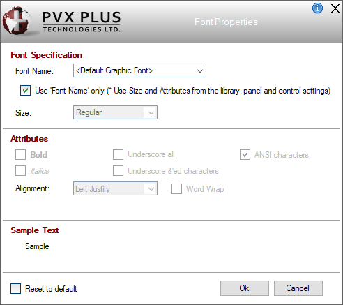
Themes and Visual Classes

Font Properties

The Font Properties window presents options for specifying a font name, font size and various other attributes for displaying text.

To invoke this window, click the three-dotted query button associated with a font property (i.e. Font or Header Font), which applies only when defining a Theme or Visual Class.

This window consists of the following:

Font Specification

Font Name

Name of the font; e.g. Courier New, Times New Roman, etc. Click the drop-down for a list of fonts that reside on the current system.

If the font is set to <Default Graphic Font> for both the Default and Control Type settings, then the font will be that defined in Library Defaults, the Panel Header or the individual control definition, with the latter taking precedence.

Use 'Font Name' only
(* Use Size and Attributes from the library, panel and control settings)

When selected (Default), only the specified Font Name is used, but the font Size and Attributes from the current definition are not used. Instead, the font Size and Attributes used will be those set in Library Defaults, the Panel Header or the individual control definitions.

If this check box is not selected, the Size and Attributes defined in the current Font Properties window will override other font settings.

(The Use 'Font Name' only check box option was added in PxPlus 2025.)

Size

(Available when Use 'Font Name' only check box is not selected)

Click the drop-down for a list of sizes. The Quarter, Half, Regular and Double sizes are available for all fonts. (Default is Regular.)

Some fonts also allow point sizes, which are fixed sizes.

The Regular size is recommended, as it is internally adjusted to match the base font settings.

Attributes

(Available when Use 'Font Name' only check box is not selected)

Bold

Use bolded text.

Underscore all

Underline all characters.

ANSI characters

Use Windows ANSI character set 0. (Default)

Italics

Use italicized text.

Underscore &'ed characters

Underline the character following the & (ampersand). This is used when defining hot keys.

Alignment

The Left Justify, Center and Right Justify alignments are available for Button, Check_Box, Radio_Button and Tristate_Box control types. (Default is Center.)

The Left Justify, Center and Right Justify alignments are also available for Default and Folder control types. (Default is Left Justify.)

For a Fonted_Text control type, multiple alignments are available: Left Justify, Center, Right Justify, Left Top, Left Middle, Left Bottom, Center Top, Center Middle, Center Bottom, Right Top, Right Middle and Right Bottom. (Default is Left Justify.)

Word Wrap

Wraps text within the margins. This option is available for Default, Button, Check_Box, Folder, Fonted Text, Radio_Button and Tristate_Box control types.

Rotation

Font rotation in degrees. This option is available for the Fonted_Text control type using a True Type font only.

Reset to default

Select this check box to reset the font properties to the default settings. The default settings are <Default Graphic Font>, Regular size with ANSI characters.