Property
Description
Attributes
Bitmap Button
Button has a bitmap whose width is divided into four images. Use this to custom design buttons with any color, style or shape by controlling the image that appears.
Note:
This property is effective on a check box only when it is drawn as a button, which occurs when a bitmap is added.
Style of button border. Options are None, Solid, Double, Groove, Ridge, Inset and Outset:
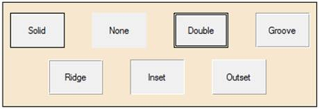
If not set, the default Windows style is used.
This must be set to a non-blank value to use the Border Width and various Border Color settings.
Note:
This property is effective on a check box only when it is drawn as a button, which occurs when a bitmap is added.
Border Width
Width of the button border (in pixels). Options are None, 1, 2, 3, 4 and 5. Only takes effect if the button is not flat and a Border Style is specified.
Note:
This property is effective on a check box only when it is drawn as a button, which occurs when a bitmap is added.
Sets the corner radius for check boxes that look like check boxes (no bitmap defined), not for check boxes that look like normal buttons. Works only in 4D mode.
Possible values are Null (blank), Round, Square or a value from 0 to 255 inclusive. See CBCornerRadius$ property
Example:
To set the corner radius for check boxes created as buttons (when a bitmap is added), use the Corner Radius property.
Note:
Corner rounding is limited based on the control type and/or the control size.
(CB Corner Radius property was added in PxPlus 2026.)
Sets the corner radius for a check box only when it is drawn as a button, which occurs when a bitmap is added. Works only in 4D mode.
Possible values are Null (blank), Round, Square or a value from 0 to 255 inclusive. See CornerRadius$ property.
Example:
To set the corner radius for check boxes with no bitmap defined, use the CB Corner Radius property.
Note:
Corner rounding is limited based on the control type and/or the control size.
(Corner Radius property was added in PxPlus 2026.)
Drop-List Button
An extra button with an arrow bitmap is attached to the right of the main button. When the arrow bitmap button is clicked, the associated popup menu is displayed.
Note:
This property is effective on a check box only when it is drawn as a button, which occurs when a bitmap is added.
Flat Button
Button shows no raised outline unless the mouse is over the button or the button is pressed down.
Note:
This property is effective on a check box only when it is drawn as a button, which occurs when a bitmap is added.
Flat - No Border
Button has no border and shows no raised outline unless the button is pressed down.
Note:
This property is effective on a check box only when it is drawn as a button, which occurs when a bitmap is added.
Controls whether a dotted focus rectangle displays around the Tri-State Check Box text (with and without a bitmap added).
Possible values are:
|
|
Default |
Uses the default setting. |
|
|
Display |
Focus rectangle is shown (On). |
|
|
Suppress |
Focus rectangle is not shown (Off). |
Example:
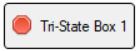
Tri-State Check Box focus is Off:
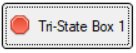
Tri-State Check Box focus is On:
Example:
Tri-State Check Box focus is Off (when a bitmap is added):
Tri-State Check Box focus is On (when a bitmap is added):
(Focus Rectangle property was added in PxPlus 2026.)
Hover Color
Text on the button is highlighted when the mouse is over the button. The default color is controlled by the 'CH' system parameter that defaults to 'Light Blue'.
Note:
This property is effective on a check box only when it is drawn as a button, which occurs when a bitmap is added.
Hover Cursor
Controls the type of cursor to display whenever the mouse moves over the control.
Options are Default, Arrow, Wait, Insert, Movement arrows, Sizing arrow, Hand, Crossed hand, Rabbit in hat, Happy face, Sad face, Up/Down arrow, Left/Right arrow and Not allowed.
Sticky Button
"Sticky" functionality; i.e. the button remains in the "pressed" position until the next selection.
Note:
This property is effective on a check box only when it is drawn as a button, which occurs when a bitmap is added.
Transparent
Button is transparent; i.e. the window contents behind the button show through. This style can be used to place buttons onto bitmaps.
Note:
This property is effective on a check box only when it is drawn as a button, which occurs when a bitmap is added.
Underscore
Text on the button is underscored.
Note:
This property is effective on a check box only when it is drawn as a button, which occurs when a bitmap is added.
Colors
Click the dotted Query button or double click inside the cell to access Color Selections. Valid formats for color selections include predefined system colors (e.g. Light Red), Custom (RGB codes), HTML Hex Color Codes, User Defined colors (e.g. Color17) and string Expressions.
After a color property is set, a tick in the selected color displays in the top left corner. A floating tip with a sample of the selected color displays when hovering the mouse over the color setting.
(The color tick and color tip were added in PxPlus 2018.)
(The Color Selections Query button and dialog were added in PxPlus 2020.)
Background Color
Button background color). See Background Color 2 below.
Background Color 2
Used in conjunction with Background Color to generate a two-color gradient fill for the button background. The gradient fill starts with Background Color at the top and flows to Background Color 2 at the bottom.
Background Color must be specified; otherwise, Background Color 2 will be ignored.
Note:
This property is effective on a check box only when it is drawn as a button, which occurs when a bitmap is added.
Border Color
Button border color. See Border Color 2 below.
Border colors are applied only if a Border Style (other than the system default) is specified for the button.
Note:
This property is effective on a check box only when it is drawn as a button, which occurs when a bitmap is added.
Border Color 2
Used in conjunction with Border Color to generate a two-color button border. Border Color is applied to the top and left borders, Border Color 2 to the bottom and right borders.
When Corner Radius is set to Round or a value, Border Color 2 is applied to all the button borders when the button is pressed down.
Border Color must be specified; otherwise, Border Color 2 will be ignored.
Color of the frame/box of the check box. Applies only to check boxes that look like check boxes (no bitmap defined), not for check boxes that look like normal buttons.
(Check Box Frame Color property was added in PxPlus 2024.)
(The name change from Check Box Frame Color to CB Frame Color was added in PxPlus 2025.)
Color of the check mark in the check box. Applies only to check boxes that look like check boxes (no bitmap defined), not for check boxes that look like normal buttons.
(Check Box Mark Color property was added in PxPlus 2024.)
(The name change from Check Box Mark Color to CB Mark Color was added in PxPlus 2025.)
Foreground
Foreground text color of the control in its default state.
Active Background Color
Background color when the button is pressed down. See Active Background Color 2 below.
Active Background Color 2
Used in conjunction with Active Background Color to generate a two-color gradient fill when the button is pressed down. The gradient fill starts with Active Background Color at the top and flows to Active Background Color 2 at the bottom.
Active Background Color must be specified; otherwise, Active Background Color 2 will be ignored.
Note:
This property is effective on a check box only when it is drawn as a button, which occurs when a bitmap is added.
Active Border Color
Button border color when the button is pressed down. See Active Border Color 2 below.
Border colors are applied only if a Border Style (other than the system default) is specified for the button.
Note:
This property is effective on a check box only when it is drawn as a button, which occurs when a bitmap is added.
Active Border Color 2
When used in conjunction with Active Border Color, these two colors represent the border colors: Active Border Color 2 (top and left borders) and Active Border Color (bottom and right borders).
When Corner Radius is set to Round or a value, Active Border Color 2 is applied to all the button borders when the button is pressed down.
Active Border Color must be specified; otherwise, Active Border Color 2 will be ignored.
Active Text Color
Foreground text color when the button is pressed down.
Note:
This property is effective on a check box only when it is drawn as a button, which occurs when a bitmap is added.
Color of the disabled check box frame. Applies only to check boxes that look like check boxes (no bitmap defined), not for check boxes that look like normal buttons.
(CB Disable Frame Color property was added in PxPlus 2025.)
Color of the check mark in the disabled check box. Applies only to check boxes that look like check boxes (no bitmap defined), not for check boxes that look like normal buttons.
(CB Disable Mark Color property was added in PxPlus 2025.)
Color of the hover rectangle in the check box when the mouse is over the control. Applies only to check boxes that look like check boxes (no bitmap defined), not for check boxes that look like normal buttons.
(Check Box Hover Color property was added in PxPlus 2024.)
(The name change from Check Box Hover Color to CB Hover Color was added in PxPlus 2025.)
Disable Background Color
Background color when the button is disabled. See Disable Background Color 2 below.
Disable Background Color 2
Used in conjunction with Disable Background Color to generate a two-color gradient fill for the button background when the button is disabled. The gradient fill starts with Disable Background Color at the top and flows to Disable Background Color 2 at the bottom.
Disable Background Color must be specified; otherwise, Disable Background Color 2 will be ignored.
Note:
This property is effective on a check box only when it is drawn as a button, which occurs when a bitmap is added.
Disable Border Color
Button border color when the button is disabled. See Disable Border Color 2 below.
Border colors are applied only if a Border Style (other than the system default) is specified for the button.
Note:
This property is effective on a check box only when it is drawn as a button, which occurs when a bitmap is added.
Disable Border Color 2
Used in conjunction with Disable Border Color to generate a two-color button border when the button is disabled. Disable Border Color is applied to the top and left borders, Disable Border Color 2 to the bottom and right borders.
Disable Border Color must be specified; otherwise, Disable Border Color 2 will be ignored.
When Corner Radius is set to Round or a value, Disable Border Color 2 has no effect.
Disable Text Color
Foreground text color when the button is disabled.
Focus Background Color
Background color when the button has focus. See Focus Background Color 2 below.
Note:
This property is effective on a check box only when it is drawn as a button, which occurs when a bitmap is added.
Focus Background Color 2
Used in conjunction with Focus Background Color to generate a two-color gradient fill for the button background when the button has focus. The gradient fill starts with Focus Background Color at the top and flows to Focus Background Color 2 at the bottom.
Focus Background Color must be specified; otherwise, Focus Background Color 2 will be ignored.
Focus Border Color
Button border color when the button has focus. See Focus Border Color 2 below.
Border colors are applied only if a Border Style (other than the system default) is specified for the button.
Note:
This property is effective on a check box only when it is drawn as a button, which occurs when a bitmap is added.
Focus Border Color 2
Used in conjunction with Focus Border Color to generate a two-color button border when the button has focus. Focus Border Color is applied to the top and left borders, Focus Border Color 2 to the bottom and right borders.
Focus Border Color must be specified; otherwise, Focus Border Color 2 will be ignored.
When Corner Radius is set to Round or a value, Focus Border Color 2 has no effect.
Focus Text Color
Foreground text color when the button has focus.
Note:
This property is effective on a check box only when it is drawn as a button, which occurs when a bitmap is added.
Controls how the image on the button will display when the button is disabled. Applicable only when there is a bitmap on the button.
Click the drop-down arrow for available selections:
Default gray disabled setting (Default)
Images display as shadows
Images converted to gray scale
Note:
This property is effective on a check box only when it is drawn as a button, which occurs when a bitmap is added.
(Gray Disabled Bitmap property was added in PxPlus 2024.)
Background color when the mouse is over the control. See Hover Background Color 2 below.
(Support for standard Check Boxes with no bitmap was added in PxPlus 2025.)
Hover Background Color 2
Used in conjunction with Hover Background Color to generate a two-color gradient fill for the button background when the mouse is over the button. The gradient fill starts with Hover Background Color at the top and flows to Hover Background Color 2 at the bottom.
Hover Background Color must be specified; otherwise, Hover Background Color 2 will be ignored.
Note:
This property is effective on a check box only when it is drawn as a button, which occurs when a bitmap is added.
Border color when the mouse is over the control. See Hover Border Color 2 below.
Border colors are applied only if a Border Style (other than the system default) is specified for the control.
(Support for standard Check Boxes with no bitmap was added in PxPlus 2025.)
Hover Border Color 2
Used in conjunction with Hover Border Color to generate a two-color button border when the mouse is over the button. Hover Border Color is applied to the top and left borders, Hover Border Color 2 to the bottom and right borders.
Hover Border Color must be specified; otherwise, Hover Border Color 2 will be ignored.
When Corner Radius is set to Round or a value, Hover Border Color 2 has no effect.
Note:
This property is effective on a check box only when it is drawn as a button, which occurs when a bitmap is added.
Foreground text color when the mouse is over the control.
(Support for standard Check Boxes with no bitmap was added in PxPlus 2025.)
Font
Font
Click the dotted Query button or double click inside the cell to specify font properties and attributes, such as Bold, Italics, etc. In addition, Alignment (default: Center) and Word Wrap can be specified.
See Font Properties.
(Alignment and Word Wrap options were added in PxPlus 2022.)
(The Use 'Font Name' only check box option was added in PxPlus 2025.)
Other
iNomads Class
Assign an iNomads class to the control. The iNomads class contains class attribute references used when defining the control in the HTML code generated in iNomads. An iNomads class reference must start with an alpha character (A-Z or a-z), followed by any combination of A-Z, a-z, 0-9, underscore or dash. Multiple references may be entered, separated by a space.
For a list of pre-defined classes, see iNomads Classes.
(iNomads Class property was added in PxPlus 2020.)