|
Template Configuration |
You can establish settings for iNomads templates using Template Configuration Maintenance, which is invoked by using any of the following methods:
|
Location |
Method |
|
From the PxPlus IDE Main Launcher |
Expand the Web Deployment category and select iNomads Setup to invoke the iNomads Setup window. Select the Options button. |
|
From a Web browser |
Launch iNomads from a Web browser. From the iNomads Application Launchpad window, invoke the iNomads Setup window by either clicking the Admin button or selecting admin from the Transaction drop box. Select the Options button. |
|
From the PxPlus Command prompt |
Invoke the iNomads Setup window by entering the following command: RUN "*plus/inomads/admin". Select the Options button. |
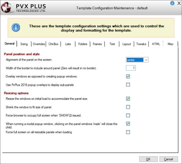
Template Configuration Maintenance is launched. The name of the template currently selected for maintenance displays in the window header (i.e. "default").
(The display of the template name in the window header was added in PxPlus 2018.)
The options for configuring iNomads templates are presented in a series of 12 tabs: General, Sizing, Overrides, ChkBox, Lists, Folders, Frames, Text, Layout, Tweaks, HTML and Misc. These options represent properties of the iNomads object and are explained in the tables below. These properties are set whenever the iNomads object is instantiated (%iNomads) but can also be set programmatically by referencing them directly.
Example:
%iNomads'Panel_Border=1
The tables below describe the options found on each of the 12 tabs. In each table, the first column displays the actual property name, and the second column displays the corresponding template option with any additional information.
|
Panel position and style | |
|
Panel_Align$ |
Alignment of the panel on the screen. Setting this defines how the panel will be aligned on the screen. |
|
Panel_Border |
Width of the border to include around panel. Setting this to zero will result in no border around the panel. This is the width of the border around the panel rendering in pixels. |
|
Overlay_Wdws |
Overlay windows as opposed to creating popup windows. When enabled, new panels will overlay the current panel instead of creating a new browser popup window. Overlaying windows improves performance and avoids problems with popup blockers. |
|
Use PxPlus 2016 popup overlays to display sub-panels. When enabled, the system will attempt to use the experimental windows overlay logic based on iFrames. (This option was added in PxPlus 2016.) | |
|
Setwdwsize |
Resize the windows on initial load to accommodate the panel size. If enabled, the system will attempt to grow/shrink the windows to match the size of the panel on the initial load of a panel. |
|
Shrink |
Shrink the window to fit size of panel. If the resize option is enabled (above), this controls whether to shrink the windows, as Windows will always be expanded if required. |
|
Maximize_Browser |
Force browser to occupy full screen when 'SHOW'(2) issued. Note: |
|
Modal_Close_Child |
When running a modal popup window, clicking on the panel windows 'mask' will close the child. |
|
Full_Screen |
Force full screen on all resizable panels when loading. Numeric. When non-zero, forces panels to be maximized when first displayed. (This option was added in PxPlus 2019.) |
|
Logical Row and Column size in Pixels | |
|
Line_Px |
Number of pixels high that each logical line occupies. The pixel size should be chosen based on the standard text size chosen for the template. |
|
Chr_Px |
Number of pixels wide that each logical column occupies. This value should accommodate the standard text size chosen for the template. If using TABLE rendering, its value must be evenly divisible by COL_PX. |
|
Margins to add to outer edge of your panel | |
|
Frame_Width |
Pixels to be added to window width to compensate for external margins. When determining panel sizes, this number of pixels will be added to allow for margin width. |
|
Frame_Height |
Pixels to be added to window height to compensate for external margins. When determining panel sizes, this number of pixels will be added to allow for margin height. |
|
Colors and Font settings | |
|
Use_Fonts |
Use application defined font information when displaying text. Normally, the system uses Style Sheets to control the font of the text. Enabling this option forces iNomads to use Fonts from the panel definition/application code. Note: |
|
Use_Backcolor |
Use application defined background colors when displaying controls/text. Normally, the system uses Style Sheets to control the background colors. Enabling this option forces iNomads to use Background colors from the panel definition. |
|
Use_Textcolor |
Use application defined text colors when displaying controls. Simple text always uses application defined color. Normally, the system uses Style Sheets to control the text colors. Enabling this option forces iNomads to use Text colors from the panel definition. |
|
Style overrides | |
|
Use_Images |
Include all static application defined images. Style sheets will provide images. Dynamic images will be included. Normally, the system uses Style Sheets to provide images. Enabling this option forces iNomads to use Images from the panel definition. |
|
Flat_Img_Btn |
Force all Image-only buttons to be 'Flat' (no visible button -- image only). |
|
Lvue_Hilite$ |
How to handle list view alternate highlighting. Option is to ignore the setting, 'Use' the colors provided by program, or use the 'StyleSheet' colors. |
|
Use_Fancy_Tip |
Use Enhanced tooltips for all TIPs. Info style Tips are rendered. |
|
Assign a Theme. Themes override text and background colors, font and miscellaneous other visual properties to provide a consistent visual look and feel. (This option was added in PxPlus 2016.) | |
|
Check Boxes | |
|
Cbx_Use_Css |
Don't use standard check boxes. Always use style sheet defined button check boxes. Normally, the system uses style sheet defined check boxes for Tri-state boxes or those with a background color. Setting this causes the system to use style sheet boxes for all check boxes. |
|
Style sheet generated Check Box contents (Must select Don't use std. above) | |
|
Cbx_Css_Val0$ |
Off text value for text/html within style sheet check boxes (normally blank/empty). |
|
Cbx_Css_Val1$ |
On text value for text/html within style sheet check boxes (normally check mark). |
|
Cbx_Css_Val2$ |
3rd state text values for text/html within style sheet check boxes (normally 'X'). |
|
List view presentation options | |
|
Lvue_Page_Output |
Use Paged output for list views. If enabled, list views and formatted list boxes will be presented as paged output. Note: |
|
Lvue_Page_Text$ |
Text to present in front of Page numbers. |
|
Lvue_Send_Cnt |
Desired minimum number of items to send when updating screen during initial paint and scrolling. Leave as zero for all list views to use just what is required. |
|
Height adjustments for List View/Grid | |
|
Row_Hi_Pad |
The number of pixels in excess of the standard line height for list view rows. Default is 2 pixels more than line height. |
|
Hdr_Hi_Pad |
The number of pixels in excess of the standard line height for list view headers. Default is 6 pixels more than line height. |
|
Grid_Hi_Pad |
The number of pixels in excess of the standard line height for grid rows. Default is 5 pixels more than line height. |
|
Folder Size and type | |
|
Tab_Height |
Folder tab height in pixels. Generally this should be between 1.5 and 2 times line height. If zero then 1.5 times line height used. |
|
Use_Webtab |
Use Web style vertical tabs for folders as opposed to horizontal tabs. Default tabs look like folders. Enabling this causes each folder to render vertically. |
|
iNomads unique folder options | |
|
Auto_Folder |
Folder Auto-invoke option. If enabled, using the arrow keys to change tab will cause folder to be changed immediately. If disabled, system will require the user to click on folder tab to switch to it. |
|
Special Tweaks for folders | |
|
Folder_Factor |
Folder height factor. The folder height (in lines) will be multiplied by this value to determine height in HTML (default 0: 1-Without frames, 1.2-With). If borderless frames are suppressed, we suggest 1; otherwise 1.2. |
|
Folder_Control_Factor |
Height multiplication factor to apply to controls over 4 lines high within folders. (Only when using Table rendering). Setting this will increase the size of controls within Folders in an attempt to compensate for size increase caused by FOLDER_FACTOR (0 = no compensation). |
|
Frame rendering options | |
|
Frame_Suppress |
Enable suppression of 'Frames' that do not have titles associated with them. Frames with titles are always displayed in the HTML; however, in some cases, it may be desirable to suppress simple non-titled frames due to overlaps. |
|
Frame_Use_Hr |
Use <HR> for single line high frames instead of standard frame display. Frame will be rendered as a horizontal line. |
|
Frame_Title_Hi |
Frame header height override in pixels (0 means use 1 line). If non-zero, this field specifies the height of a frame header in pixels. Only used in Absolute rendering. |
|
Frame_Bottom_Hi |
Frame bottom height to allow for corners etc. in pixels (0 means use 1 line). If non-zero, this field specifies the height of a frame bottom in pixels. Only used in Absolute rendering. |
|
Single_Frame_Crop |
On frames with text (Headers), don't use end frame header formatted cells if frame is 1 line high. |
|
Frame Tweaks | |
|
Frame_Btm_Adj |
Frame bottom adjustment. Logical number of lines the bottom of a frame will be moved up to compute true bottom. |
|
Text message contents for messages display by system | |
|
Text_Close$ |
The text word to be displayed that will 'Close' a window. Default is 'Close' but in multilingual systems you can change this. |
|
Text_Timeout$ |
Text to display during disconnect countdown when device is left idle too long. Insert ##:## where the countdown is to appear. |
|
Text_Restore$ |
Text to display when a screen is refreshed due to transmission errors or user sending out of sequence. Also displayed after session rescue. |
|
Text_Relaunch$ |
The text to be displayed on Application complete screen to relaunch the session. This text will be displayed with the hyperlink to relaunch the iNomads process. Default is Relaunch. If this field is blank, relaunch capability is not available. (This option was added in PxPlus 2019.) |
|
Render_Absolute |
Enable absolute rendering as opposed to old-style table base rendering. Preferred is Absolute over old-style table based. It provides more accurate screen layouts. |
|
Use 3 Line (hamburger ICON) option for menu bar initiation. If enabled, the system will render a 3 line (≡) option on the panel title to indicate a menu bar. (This option was added in PxPlus 2016.) | |
|
Menu Hover timer. This defines the number of milli-seconds to hover the mouse over a menu option before it is automatically selected. Default is 1000. If set to 0 (zero), the menu hover has no effect, and the menu option must be manually selected. (This option was added in PxPlus 2017.) | |
|
Table rendering options which are ignored if using absolute rendering | |
|
Col_Px |
Number of pixels used to define each table column when generating panels. This defines the resolution used when converting panels to HTML tabular displays. Its value must be an integral factor of CHR_PX, generally 1/2 or 1/3. |
|
Vert_Allowance |
Vertical allowance to use when generating HTML. Controls that start within this distance of proceeding control are to be considered on the same line. If non-zero, controls positions are compared relative prior controls for alignment. If zero, controls are positioned using simple rounding. |
|
Vert_Adj_Method |
Use "Original" line spacing algorithm when applying vertical allowance (above). |
|
Vert_Allow_Noframes |
Suppress the vertical allowance (above) when rendering frames. This is only applicable if the vertical allowance is non-zero, otherwise ignored. |
|
Disable_Tr_Height |
Don't force table row heights, but allow browser to determine height based on content. If disabled, this option has been shown to cause random line spacing in FireFox. |
|
Snapto_Lines |
Dynamically 'Snap' (align) all controls to standard lines increments. Set this option to have the system 'Snap' your controls to standard vertical positions. |
|
Hide_Show_Redraw |
Refresh screen when hiding/showing controls. When using a table-based layout, special logic has to be applied to hide controls that occupy same cell. Usually the overlap logic works, but in some instances, it is better to have system just redraw screen on a hide/show. |
|
Adjustments based on changes to Style sheet (CSS) and Font from default | |
|
Grid_Hi_Adj |
The number of pixels higher your style sheet will make grid rows. Default style sheet increases row height by 1 pixel. |
|
Grid_Wd_Adj |
The number of pixels wider your style sheet will make grid columns. Default style sheet increases width by 1 pixel. |
|
Lvue_Hi_Adj |
The number of pixels higher your style sheet will make list view rows. Default style sheet increases row height by 1 pixel. |
|
Lvue_Wd_Adj |
The number of pixels wider your style sheet will make list view columns. Default style sheet increases width by 1 pixel. |
|
Cbx_Rbt_Adjust |
Right justified Check box/Radio Button pixel adjustment. In NOMADS, the actual placement of right justified Check boxes and Radio Buttons varies based on the font. Use this to apply minor adjustments. |
|
Btn_Sz_Adjust |
Amount to adjust button size/position in order to assist alignment. Buttons beside inputs are often made slightly bigger and positioned slightly above corresponding input field. This adjustment only applies to buttons < 2 lines high. |
|
Include HELP button on title line if help present. When set and the panel has HELP defined, the system will include a Help button on the titlebar. (This option was added in PxPlus 2017.) | |
|
HTML elements to be used/included in rendering | |
|
Meta_Tags$ |
Additional header META tags to be included in the HTML. |
|
Window_Open$ |
JavaScript Window.open parameters to use when creating popup windows. Position and size parameters are generated by the system. |
|
Popup windows suppression | |
|
Avoid_Popups |
Avoid using popup windows. If set, system will attempt to avoid using Popup windows to open new browser sessions. |
|
Popup_Pdf_Msg$ |
Message box text to show when avoiding Popups and viewing .pdf report. |
|
Popup_Msg$ |
Message box text to show when avoiding Popups and viewing other file/site. |
|
URL settings | |||||||||||||
|
Img_Dir$ |
Image web based URL (In HTML will have "/" appended - Default 'images'). | ||||||||||||
|
Miscellaneous | |||||||||||||
|
Focus_Outline$ |
Outline to use to highlight current input field. Format is "Color Type Width" such as "Orange solid 1px" or "Invert dotted thin". | ||||||||||||
|
Charting object to use. If -none- then no chart will be available. Path must be relative *plus/inomads/add-ons. | |||||||||||||
|
Calendar_Qry_Mask$ |
Mask used to test Query to determine if JavaScript calendar can be used. If empty, only standard test for the existence of a Query panel with the word 'calendar' is used. | ||||||||||||
|
Set the default Query View. Set the default query view for this template. Available selections are:
To set the query view for all templates, set %NOMADS'Query_View. This is overridden by the Set the default Query View option, which can be overridden at the individual query level. See Query Header Definition. (Support for setting the default Query View was added in PxPlus 2017.) | |||||||||||||
|
Fkey_Pulldown$ |
Option to include Function key pull down on Caption line. A Function key pull down will be included on the caption line to assist on devices without function keys based on the setting of this option. | ||||||||||||
|
Rclick_Option$ |
Option to include Right Mouse click button on Caption line. When active, a button on the caption line allows the user to indicate the next click submitted to the panel should be considered a Right Mouse click. | ||||||||||||
|
Barcode_Option$ |
Browsers to enable Bar Code Reader Icon on. Comma separated list of browsers whose caption line allows the user to initiate Bar Code Reader for current input field. | ||||||||||||
|
Barcode_Types$ |
Accepted Bar code that the reader will process (Blank = UPC_A,EAN_13). Comma separated list of Bar codes that the integrated reader will accept. | ||||||||||||