Property
Description
Attributes
Borderless
Control has no border or frame.
Sets the radius for the list box corners. Works only in 4D mode. This option is available for all List Box Types except Report View and Variable List Boxes.
Possible values are Null (blank), Round, Square or a value from 0 to 8 inclusive. See CornerRadius$ property.
Example:
Corner Radius set to Round:
Corner Radius set to Square:
Corner Radius set to a value of 8:
Note:
Corner rounding is limited based on the control type and/or the control size.
(Corner Radius property was added in PxPlus 2026.)
Disable Sorting
Clicking on the column heading does not cause list box elements to be sorted. The column headings will not have the 3D button look but will appear flat. Column resizing is still allowed.
(Disable Sorting property was added in PxPlus 2018.)
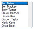
Controls whether a dotted focus rectangle displays around the List Box selected row.
Possible values are:
|
|
Default |
Uses the default setting. |
|
|
Display |
Focus rectangle is shown (On). |
|
|
Suppress |
Focus rectangle is not shown (Off). |
Example:
List Box focus is Off:
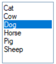
List Box focus is On:
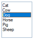
(Focus Rectangle property was added in PxPlus 2026.)
Attributes (ReportView)
Auto Column Size
When selected, columns will automatically be proportionally resized when the list box is resized. Default is Off.
(Auto Column Size property was added in PxPlus 2018.)
Center Text Vertically
When selected, text will be centered vertically in the list box row only when Lines Per Row is > 1. Text that exceeds the column width is truncated and an ellipsis ( ) is displayed.
When this check box is not selected (Default), text is aligned to the top of the list box row, and text that exceeds the column width is word wrapped.
(Center Text Vertically property was added in PxPlus 2019.)
Column Size Lock
When selected, the report view column headers cannot be resized by dragging. Default is Off.
(Column Size Lock property was added in PxPlus 2018.)
Grid lines
Controls the display of grid lines between the rows and columns. Options are No lines (Default), Full grid, Vertical lines, Horizontal lines.
(Grid lines property was added in PxPlus 2018.)
Header Height
Controls the height of the header in report view lists in pixels.
Setting this property to -1 restores the height to its default size. Setting this property to 0 results in no header.
(Header Height property was added in PxPlus 2020.)
Header Lock
Locks the column headers so that the user is unable to click on them or drag them. Default is Off.
(Header Lock property was added in PxPlus 2018.)
Number of lines high per row. Valid values are >= 1. Allows for word-wrap. Can also be set to -1 to use the default lines per row for the list box.
(Lines Per Row property was added in PxPlus 2018.)
(Support to allow a setting of -1 was added in PxPlus 2024.)
Sort Options
Controls how column data is sorted. Click the drop-down arrow for available selections:
|
Default |
Null values at end |
|
None (Raw binary sort) |
Ignore case/Nulls last |
|
Ignore case |
Ignore accents/Nulls last |
|
Ignore accents |
Ignore case & accents/Nulls last |
|
Ignore case & accents |
|
The Default setting will use the system StdSortOrder setting. See the 'OPTION' mnemonic or the 'SortOrder$ property.
(Sort Options property was added in PxPlus 2018.)
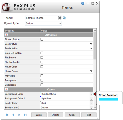
Colors
Click the dotted Query button or double click inside the cell to access Color Selections. Valid formats for color selections include predefined system colors (e.g. Light Red), Custom (RGB codes), HTML Hex Color Codes, User Defined colors (e.g. Color17) and string Expressions.
After a color property is set, a tick in the selected color displays in the top left corner. A floating tip with a sample of the selected color displays when hovering the mouse over the color setting.
(The color tick and color tip were added in PxPlus 2018.)
(The Color Selections Query button and dialog were added in PxPlus 2020.)
Background
Background color of the control in its default state.
Foreground
Foreground text color of the control in its default state.
Color of the frame/border around the control.
(Frame Color property was added in PxPlus 2024.)
Header Background Color
Sets the background color for the report view header.
(Header Background Color was added in PxPlus 2016.)
Header Text Color
Sets the color of the text for the report view header.
Header Text Color property was added in PxPlus 2016.)
Hilight Color 1
Background color - alternating lines.
(Hilight Color 1 property was added in PxPlus 2016.)
Hilight Color 2
Background color - alternating three lines.
(Hilight Color 2 property was added in PxPlus 2016.)
Hotlink Color
Color applied to the text of a column defined as a hotlink to provide a visual cue.
For information on defining a hotlink column, see Hotlink.
(Hotlink Color property was added in PxPlus 2018.)
Line Color
(Applicable to Report View and Tree View Only)
Color of the lines drawn between rows and columns of a report view list box or between entries of a tree view list box.
(Line Color property was added in PxPlus 2020.)
Disable Background Color
Background color when the control is disabled.
(Disable Background Color property was added in PxPlus 2022.)
Disable Text Color
Foreground text color when the control is disabled. Not supported for list view.
(Disable Text Color property was added in PxPlus 2022.)
Focus Background Color
Background color when the control has focus.
(Focus Background Color property was added in PxPlus 2019.)
Focus Text Color
Text color when the control has focus.
(Focus Text Color property was added in PxPlus 2019.)
Hover Background Color
(Applicable to Report View Only)
Background color when the mouse is over a list view row.
(Hover Background Color property was added in PxPlus 2018.)
Font
Font
Click the dotted Query button or double click inside the cell to specify font properties and attributes such as Bold, Italics, etc.
See Font Properties.
(The Use 'Font Name' only check box option was added in PxPlus 2025.)
Header Font
Defines the font for the list view header. See Font Properties.
(Header Font property was added in PxPlus 2016.)
(The Use 'Font Name' only check box option was added in PxPlus 2025.)
Other
iNomads Class
Assign an iNomads class to the control. The iNomads class contains class attribute references used when defining the control in the HTML code generated in iNomads. An iNomads class reference must start with an alpha character (A-Z or a-z), followed by any combination of A-Z, a-z, 0-9, underscore or dash. Multiple references may be entered, separated by a space.
For a list of pre-defined classes, see iNomads Classes.
(iNomads Class property was added in PxPlus 2020.)