Property
Description
Display
Active tab will remain the same width as inactive tabs when using sidebar folders.
(Do Not Extend Active Tab Width property was added in PxPlus 2024.)
Frame Style
Determines the style level and bevel sizes in creating the frame (Fixed value or numeric Expression). This is only used if (at run time) only one sub-panel exists. Click the drop-down arrow for a list of selections: As is, None, 3D Frame, Recessed Frame, Raised Frame, Top/Bottom line.
Note:
Frame Style is applicable only to
Tabless Folders and to folders with Tab Position set to Left Sidebar or Right Sidebar.
Sidebar Tab Height
(Applicable to Sidebar Folders Only)
Height of the sidebar folder tabs. If not specified, the value of %NOMADS'SidebarFolderTabHeight will be used. If neither are set, the default height is 2.5 lines.
(Sidebar Tab Height property was added in PxPlus 2018.)
Tab Offset
(Not Applicable to Tabless Folders)
This option is used only when the Tab Position selected is Left (or Right) Sidebar. It determines the distance by which the starting line of the folder tabs will be offset from the starting line of the folder control.
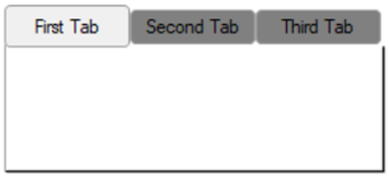
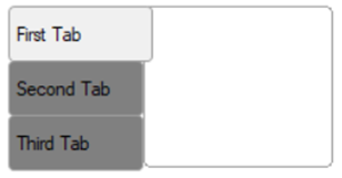
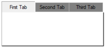
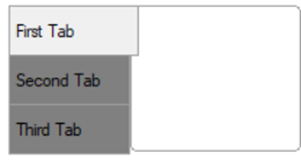
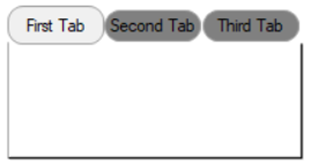
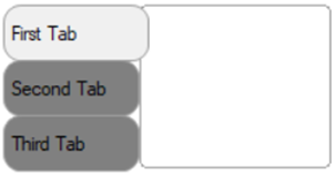
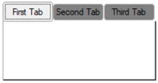
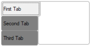
Tab Position
(Not Applicable to Tabless Folders)
Tabs placement. Click the drop-down arrow for a list of selections to indicate where the folder tabs will be drawn on the folder region: As is, Top, Bottom, Left Sidebar, Left (Rotated), Right Sidebar, Right (Rotated).
Note:
Left (Rotated) and Right (Rotated) tab positions do not support bitmaps and images.
Tab Width
(Not Applicable to Tabless Folders)
Uniform width to be used for all tabs.
When the Tab Position selected is Top, Bottom, Left (Rotated) or Right (Rotated), you can either enter a tab width or leave it blank. Leaving it blank will trigger NOMADS to automatically calculate the tab width by using the folder width and the number of tabs.
When the Tab Position selected is Left Sidebar or Right Sidebar, a tab width must be entered, as NOMADS will not automatically calculate it if left blank. Format mask: ###.
Attributes
Sets the radius for the tab button corners. Works only in 4D mode.
Possible values are Null (blank), Round, Square or a value from 0 to 255 inclusive. See CornerRadius$ property.
Example:
Tab Corner Radius set to Round:
|
|
|
Tab Corner Radius set to Square:
|
|
|
Tab Corner Radius set to a value of 10:
|
|
|
Note:
Corner rounding is limited based on the control type and/or the control size.
(Tab Corner Radius property was added in PxPlus 2026.)
Controls whether a dotted focus rectangle displays around the tab button text. By default, the focus rectangle is shown (On).
Possible values are:
|
|
Default |
Uses the default setting. |
|
|
Display |
Focus rectangle is shown (On). |
|
|
Suppress |
Focus rectangle is not shown (Off). |
Example:
Tab focus is Off:
|
|
|
Tab focus is On:
|
|
|
(Tab Focus Rectangle property was added in PxPlus 2026.)
Colors
Click the dotted Query button or double click inside the cell to access Color Selections. Valid formats for color selections include predefined system colors (e.g. Light Red), Custom (RGB codes), HTML Hex Color Codes, User Defined colors (e.g. Color17) and string Expressions.
After a color property is set, a tick in the selected color displays in the top left corner. A floating tip with a sample of the selected color displays when hovering the mouse over the color setting.
(The color tick and color tip were added in PxPlus 2018.)
(The Color Selections Query button and dialog were added in PxPlus 2020.)
Background color of the folder panel and a folder tab in its default state.
To just set the folder tab color, set the Background property to Default and then set the Tab Color property under Colors (States) below.
To set a gradient color for the folder tabs, set the Tab Color and Tab Color 2 properties under Colors (States) below. These will override the tab color set in the Background property.
Foreground
Foreground text color on a tab in its default state.
Click the dotted Query button or double click inside the cell to access Color Selections. Valid formats for color selections include predefined system colors (e.g. Light Red), Custom (RGB codes), HTML Hex Color Codes, User Defined colors (e.g. Color17) and string Expressions.
After a color property is set, a tick in the selected color displays in the top left corner. A floating tip with a sample of the selected color displays when hovering the mouse over the color setting.
(The Color (States) category for Folder controls was added in PxPlus 2022.)
(NOMADS Only)
Color of the active folder tab border on sidebar tabs.
(Active Tab Border Color property was added in PxPlus 2024.)
Active Tab Color
(NOMADS Only)
Background color of the folder tab when the folder is active. See Active Tab Color 2 below.
(Active Tab Color property was added in PxPlus 2022.)
Active Tab Color 2
(NOMADS Only)
Used in conjunction with Active Tab Color to generate a two-color gradient fill on the folder tab when the folder is active. The gradient fill starts with the Active Tab Color at the top and flows to the Active Tab Color 2 at the bottom.
Active Tab Color must be specified; otherwise, Active Tab Color 2 will be ignored.
(Active Tab Color 2 property was added in PxPlus 2022.)
Active Text Color
(NOMADS Only)
Foreground text color of the folder tab when the folder is active.
(Active Text Color property was added in PxPlus 2022.)
(NOMADS Only)
Color of the disabled folder tab border on sidebar tabs.
(Disable Tab Border Color property was added in PxPlus 2024.)
Disable Tab Color
(NOMADS Only)
Background color of the folder tab when the folder is disabled. See Disable Tab Color 2 below.
(Disable Tab Color property was added in PxPlus 2022.)
Disable Tab Color 2
(NOMADS Only)
Used in conjunction with Disable Tab Color to generate a two-color gradient fill on the folder tab when the folder is disabled. The gradient fill starts with the Disable Tab Color at the top and flows to the Disable Tab Color 2 at the bottom.
Disable Tab Color must be specified; otherwise, Disable Tab Color 2 will be ignored.
(Disable Tab Color 2 property was added in PxPlus 2022.)
Disable Text Color
(NOMADS Only)
Foreground text color of the folder tab when the folder is disabled.
(Disable Text Color property was added in PxPlus 2022.)
(NOMADS Only)
Color of the folder tab border on sidebar tabs while hovering.
(Hover Tab Border Color property was added in PxPlus 2024.)
Hover Tab Color
(NOMADS Only)
Background color of the folder tab when the mouse is over the tab. See Hover Tab Color 2 below.
(Hover Tab Color property was added in PxPlus 2022.)
Hover Tab Color 2
(NOMADS Only)
Used in conjunction with Hover Tab Color to generate a two-color gradient fill on the folder tab when the mouse is over the tab. The gradient fill starts with the Hover Tab Color at the top and flows to the Hover Tab Color 2 at the bottom.
Hover Tab Color must be specified; otherwise, Hover Tab Color 2 will be ignored.
(Hover Tab Color 2 property was added in PxPlus 2022.)
Hover Text Color
(NOMADS Only)
Foreground text color of the folder tab when the folder is disabled.
(Hover Text Color property was added in PxPlus 2022.)
(NOMADS Only)
Color of the folder tab border on sidebar folders.
(Tab Border Color property was added in PxPlus 2024.)
(NOMADS Only)
Background color of the folder tab when in its normal state. See Tab Color 2 below. When set, this will override the tab color set in the Background property above.
(Tab Color property was added in PxPlus 2022.)
(NOMADS Only)
Used in conjunction with Tab Color to generate a two-color gradient fill on the folder tab when in its normal state. The gradient fill starts with the Tab Color at the top and flows to the Tab Color 2 at the bottom.
Tab Color must be specified; otherwise, Hover Tab Color 2 will be ignored.
(Tab Color 2 property was added in PxPlus 2022.)
Font
Font
Click the dotted Query button or double click inside the cell to specify font properties and attributes such as Bold, Italics, Alignment (default: Left Justify), Word Wrap, etc.
See Font Properties.
(The Use 'Font Name' only check box option was added in PxPlus 2025.)
Other
iNomads Class
Assign an iNomads class to the control. The iNomads class contains class attribute references used when defining the control in the HTML code generated in iNomads. An iNomads class reference must start with an alpha character (A-Z or a-z), followed by any combination of A-Z, a-z, 0-9, underscore or dash. Multiple references may be entered, separated by a space.
For a list of pre-defined classes, see iNomads Classes.
(iNomads Class property was added in PxPlus 2020.)