|
Library Bulk Edit and Search Utility |
The Library Bulk Edit and Search utility provides a quick and convenient way to apply property changes simultaneously to controls in multiple panels either in a single library or in multiple libraries within a specified directory.
After defining the criteria for filtering your selections (i.e. the pathname of the library or directory, control type and filter options), clicking the Find Controls button launches the search. Controls that match the criteria are displayed in the Selected Controls list box. You can specify the Properties to Edit for selected panel headers or panel controls that are in multiple panels in the same library or in different libraries within the same directory.
Using this utility, you can easily standardize the appearance of panel headers and panel controls over an entire library.
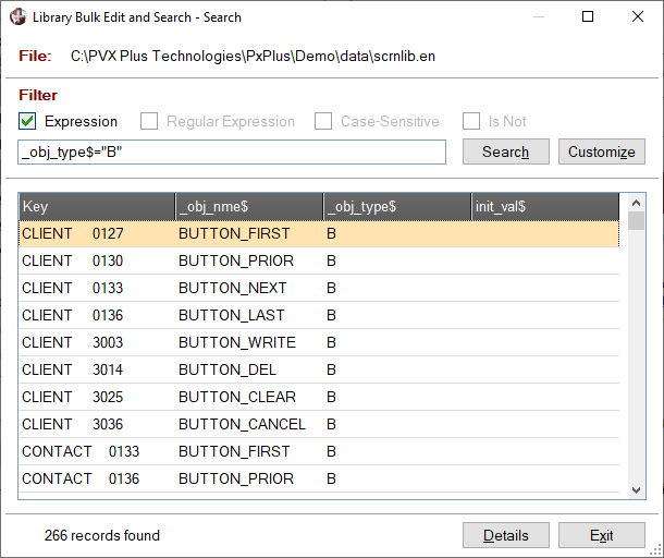
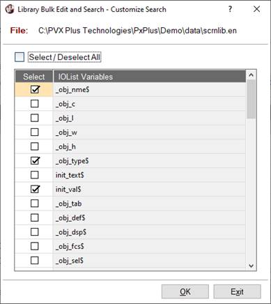
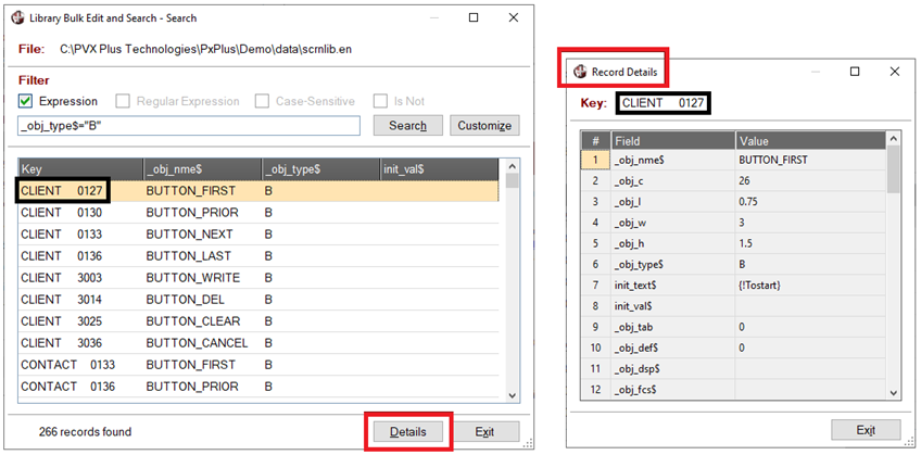
The Search Library button invokes a concurrent Search window for defining filter criteria to search the records in a selected library file. The Customize button in the Search window launches a window for selecting which columns to display in the Search list box.
(The Library Bulk Edit utility was added in PxPlus 2017 and renamed to Library Bulk Edit and Search in PxPlus 2023 Update 1.)
(The Search Library button was added in PxPlus 2023 Update 1.)
(The Customize button was added in PxPlus 2024.)
To invoke this utility, use one of the following methods:
|
Location |
Method |
|
From the PxPlus IDE Main Launcher |
Expand the Graphical Application Builder (NOMADS) category. Then expand the Utilities category and select Library Bulk Edit. |
|
Select Utilities > Library Bulk Edit from the menu bar. | |
|
From the NOMADS Session Manager |
Select Utilities > Library Bulk Edit from the menu bar. |
The Library Bulk Edit and Search utility is displayed. Below is a sample entry showing search results and the properties to be edited.
This window consists of the following:
|
Select Library to specify the pathname of a particular library file. (Default: Library) Select Directory to specify the pathname of a particular directory in which the library files are located. If accessing this utility from the PxPlus IDE Main Launcher or NOMADS Session Manager: Enter the pathname of the library file or directory in the adjacent input control or click the Query button. If accessing this utility from NOMADS Library Object Selection: The Type drop box defaults to Library, and the pathname of the current library file is displayed in the adjacent input control. (Both are set to view only.) | |||||||||||||||||||||||||||||||||||||||||||||||||||||||||||||||||||||||||
|
Button that invokes a Search window for defining filter criteria to search the records in the selected library file. This window consists of the following:
Note:
| |||||||||||||||||||||||||||||||||||||||||||||||||||||||||||||||||||||||||
|
(Available when Type is Directory) Select this check box to further define the search criteria by including library files found in the sub-directories of the specified directory. (By default, the Include Sub-Directories check box is not selected.) When Type is Library, this check box is not displayed. (The Include Sub-Directories check box was added in PxPlus 2018.) | |||||||||||||||||||||||||||||||||||||||||||||||||||||||||||||||||||||||||
|
Select the type of control. (Default is All Controls.) Note:
|
|
|
All Controls |
(Default) |
|
|
Button |
See Button Control. |
|
|
Chart |
See Chart Control. |
|
|
Check Box |
|
|
|
External Control |
See External Control. |
|
|
Drop Box |
See Drop Box Control. |
|
|
Embedded Panel |
See Embedded Panels. |
|
|
Folder |
See Folder Controls. |
|
|
Fonted Text |
|
|
|
Frame |
See Box/Frame Control. |
|
|
Grid |
See Grid Control. |
|
|
Horizontal Scroll Bar |
See Scrollbar Controls. |
|
|
Image |
|
|
|
List Box |
See List Box Controls. |
|
|
Multi Line |
See Multi-Line Control. |
|
|
Radio Button |
See Radio Button Control. |
|
|
Shape |
See Shape Control. |
|
|
Text |
|
|
|
Tristate Box |
|
|
|
Variable Drop Box |
See Drop Box Control. |
|
|
Variable List Box |
See List Box Controls. |
|
|
Vertical Scroll Bar |
See Scrollbar Controls. |
|
|
Panel Header |
See Panel Header. |
|
|
Library Defaults |
See Library Defaults. (The Library Defaults selection was added in PxPlus 2017 Update 0002.) |
(Optional) The filter options below are used to further define the search criteria for filtering your selections. All the filter options are disabled when the selected Control Type is Library Defaults.
|
Expression |
Select this check box to enter an expression as the filter value in the multi-line input. If the expression evaluates to 1 (true), the control(s) are loaded into the Selected Controls tree view list box. Note: |
|
Case-Sensitive |
(Available when Expression check box is not selected) Select this check box if the filter value entered in the multi-line input is case-sensitive. (By default, the Case-Sensitive check box is not selected.) |
|
Is Not |
(Available when Expression check box is not selected) Select this check box if you want the search to exclude controls in which the filter value was found. (By default, the Is Not check box is not selected.) |
|
(Multi-line input) |
Used for entering a free-form filter value. If the Expression check box is selected, enter an expression. If the filter value is case-sensitive, select the Case-Sensitive check box. |
Examples:
The table below contains examples of searches with different search criteria:
|
Control Type |
Expression |
Case-Sensitive |
Is Not |
Filter Value |
Meaning |
|
All |
Not Selected |
Not Selected |
Not Selected |
BT_ |
Find all controls with BT_ as part of their control names |
|
All |
Not Selected |
Selected |
Not Selected |
BT_ |
Find all controls with uppercase BT_ as part of their control names |
|
Button |
Not Selected |
Not Selected |
Not Selected |
{! |
Find all Button controls with bitmaps |
|
Button |
Not Selected |
Not Selected |
Selected |
{! |
Find all Button controls without bitmaps |
|
Multi-Line |
Selected |
N/A |
N/A |
POS("L"=_OBJ_STS$) |
Find all Multi-Line controls with the Locked attribute set |
|
Fonted Text |
Selected |
N/A |
N/A |
NOT(UCS(_OBJ_VISUAL_CLASS$)="TEST") |
Find all Fonted Text controls that do not have the "TEST" Visual Class |
Button that launches the search process for filtering your selections.
If the search process is expected to take several minutes, an Abort Load button will display in the Selected Controls list box. Clicking this button halts the search process but does not clear the selection criteria or any property changes entered in the Properties to Edit grid. This allows any necessary modifications to be made before launching another search.
(The Abort Load button was added in PxPlus 2018 Update 0001.)
If matches are found, the Selected Controls tree view list box will be populated with controls matching your search criteria.
If no matches are found, the Selected Controls tree view list box will be blank and a message will display.
(The Search button was renamed to Find Controls in PxPlus 2023 Update 1.)
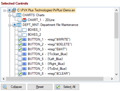
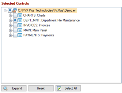
Selected Controls
Tree view list box that is used to display a list of controls that match the search criteria, if any are found. Use this list to select the controls to which the properties changes will be applied. See Selected Controls.
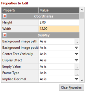
Properties to Edit
Grid that lists the properties for the selected Control Type. Use this grid to enter the property changes to be applied to selected controls. See Properties to Edit.
Ok
(Available when a property value in the Properties to Edit grid is changed)
Processes the property changes for the selected controls and displays a message upon completion. The Library Bulk Edit and Search utility is subsequently closed.
Apply
(Available when a property value in the Properties to Edit grid is changed)
Processes the property changes for the selected controls and displays a message upon completion. The Library Bulk Edit and Search utility remains open for additional changes (i.e. to different libraries, controls or properties).
Clear
Clears selections and leaves the Library Bulk Edit and Search utility open.
Exit
Closes the Library Bulk Edit and Search utility without processing any changes.
Selecting the Search button loads the Selected Controls tree view list box with a list of controls (if any found) that match the search criteria entered. Use this list to select the controls to which the properties changes in the Properties to Edit grid will be applied.
|
|
|
This tree view list box consists of the following:
|
Lists all the controls (if any found) that match the search criteria entered. This list is used to select the controls to be edited. The tree view structure consists of a library (highest level), under which are listed the panels in that library, followed by an indented list of controls on that panel.
If the search criteria is based on Control Type = Panel Header, only library and panel nodes are loaded into the Selected Controls tree view list box. If the search criteria is based on Control Type = Library Defaults, only library nodes are loaded into the Selected Controls tree view list box. Right clicking on a panel node or control node invokes a popup menu for quick access to Library Object Selection and the NOMADS Designer. When right clicking on a library node, only the Library Object Selection option is available. (The right-click popup menu was added in PxPlus 2018.) To select all libraries/panels/controls in the tree view, click the Select All button. Note: | ||||
|
Collapse (Expand) |
Toggle button that is used to either collapse or expand the entire tree view. To collapse or expand a single "parent" node, click the corresponding + plus or - minus sign. This toggle button is disabled when the selected Control Type is Library Defaults. | |||
|
Reset |
Button that is used to clear all selected check boxes and reload the tree view. Note: | |||
|
Select All (Deselect All) |
Toggle button that is used to either select or deselect all the check boxes in the tree view. |
The Properties to Edit grid lists the properties for the selected Control Type and the current value of each property. Use this grid for entering the changes to be applied to selected controls. See Selected Controls. All values entered in the grid are cleared when either the Clear Properties or Clear button is selected.
This grid consists of the following:
|
Property |
Lists the properties for the selected Control Type. If Control Type is a specific type (i.e. Button, Check Box, etc.), the grid is loaded with the properties for that control. Position the mouse pointer over the property name to display a floating tip with the variable name. (The floating tip with the variable name was added in PxPlus 2018.) If Control Type is All Controls, the grid is loaded with all properties for all control types; however, not all properties apply to every control. To find out which controls use a particular property, position the mouse pointer over the property name to display a floating tip with a list of applicable controls. If Control Type is Panel Header, the grid is loaded with Panel Header properties. Position the mouse pointer over the property name to display a floating tip with the variable name. (The floating tip with the variable name was added in PxPlus 2018.) If Control Type is Library Defaults, the grid is loaded with properties found in Library Defaults. Position the mouse pointer over the property name to display a floating tip with the variable name. (The floating tip with the variable name was added in PxPlus 2018.) The properties are grouped into categories and sorted alphabetically within each group by default. These categories can be expanded/collapsed by clicking the + (plus) or - (minus) button adjacent to the category name. By default, the categories are displayed in the following order: Name/Type, Events, Coordinates, Display, Attributes, Colors, Font, User Aids, Other. Only the categories that apply to the selected Control Type are displayed.
Note: | ||||||||||||||||||
|
Value |
Displays the current value assigned to a given property. The method for entering or displaying these values is dependent on the property type. Some fields are intended for entering free-form values; e.g. co-ordinates for Height and Width. Drop box style cells are identified by a down arrow button, which indicates that pre-set selections are available; e.g. Tab Stop, Initially Disabled, Enable Scrolling, Object Persistence, Implied Decimal, etc. Query style cells are identified by a three-dotted button. These cells are often associated with more than one field, and clicking the button invokes a separate dialog for entering/changing field values. The dialog that is invoked varies depending on the property. Double clicking inside the cell either invokes the same dialog as the dotted button or allows values to be entered directly into the cell. The As is option indicates that the current/default setting for a given property will be maintained "as is" for the controls selected in the Selected Controls tree view list box. (The ability to double click inside a Query style cell was added in PxPlus 2023.) | ||||||||||||||||||
|
Clear Properties |
Clears all changes made to the property settings in the Value column and reloads the Properties to Edit grid based on the Control Type selected. |
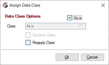
When the Control Type selected is Check Box, Drop Box, List Box, Multi-Line, Tristate Box, Variable Drop Box or Variable List Box, the Properties to Edit grid displays a Data Class property that is used to apply or reapply data classes to selected controls.
Select the Data Class (three-dotted) button to launch the Data Class Options dialog:
This dialog allows you to:
|
|
Reapply the current data class assigned to a control As is to update control properties with the current information in the data class. With the As is check box selected, click the Reapply Class check box, and then click OK. |
|
|
Choose an existing data class to be applied. Deselect the As is check box. In the Class field, enter an existing data class by using the Query button (binoculars) or typing a valid data class name. |
|
|
Create a new data class on-the-fly (either dynamic or not dynamic) to be applied. Deselect the As is check box. In the Class field, enter a new data class name and respond Yes to the displayed message, which launches Data Class Definitions maintenance. |
|
|
Clear the current data class assigned to a control. Deselect the As is check box and leave the Class field blank. When the Apply button is selected, the data class will be cleared from selected controls. |
If a data class (either dynamic or not dynamic) is selected in the Data Class Options dialog, individual control properties in the Properties to Edit grid can be manually changed to Dynamic (or a different setting) and then applied to selected controls. See Dynamic Control Properties.
(Support for applying data classes was added in PxPlus 2018 Update 0001.)
Once you have selected the controls to edit (in the Selected Controls tree view list box) and have edited the properties (in the Properties to Edit grid), you are now ready to process the changes. To do this, use either of the following options:
|
|
Click the Apply button to apply the changes and keep the utility open to make any additional changes (i.e. for a different library or directory). |
|
|
OR |
|
|
Click the OK button to apply the changes and close the utility. |
To verify that the properties have been changed, access the library/panel using the NOMADS Panel Designer, which can be invoked from the right-click popup menu within the Selected Controls tree view.
Panel Bulk Edit Utility
NOMADS Library Variables