|
GRID |
Create/Control Grid |
|
GRID ctl_id,@(col,ln,wth,ht)[,ctrlopt] | |
|
2. Delete Grid: |
GRID REMOVE ctl_id[,ERR=stmtref] |
|
3. Add Row/Column: |
GRID ADD ctl_id,col,row[,ERR=stmtref] |
|
4. Load: |
GRID LOAD ctl_id,col,row,contents$[,ERR=stmtref] |
|
GRID DELETE ctl_id,col,row[,ERR=stmtref] | |
|
6. Clear: |
GRID CLEAR ctl_id,col,row[,width,height][,ERR=stmtref] |
|
7. Disable/Enable: |
GRID {DISABLE | ENABLE} ctl_id[,ERR=stmtref] |
|
8. Lock/Unlock: |
GRID {LOCK | UNLOCK} ctl_id,col,row[,width,height][,ERR=stmtref] |
|
9. Set Focus: |
GRID GOTO ctl_id[,ERR=stmtref] |
|
GRID GOTO ctl_id,col,row[,ERR=stmtref] | |
|
11. Read First Cell: |
GRID READ ctl_id,col,row,var$,eom$[,ERR=stmtref] |
|
12. Read Next: |
GRID READ NEXT ctl_id,col,row,var$,eom$[,ERR=stmtref] |
|
13. Select Range: |
GRID SELECT ctl_id,col,row[,width,height][,ERR=stmtref] |
|
14. Select Read: |
GRID SELECT READ ctl_id,col,row[,ERR=stmtref] |
|
GRID SELECT READ NEXT ctl_id,col,row[,ERR=stmtref] | |
|
16. Select Reset: |
GRID SELECT RESET ctl_id[,ERR=stmtref] |
|
17. Find or Retrieve: |
GRID FIND ctl_id,col,row,var$[,ERR=stmtref] |
|
18. Write Setting: |
GRID WRITE ctl_id,col,row,contents$[,ERR=stmtref] |
|
19. Set Focus: |
GRID SET_FOCUS ctl_id,alt_ctl[,ERR=stmtref] |
|
20. Focus Notification: |
GRID AUTO ctl_id[,ERR=stmtref] |
|
21. Hide/Show: |
GRID {HIDE | SHOW} ctl_id[,ERR=stmtref] |
|
@(col,ln,wth,ht) |
Position and size of the grid region. Numeric expressions. Column and line coordinates for top left corner, width in number of columns and height in number of lines. Note: | ||||||||||||||||
|
alt_ctl |
Alternate CTL value that will be generated when the grid receives focus. | ||||||||||||||||
|
ctl_id |
Unique logical identifier for the grid (any integer -32000 to +32000). Avoid integers that conflict with keyboard definitions (e.g. 4 cancels CTL=4 for the F4 key) or Negative CTL Definitions. Use this value with the Apostrophe Operator to access various GRID Properties. | ||||||||||||||||
|
col,row |
Column and row refer to cell location/coordinates. Numeric expressions. For the READ or SELECT READ formats (with or without the NEXT clause), the col,row must be numeric variables rather than expressions of literals. | ||||||||||||||||
|
contents$ |
Value(s) to be written to the cell(s) or settings. String expression(s). | ||||||||||||||||
|
ctrlopt |
Control options. Supported options for GRID include:
| ||||||||||||||||
|
eom$ |
EOM (End-of-Message) character sequence. Hex string expression (e.g. $0D$ for the Enter key). | ||||||||||||||||
|
var$ |
String variable. Receives cell values returned for FIND and READ. | ||||||||||||||||
|
stmtref |
Program line number or statement label to which to transfer control. |
Use the GRID directive to create a grid or table of cells in columns and rows; i.e. a spreadsheet input format. The GRID control object is a two-dimensional array of multi_line input fields (default), check_boxes, buttons, drop_boxes or any combination of these control objects. Each cell can be of a different type.
For some formats of the GRID directive (e.g. GOTO and FIND), both column and row coordinates are required (to act as pointers to a particular cell). For other formats, one or both of the values can be 0 (zero).
The following chart shows how PxPlus interprets the column and row values:
|
Column, Row Values |
How PxPlus Interprets These |
|
col = 1, row = 1 |
The topmost cell is 1,1. |
|
col = 0, row = 0 |
All columns and rows respectively. Example: grid delete 100,0,0 (Deletes the entire grid whose control ID is 100) |
|
col = num, row = 0 |
Entire column. Example: grid delete 100,3,0 (Deletes column 3 of the grid whose control ID is 100) Note: |
|
col = 0, row = num |
Entire row. Example: grid delete 100,0,2 (Deletes row 2 of the grid whose control ID is 100) Note: |
|
col = num, row = num |
Column and row. Example: grid delete 100,3,2 (Deletes both an entire column (column 3) and an entire row (row 2) of the grid whose control ID is 100) grid goto 100,3,2 (Sets focus on the cell located in column 3, row 2) |
|
col and/or row = -1 |
By default, there are also column and row headers you can gain access to using column and/or row = -1. You cannot include these headers in any range specifications. |
The Apostrophe Operator can be used with the unique logical identifier (ctl_id) to dynamically read and alter a wide variety of control attributes (properties) directly from the programming language. Most cell attributes are only accessible through the implementation of properties. For example, drag and drop functionality utilizes the 'DraggedColumn, 'DraggedRow, 'DroppedOnColumn and 'DroppedOnRow properties.
See GRID Properties for the list of properties available for manipulating a grid.
The single character parameters for OPT=char$ are listed below:
|
|
"A" |
Auto signal is on. PxPlus returns a signal on changes. |
|
|
"B" |
Borderless. Grid has no border or frame. |
|
|
"D" |
Disabled. Grid is grayed out and is not accessible to the user. |
|
|
"d" |
Grid is permanently disabled (cannot be enabled). |
|
|
"H" |
Hide. Grid is not displayed but is accessible programmatically. |
|
|
"s" |
Scroll. Grid can scroll within a resizable/scrollable dialogue box. |
|
|
"T" |
Strip Trailing. Strip trailing spaces. |
|
|
"X" |
Signal on exit. Signal when focus exits from the grid. |
|
|
"Z" |
Cursor changes to resize pointer if within 4 pixels from the edge of the control. |
The FMT=def$ option allows you to define the format for cells in the grid. In the following syntax, the round and square brackets are part of the format:
FMT=[col_title](cell_type:col_name) Alignment Width
|
|
Alignment |
Alignment character: L (left), C (centered), R (right). Default: L |
|
|
cell_type |
Cell type for the column. The default cell type is "Normal". See Cell Types. |
|
|
col_name |
A text string containing the logical name of column. If no name is provided, the column title can be used to reference the column. |
|
|
col_title |
Text string appearing as the title in the top row of the grid. |
|
|
Width |
Width of the column in standard text character columns. |
"[Client ID](Multi_line:CST_ID$)L10 [Name](Normal:CST_NAME$)L10"
The following cell types can be assigned using the FMT= option in the GRID directive or via the 'CellType$ grid object property:
|
Cell Type |
Description |
|
"BarChart" |
Used to display horizontal bar charts based on the contents of the 'Text$ property. See Horizontal Bar Charts in Grid Cells. (BarChart cell type was added in PxPlus 2017.) |
|
"Button" |
Cell works like a button if clicked. Cell can be changed if not locked (on double click). Set 'Lock property to 1 to achieve standard button behavior for cell. |
|
"CheckBox" |
Check box with no 3D effect ('Value=0 or 1,'Text=label). |
|
"CheckBoxRaised" |
3D check box that looks raised. |
|
"CheckBoxRecessed" |
3D check box that looks recessed. |
|
"CheckMark" |
Check box that uses a check mark. |
|
"CheckMarkRaised" |
Raised check box that uses a check mark. |
|
"CheckMarkRecessed" |
Recessed check box that uses a check mark. |
|
"DropBox" |
A text cell that, when editing, allows the user to make a selection from a drop-down list. The drop list is loaded from the 'Text$ property. Drop boxes provide a multiple character search capability that makes it easier to search for an exact match in a drop box list. See Multiple Character Search. (Multiple character search in drop boxes was added in PxPlus 2019.) |
|
"DropBoxHideBtn" |
Same as "DropBox", but the drop-down button is shown only when focus is on the cell. Drop boxes provide a multiple character search capability that makes it easier to search for an exact match in a drop box list. See Multiple Character Search. (Multiple character search in drop boxes was added in PxPlus 2019.) |
|
"Ellipsis" |
Normal text cell that will show three dots ( ) if text exceeds displayable area. Ctrl - Enter can be used to force a new line in the cell (inserts $0D0A$ into cell value). |
|
"EllipsisDrop" |
Same as "Ellipsis", but forces the cell to drop vertically only during an edit. Ctrl - Enter can be used to force a new line in the cell (inserts $0D0A$ into cell value). |
|
"FlatButton" |
A flat button that shows no visible change when clicked. (FlatButton cell type was added in PxPlus 2014 Feature Pack 1 - Update 0001.) |
|
"FlatButtonInOnly" |
A button that looks flat only when not depressed. (FlatButtonInOnly cell type was added in PxPlus 2014 Feature Pack 1 - Update 0001.) |
|
"FlatTextButton" |
Similar to "TextButton", but the button is flat and shows no visible change when clicked. (FlatTextButton cell type was added in PxPlus 2014 Feature Pack 1 - Update 0001.) |
|
"FlatTextButtonInOnly" |
Similar to "TextButton", but the button looks flat only when not depressed. (FlatTextButtonInOnly cell type was added in PxPlus 2014 Feature Pack 1 - Update 0001.) |
|
Small button at the right side of the cell used to invoke a lookup. Button image is defined via the cell's 'Bitmap$ property. If no image is given, button shows three dots. When the button is pressed, the eom$ value when doing a GRID READ ctl,col,row,var$,eom$ is $FF$. See Processing Lookups and Queries for a sample program. | |
|
"LookupHideBtn" |
Same as "Lookup", but indicates that the button is hidden when the cell is not selected. |
|
"Multi_line" |
Normal text cell that can contain multiple lines of text. Press Enter or Ctrl - Enter to create a new line (value $0D0A$). When the cell being edited contains multiple lines of text, the Up/Down arrow keys can be used to move within the lines of text. Pressing Enter twice consecutively exits the cell being edited. (Usage of the Enter and Up/Down arrow keys when editing a cell was added in PxPlus 2017 Update 0004.) |
|
"Normal" |
Normal text cell that contains one line of data. |
|
"Query" |
Same as "Lookup", but the user is unable to edit the cell. |
|
"QueryHideBtn" |
Same as "LookupHideBtn", but the user is unable to edit the cell. |
|
"SingleLine" |
Normal text cell that allows for a single line of entry, expanding the cell horizontally according to the overlap rules. It does not allow vertical expansion like a multi-line. |
|
"TextButton" |
Similar to "Button", except that the text on the button adheres to the 'Align$ property and will wrap. (TextButton cell type was added in PxPlus 2014 Feature Pack 1 - Update 0001.) |
|
"UseTextEllipsis" |
Similar to "Ellipsis", "Normal" and "SingleLine" respectively, except the value of 'Text$ property is displayed. During input and editing, the 'Value$ property is presented and entered into the cell. Sorting on a column is done using the 'Value$ property. To sort a date column, set the cell type to "UseTextNormal", and then write a sortable value to the cell's 'Value$ property and set the 'Text$ property to the value to be displayed. |
|
"VarDropBox" |
A text cell that, when editing, allows the user to make a selection from a drop-down list or enter any other value. Drop list selections are loaded using the 'Text$ property. Drop boxes provide a multiple character search capability that makes it easier to search for an exact match in a drop box list. See Multiple Character Search. (Multiple character search in drop boxes was added in PxPlus 2019.) |
|
"VarDropBoxHideBtn" |
Same as "VarDropBox", but the drop-down button is shown only when focus is on the cell. Drop boxes provide a multiple character search capability that makes it easier to search for an exact match in a drop box list. See Multiple Character Search. (Multiple character search in drop boxes was added in PxPlus 2019.) |
Horizontal Bar Charts in Grid Cells
A "BarChart" cell type in the grid can be used to display horizontal bar charts based on the contents of the 'Text$ property.
(Horizontal bar chart support in grids was added in PxPlus 2017.)
The length of the bar and fill color are defined by a series of comma-separated parameters set in the 'Text$ property. The first parameter defines the length of the bar as a percentage of the cell width. A value of 100 will result in the bar covering the complete cell, 50 will cover half of the cell, etc. If the cell is resized, the bar length will be adjusted accordingly. The second and optional third parameters define the color of the bar with the second parameter representing the color for the top of the bar and the third parameter, if present, the bottom of the bar. If the third parameter is omitted, the bottom of the bar will be automatically generated by the system to make the bar appear slightly three-dimensional.
Multiple bars may be supplied to create multiple bars within the cell with each bar specification being separated by a semi-colon. Any portion of the bars that exceeds the total width of the cell will be truncated.
Example:
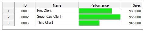
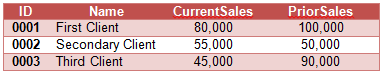
For this example, let us assume that we are dealing with client information that is comparing CurrentYTDSales against PriorYTDSales with the following data:
If we want to present a simple graph in the grid, we might code something like this:
0010 begin
0020 print 'CS'
0030 let gd=10
0040 grid gd,@(5,5,66,6),fmt="[ID]10C [Name]20 [Performance]20 [Sales]10R"
0050 let gd'autoSequence=-1
0060 let gd'colno=3,gd'celltype$="BarChart"
0070 let row=0
0080 while 1
0090 read data id$,name$,CurrentSales,PriorSales,end=*break
0100 let pct=(100*CurrentSales)/PriorSales
0110 row++
0120 grid load gd,1,row,id$+sep+name$+sep+""+sep+str(CurrentSales:"$##,##0")+sep
0130 let bar$=str(pct)+",Green"
0140 let gd'colno=3,gd'row=row,gd'text$=bar$
0150 wend
0160 input *
0170 data "0001","First Client",80000,100000
0180 data "0002","Secondary Client",55000,50000
0190 data "0003","Third Client",45000,90000
This would result in a grid something like this:
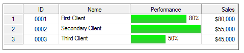
If we want to include the percentage as a number following the bar, we could include the text to display in the value of the cell. In the program above, we set the cell value to "", but this could be changed to include the actual value as follows:
0120 grid load gd,1,row,id$+sep+name$+sep+str(pct)+"%"+sep+str(CurrentSales:"$##,##0")+sep
This would result in the following:
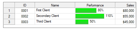
Notice that the percentage does not show on the second line because the bar completely fills the cell width. In fact, the percentage for ID 0002 is 110%. To resolve this, we need to adjust the bar display percentage to allow for both the full bar and the text. This can be done by factoring the bar percentage itself:
0130 let bar$=str(pct/1.5)+",Green"
This would result in the following:
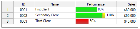
Let us assume we want to enhance this as follows:
If the Percentage is < 70%, display the bar in Red, and for any percentage over 100%, display the bar in Yellow.
To do this, we could change line 130 and add 135 as follows:
0130 let bar$=str(min(pct,100)/1.5)+","+tbl(pct<70,"Green","Red")
0135 let bar$+=";"+str(max(pct-100,0)/1.5)+",Yellow"
This would result in the following:
Drop boxes provide a multiple character search capability that makes it easier to search for an exact match in a drop box list.
To use this capability effectively, the characters must be entered within a ½ second of one another and must exactly match the start of an item in the drop box.
Example:
Assume that a drop box contains the following items:
C10000
C30000
C50000
Typing the character "c" followed within ½ second by the number "3" would select the "C30000" item.
(Multiple character search in drop boxes was added in PxPlus 2019.)
Processing Lookups and Queries
The following program creates a grid with cells that use a Calendar query:
PRINT 'CS',
mygrid=1000
GRID mygrid,@(20,12,40,10)
mygrid'columnswide=3,mygrid'rowshigh=5
mygrid'row=0
mygrid'colno=0,mygrid'columnwidth=10
mygrid'colno=1,mygrid'celltype$="lookup" ! can edit cell
mygrid'colno=2,mygrid'celltype$="query" ! cannot edit cell
WHILE 1
OBTAIN (0,SIZ=1)'ME',*,'MN'
IF CTL=-1999 OR CTL=4 \
THEN BREAK ! X or ESC
IF CTL=mygrid \
THEN GRID READ mygrid,mycol,myrow,myVal$,myEOM$;
IF mycol<3 AND myEOM$=$FF$ \
THEN GOSUB Do_Calendar \
ELSE MSGBOX myVal$,"Value" ! the EOM for the lookup/query button is $FF$
WEND
END
!
Do_Calendar:
PROCESS "Calendar","*win/calendar.en",myVal$
GRID LOAD mygrid,mycol,myrow,myVal$+SEP
RETURN
Create Grid
GRID ctl_id,@(col,ln,wth,ht)[,ctrlopt]
Use this format to create your grid. The value in ctl_id is a unique identifier for your grid. This value is used to generate a CTL value whenever the grid is selected and changed.
When first creating a new grid, the height of the font declared in the FNT= option will be used to determine the default row height. If the font height exceeds 20 (the normal default row height), the system will automatically adjust the default row heights to a size large enough to accommodate the font size specified.
(Support for the automatic adjustment of row height was added in PxPlus 2019.)
GRID REMOVE ctl_id[,ERR=stmtref]
Use this format to delete an entire grid.
GRID ADD ctl_id,col,row[,ERR=stmtref]
Use the GRID ADD format to add a row or column of blank cells to your grid. At least one of the col,row values must be other than 0 (zero).
GRID LOAD ctl_id,col,row,contents$[,ERR=stmtref]
Use GRID LOAD to load contents$ into the grid from a string variable or expression. You must include both the column and the row for the address at which the load is to start. If column and row are both 0 (zero), then the grid is cleared first.
PxPlus can load a number of columns and rows of data at a time. Column and row separators are mandatory. Set the column separator using the SEP= option. Set your row separator by including it as the last character in your data string. (PxPlus treats the last character in the string as your row separator.)
Loading and interacting with a grid can sometimes be slow, especially when working in a WindX environment. For information and examples on the different ways to speed up grid interactions, see How to Speed Up Grid Loading and Processing.
Adding a New (Bottom) Row
Use row=0 to add a new row to the bottom of a grid.
Example:
grid load ctl,1,0,data$+esc ! (using ESC as the row delimiter)
GRID DELETE ctl_id,col,row[,ERR=stmtref]
Use the GRID DELETE format to delete a column or row from your grid. You can identify a column to delete, a row to delete, or both.
Clear
GRID CLEAR ctl_id,col,row[,width,height][,ERR=stmtref]
Use the GRID CLEAR format to clear or reset the contents of a range of cells to the default (empty). You can clear a column or a row or both.
GRID {DISABLE | ENABLE} ctl_id[,ERR=stmtref]
Use the GRID DISABLE format to disable a grid so that it will be visible but inaccessible to users. To reactivate it, use GRID ENABLE.
GRID {LOCK | UNLOCK} ctl_id,col,row[,width,height][,ERR=stmtref]
Use the GRID LOCK format to allow/deny access to a range of cells in the grid. The user cannot change the cell's value; however, if the cell is a button control, the user can still click on it. Use the GRID UNLOCK format to release the locked range of cells for other processes.
The default background color for locked cells is LIGHT GRAY (standard button face color). Use the 'BackColor$ property to override this.
GRID GOTO ctl_id[,ERR=stmtref]
Use this format of the GRID GOTO directive to set the focus on the first cell of your grid, ready for the user's next action.
GRID GOTO ctl_id,col,row[,ERR=stmtref]
Use this format of the GRID GOTO directive to go to a specific cell address (other than the first cell) and set the focus on that cell, ready for the user's next action. You must include both column and row coordinates in this format of the directive (not zero values).
GRID READ ctl_id,col,row,var$,eom$[,ERR=stmtref]
Use var$ in the GRID READ format to receive the modified cell address and value of the first selected cell. If the cell does not exist, an Error #2: END-OF-FILE on read or File full on write. If there is more to read, the CTL event is re-posted. The eom$ string tells you which input sequence ended the message (e.g. $0D$ for the Enter key).
The GRID READ directive must include both column and row addresses. PxPlus returns a queue of cells that have been changed and generates an additional CTL event after a read to ensure that no events are lost. There can be a problem due to potential race conditions when the host is unable to keep up with the user input. To circumvent this, PxPlus returns Error #2: END-OF-FILE on read or File full on write if the queue is empty.
Determining Which Cell in a Grid was Changed
When a cell in a grid changes, you need to use the row and column numbers returned by the GRID READ directive to determine which cell changed.
The properties 'CurrentRow and 'CurrentColumn do not necessarily reflect the changed cell. They indicate at which cell the input is currently positioned.
Suppose you are in cell 1,1 and enter some data. Then, you use the mouse to change to cell 2,3. The grid will generate an ON CHANGE event. When you issue a GRID READ, you will get column 1, row 1, and the new data. If, however, you were to check current row/column, they would say 2,3, which is where you are now positioned.
When using NOMADS, the values returned from the GRID READ will be in XXXXX.ROW and XXXXX.COLUMN where XXXXX is the name of the grid.
GRID READ NEXT ctl_id,col,row,var$,eom$[,ERR=stmtref]
Use the string var$ in the GRID READ NEXT format to receive the modified cell address and value of the next (not first) selected cell. If this cell does not exist, PxPlus returns an Error #2: END-OF-FILE on read or File full on write. If there is more to read, no CTL event is re-posted. The CTL value is posted when another cell is changed. The eom$ string tells you what input sequence ended the message (e.g. $0D$ for the Enter key)
Use the following formats to select ranges of cells to READ or to RESET (to remove cells from the SELECT state). GRID SELECT can be used to control cell selection. (When you SELECT a range of cells, the given cells are added to the list of selected cells.) To determine which cells are selected, use GRID SELECT READ to obtain the first selected cell, and then use GRID SELECT READ NEXT to get subsequent cells.
GRID SELECT ctl_id,col,row[,width,height][,ERR=stmtref]
Select Range. This format selects a range of cells from your grid.
The SelectCount property returns the number of selected cells; however, when the RowHiLight property is set, SelectCount returns the number of rows:
Example:
0010 BEGIN
0020 LET G=10
0030 GRID G,@(20,10,50,12)
0040 GRID ADD G,5,9
0050 LET G'ROWHILIGHT=1
0060 GRID SELECT G,0,0
0070 PRINT G'SELECTCOUNT
0080 INPUT *
GRID SELECT READ ctl_id,col,row[,ERR=stmtref]
Select Read. Use this to read the first selected cell. By default, the current cell is always selected; thus, this will always return a value. However, the values returned may reference a cell that does not exist as it has been deleted due to a GRID LOAD.
GRID SELECT READ NEXT ctl_id,col,row[,ERR=stmtref]
Select Read Next. Use this format to read the next (not the first) selected cell. When PxPlus encounters a GRID SELECT READ NEXT after the last selected cell is returned, it reports Error #2: END-OF-FILE on read or File full on write.
GRID SELECT RESET ctl_id[,ERR=stmtref]
Select Reset. This format removes all cells from the SELECT state. There is no way to remove cells from the selected state individually.
GRID FIND ctl_id,col,row,var$[,ERR=stmtref]
Use a string var$ in the GRID FIND format to return the value for a specific cell.
GRID FIND ctl_id, 0,row, var$[,ERR=stmtref]
(Retrieve all cells in row)
GRID FIND ctl_id, col, 0, var$[,ERR=stmtref]
(Retrieve all cells in column)
GRID FIND ctl_id, 0, 0, var$[,ERR=stmtref]
(Retrieve all cells in grid)
Specifying a col or row of 0 (zero) causes PxPlus to return all columns/rows of the grid.
(The ability to retrieve a range of grid cells was added in PxPlus v7.10.)
GRID WRITE ctl_id,col,row,contents$[,ERR=stmtref]
Use GRID WRITE to update your grid by writing settings to specified cells.
GRID SET_FOCUS ctl_id,alt_ctl[,ERR=stmtref]
Use the GRID SET_FOCUS format to have PxPlus return CTL values when focus changes to an address in the grid.
GRID AUTO ctl_id[,ERR=stmtref]
Use this format to have PxPlus return a CTL value whenever focus changes occur within your grid. You can use the values in your applications to track a user's selections.
GRID {HIDE | SHOW} ctl_id[,ERR=stmtref]
With the GRID HIDE format, the grid remains active but is not displayed. It is still accessible programmatically. Use the SHOW format to restore the display and user access.
GRID Properties
How to Speed Up Grid Loading and Processing
The example demonstrates how you can use a combination of GRID directives and GRID control object properties to perform various functions (formatting, loading, retrieving, etc.).
0010 ! GRIDDEMO - Grid demo program
0020 begin ;
0020:print 'CS',"Grid Demonstration"
0030 grid 10,@(3,3,70,15)
0040 grid load 10,0,0,""
0050 for R=1 to 10
0060 let R$=""
0070 for C=1 to 10
0080 let R$+=str(C*R)+sep
0090 next
0100 grid load 10,1,0,R$
0110 next
0120 let X=10
0130 for I=1 to 10;
0130:let X'ROW=-1,X'COLUMN=I;
0130:let X'VALUE$="Col "+str(I);
0130:next
0140 for I=1 to 10;
0140:let X'ROW=I,X'COLUMN=-1;
0140:let X'VALUE$="Row "+str(I);
0140:next
0150 let X'COLUMN=-1,X'COLUMNWIDTH=6
0160 let X'COLUMN=2,X'ROW=0,X'LOCK=1
0170 let X'COLUMN=3,X'ROW=0,X'COLUMNWIDTH=7,X'CELLTYPE$="Button",X'LOCK=1
0180 let X'COLUMN=4,X'ROW=0,X'COLUMNWIDTH=7,X'CELLTYPE$="CheckMarkRecessed"
0190 let X'COLUMN=5,X'ROW=0,X'COLUMNWIDTH=7,X'CELLTYPE$="DropBox",
0190:X'TEXT$="cat/pig/dog/"
0200 let X'COLUMN=6,X'ROW=0,X'COLUMNWIDTH=7,X'CELLTYPE$="DropBoxHideBtn",
0200:X'TEXT$="cat/pig/dog/"
0210 let X'COLUMN=7,X'ROW=0,X'COLUMNWIDTH=7,X'BITMAP$="!bug"
0220 let X'COLUMN=8,X'ROW=0,X'ALIGN$="C"
0230 let X'COLUMN=9,X'ROW=0,X'ALIGN$="R"
0240 let X'COLUMN=0,X'ROW=2,X'BACKCOLOUR$="LIGHT CYAN"
0250 let X'COLUMN=0,X'ROW=3,X'BACKCOLOUR$="LIGHT YELLOW"
0260 let X'ROW=8;
0260:for I=1 to 10;
0260:let X'COLUMN=I;
0260:let X'BACKCOLOUR$="RGB:"+str(rnd(200)+55)+" "+str(rnd(200)+55)+
0260:" "+str(rnd(200)+55);
0260:next
0270 let X'ROW=9;
0270:for I=1 to 10;
0270:let X'COLUMN=I;
0270:let X'TEXTCOLOUR$="RGB:"+str(rnd(200)+55)+" "+str(rnd(200)+55)+
0270:" "+str(rnd(200)+55);
0270:next
0280 for I=1 to 10;
0280:let X'COLUMN=I,X'ROW=I,X'FONT$="Arial,1,BI";
0280:next
0290 input X$;
0290:if ctl=4
0290:then stop
0300 if ctl<>10
0300:then print "Recv'd CTL=",ctl;
0300:goto 0290
0310 grid read 10,C,R,ZZ$,E$
0320 print @(0,20),'CL',"Col=",C," Row=",R," Dta=",ZZ$," Eom=$",hta(E$),"$",
0330 goto 0290