Property
Description
When set, the control will generate a 'Change' event whenever its value changes as opposed to the default Off state where the control will only generate the change event when losing focus.
Possible values are:
|
0 |
Only signal change when exiting the control or on special event such as double click/Enter. (Default) |
|
1 |
Signal all changes to the value of the control regardless of why the change occurred. |
|
2 |
Signal all changes done by the user but not done by the program. |
Controls the automatic completion of user entries: For parameters, see Auto Complete as described in the MULTI_LINE directive.
Ctl_id to be generated by a multi-line to signal that the list of entries for the Auto Complete drop box is to be loaded via the AutoValue$ property.
List of entries to load into Auto Complete drop box. See AutoCtl property.
Background color. When a multi-line control is disabled, it retains the background color that has been set instead of showing the standard disabled color.
For information on valid color names and color specifications, see Color Properties. (Default: "DEFAULT")
Add border: 1 - Border; 0 - No border (Default: 1)
Note:
Applicable only when using Windows XP or Windows 7 style controls.
This property, when set to any value, will cause the control to be moved to the top of the display order. Once at the top of the display order, the control will appear visually on top of any other control on the window. (Default: Not Applicable - Always returns 0)
Invoke month calendar control. For parameters, see Calendar Feature as described in the MULTI_LINE directive.
Screen position (column) of control.
Width of control in column units.
Sets the radius for the multi-line corners. Works only in 4D mode.
Possible values are:
|
|
(Null) |
Property is not set. |
|
|
Round |
Sets the default radius of 3 for round corners. |
|
|
Square |
Sets the default radius of 0 for square corners. |
|
|
(Value) |
Enter a value from 0 to 7 inclusive. |
Example:
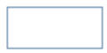
CornerRadius$ set to Round:
MULTI_LINE 100,@(10,15,10,2)
y=100
y'CornerRadius$="round"
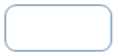
CornerRadius$ set to Square:
MULTI_LINE 100,@(10,15,10,2)
y=100
y'CornerRadius$="square"
CornerRadius$ set to a value of 7:
MULTI_LINE 100,@(10,15,10,2)
y=100
y'CornerRadius$="7"
Note:
Corner rounding is limited based on the control type and/or the control size.
(The CornerRadius$ property was added in PxPlus 2026.)
Control type ("MULTI_LINE"). See MULTI_LINE directive.
Background color when the control is disabled. For information on valid color names and color specifications, see Color Properties.
(Multi-Line support was added in PxPlus 2019.)
Foreground text color when the control is disabled. For information on valid color names and color specifications, see Color Properties.
(Multi-Line support was added in PxPlus 2019.)
Enabled indicator: 1 = True; 0 = False (Default: 1)
The 'Encrypt$ property for multi-lines can be set on fields that are to be kept confidential by the user (such as a password) and that the system only needs to verify that the user has entered the same value as opposed to knowing what the user entered. When the 'Encrypt$ property is set, the control will return the SHA1 hash key of the value set in 'Encrypt$ followed by the value in the field. This is an industry standard hashing algorithm that is generally acceptable for security purposes.
Example:
If the input field contains the value "MyPassword", then setting the 'Encrypt$ property to "Hide the Password:" -- When you read the field, it will return the value of HSH ("Hide the Password:MyPassword",-1), which is its SHA1 value. This is a one-way encrypt into a 40 byte (20 Hex characters or 160 bit) value -- see http://en.wikipedia.org/wiki/SHA-1.
Note:
When the Encrypt$ property is set, you cannot load a value into the multi-line; you can only clear it. Any attempt to set a value in the multi-line is ignored (since a write back would be trying to write back the SHA1 value).
This feature allows the system to store a user input such as a password and validate against the SHA1 of a prior entry without ever knowing what the password is. For increased security, you cannot read back the 'Encrypt property. If you do read, this property will return the following string:
D:n,L:n,U:n,S:n
Where:
Each of the 'n' values indicates the number of Digits, Lowercase, Uppercase and Special characters in the field. This can be used to determine general password characteristics so the developer can impose restrictions on the password such as must be > 6 characters, contain a number and at least one special character.
'SelectText$ will be disabled while 'Encrypt$ has a value, and this property is only valid on regular multi-lines -- not Rich Text multi-lines. Once set, this will allow for secure interaction for password fields with a WindX connection without having to resort to using SSL for communications.
This property is used to define how the ENTER key will be processed with the control. For the multi-line, the EnterMode property defines whether the ENTER key is to be allowed within the control or considered a TAB to exit the control.
When 0 (zero), it indicates that the ENTER key will not be considered as a TAB; thus, depending on the type of multi-line, it will signal the input complete for a 1-line field or insert a line feed on a control with multiple input lines.
(Default for Multi-line: The default setting reflects the '+E' mnemonic setting.)
Last change terminator. See also MULTI_LINE directive.
Control format definition. Refer to the FMT= option as described in the MULTI_LINE directive.
Focus indicator: 1 = Control has focus (Default: 0)
Background color when the control has focus. For information on valid color names and color specifications, see Color Properties.
(Multi-Line support was added in PxPlus 2018.)
Foreground text color when the control has focus. For information on valid color names and color specifications, see Color Properties.
(Multi-Line support was added in PxPlus 2018.)
This property is used to reference the font for a control. It will contain (or can be set to) a string containing three comma-separated fields of the font name, size and attributes. See 'FONT' mnemonic.
Example:
To set the font to Arial, 1.5 times normal size, and Bold, the format would be xxx'Font$="Arial,1.5,B".
Color of the frame/border around the control. For information on valid color names and color specifications, see Color Properties.
(The FrameColor$ property was added in PxPlus 2024.)
Height of control in pixels.
Background color when mouse is over the control. For information on valid color names and color specifications, see Color Properties.
(Multi-line support was added in PxPlus 2025.)
Color of border when mouse is over the control. For information on valid color names and color specifications, see Color Properties.
(Multi-line support was added in PxPlus 2025.)
Foreground text color when mouse is over the control. For information on valid color names and color specifications, see Color Properties.
(Multi-line support was added in PxPlus 2025.)
Windows handle for control.
Controls implied decimal input.
Hot key to jump to control.
Left margin for control in pixels.
Input length of line.
Screen position of control.
Height of control in number of lines.
Lock status: Possible values are:
|
0 |
Unlock (Default) |
|
1 |
Lock |
|
2 |
Lock (cell contents can be selected/copied) (Grid Only) |
|
-1 |
Permanently locked (Multi-Line Only) |
(The Lock status of 2 was added in PxPlus 2019.)
Background color when the control is locked. For information on valid color names and color specifications, see Color Properties.
(The LockBackColor$ property was added in PxPlus 2024.)
Foreground text color when the control is locked. For information on valid color names and color specifications, see Color Properties.
(The LockTextColor$ property was added in PxPlus 2024.)
Defines how a control will look. Possible values are:
|
2 |
Old Windows 3.1 2D look. |
|
3 |
Windows 95/98 3D look. |
|
4 |
Windows XP/Vista/Windows 7 look. |
This property reports/sets the CTL value to generate when an object is selected on a right-click of the mouse.
Message line text for the control.
String text to display when the value of the multi-line field is empty. If a numeric format string has been assigned, then the text is displayed when the value is 0 (zero).
User object method. (Default: 0 - No object specified)
The 'ObjectID property allows applications to intercept property values and add methods to controls. When set to a valid ObjectID by the application, you can add methods and add/override property logic for any control in the system. When set in the system, it allows the application to logically request methods against the control that, in turn, will be performed by the related Object ID. It will also first check the object for any property requests and, if the property is defined in the object, set or get that property instead of the controls.
To allow the specified object to get true access to the control, while executing within the object identified by the 'ObjectID property, the system will direct any property requests directly to the control.
Note:
When a control is deleted from the system, any object identified by an 'ObjectID property will be automatically dropped.
This multi-line property controls the generation of a CTL event when the control is double clicked. The value is ignored if the control is disabled, but will be generated if the control is locked.
It can be set to a non-zero CTL value, which will be generated if the user double clicks the control.
(The OnDoubleClick property was added in PxPlus 2022 Update 1.)
On focus, resize columns: Returns to defined size when focus leaves. Assign 0 to reset.
On Focus CTL event: 0 is returned if no On Focus CTL value is set up for the control.
On focus, resize lines: Returns to defined size when focus leaves. Assign 0 to reset.
This property controls the CTL event that will be fired prior to the system displaying the Tip for any control. If the value of this property is non-zero, the system will use its value of a CTL event to fire and will defer the display of the tip until the application changes the value in 'Tip$. If the value in 'Tip$ is not changed, no tip will be displayed.
Setting this to zero (Default) disables the event from being sent and the current 'Tip$ will be displayed.
Parent window handle.
Password mask data.
If this property is set to 1, the multi-line will have its contents replaced with the PxPlus defined password character (default $). Setting this property to 0 (zero) removes the masking.
(Read/Write support for the Password property was added in PxPlus 2023.)
Strip non-printing characters from pasted data. When this property is set to On, the filter strips leading/trailing non-printing characters, such as line feeds or tabs, from data that is copied/pasted into a multi-line control and replaces any internal sequence of non-printing characters with a single space. (Default: 1 (On), except for multi-lines that are >1 line high and accept multiple lines of input, which default to 0 (Off))
Example:
Data that is copied as
123 Main Street
Markham
Ontario
will be pasted as:
123 Main Street Markham Ontario
The Clipboard will reflect the actual data pasted in case the user wants to paste the data elsewhere.
(The PasteFilter property was added in PxPlus 2020 Update 1.)
This property contains the value last returned when the multi-line was read.
(The PriorValue$ property was added in PxPlus 2018.)
Contains the CTL value for a query button that is to be placed within an input multi-line control. Button position, size and visibility are controlled by the multi-line. Transparency fills the button with multi-line background color.
Set scrollbar types. Possible values are:
|
0 |
No scrollbars. |
|
1 |
Vertical scrollbars. |
|
2 |
Horizontal scrollbars. |
|
3 |
Both scrollbars. |
Set scroll wheel increment. This property is used to define how many lines each click of the scroll wheel will move a list box or grid.
Possible values are:
|
0 |
Scroll wheel support (all events go to parent window). |
|
1 |
Scroll only if the control has focus (mouse can hover on or off control). |
|
2 |
Scroll only if the control has focus (mouse must be hovered over control). |
|
3 |
If control does not have focus, then scroll when mouse hovers over this control (otherwise, same as 1). |
|
4 |
If control does not have focus, then scroll when mouse hovers over this control (otherwise, same as 2). |
Length of selected item: This reports the number of characters currently highlighted. This allows for cut, copy and paste within a graphical user interface input region.
This property indicates where the highlight begins within the data or, if nothing is highlighted, the current cursor location. This allows for cut, copy and paste within a graphical user interface input region.
Text contained within the highlight: This allows for cut, copy and paste within a graphical user interface input region. See Multiple Selections.
Separator character between each field, column or data point.
Separator character for each row or data set.
Controls whether a 'Change' signal will be generated when the control (or region of a grid control) is exited regardless of whether the control's value changes. Normally, controls only signal changes when the control loses focus and the contents have changed. Setting 'SignalOnExit allows a change signal to also be generated whenever focus leaves the control (or region for grid).
|
0 |
No signal on exit unless control value has changed. |
|
1 |
Signal on exit regardless of whether value has changed (on grid, signals whenever changing cell). |
|
2 |
Signal when changing row or on exit of grid (sets column value to 0 and row value to last row exited). (Grid Only) |
|
3 |
Signal when exiting the grid (sets column and row values to zero). (Grid Only) |
Enable spell checking. For a multi-line and grid cell, set this property to non-zero to enable spell checking on the input field. Reading this property will determine whether spell checking is enabled. (Default: 0)
(The SpellCheck property was added in PxPlus 2019.)
Foreground text color. For information on valid color names and color specifications, see Color Properties. (Default: "DEFAULT")
Tip message for control.
Top of control in pixels.
Force text to uppercase: 1 = On; 0 = Off (Default: 0)
Current item value.
Change control's value without generating OnChange event: Same as 'Value$; however, when used to change the value in the control, no OnChange event will occur.
Normally, on list style or input controls which have Signal All Changes enabled, changing the control value under either program control or by user input will generate an OnChange event. Changing the value of a control using the ValueNoSignal$ property allows the control's value to change without generating the OnChange event.
Control visible flag: 1 = Yes; 0 = No (Default: 1)
Width of control in pixels.
Controls the list of properties to be returned in '_PropValues$. Each value is separated by the value in '_PropSep$.
This property can be used to speed up the processing of multiple property accesses but reducing the number of interactions with the control. See Multi-Property Access.
Controls the separator used between each of the values of the properties returned in '_PropValues$ as defined by '_PropList$.
This property can be used to speed up the processing of multiple property accesses but reducing the number of interactions with the control. See Multi-Property Access.
Accesses the values of the properties defined in '_PropList$. Each value is separated by the value in '_PropSep$.
This property can be used to speed up the processing of multiple property accesses but reducing the number of interactions with the control. See Multi-Property Access.