|
Using Property Sheets |
|
The Property Sheet is a resizable window in the work area that presents the design properties for a selected control object or the panel header using a two-column table format. When the NOMADS Panel Designer is initially launched, this window is anchored to the right side of the work area by default.
The Menu Bar and Tool Bar options above the work area provide access to Panel Designer functionality. The name of the current project is also displayed.
(The project name display was added in PxPlus 2023.)
The Controls Toolbox to the left of the work area provides a collection of creation tools for adding controls to any panel.
To select Property Sheets, use one of the following methods:
|
Location |
Method |
|
Select Utilities > Property Sheets from the menu bar. | |
|
Select Designer > Property Sheets from the menu bar before creating a new panel or selecting an existing panel. |
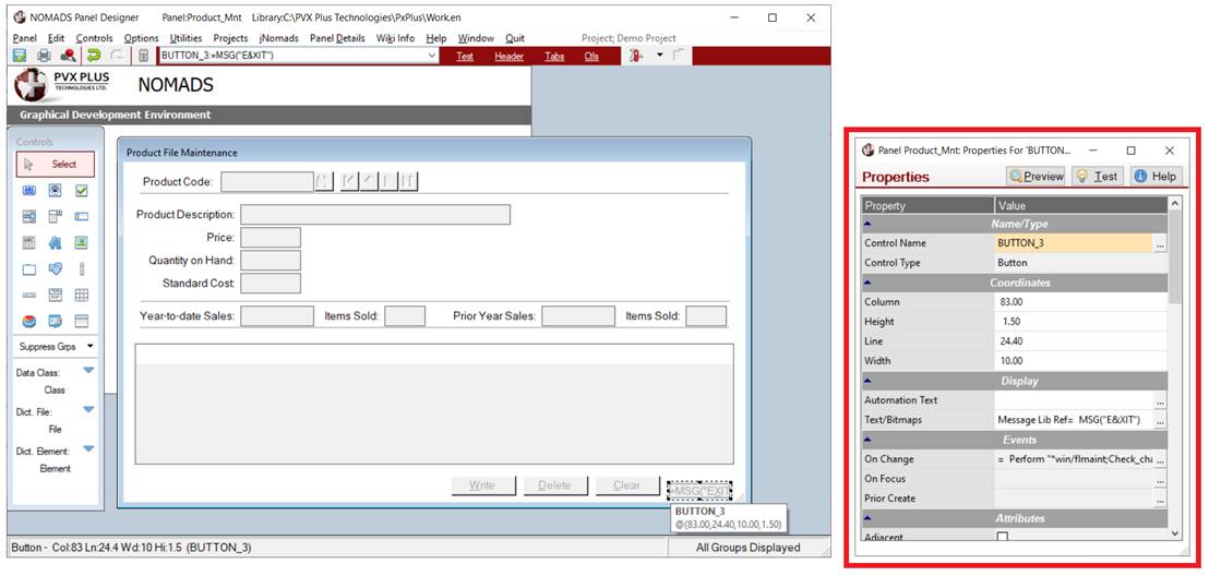
The example below shows the Property Sheets version of the NOMADS Panel Designer. On the design panel, a button control is selected, and the Button Properties for this control are displayed using the Property Sheet:
The Property Sheet presents the design properties in a table with two columns, Property and Value. Three buttons, Preview, Test and Help, are also provided.
|
This column lists the property names for the Control Type selected. Use the scroll bar to navigate through the full list of properties. Only the properties that apply to the selected control type (see Types of Controls) or panel header (see Panel Header Properties) are displayed. Hover the mouse pointer over a Property cell in the table to display a floating tip with Help information for the associated property. See Help Text. | |
|
This column contains the current value defined (or assigned by default) for the property. The method for entering or displaying these values is dependent on the property type. Some fields are intended for entering free-form values; e.g. object co-ordinates for Column, Height, Line, Width, etc. Check boxes may be used to toggle On/Off selections; e.g. Tab Stop, Initially Disabled, Enable Scrolling, etc. Drop box style cells are identified by a down arrow button, which indicates that pre-set selections are available; e.g. Alt-Key, Object Persistence, Implied Decimal, etc. Query style cells are identified by a three-dotted button. These cells are often associated with more than one field, and clicking the button invokes a separate dialog for entering/changing field values. The dialog that is invoked varies depending on the property. Double clicking inside the cell either invokes the same dialog as the dotted button or allows values to be entered directly into the cell. Hover the mouse pointer over a Value cell in the table to display a floating tip with Help information for the associated property. See Help Text. (The ability to double click inside a Query style cell was added in PxPlus 2023.) | |
|
Preview |
Some GUI controls, such as Buttons and Check Boxes, are displayed in a limited edit mode format as you draw them on the panel. Click the Preview button to get a quick look at how the visible properties of a control will appear at run time. Note: |
|
Test |
The Test button switches the panel into test mode, which processes the panel and allows panel controls to function in an interactive state (as they would appear to the user). To exit test mode and return to edit mode, press the Esc or the F4 key, or use the X (Close) button on the test panel. |
|
Help |
Launches PxPlus Help. |
All properties listed in the Property Sheet are categorized into groups. The default order consists of the following: Name/Type, Events, Coordinates, Display, Validation, Attributes, Colors, Font, User Aids, Other. You can customize the sort order of the property categories and their associated properties. See Change Bulk Edit/Property Sort Order.
The property categories are defined as follows:
|
Name/Type |
Contains the Control Name, Control Type, Data Class, and any additional properties such as List Box Type and Shape. |
|
Events |
Logic that will execute when a particular event occurs; e.g. On Change, On Focus and Post Create events. |
|
Coordinates |
Object co-ordinates for Column, Height, Line and Width. |
|
Display |
Visual display information; e.g. Bitmap Button, Input Length, Input Format. |
|
Validation |
Validation logic for Multi-line controls; e.g. Formatter, Validation Rules and Validator. |
|
Attributes |
Control attributes represented as a series of check box cells in the property list; e.g. Auto Tab Skip, Numeric, Initially Hidden. |
|
Colors |
Background and Foreground colors of the control or panel. |
|
Font |
Graphic font. |
|
User Aids |
Floating Tip, Help Reference and Message Bar text. |
|
Other |
Additional panel/object features; e.g. Comments, Groups, Popup Menu, Query, Security and User Tag references. |
Property Sheets can be enlarged by dragging the window border. The property categories (i.e. Name/Type, Coordinates, Events, Display, Attributes, etc.) can be expanded or collapsed by clicking the Up/Down arrow buttons adjacent to each category heading. If needed, you can minimize the Property Sheet to the bottom of the Panel Designer work area while you adjust the layout of your panel.
To adjust the format and appearance of Property Sheets, select Options > Properties Table from the menu bar to access the following options:
|
Change Bulk Edit/Property Sort Order |
This option opens the Change Bulk Edit/Property Sort Order window for customizing how property groupings are displayed in Property Sheets, as well as in the Panel Bulk Edit Utility and the Library Bulk Edit and Search Utility (for the Properties to Edit grid). |
|
Save Window Settings |
This option is used to maintain panel persistence of the Property Sheet on exit from the Panel Designer. With this setting, the Property Sheet will be restored to the same format, size and location the next time you return to the Panel Designer. It also remembers if the Property Sheet is disabled. This setting is saved in the nomads.ini file or a project settings file under [Options]/Save. |
|
Disable Window |
This option is used to disable access to the Property Sheet. It also prevents the Property Sheet from being reloaded each time a control is selected (moved, resized, etc.), which can improve performance when running NOMADS across a WindX connection. This setting is saved in the nomads.ini or a project settings file under [PropertiesWindow]/Disable. |
|
Show Minimized Window |
This option exposes the minimized Property Sheet in the bottom left corner of the Panel Designer. This can be used as a quick method to locate the Property Sheet when it seems out of sight behind the Panel Designer work area. The Restore button can be used to maximize the Property Sheet. |
When a control is edited or created, design properties for that component are loaded automatically in the Property Sheet. The heading bar identifies the control type or panel header selected for editing.
When a property value is changed in the Property Sheet, the change is reflected immediately in the panel. When using the mouse to resize or move a control on the panel, the Column, Height, Line and Width property values (under the Coordinates category in the Property Sheet) are updated.
To reverse any changes, click the Undo tool bar button.
To save any changes, click the Save tool bar button or select Panel > Save from the menu bar; otherwise, close the panel without saving changes.
When the mouse pointer is positioned over a cell in the Property or Value column, a floating tip displays with Help information for the associated property. These tips are hidden or shown based on the Hide Tips option that is available by clicking the PxPlus icon in the upper left corner of the Property Sheet.
Using NOMADS+ Toolbar
Using Folder Style