|
Calendar |
|
The Calendar feature provides a user-friendly way to enter date information into a Multi-Line input area. When applied to a Multi-Line control, it can be used to invoke a month calendar popup that allows users to pick a date to be inserted automatically into the input area.
A calendar button can be added next to the control (if the Create Calendar Button check box is selected in the Calendar Control Definition window). The user will also be able to invoke the calendar by pressing Shift - F2.
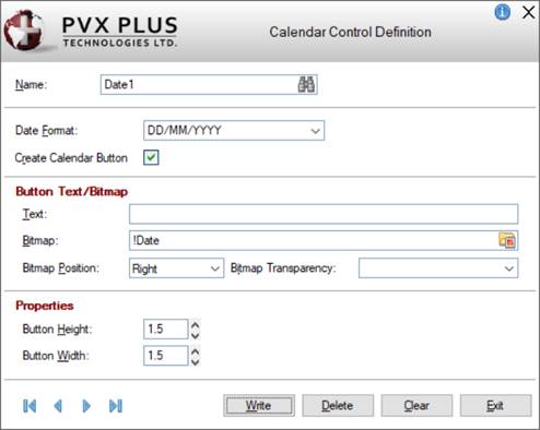
The Calendar Control Definition window in NOMADS is used to set up how the Calendar feature will be applied in your application. Definitions created using this window will be stored in the providex.cal file.
To invoke this window, use one of the following methods:
|
Location |
Method |
|
From the PxPlus IDE Main Launcher |
Expand the Graphical Application Builder (NOMADS) category. Then, expand the Setup category and select Calendar. |
|
From the NOMADS Session Manager |
From the Utilities menu, select Calendar. |
|
From the Utilities menu, select Calendar. (The Calendar utility was added to the Utilities menu in PxPlus 2022.) | |
|
From the NOMADS Panel Designer |
From the Utilities menu, select Calendar. |
This window consists of the following:
|
Name |
Name of calendar entry. Maximum length is 64 characters. Type a new name and press Enter or click the Query button (binoculars) to select from a list of existing entries. This is the primary key for the file. Adds the definition to the Calendar List. |
|
Date Format |
Date formatting rules based on the defaults of the DTE( ) function. Click the drop-down arrow for a list of possible options or enter a new date format. A ; (semi-colon) cannot be used (the string after the semi-colon is ignored). If the time formatting string is used, the current time is assumed. |
|
Create Calendar Button |
Check box to indicate that the calendar button is to be created. |
|
Button Text/Bitmap | |
|
Text |
Text that will display on the button. |
|
Bitmap |
Bitmap that will display on the button. Default is !Date. Click the Bitmap Library button to select a different embedded or external bitmap reference. If you only want text on the button, then leave this field blank. |
|
Bitmap Position |
Bitmap position. Available selections are Left or Right of the text. Default is Right. |
|
Bitmap Transparency |
Bitmap transparency option. Available selections are None, Pixel sets transparency, or 'Light Gray' is transparent. Default is None. |
|
Properties | |
|
Button Height |
Height of the button. If set to 0 (default), then the height of the associated Multi-Line control will be applied to the button. |
|
Button Width |
Width of the button. If set to 0 (default), then the width of the associated Multi-Line control will be applied to the button. |
|
| |
|
Write |
Adds/updates the current record. |
|
Delete |
Removes the current record. |
|
Clear |
Clears the current record. |
|
Exit |
Closes the Calendar Control Definition window. You will be prompted to save any changes prior to closing. |
To assign a specific calendar control definition to a Multi-Line control, a Query must be associated with the Multi-Line control. To do this:
|
|
1. |
Select the Query tab of the Multi-Line Properties dialog. |
|
|
2. |
For the Query Type, select Calendar. |
|
|
3. |
Select the Calendar drop-down arrow for a list of existing calendar control definitions that were previously defined using the Calendar Control Definition window. |
|
|
4. |
Click OK to save and exit the Multi-Line Properties dialog. A calendar button displays beside the Multi-Line control. |
See Assigning a Query.