|
Variable Drop Box Control |
|
VARDROP_BOX ctl_id, @(col,ln,wth,ht) [, ctrlopt ]|
VARDROP_BOX { REMOVE | DISABLE | ENABLE } ctl_id
VARDROP_BOX { GOTO | HIDE | SHOW | AUTO } ctl_id
VARDROP_BOX SET_FOCUS ctl_id, ctl_val
VARDROP_BOX LOAD ctl_id, dlm_list$
VARDROP_BOX LOAD ctl_id, array_name$ {ALL}
VARDROP_BOX LOAD ctl_id, index, {element$ | * }
VARDROP_BOX FIND ctl_id, index,var$
VARDROP_BOX READ ctl_id, var$ [, mode$ ]
VARDROP_BOX READ ctl_id, var [, mode$ ]
VARDROP_BOX WRITE ctl_id, element$
VARDROP_BOX WRITE ctl_id, index
VARDROP_BOX WRITE ctl_id , ""
A variable drop box normally displays a single line on the screen with a down arrow on the right side and allows variable input. This means that the user can select any element from a list of items associated with the variable drop box or can enter any other value. To view the list, the user clicks on the down arrow. For syntax details, see VARDROP_BOX directive.
For information on adding a variable drop box to a panel using the NOMADS Panel Designer, see Drop Box Control.
For a list of properties that can be applied to a variable drop box, see Vardrop_Box Properties.
For examples on how to process a Standard list box, see List Box.
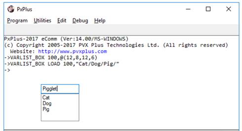
Example:
VARDROP_BOX 100,@(10,6,12,6)
VARDROP_BOX LOAD 100,"Cat/Dog/Pig/"