|
List Box Controls |
|
LIST_BOX ctl_id, @(col,ln,wth,ht) [, ctrlopt ]
LIST_BOX { REMOVE | DISABLE | ENABLE } ctl_id
LIST_BOX { GOTO | HIDE | SHOW | AUTO } ctl_id
LIST_BOX SET_FOCUS ctl_id, ctl_val,
LIST_BOX LOAD ctl_id, dlm_list$
LIST_BOX LOAD ctl_id, array_name$ {ALL}
LIST_BOX LOAD ctl_id, index,{element$ | * }
LIST_BOX FIND ctl_id, index,var$
LIST_BOX READ ctl_id, var$ [, mode$ ]
LIST_BOX READ ctl_id, var [, mode$ ]
LIST_BOX WRITE ctl_id, element$
LIST_BOX WRITE ctl_id, index
LIST_BOX WRITE ctl_id, ""
List box controls allow users to select items from a displayed list. Users can select but not enter values in a list box. Use a Variable List Box to implement a list box that allows both variable input, as well as selection from a list.
The LIST_BOX directive can be used to create and load several different List Box Styles.
For information on adding a list box to a panel using the NOMADS Panel Designer, see List Box Controls.
For a list of properties that can be applied to a List Box, see List_Box Properties.
Standard list boxes contain a single column of data with no formatting. Other available list box styles are:
|
Displays multiple elements in different columns with alignment and width formatting, allowing colour mnemonics to be inserted into the data. See Example 2 below. | |
|
Lists a single element over multiple columns, where data wraps from the bottom of one column to the top of the next. See Example 3 below. | |
|
Displays multiple elements in different columns (like a formatted list box) and allows column headings, sorting, bitmaps and other attributes. See Example 4 below. | |
|
Displays data grouped hierarchically into a collapsible tree-like structure which optionally may include + and - buttons to expand tree levels, dotted lines, etc. See Example 5 below. State indicators may be applied to Tree View list boxes. See State Indicators below. |
Alternate styles are defined using the ctrlopt settings OPT= and FMT=. For syntax details, see LIST_BOX directive.
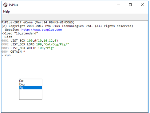
Example 1: Standard List Box
The following example displays a simple Standard list box with a single column of data and no formatting:
LIST_BOX 100,@(10,16,12,6)
LIST_BOX LOAD 100,"Cat/Dog/Pig/"
LIST_BOX WRITE 100,"Pig"
The LIST_BOX LOAD directive loads the list box in one step using a single variable that contains all the list items separated by delimiters. In this case, the "/" character is used to delimit the individual entries. (The delimiter is derived from the last character in the string and could be any character.)
LIST_BOX LOAD can also be used to clear a list box:
LIST_BOX LOAD 100,""
It can also be used to remove an item:
LIST_BOX LOAD 100,n,*
Where:
|
n |
Specifies the index number (i.e. sequential position) of the entry to delete |
|
* |
Signals the delete function |
The LIST_BOX WRITE directive is used to select an entry and can be set utilizing either the text of the entry or its index number.
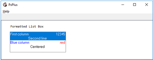
Example 2: Formatted List Box
The following example displays a Formatted list box with different colors and items displayed over multiple lines:
PRINT 'CS',@(5,1),"Formatted List Box"
LIST_BOX 100,@(5,3,30,5),OPT="~",FMT="L20 R10/C30",SEP="/"
LIST_BOX LOAD 100,0,"First column/12345/Second line"
LIST_BOX LOAD 100,0,'BLUE'+"Blue column/"+'RED'+"red/"+'BLACK'+"Centered/"
LIST_BOX WRITE 100,"First column/12345/Second line"
See Formatted Style below.
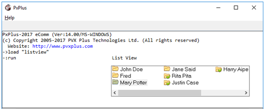
Example 3: List View
The following example displays a List View with images:
PRINT @(40,4),"List View"
DIM Items$[1:7]
LET Items$[1]="!File,John Doe",Items$[2]="!File,Fred"
LET Items$[3]="!File,Mary Potter",Items$[4]="!File,Jane Said"
LET Items$[5]="!Done,Rita Pita",Items$[6]="!Done,Justin Case"
LET Items$[7]="!Done,Harry Aipe"
LIST_BOX 300,@(40,6,50,5),OPT="l",FMT="{}",SEP=","
LIST_BOX LOAD 300,Items${ALL}
LIST_BOX WRITE 300,"!File,Mary Potter"
See List View Style below.
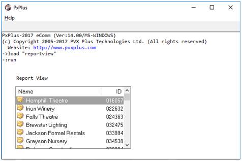
Example 4: Report View
The following example displays a Report View with multiple columns:
PRINT @(5,7),"Report View"
LIST_BOX 200,@(5,9,40,10),OPT="rV",FMT="{} [Name]L30 [ID]R8"
SELECT clientid$,clientname$ FROM "client"
LIST_BOX LOAD 200,0,"!file_edit"+SEP+clientname$+SEP+clientid$
NEXT RECORD
LIST_BOX WRITE 200,1
See Report View Style below.
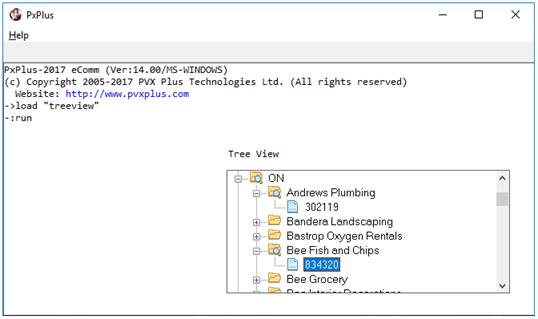
Example 5: Tree View
The following example displays a Tree View:
PRINT @(40,7),"Tree View"
LIST_BOX 400,@(40,9,50,10),OPT="e|!E",FMT="{!Page|!File|!File_open}"
SELECT clientid$,clientname$,*,*,*,state$ FROM "client",KNO=2
LET city$=state$+SEP+clientname$+SEP+clientid$
LIST_BOX LOAD 400,0,city$
NEXT RECORD
LIST_BOX WRITE 400,city$
See Tree View Style below.
Refer to the following pages for information on creating these list box styles:
Loading List Boxes
Load On Demand
Selecting Items from a List Box
The Formatted list box allows you to display multiple data elements over multiple columns in a table format. This type of list box is created by adding FMT= settings to the LIST_BOX definition.
Example:
LIST_BOX 100,@(5,3,30,5),OPT="~",FMT="L20 R10/C30",SEP="/"
The list of columns is a space - separated string enclosed in quotation marks. Each column is formatted with an alignment code for left, right or centre (L n, R n, C n). The width in the format definition is the display (window) width, not the number of characters in the text. Each new row is delineated by a / slash.
To hide data, use "S" to indicate that a column is to be skipped - data is present, but not displayed and the user cannot gain access to the column.
For details on creating a Formatted list box, see LIST_BOX directive.
A List View is similar to a standard list box, but it displays the data as a continuous list over multiple columns. This type of list box is created by adding OPT="l" (lowercase L) to the LIST_BOX definition.
Example:
0200 LIST_BOX 100,@(2,14,12,6),FNT="*",OPT="l"
Use FMT= to override the default column sizing of the list view (only "Ln", "Rn" and "Cn" alignment are supported). A bitmap/icon may be placed to the left of the data element by including { } curly braces in the FMT= string.
For details on creating a List View list box, see LIST_BOX directive.
A Report View displays multiple data elements in table form (similar to a Formatted list box), but it also includes headings, sorting, and other attributes. This type of list box is created by adding OPT="r" to the LIST_BOX definition.
Example:
LIST_BOX 200,@(5,11,30,10),OPT="rV",FMT="{} [Name]L20 [ID]R8"
The report view in Example 2: List Box Styles displays a bitmap at the beginning of each row/line and uses full-row highlighting. Other OPT= settings to refine a report view include "b" (suppress column header buttons), "p" (highlight partial matches), "q" (disable sorting), "v" (first column highlight), and "V" (full row highlight).
Use FMT= to define column alignment, titles, sorting, and bitmap placement. The format definition is similar to that described for Formatted list boxes; however, "Ln", "Rn", and "Cn" are the only alignment options, and there are additional sorting options available for date and numeric sorting. A bitmap/icon may be placed to the left of the data element by including { } curly braces in the FMT= string.
For details on creating a Report View list box, see LIST_BOX directive.
A Tree View displays the data hierarchically in a tree-like structure. This type of list box is created by adding OPT="e" to the LIST_BOX definition.
Example:
LIST_BOX 400,@(40,11,30,10),OPT="e|!",FMT="{!Page|!File|!File_open}"
Several other OPT= settings can be used in the definition: "!" (use bitmaps/icons), "|" (show connecting lines), "b" (suppress expand/collapse buttons), "E" (enable direct editing), "q" (disable sorting). Use FMT= to define default images to be used in the tree. The order of the images determines when they are used:
1. Default overall bitmap or icon: always used with any listed entries that do not have subordinates.
2. Default bitmap or icon for items with subordinates.
3. Default bitmap or icon for items with subordinates if the tree level is expanded (i.e. shown) in tree view.
4. Bitmap or icon for entries that do not have any subordinates when the item is selected.
5. Bitmap or icon for entries that have subordinates when selected.
6. Bitmap or icon for entries that have subordinates when selected and level is expanded.
For details on creating a Tree View list box, see the LIST_BOX directive.
For a list of properties that can be applied to a Tree View list box, see Treeview Properties.
The code in Example 2: List Box Styles shows different ways to load list boxes. There are examples of loading a list box one item at a time (Formatted, Report View and Tree View), loading it all at once using an array (Standard), and building the entire list in a string variable and loading it all at once (List View).
Any method may be used with any type of list box. Loading the list box all at once is faster than loading one item at a time, but you must wait for the compilation to complete before anything is displayed. When loading one item at a time, the items are displayed immediately, and the list box is accessible while it loads. Load time can be decreased by hiding the list box control while it is loading.
When loading Formatted and Report View list boxes, the values in the individual columns must be separated using a column delimiter. By default, the SEP value is used, but this can be changed by specifying a SEP= clause when creating the list box or by setting the 'Sep$ property. See Dynamic Control Properties. If loading one item at a time, a line delimiter is not used, but if loading the entire contents via a single load, then the last character of the string value will be used as the line delimiter.
Example:
LIST_BOX LOAD 200,0,"!file_edit"+SEP+cst_name$+SEP+cst_id$
When loading a Tree View, all the levels of each entry must be specified, separated by delimiters as described above.
item$=cst_smn$+SEP+cst_name$+SEP+cst_id$
LIST_BOX LOAD 400,0,item$
Another method is available for speeding up the load process for list boxes. On-demand loading allows an application to load a list box with only those items that the user actually scrolls into view. This reduces network traffic and file access since a list box is only loaded with those items required by the user. In addition, it assures proper function of the scrollbar and its relationship to the list.
The following properties are used to implement load-on-demand logic:
|
|
Defines number of items | |
|
|
CTL issued when data needed | |
|
|
Lowest item needed | |
|
|
Highest item needed |
This feature requires the developer to pre-declare the number of items that the list box is to have (by setting the 'ItemCount property). When the user scrolls items into view, the system generates a CTL event.
Upon receiving the CTL event (set by 'ItemNeededCtl), the application queries 'ItemNeededFrom and 'ItemNeededTo to determine the index number and the number of items. The application then loads the list box with the contents of the specified items by setting 'Item and 'ItemText$. If no elements are needed, then 'ItemNeededFrom and 'ItemNeededTo will be zero. Once the value has been loaded into the 'ItemNeededTo, PxPlus checks if further items are required, and if so, it generates another CTL event.
In the case of a Report View list box, should the user request that the list be sorted or attempt to auto-size the width of a column, the system will force a load of all list box elements before processing the request.
In some instances, the contents of the list box may need to be shown prior to the contents being loaded, in which case the system will display 5 dots in place of the data.
To select an item from a list box, the user can use the mouse to double click an item or highlight the item if the auto-signal option is specified (OPT="A"). An item can also be selected by highlighting it and then moving focus to another control. To determine the value of the selection, the LIST_BOX READ directive can be used, or the control's 'Value$ property can be queried. The value that is returned consists of all the column entries including the column separators and image references.
In the case of Formatted list boxes, embedded mnemonics, such as colors, are included as well. Tree Views return the item and its parent branches.
Example:
LIST_BOX 100,@(5,3,30,5),OPT="~",FMT="L20 R10/C30",SEP="/"
LIST_BOX LOAD 100,0,"First column/12345/Second line"
LIST_BOX LOAD 100,0,'BLUE'+"Blue column/"+'RED'+"red/"+'BLACK'+ \ "Centered"
LIST_BOX WRITE 100,2
LIST_BOX READ 100,x$
PRINT x$
Blue column/ red/ Centered
Item$=STP(MNEMONIC x$)
PRINT Item$
Blue column/red/Centered
Standard, Formatted, List View and Report View list boxes can support multiple item selection. This is enabled by specifying OPT="#". If items were loaded in a single string, then when you read/write the element(s) highlighted in the list box, the item(s) will be returned in the variable using either the delimiter from the LIST_BOX LOAD statement or, as default delimiter, the SEP character.
To determine which items were selected, you can use the LIST_BOX READ directive or look at the 'VALUE property. The resulting value will contain all the selected items, which must then be parsed to access the individual items.
Another way to access the selected items is to use the 'SelectCount, 'SelectIndex and 'SelectItem properties to spin through the selections individually. 'SelectCount contains the number of items/cells selected. (Set this property to zero to deselect all.) 'SelectIndex is the index to point to a selected element; i.e. set to 1 to point at the first item selected, 2 to point at the second item selected, etc. After 'SelectIndex has been set, then 'SelectItem will contain the sequential location within the list of the item being pointed at by the 'SelectIndex property.
Example:
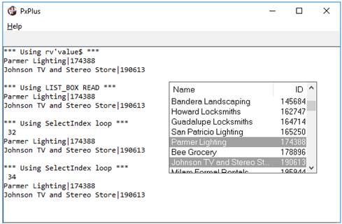
rv=100
LIST_BOX rv,@(40,4,35,10),OPT="rV#",FMT="[Name]L25 [ID]R8",SEP="|"
SELECT clientid$,clientname$ FROM "client"
LIST_BOX LOAD rv,0,clientname$+"|"+clientid$
NEXT RECORD
!
! Select several items (normally done by mouse clicks)
LIST_BOX WRITE rv,32
LIST_BOX WRITE rv,34
!
! Determine selections using 'value$ property
PRINT 'CS',"*** Using rv'value$ ***",'LF',rv'value$
!
! Determine selections using LIST_BOX READ directive
LIST_BOX READ rv,x$
PRINT "*** Using LIST_BOX READ ***",'LF',x$
!
! Determine selections using 'SelectCount/'SelectIndex properties
i=rv'SelectCount
FOR i
rv'SelectIndex=i
PRINT "*** Using SelectIndex loop ***",'LF',rv'SelectItem, \
'LF',rv'value$
NEXT
!
OBTAIN *,
Tree Views also support multiple selections when state indicators are used. See State Indicators below.
State indicators are basically images that appear in front of a Tree View entry that can be used to indicate whether the item has been selected or not or what state the item is in. State indicators are currently supported for Tree View list boxes only.
The following properties are used to create and process state indicators:
|
|
Control auto toggling of state | |
|
|
Control cascading of states | |
|
|
State of 'Item | |
|
|
List of images used to display states |
Assigning Images
The application must set the 'StateBitmaps$ property in order to define the number of images that will used in the display of state indicators. A maximum of 15 images, separated by pipe character delimiters ( | ), can be assigned. All images must be of the same size/format and may specify transparency options. These images can be external or internal. The order of the images will correspond to the state values and may include an additional image for use with cascading states.
Example:
tv'StateBitmaps$="!EmptyBox|!CheckedBox|!HalfCheckedBox"
Toggling Between States
Once the bitmaps are set, each item/row/entry may set its 'ItemState property to determine what image is to appear next to the row text, depending on the state. A maximum of 15 states can be assigned for each image. A state of 0 zero causes no state indicator to be displayed. For example, assuming that the list box is defined with 3 images, the first image will appear if the item state is 1, the second image will appear if the item state is 2, and the third image will appear if the item state is 3.
A CTL event will return EOM="S" if the property is set to a non-zero value. This is used to identify that the user clicked over the indicator state portion of the line, as opposed to elsewhere in the item. Applications that add state indicators to their existing logic should add a check for this EOM code.
Auto Toggling of States
'AutoState is a numeric property that controls auto toggling of states. If this property is set, state indicators can automatically be toggled without generation of a CTL event with EOM="S".
The number of states that the system will toggle through is determined by the value set in this property, or if the property is set to 1, the number of bitmaps assigned to the tree view. In addition, when the user toggles a state indicator while holding down the Shift , all entries between the current entry and the last will be toggled to the new state of the current entry (in effect, allowing for group select/deselect).
Cascading States
If the 'CascadeState property is set to non-zero, the system automatically cascades parent states to their children and correspondingly makes parent states representative of all of their children. Setting a parent state, either under program control or using the 'AutoState property in the tree view definition, will result in all subordinate children being set to the same state.
When a child state is set, its parent state will be set according to the state of all of the child's siblings; i.e., if all children are in a consistent state, the parent will be set to the same state. If a parent has children of various states (some on, some off), the parent's state will be set to the value set in the 'CascadeState property.
Example:
You could have three state indicators - Off (state 1), On (state 2), and Partial (state 3). You would set 'AutoState to 2 and 'CascadeState to 3 to have children that automatically toggle off/on and parents that will be On if all children are on, Off if all children are off, and Partial (state 3) if the children are not in a consistent state.
When cascading, only items with states will be affected. In addition, items without states will not affect their parents' states nor will changing the parent of an item without a state affect the children of that item.
Loading the Tree View
When loading an item with a state indicator into the tree view, the item content must contain an image clause inside { } curly braces. This clause may contain an optional image reference to be displayed next to the state image. It must also contain a ;state_value expression for setting the initial state of the item.
Example:
LIST_BOX LOAD tree,0,"{!Stop;2}category$+SEP+name$
LIST_BOX LOAD tree,0,"{;1}parent$+SEP+child$
When the Tree View is loaded, the syntax for loading an item includes {optional_image;state_value}, allowing you to include an additional image to be displayed next to state image. The ;state_value is required for setting the initial state of the item.
Selection
In addition to the State Indicator properties above, Tree View List boxes support the following:
|
|
Number of child items | |
|
|
State filter to apply |
Use 'SelectedChildren in conjunction with 'SelectStateMask to return the number of child items with the desired state. When 'SelectStateMask is set, the 'SelectCount, 'SelectIndex and 'SelectItem properties will reflect only those items that have the specified state; e.g., to find all items that have a state of one, set 'SelectStateMask to 1. 'SelectCount will then indicate the number of items that have this state and sequencing through 'SelectIndex and 'SelectItem will return their item numbers.
See Treeview Properties.
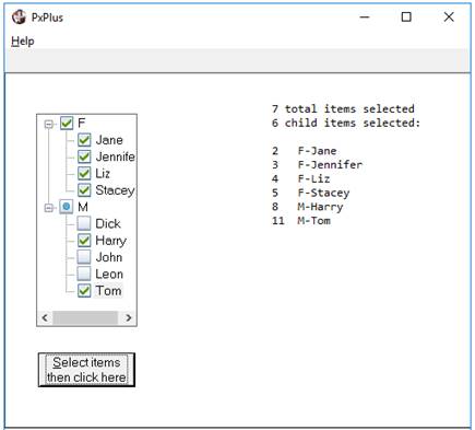
Example:
! Tree view with state indicators
PRINT 'CS'
BUTTON 1000,@(5,20,15,2.5)="&Select items then click here"
tree=2000
LIST_BOX tree,@(5,3,15,15),OPT="e|A!"
tree'StateBitmaps$="!EmptyBox|!CheckedBox|!DotInBox"
tree'AutoState=2
tree'CascadeState=3
! Load the treeview from the data statements
WHILE 1
READ DATA category$,name$,END=*BREAK
LIST_BOX LOAD tree,0,"{;1}"+category$+SEP+name$
WEND
! Selection loop - Select items and click 'OK'
WHILE 1
OBTAIN *
IF CTL=4 \
THEN BREAK
IF CTL=1000 \
THEN GOSUB Display_Selected
WEND
END
!
Display_Selected:
tree'SelectStateMask=2
PRINT 'LF',@(40),tree'SelectCount," total items selected",'LF',
PRINT @(40),tree'SelectedChildren," child items selected:",'LF'
n=tree'SelectCount
FOR n
tree'SelectIndex=n
LIST_BOX FIND tree,tree'SelectItem,item$
READ DATA FROM item$ TO category$,name$
IF name$<>"" \
THEN PRINT @(40),tree'SelectItem,@(45),category$+"-"+name$
NEXT
RETURN
!
DATA "M","Tom","M","Dick","M","Harry","M","John","F","Jane"
DATA "F","Jennifer","M","Leon","F","Stacey","F","Liz"
This example creates a Tree View with state indicators. The "!" option is required to allow bitmaps, and in this example, the "A" option allows selection with a single mouse click. The Tree View has two states for the child items ('AutoState=2), displaying either an !EmptyBox or !CheckedBox image. The third image, !DotInBox, is used by a parent item when its children have mixed states ('CascadeState=3).
When the Tree View is loaded, the state value for each item is initialized to 1. The selection loop allows the user to click on items, and clicking the button displays those selected by executing a loop based on the 'SelectCount and 'SelectIndex properties. Notice that the display logic filters out the parent-only entries and just displays the selected children.