Charts Button: Define a Chart option
Popup Menu: Define a Chart option
|
Defining and Displaying an AutoChart |
To define an AutoChart for a List Box or Grid, the control must have multiple columns, and the system popup menu must be available to the control. An AutoChart is defined via the Define a Chart menu item on the system menu. To add a system popup menu, see List Box and Grid System Popup Menu.
To define an AutoChart for a Query, the system must use the Query+ interface. AutoChart definitions are based on the columns of a Query (Standard Query or Query List) and are created using the Define a Chart option in the Query Definition or a Run-Time Query.
End-user AutoChart definitions, which are only visible to the user who created them, are created at run time. To create an AutoChart for a List Box or Grid, the user must right click on the List Box or Grid when the panel is being run and select Define a Chart.
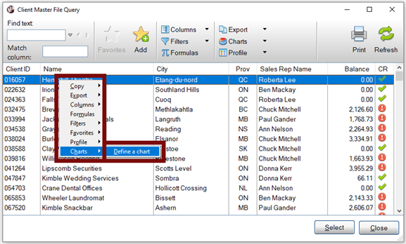
To create an end-user AutoChart for a Query, the user must invoke the Query and select the Define a Chart menu item from the popup menu or from the Charts button at the top of the Query. End-user AutoChart definitions are saved in chart.inf files.
Public AutoChart definitions are visible to all users and can be created by the developer or by end-users with special settings on their system, as explained below. The difference is that public developer definitions are created on the development system and saved in chart.dev files, and public end-user definitions are created on the end-user system and stored in chart.inf files.
(The ability to separate developer and end-user Auto Chart definitions was added in PxPlus 2020.)
To create public developer AutoCharts that are separate from end-user definitions, the developer can set the %NOMADS property %NOMADS'DeveloperCharts=1 on their development system. This will save all new AutoChart definitions for both Query and/or List Box and Grid type definitions in the developer chart.dev files. No end-user definitions can be made while this setting is in effect.
(The %NOMADS'DeveloperCharts property was added in PxPlus 2020.)
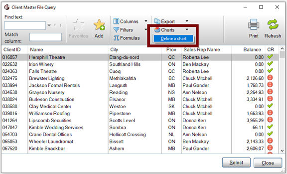
Another way to create a public developer Autochart based on a Query is to define the AutoChart from within the Query Definition. Charts can be defined either by clicking the Define Chart button on the Query Definition toolbar or by clicking the Test button and selecting the Define a Chart menu item when the Query is running, similar to the end-user definition. A public AutoChart based on a Query List or a Standard Query definition can be used to create a Smart Chart. See Smart Controls.
It is also possible to allow end-users to define public AutoCharts. By setting the %NOMADS property %NOMADS'PublicAutoChart=1 for an end-user, that user has the capability to create private and public AutoChart definitions for Queries and/or List Boxes and Grids. These charts are defined at run time using the Define a Chart menu item described above; however, a Public option will now appear as part of the definition. Public definitions created in this manner are considered to be end-user public definitions and are stored in the chart.inf file.
The AutoChart Definition File Maintenance utility can be used to copy and delete AutoChart end-user and public definitions.
The Define a chart option launches the Chart Wizard, which walks you through a series of steps for designing a new AutoChart. See Chart Wizard Steps.
|
|
|
|
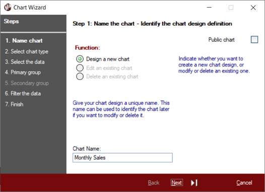
Identify the chart design definition.
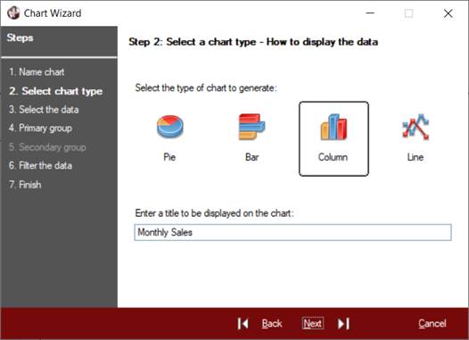
Specify how the chart results are to be displayed.
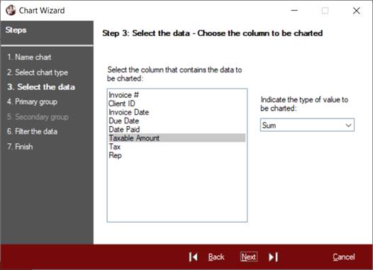
Choose the column to be charted.
Step 4 and Step 5: Group the Data
Set up a primary group to categorize the data and an optional secondary group to refine the chart definition.
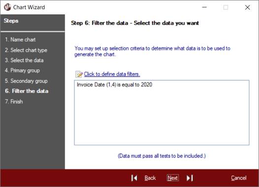
Set up selection criteria to determine what data is to be used to generate the chart.
Select options to govern the behavior of the chart and save the chart design.
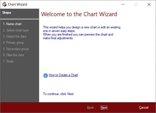
Invoking the Chart Wizard displays the Welcome panel, which provides a How to Create a Chart link that launches PxPlus Help documentation. Click Next to proceed to the first step.
Identify the chart design definition.
Indicate whether you want to create a new chart, or edit or delete an existing chart.
Give the new chart definition a unique and meaningful Chart Name so that it can be identified later when displaying, editing or deleting it.
By default, an AutoChart is available only to the user who created it. By setting the PublicAutoChart property of the %NOMADS object to non-zero, you can select the Public chart option and create an AutoChart that will be available for all users to display:
IF %nomads=0
then %nomads=NEW("*obj/nomads")
%nomads'PublicAutochart=1
Specify how the chart results are to be displayed.
Select a chart type to display the results: Pie, Bar, Column or Line.
Pie, Bar and Column charts are useful for comparing grouped results, such as sales totals for salespersons.
A Line chart is useful for displaying actual values such as daily temperatures.
Enter a title to be displayed on the chart. When designing a new chart, the title initially defaults to the Chart Name entered in Step 1.
(The use of the Chart Name as the default title was added in PxPlus 2020.)
Select the column that contains the data to be charted.
Indicate the type of value to be charted: Actual Value (default), Count, Sum, Average, Maximum or Minimum. Will the chart display calculated values (i.e. sums, averages, maximum or minimum values) or the actual values themselves? In these cases, the selected column must contain numeric values.
When charting sums, averages, maximum and minimum values, a primary group will need to be set up (in Step 4) to determine against which column the sum, average, etc. will be applied. When charting actual values, a primary group is optional.
If the purpose of the chart is to count the number of occurrences of values within a column, the column may contain numeric or text values. For example, in a list of sales transactions, a count could be based on the Sales Rep ID column to determine the number of sales in which each salesperson was involved.
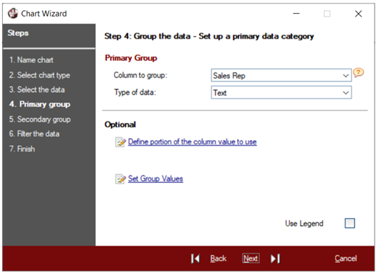
Set up a primary group to categorize the data (in Step 4) and an optional secondary group (in Step 5) to refine the chart definition. See Grouping the Data.
Count, Sum, Average, Minimum and Maximum chart options are cumulative or summary values and are based on grouping the data, such as sales totals for each salesperson where the sum of the sales amounts are grouped by the Salesperson ID. Another example would be inventory counts for products that are grouped by Product Line. For these chart options, a primary group is required.
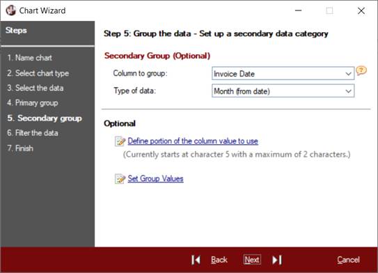
Once a primary group has been set up, you have the option to specify a secondary data category to further refine the chart definition.
In Step 5, set up an optional secondary group to allow comparisons of multiple sets of data, such as sales totals for a salesperson per month where the sales totals are grouped by Salesperson ID and the month portion of a Date field. Another example would be inventory counts for products across different warehouses that are grouped by Product Line and Warehouse.
A chart definition specifying the Actual Value option does not require grouping; however, groupings can be set up based on the value of a specified column. For example, a file consisting of daily records containing the date, the name of a city and the average temperature in that city can be used to plot the daily temperature against the other cities, where the City field defines one grouping and the Day defines another.
(The ability to define a secondary group was added in PxPlus 2020.)
When setting up a primary and an optional secondary group, the first step is to select the column to be used for grouping.
The next step is to indicate the type of value in that column, i.e. Numeric, Text, Year (from date), Month (from date) or Day number (from date).
If the value is a date, it is important to specify year, month or day number rather than text, as the sorting sequence for the results will reflect the date sequence rather than the alphabetic sequence that is used for text. In the case of months, the results will include all 12 months with a point value of 0 included for any months not present in the data. In addition, months designated by a 2-character digit will be displayed using the abbreviated month name.
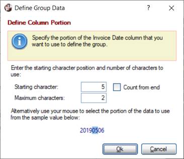
The grouping of the data can be based on a portion, rather than the whole value, of the column. To specify what part of the value to use, click the Define portion of the column value to use hyperlink button to invoke the Define Column Portion window.
The Set (or Edit) Group Values hyperlink button (in Step 4 and Step 5) invokes the Group Information window, which is used to define pre-set group member values for each grouping, if desired.
By default, in a chart with only a primary group specified, the chart points are displayed in a single color with the group name below each point in a Column or Line chart or next to each bar in a Bar chart. A Use Legend option is available (in Step 4 only), which, when turned On, displays the chart points in different colors with a color-coded legend to identify the points. If a chart specifies both a primary group and a secondary group, the use of the legend is mandatory, and the Use Legend option is not available.
To specify the portion of the data to use, indicate the position of the Starting character and the maximum number of subsequent characters. This can be done in two ways. One way is to enter the desired value in the Starting character and Maximum characters fields. Another way is to use the mouse to highlight the portion to use from the sample value provided. The sample value displayed is taken from the selected column of a live record, if available; otherwise, the sample value will display a number of X's (depending on the length of the column).
The first character is 1, and if you leave the Maximum characters field blank, the default is the remainder of the value. The starting character position is determined by counting from the beginning of the value (i.e. from left to right).
If the Count from end check box is selected, the starting character position is determined by counting from the end of the value (i.e. from right to left).
The values for the Starting character position and/or Maximum characters fields can be changed at any time either by entering the new value in the appropriate field or by clicking on the highlighted portion of the sample value to clear the previous highlight and then using the mouse to select the new portion.
Clicking OK on the Define Column Portion window saves the desired settings and displays them on the wizard panel as shown above in Step 5.
Defining Pre-set Group Member Values
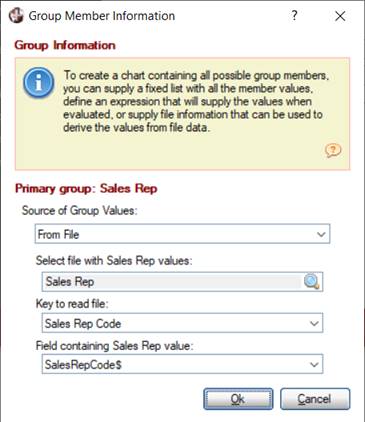
Values used for grouping data, such as Salesperson IDs or Department Codes, are derived from the dataset being processed. The dataset may not reference all possible members within the group. By default, the missing members will not appear in the chart; however, missing members can be included in the chart by supplying the information needed to determine all the possible members.
For example, suppose a company has three salespersons: Ann, John and William. When charting their sales for a particular month, John did not make any sales for that month. Because there were no records for John, by default, the chart would not include him. To include any missing salespersons, the names of all salespersons can be supplied as pre-set group member values. This can be done by clicking the Set (or Edit) Group Values hyperlink button (in Step 4 and Step 5) to invoke the Group Information window for the current grouping.
To create a chart containing all possible group members, you can supply a fixed list with all the member values, define an expression that will supply the values when evaluated, or supply file information that can be used to derive the values from file data.
The source of the group member values may be derived as follows:
|
Source of Group Values |
Description |
|
From Dataset |
(Default) Group member values are derived from the dataset being processed. The dataset may not have records for all group members, resulting in members not appearing in the chart. |
|
Fixed values |
Enter one group member value per line in the input box. |
|
Expression |
Enter an expression that will supply the list of member values to be used for the group. The resulting values must be separated by a character, such as a comma or slash, which should also end the list. Example: Ann/John/William/ |
|
From File |
Enter the file information required to retrieve group values from a file: Select the logical file name of the file containing the group values. Select the key to read the file. (Default is the primary key.) Select the field that contains the group value. (Default is the first field.) |
When From Dataset or From File is selected, the group member values will be sorted alphabetically when charted.
If Fixed values or Expression is selected, the group members will remain in the order specified, with any additional members found in the dataset added to the end.
(The ability to define pre-set group member values was added in PxPlus 2020.)
Set up selection criteria to determine what data is to be used to generate the chart.
Filters can be applied to the values in individual columns (or portions of the values) to determine if a row in the list should be included in the chart calculations.
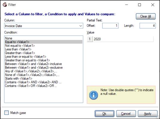
To do this, select the Click to define data filters hyperlink button to invoke the Filter window:
Conditions that can be applied to column filters are:
|
|
None |
Between <Value1> and <Value2> inclusive |
|
|
Equal to <Value1> |
Between <Value1> and <Value2> exclusive |
|
|
Not equal to <Value1> |
Any of <Value1>,<Value2>,<Value3>,... |
|
|
Less than <Value1> |
None of <Value1>,<Value2>,<Value3>, |
|
|
Greater than <Value1> |
Starts with <Value1> |
|
|
Less than or equal to <Value1> |
Contains <Value1> AND <Value2> AND |
|
|
Greater than or equal to <Value1> |
Contains <Value1> OR <Value2> OR |
Individual filters can be defined for multiple columns, but the data in a row must pass all filters to be included.
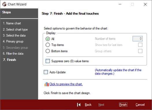
Select options to govern the behavior of the chart and save the chart design.
The Display options allow you to choose to display All items or a certain number of Top items or Bottom items. If you select either Top items or Bottom items (i.e. items with the highest or lowest values), you must indicate the Number of items to display. You must also indicate whether to show all items tied for the last position and whether to group the remaining results as "Other". The Suppress zero (0) value items check box is used to suppress any items with a value of zero. These options are not available to charts with secondary data groups (see Step 5).
The Auto-Update check box can be selected to indicate that the chart is to be updated automatically if the content of the associated list changes while the chart is displayed. This will occur a few seconds after the last change takes place. (The slight time lag is by design to allow multiple updates to occur, such as reloading the list, before the chart is redisplayed.)
If the Auto-Update option is not selected, the AutoChart display window will have a Refresh button to allow the user to update the chart as desired.
To preview the chart, select the Click to preview the chart hyperlink button.
At this point, you can go back to make changes, select Finish to save the definition, or select Cancel to abandon it.
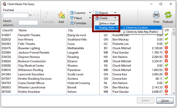
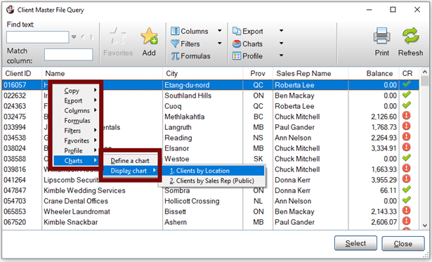
To display an AutoChart, click the Charts button at the top of the Query or right click on the data list to invoke the popup menu. If an AutoChart definition exists for the control, a Charts > Display Chart option will display in the popup menu.
If more than one AutoChart definition exists, selecting the Display Chart option will show the names of all AutoCharts associated with that list control. AutoCharts defined by the user appear first, followed by any public definitions.
|
|
|
|
|
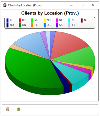
When selecting an AutoChart to display, the chart is displayed as a concurrent window so that the user may continue to work on the original panel. The AutoChart display window is also synchro-locked to the original panel; that is, when moved next to the top corner of the original panel, the AutoChart window will snap into position adjacent to the original panel, and the movements of the AutoChart window are synchronized with the original panel. The AutoChart window is also resizable.
The AutoChart window displays an Output to Clipboard button in the bottom left corner. When selected, data from the chart is placed on the Clipboard in a format that can be easily pasted into a spreadsheet:
group name + TAB + value + CRLF
If the Auto-Update option is selected in the AutoChart definition (see Step 7), the chart will automatically be updated whenever the contents of the associated list control change. There is a minor delay before the update takes place to allow multiple updates to the list control before the chart itself is updated.
If the Auto-Update option is not selected, a Refresh button displays next to the Output to Clipboard button to allow the user to update the chart as desired.
Creating a Smart Control (or Smart Chart) Definition