|
Smart List Box |
Step 6: Field Layout |
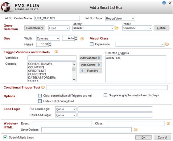
The Add a Smart List Box window is used to add (and edit) a Smart List Box on the file maintenance panel. See Webster+ [list] short code.
(The ability to add/edit a Smart List Box was added in PxPlus 2021.)
To invoke this window, use one of the following methods:
Click the Add Object button (above the Layout Grid) and select the Smart List Box option. OR
Right click on a cell in the Layout Grid, select Add Object from the popup menu and then select the Add or Edit a Smart List Box option.
Many of these options are also available when defining a Smart List Box control in the NOMADS Panel Designer (see Defining Smart Controls), except for these differences:
|
List Box Control Name |
Enter a unique name or use the default name provided. (Same as Name property in List Box Properties.) | ||||||
|
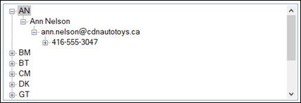
Style of the Smart List Box. Click the drop-down arrow for a list of selections: Report View (Default) and Tree View.
(The ability to create a Tree View type of Smart List Box was added in PxPlus 2023 Update 1.) | |||||||
|
Size |
| ||||||
|
Visual Class |
(Optional) Assign a Visual Class to the List Box control for setting up default settings such as font, color and various attributes. | ||||||
|
(Available when HTML Page check box is selected for Form Type)
(HTML Event was added in PxPlus 2022.) | |||||||
|
Span Multiple Lines |
(Applicable for NOMADS Panels Only) When selected (Default), the List Box spans according to its size. Fields placed in the rows below the List Box and below the adjoining cell (in a two-column layout) are pushed down to accommodate the List Box. The field in the adjoining cell remains in place beside the List Box. Deselecting this option allows fields to be placed beside the List Box (in a two-column layout). However, fields below the List Box (in the same column) are not pushed down, which may result in overlapping and hidden fields. This option works the same for Smart List Boxes, Smart Charts, Images and Embedded Panel/HTML Short Codes. For an example using a Smart List Box, see Example - Span Multiple Lines below. |
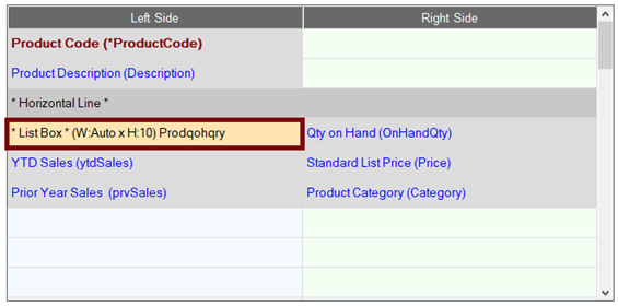
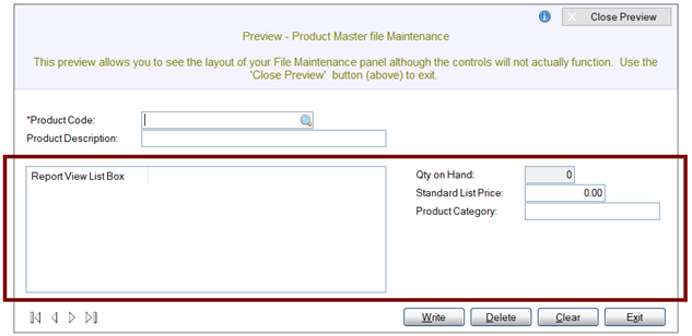
Example - Span Multiple Lines :
This panel layout shows a List Box on the left side, a field in the adjoining cell on the right side, and fields in the rows below.
Panel Layout with Smart List Box
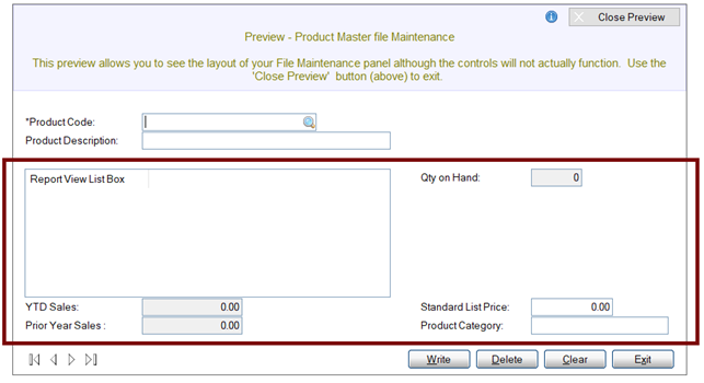
To demonstrate the effect of the Span Multiple Lines option, two screen shots are provided, showing this NOMADS panel in Preview mode.
For this first screen shot, the Span Multiple Lines option is On. Notice that the field in the adjoining cell beside the List Box remains in place, and the fields below the List Box are pushed down to accommodate it.
Smart List Box - Span Multiple Lines (On)
For this second screen shot, the Span Multiple Lines option is Off. Notice that the field in the adjoining cell and the fields on the right side remain in place. The fields on the left side below the List Box are not pushed down. In this case, the List Box is overlapping the fields below it.
Smart List Box - Span Multiple Lines (Off)