|
Drop Box Control |
|
DROP_BOX ctl_id, @(col,ln,wth,ht) [, ctrlopt ]
DROP_BOX { REMOVE | DISABLE | ENABLE | ON | OFF } ctl_id
DROP_BOX { GOTO | HIDE | SHOW | AUTO } ctl_id
DROP_BOX SET_FOCUS ctl_id, ctl_val
DROP_BOX LOAD ctl_id, dlm_list$
DROP_BOX LOAD ctl_id, array_name$ {ALL}
DROP_BOX LOAD ctl_id, index, {element$ | * }
DROP_BOX FIND ctl_id, index,var$
DROP_BOX READ ctl_id, var$ [, mode$]
DROP_BOX READ ctl_id, var [, mode$]
DROP_BOX WRITE ctl_id, element$
DROP_BOX WRITE ctl_id, index
DROP_BOX WRITE ctl_id, ""
A drop box control is similar to a Standard List Box, but the default state only displays a single line of text. The remaining list is made available by clicking the drop down arrow button. The user can select any element from a list of items you assign to the drop box, but variable input is not allowed. For syntax details, see DROP_BOX directive.
For information on adding a drop box to a panel using the NOMADS Panel Designer, see Drop Box Control.
For a list of properties that can be applied to a drop box, see Drop_Box Properties.
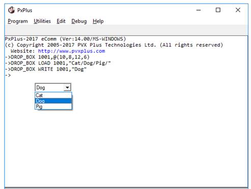
Example:
DROP_BOX 1001,@(10,8,12,6)
DROP_BOX LOAD 1001,"Cat/Dog/Pig/"
DROP_BOX WRITE 1001,"Dog"
For examples of how to process a Standard list box, see List Box Controls.