|
Button Control |
|
BUTTON [ * ] ctl_id, @(col,ln,wth,ht) = contents$ [, ctrlopt ]
BUTTON { REMOVE | DISABLE | ENABLE | ON | OFF } [*] ctl_id
BUTTON { HIDE | SHOW | GOTO } [ * ] ctl_id
BUTTON SET_FOCUS [ * ] ctl_id, ctl_val
BUTTON READ [ * ] ctl_id, mode$
When a user clicks a button in a graphical application, it is usually defined to send a signal (ctl_id) to the application to perform a specific action. See CTL Values.
Several options are available for creating a button control in PxPlus. For syntax details, see BUTTON directive.
For information on adding a button to a panel using the NOMADS Panel Designer, see Button Control.
The BUTTON directive can also be used to place a Taskbar Notification Icon in the bottom right corner of the MS Windows desktop (a.k.a. the System Tray). See Handling Images and Icons.
For a list of properties that can be applied to a button, see Button Properties.
Example:
B1=1001;
BUTTON B1,@(5,18,10,2)="{!book_open}Library"
B2=1002;
BUTTON B2,@(20,18,10,2)="Library"
B2'TEXTCOLOUR$="Green"
B3=1003;
BUTTON B3,@(35,18,10,2)="Library",OPT="VUTf";
B3'HOVERCOLOUR$="Red"
INPUT "Press any key to end ",*,'CS',
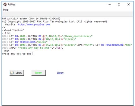
This example creates three buttons with control IDs of 1001 to 1003, 10 columns wide and 2 lines high.
The first button contains a bitmap of an open book and the text "Library". The PxPlus installation includes a group of internal bitmaps available for use in control objects identified by a leading ! exclamation point in the syntax. Braces indicate that the bitmap is to be placed on the button. See Displaying Bitmaps/Icons.
The second button is specified with text colour set to "Green" using a dynamic property. For the third button, the "VUTf" options are applied to make it transparent and flat with no border. It also has underlined text that changes colour to "Red" when the mouse hovers over it.