|
Template Designer Wizard |
The Template Designer Wizard provides a simple and convenient eight-step process for creating templates for use in iNomads. A template defines the way that panels will be presented to the Web browser and controls the visual characteristics of the Web page such as size, font, colors and images. See Template Designer Wizard Steps.
After the template is created, you can use Template Maintenance to modify your template as needed. See Modifying Selections After the Template is Created.
(The Template Designer Wizard was added in PxPlus 2016.)
To invoke the wizard, use one of the following methods:
|
Location |
Method |
|
From the PxPlus IDE Main Launcher |
Expand the Web Deployment category and select iNomads Setup to invoke the iNomads Setup window. Click the New Template button. |
|
From a Web browser |
Launch iNomads from a Web browser. From the iNomads Application Launchpad window, invoke the iNomads Setup window by either clicking the Admin button or selecting admin from the Transaction drop box. Click the New Template button. |
|
From the PxPlus Command prompt |
Invoke the iNomads Setup window by entering the following command: RUN "*plus/inomads/admin". Click the New Template button. |
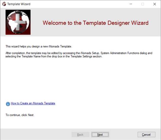
This launches the Welcome panel, which provides general information about the Template Designer Wizard and a Help link for creating an iNomads Template.
Click Next to proceed to Step 1: Name.
The wizard panel for each step consists of three sections:
|
Progress Bar |
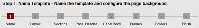
This section extends across the top of the wizard panel and lists the eight steps for creating a template. A white step number against a dark red background indicates the current step being defined. A gray step number against a gray background indicates that the step is temporarily unavailable until required information has been entered first. The step number will change to white when that step becomes available for entry. Clicking on a step number will go directly to that step without having to select intermediate steps in order. This is useful when reviewing or changing previous selections before exiting the wizard. Keep in mind that certain steps may require data before advancing to subsequent steps. |
|
Work Area |
This section is the body of the wizard panel and consists of fields used for processing each step. |
|
Navigation Bar |
This section extends across the bottom of the wizard panel and consists of buttons for moving through the steps. |
As you proceed through the wizard, you may notice that some panels contain several fields. While entering a template Name (step 1) is a required field, you are not required to enter data for all the fields. Data only needs to be entered for fields that you want to customize to generate a template tailored to your specific needs and that is different from the standard iNomads template.
To determine what data you need to enter, you may find it helpful to review the configuration settings for some of the sample templates first. This is done by invoking the iNomads Setup window, selecting a sample template such as admin or dentist from the Template drop box and clicking the Custom button (within the Template Settings frame box) to launch Template Maintenance where the settings for the selected template can be viewed.
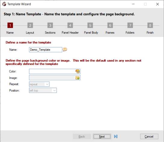
Name the template and configure the page background.
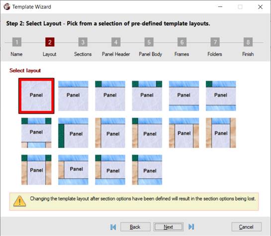
Choose the layout from a selection of pre-defined template layouts.
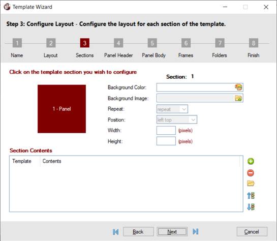
Configure the layout for each section of the template.
Configure the appearance of the panel header and borders.
Configure the appearance of the panel text and background.
Configure the appearance of any frames within the panel.
Configure the appearance of any folders on the panel.
Review the summary and save the template.
Enter a Name for the template and define the page background color and image. When you are ready to proceed to the next step, click Next.
This panel consists of the following:
|
Define a name for the template | |||||||||
|
Name |
(Required) A name for the template must be entered to allow the remaining wizard steps to become available. Valid characters are A-Z, a-z, numbers 0-9, . (dot) and _ (underscore). A message displays when an invalid character has been entered. Hovering the mouse pointer over the button adjacent to this field displays a floating tooltip that includes a templates Help link. | ||||||||
|
Define the page background color or image The following four options will be the default used in any section of the template not specifically defined in Step 3: Sections. | |||||||||
|
Color |
Specify a color to use for the background. See Color Specification for information on applying a color. When a color is selected/entered, a preview of that color is displayed. | ||||||||
|
Image |
Select the image to display for the background. Click the Image browse button to select an image. Clicking Finish (Step 8) copies the image from its current location to an Images directory that will be created for that template under *plus\inomads\templates. | ||||||||
|
Repeat |
(Available only when an Image is selected) Displays the following selections for duplicating the image:
| ||||||||
|
Position |
(Available only when an Image is selected) Displays the following selections for positioning the image: left top (Default), left center, left bottom, right top, right center, right bottom, center top, center center, center bottom, full screen. | ||||||||
Select a basic layout for the template by clicking on the image that most closely resembles the desired layout. By default, the first layout is selected. When you are ready to proceed to the next step, click Next.
If more sections need to be added to the layout, first complete Step 8 of the wizard by clicking Finish to save the template and then access Template Maintenance to modify the settings on the Advanced Layout tab.
Determine the layout for each section of the template.
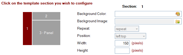
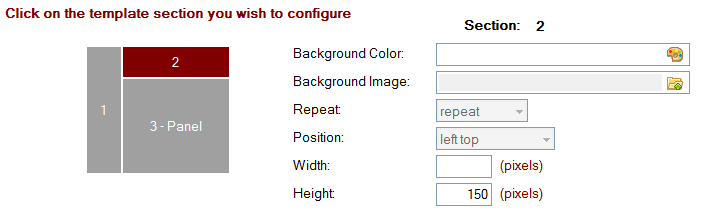
A diagram of the template layout selected in Step 2 is displayed with a number identifying each section. By default, the first section is highlighted, indicating that this section is currently being configured, and the words Section: 1 displayed in bold above the list of options confirms this. To configure a different section, click that section in the diagram. The Section heading above the list of options to the right changes to match the number of the selected section.
To illustrate this further, refer to the following example.
Example:
|
|
1. |
Start the Template Designer Wizard. In Step 2, click on the layout below to select it.
|
|
|
2. |
Proceed to Step 3. A diagram of this layout is displayed (see below). Section 1 is highlighted in dark red by default, and the words Section: 1 display above the list of options to the right, indicating that these option settings belong to Section 1.
|
|
|
3. |
Click on Section 2 inside this diagram (see below). Section 2 is highlighted in dark red, and the words Section: 2 display above the list of options to the right, indicating that these option settings belong to Section 2.
|
This panel consists of the following:
|
Background Color |
Specify the color to use for the section background. See Color Specification for information on applying a color. When a color is selected/entered, a preview of that color is displayed. | ||||||||
|
Background Image |
Select the image to display for the section background. Click the Image browse button to select an image. Clicking Finish (Step 8) copies the image from its current location to an Images directory that will be created for that template under *plus\inomads\templates. | ||||||||
|
Repeat |
(Available only when a Background Image is selected) Selections for duplicating the image are:
| ||||||||
|
Position |
(Available only when a Background Image is selected) Selections for positioning the image are left top (Default), left center, left bottom, right top, right center, right bottom, center top, center center, center bottom, full screen. | ||||||||
|
Width |
Enter a width of the section (in pixels). If the width of the section increases as the panel is resized, leave the Width blank. | ||||||||
|
Height |
Enter a height of the section (in pixels). If the height of the section increases as the panel is resized, leave the Height blank. |
The lower portion of the Step 3: Sections panel allows you to optionally include additional contents such as Text, Images, Menus and Other parameters in the selected section of the template layout.
To do this, click the Add Section Contents button beside the list box. From the popup menu, select the type of contents you are adding. When you have made your selection, a separate dialog with options pertaining to your selection will display. After saving the section contents, you can use the Delete, Edit and Move Up/Move Down buttons to the right of the Section Contents list box to remove, modify or rearrange the order of these additions.
The options for adding Text, Images, Menus and Other parameters are described below.
|
Section Contents - Text Template | |
|
Text |
Enter the text to add to the current section. |
|
Font |
Enter a font for the text. |
|
Color |
Specify a color for the text. See Color Specification for information on applying a color. |
|
URL |
Enter a URL if the text will be a hyperlink. If the text launches a Web page, enter the URL address preceded with http://. |
|
Vertical Position |
Enter a vertical position for the text. Selections are Top (Default), Middle, Bottom. |
|
Vertical Adjustment |
Enter a value (in pixels) to adjust the vertical position of the text, if necessary. |
|
Horizontal Position |
Enter a horizontal position for the text. Selections are Left (Default), Center, Right. |
|
Horizontal Adjustment |
Enter a value (in pixels) to adjust the horizontal position of the text, if necessary. |
|
Section Contents - Image Template | |
|
Image |
Select the image to add to the current section. Click the Image browse button to select an image. Clicking Finish (Step 8) copies the image from its current location to an Images directory that will be created for that template under *plus\inomads\templates. To clear the image from the input control, click the Delete Image button. |
|
Width |
Enter a width for the image (in pixels). The image will be scaled to the specified height and width. |
|
Height |
Enter a height for the image (in pixels). The image will be scaled to the specified height and width. |
|
URL |
Enter a URL if the image will be a hyperlink. If the image launches a Web page, enter the URL address preceded with http://. |
|
Vertical Position |
Enter a vertical position for the image. Selections are Top (Default), Middle, Bottom. |
|
Vertical Adjustment |
Enter a value (in pixels) to adjust the vertical position of the image, if necessary. |
|
Horizontal Position |
Enter a horizontal position for the image. Selections are Left (Default), Center, Right. |
|
Horizontal Adjustment |
Enter a value (in pixels) to adjust the horizontal position of the image, if necessary. |
|
Section Contents - Menu Template | |
|
Menu Name |
Enter a name for the menu. |
|
Define Menu |
Click this button to invoke the Define Menus dialog for defining a new menu for the current section. |
|
Width |
Enter a width for the menu (in pixels). |
|
Height |
Enter a height for the menu (in pixels). |
|
Vertical Position |
Enter a vertical position for the menu. Selections are Top (Default), Middle, Bottom. |
|
Vertical Adjustment |
Enter a value (in pixels) to adjust the vertical position of the menu, if necessary. |
|
Horizontal Position |
Enter a horizontal position for the menu. Selections are Left (Default), Center, Right. |
|
Horizontal Adjustment |
Enter a value (in pixels) to adjust the horizontal position of the menu, if necessary. |
|
Section Contents - Other Template | |
|
Parameter 1 Parameter 8 |
Define the parameters to be passed to the user-defined Template Definition files (similar to text.tpl, image.tpl or menu.tpl). |
When you are ready to proceed to the next step, click Next.
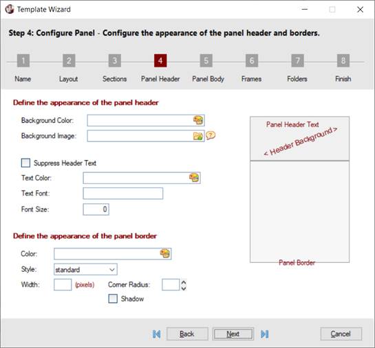
Configure the appearance of the panel header and the panel border that will be drawn around the NOMADS panel.
This panel consists of the following:
|
Define the appearance of the panel header | |
|
Background Color |
Specify a color for the panel header background. See Color Specification for information on applying a color. |
|
Background Image |
Select the image to display for the panel background. Click the Image browse button to select an image. Clicking Finish (Step 8) copies the image from its current location to an Images directory that will be created for that template under *plus\inomads\templates. Note: |
|
Suppress Header Text |
Select this check box to hide the panel header text. When selected, the other panel header text options, Text Color, Text Font and Font Size, are disabled. |
|
Text Color |
(Available if the Suppress Header Text check box is not selected) Specify a color for the panel header text. See Color Specification for information on applying a color. |
|
Text Font |
(Available if the Suppress Header Text check box is not selected) Enter a font for the panel header text. |
|
Font Size |
(Available if the Suppress Header Text check box is not selected) Enter a font size for the panel header text. |
|
Define the appearance of the panel border | |
|
Color |
Specify a color for the panel border. See Color Specification for information on applying a color. |
|
Style |
Select a style for the panel border. Selections are standard (Default), none, solid, dotted, dashed, double, groove, ridge, inset, outset. |
|
Width |
Enter the width for the panel border (in pixels). |
|
Rounded Corner Radius |
Enter a value for the rounded corner radius. A blank or low value (i.e. <10) produces squared panel corners. A higher value (10 - 30) produces progressively rounded panel corners. Maximum value is 99. |
|
Shadow |
Select this check box to create a shadow effect behind the panel. |
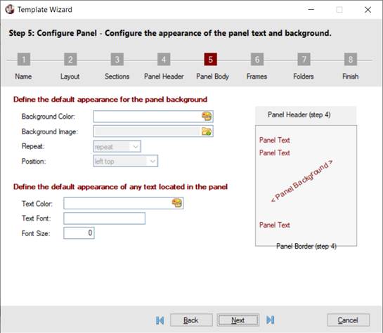
Configure the appearance of the panel background and any text that displays on the NOMADS panel.
This panel consists of the following:
|
Define the default appearance for the panel background | |||||||||
|
Background Color |
Specify a color for the panel header background. See Color Specification for information on applying a color. | ||||||||
|
Background Image |
Select the image to display for the panel background. Click the Image browse button to select an image. Clicking Finish (Step 8) copies the image from its current location to an Images directory that will be created for that template under *plus\inomads\templates. | ||||||||
|
Repeat |
(Available only when a Background Image is selected for the panel background) Selections for duplicating the image are:
| ||||||||
|
Position |
(Available only when a Background Image is selected for the panel background) Selections for positioning the image are left top (Default), left center, left bottom, right top, right center, right bottom, center top, center center, center bottom, full screen. | ||||||||
|
Define the default appearance of any text located in the panel | |||||||||
|
Text Color |
Specify a color for the panel text. See Color Specification for information on applying a color. | ||||||||
|
Text Font |
Enter a font for the panel text. | ||||||||
|
Font Size |
Enter a font size for the panel text. | ||||||||
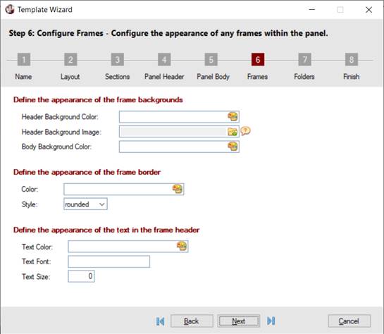
Configure the appearance of any frame (box) controls on the NOMADS panel.
This panel consists of the following:
|
Define the appearance of the frame backgrounds | |
|
Header Background Color |
Specify a color for the frame header background. See Color Specification for information on applying a color. |
|
Header Background Image |
Select the image to display for the frame header background. Click the Image browse button to select an image. Clicking Finish (Step 8) copies the image from its current location to an Images directory that will be created for that template under *plus\inomads\templates. |
|
Body Background Color |
Specify a color for the frame background. See Color Specification for information on applying a color. |
|
Define the appearance of the frame border | |
|
Color |
Specify a color for the frame border. See Color Specification for information on applying a color. |
|
Style |
Select a style for the frame border. Selections are rounded (Default), square, none. |
|
Define the appearance of the text in the frame header | |
|
Text Color |
Specify a color for the frame header text. See Color Specification for information on applying a color. |
|
Text Font |
Enter a font for the frame header text. |
|
Text Size |
Enter a font size for the frame header text. |
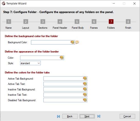
Configure the appearance of folder controls on the NOMADS panel.
This panel consists of the following:
|
Define the background color for the folder | |
|
Background Color |
Specify a color for the folder background (excluding the tabs). See Color Specification for information on applying a color. If no folder Background Color is defined, the folder background will be the color defined for the Active Tab Background. |
|
Define the appearance of the folder border | |
|
Color |
Specify a color for the folder border. See Color Specification for information on applying a color. Note: |
|
Style |
Select a border style to apply around the folder and the tabs. Selections are standard (Default), none, solid. |
|
Define the colors for the folder tabs | |
|
Active Tab Background |
Specify a color for the background of the active tab. See Color Specification for information on applying a color. |
|
Active Tab Text |
Specify a color for the text of the active tab. See Color Specification for information on applying a color. |
|
Inactive Tab Background |
Specify a color for the background of the inactive tab. See Color Specification for information on applying a color. Note: |
|
Inactive Tab Text |
Specify a color for the text of the inactive tab. See Color Specification for information on applying a color. |
|
Disabled Tab Background |
Specify a color for the background of the disabled tab. See Color Specification for information on applying a color. |
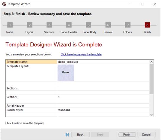
Review your selections for the previous steps. The wizard options and data are presented in a grid format with your selections shown in the second column. A vertical scroll bar, if applicable, allows you to scroll through the grid.
Select the Click here to preview the template hyperlink above the grid to preview the template with your selections applied.
To change any of your selections, you can either use the Back button or click the numbered step button in the progress bar at the top to navigate to any of the previous steps and make the desired changes.
When you are satisfied with the results, click the Finish button to complete the wizard and save the template. In addition, any selected images are copied to an Images directory that is automatically created for the new template under *plus\inomads\templates.
After saving the template and exiting the wizard, you may decide to make additional changes to the template. To do this, follow these steps:
|
|
1. |
Invoke the iNomads Setup window from either the PxPlus IDE Main Launcher (go to Web Deployment category and select iNomads Setup) or the iNomads Application Launchpad (click Admin button). |
|
|
2. |
From the Template drop box, select the name of the template to modify. |
|
|
3. |
Click the Custom button (within the Template Settings frame box) to invoke Template Maintenance. From this window, you can change any of your template's previous settings. |
|
|
4. |
After making changes, click the Apply button and then click Test to preview the template with these changes. |
|
|
5. |
When you are satisfied with the results, click OK or Close to exit Template Maintenance. |
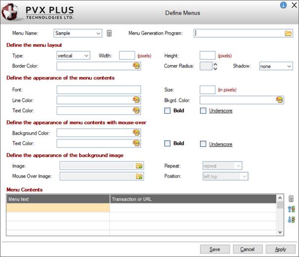
The Define Menus window is used to create one or more menus to add to a template. It consists of options for defining the menu layout, the menu contents and background image.
To invoke this window, follow these steps:
|
|
1. |
Go to the Step 3: Sections panel of the Template Designer Wizard. |
|
|
2. |
Click the Add Section Contents button beside the Section Contents list box. |
|
|
3. |
Select Menu from the popup menu. The Section Contents - Menu Template window displays. |
|
|
4. |
Click the Define Menu button. The Define Menus window displays. |
This window consists of the following:
|
Menu Name |
Enter a name for the new menu definition. To view or modify the settings for a previously saved menu definition, select the name from the drop box or manually enter the name. You can create multiple menu definitions for the same template. To do this, highlight the existing menu name and type a new name. If the new menu name does not exist, a message asks if you wish to reset the current menu values and offers three possible responses: Yes, No, Contents Only:
Note: | ||||||||
|
Click the Program browse button to select or manually enter the program file name to use for generating the menu. See Menu Generation Program. | |||||||||
|
Define the menu layout | |||||||||
|
Type |
Select either a vertical or horizontal menu layout:
| ||||||||
|
Width |
Enter a width for the menu options area. This setting is ignored when Type is horizontal. | ||||||||
|
Height |
Enter a height for the menu options area. (Applies when Type is either horizontal or vertical.) | ||||||||
|
Border Color |
Specify a color for the menu border. See Color Specification for information on applying a color. | ||||||||
|
Corner Radius |
(Available only when a Border Color is specified) Enter a value for the rounded corner radius or use the spinner controls to specify a value. A blank or low value (i.e. <10) produces squared menu corners. A higher value (10 - 30) produces progressively rounded menu corners. Maximum value is 99. | ||||||||
|
Shadow |
Select a shadow style for the menu. Selections are none (Default), bottom right, bottom left, top right, top left, full, bottom, top, left, right. | ||||||||
|
Define the appearance of the menu contents | |||||||||
|
Font |
Enter a font for the menu text. | ||||||||
|
Size |
Enter a font size for the menu text (in pixels). | ||||||||
|
Line Color |
Specify a color for the line (vertical or horizontal) separating the menu options. See Color Specification for information on applying a color. | ||||||||
|
Bkgrd. Color |
Specify a color for the menu background. See Color Specification for information on applying a color. | ||||||||
|
Text Color |
Specify a color for the menu text. See Color Specification for information on applying a color. | ||||||||
|
Bold |
Select this check box to bold the menu text. | ||||||||
|
Underscore |
Select this check box to underline the menu text. | ||||||||
|
Define the appearance of menu contents with mouse-over | |||||||||
|
Background Color |
Specify a color for the background only when the mouse pointer is positioned over individual menu options. See Color Specification for information on applying a color. | ||||||||
|
Text Color |
Specify a color for the menu text only when the mouse pointer is positioned over individual menu options. See Color Specification for information on applying a color. | ||||||||
|
Bold |
Select this check box to bold the menu text only when the mouse pointer is positioned over individual menu options. | ||||||||
|
Underscore |
Select this check box to underline the menu text only when the mouse pointer is positioned over individual menu options. | ||||||||
|
Define the appearance of the background image | |||||||||
|
Image |
Select the image to display for the menu background. Click the Image browse button to select an image. Clicking Finish (Step 8) upon completion of the wizard copies the image from its current location to an Images directory that will be created for that template under *plus\inomads\templates. | ||||||||
|
Mouse Over Image |
Select the image to display when the mouse pointer is positioned over the menu. Click the Image browse button to select an image. Clicking Finish (Step 8) upon completion of the wizard copies the image from its current location to an Images directory that will be created for that template under *plus\inomads\templates. | ||||||||
|
Repeat |
(Available only when a Background Image is selected) Selections for duplicating the image are:
| ||||||||
|
Position |
(Available only when a Background Image is selected) Selections for positioning the image are left top (Default), left center, left bottom, right top, right center, right bottom, center top, center center, center bottom, full screen. | ||||||||
|
| |||||||||
|
Menu Contents |
See Menu Contents. | ||||||||
|
Save |
Saves the current record and then closes the window. | ||||||||
|
Cancel |
Cancels any changes to the current record and then closes the window. | ||||||||
|
Apply |
Applies the changes to the current record and then leaves the window open with the current record displayed. | ||||||||
The Menu Contents portion of the Define Menus window is used to define the contents for the menu. If a Menu Generation Program is entered, the Menu Contents grid is not available for entry.
For each option that you want to include in the menu, a separate grid row must be entered with the following details:
|
Menu text |
Enter the text for the menu option that will be visible to the user. |
|
Transaction or URL |
If the menu launches a different iNomads transaction, enter the Transaction code. |
Use the Delete and Move Up/Move Down buttons beside the list box to remove a menu option or rearrange the order of the options within the menu.
To view or change the content for a different menu, select a menu from the Menu Name drop box. Switching to a different menu automatically saves any changes to the current menu definition. You can also click the Apply button to save changes.