|
Adding and Modifying Sub-Panels |
|
Once the Folder control is created, you can change property settings to assign new sub-panels or to change various aspects of the control.
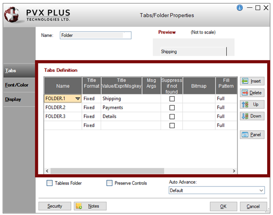
The Tabs Definition grid on the Tabs/Folder Properties dialogue is used to add, remove or modify the sub-panels in your folder control.
The seven basic steps required for defining tab information for each sub-panel are:
|
Step |
Description | ||||||||||||||
|
Step 1: Name |
In the Tabs Definition grid, type a panel Name or click the drop-down arrow to retrieve a list of available panels for the current library. Note: | ||||||||||||||
|
Step 2: Title Format |
Select a Title Format from the drop-down list of selections: Fixed, Expr, Msg. Default is Fixed. | ||||||||||||||
|
Step 3: Title |
Enter the text for the Title that will appear in the tab. If the Title Format selected is Expr (Expression), the value entered must be a string variable or text surrounded by quotes. If the Title Format selected is Msg (Message Library Reference), you need to assign the message key, along with optional message arguments. Click the magnifying glass button to invoke the Message Library Reference dialogue and select an entry from an existing message file. | ||||||||||||||
|
Step 4: Suppress if not found Option |
To suppress the drawing of a folder, select the Suppress if not found check box. See Auto Detection of Folder Tabs. | ||||||||||||||
|
Step 5: Bitmap |
To add a bitmap or an image to a tab, click the magnifying glass button to invoke the Bitmaps dialogue for specifying the bitmap or image to use. Note: | ||||||||||||||
|
Step 6: Fill Pattern |
Select a Fill Pattern to be used. This is the direction in which the fill colors will be applied to the tab. Click the drop-down arrow for a list of selections.
| ||||||||||||||
|
Step 7: Fill Color |
Select the Fill Color for the tab. Click the Query button to access Color Selections. Valid formats for color selections include predefined system colors (e.g. Light Red), Custom (RGB codes), HTML Hex Color Codes, User Defined colors (e.g. Color17) and string Expressions. Two colors are required for gradient filling. The first color is the starting color, and the second color is the ending color. Only one color is necessary if the Fill Pattern selected is Full. Color settings for individual tabs will override normal tab colors set in %NOMADS Properties (i.e. %NOMADS'Tab_Folder_Colors$), as well as Themes and Visual Classes (i.e. Background Color or Tab Color and Tab Color 2). (The Color Selections dialog was added in PxPlus 2020.) | ||||||||||||||
|
|
| ||||||||||||||
|
Insert |
Inserts a blank row in the Tabs Definition grid for adding a new tab. Defaults are set for the Title Format, Fill Pattern and Fill Color. Also available from the popup menu when right clicking on the Name column in the Tabs Definition grid. | ||||||||||||||
|
Delete |
Removes the selected tab definition. Multiple tab definitions can be removed by highlighting the tabs in the grid and clicking the Delete button. Also available from the popup menu when right clicking on the Name column in the Tabs Definition grid. | ||||||||||||||
|
Up |
Changes the order of the tabs on the panel. | ||||||||||||||
|
Launches the panel that corresponds to the folder tab currently selected in the Tabs Definition grid. The panel is launched in a separate NOMADS Panel Designer session to allow any changes to be made if needed. Also available from the popup menu when right clicking on the Name column in the Tabs Definition grid. (The Panel button was added in PxPlus 2020.) |
For information on the Execute Pre-Disp One Time and Execute Post-Disp One Time options, see Preserve Controls.
For information on the Security settings for tabs/folders, see Tabs/Folders - Viewing Security Settings.
For other attributes that can be defined for a folder control, see Auto Detection of Folder Tabs and Tabless Folders.