|
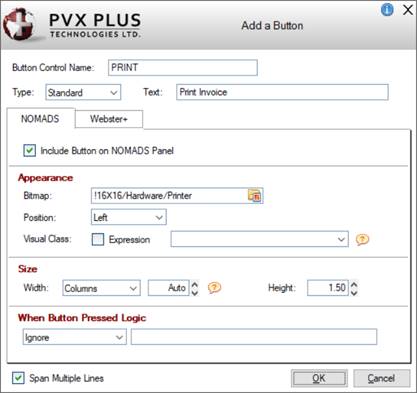
Button Control Name |
Enter a unique name or use the default name provided. (Same as
Name property in Button Properties.) |
|
Type |
Select the type of Button control:
|
Standard |
(Default) Creates a standard button control. |
|
Hyperlink |
Creates a Web-link style button (i.e. no frame, is underscored, and text on the button is highlighted whenever the mouse hovers over the button). |
|
Drop List |
Creates a drop-down style button. |
(The Drop List button type was added in PxPlus 2022.) |
|
Text |
Enter the button text or leave blank. If left blank, a bitmap (NOMADS panel) and/or a symbol (Webster+ page) must be entered; otherwise, a message will display. |
|
Span Multiple Lines |
(Applicable for NOMADS Panels Only)
When selected (Default), the Button spans according to its size. Fields placed in the rows below the Button and below the adjoining cell (in a two-column layout) are pushed down to accommodate the Button. The field in the adjoining cell remains in place beside the Button.
Deselecting this option allows fields to be placed beside the Button (in a two-column layout). However, fields below the Button (in the same column) are not pushed down, which may result in overlapping and hidden fields.
This option works the same for Smart List Boxes, Smart Charts, Images and Embedded Panel/HTML Short Codes. For an example using a Smart List Box, see
Example - Span Multiple Lines. |
|
NOMADS |
|
|
Include Button on NOMADS Panel |
(Available when
NOMADS Panel check box is selected for Form Type)
When adding a new Button, this check box is selected by default to enable the options on the NOMADS folder panel. |
|
Appearance |
|
Bitmap |
(Available when button Type is Standard or Hyperlink)
Bitmap to display on the Button. Click the Bitmap Library button to select a bitmap or enter the text value for the bitmap (e.g. !Checkmark). |
|
Position |
(Available when button Type is Standard or Hyperlink)
Bitmap position on the Button: Left (Default), Right. Top or Bottom. This option is enabled when button Text is entered.
(The Top and Bottom bitmap positions were added in PxPlus 2022 Update 1.) |
|
Popup Library |
(Available when button Type is Drop List)
Library path for the popup menu. Click the drop-down arrow for a list of (up to nine) previous library selections.
Click the Browse button to look through the directory structure to find the library or type the library path. An expression can also be entered by preceding the expression with an = (equals sign); e.g. =libname$ or ="mylib.en". Note:
The Library name may be a specific or generic reference. See Cascading Language Suffixes. |
|
Popup Panel |
(Available when button Type is Drop List)
Popup menu name. Click the drop-down arrow for a list of existing popup menus in the selected library. Click the Popup button to invoke the
Menu Bar Definition for the selected popup menu.
A new popup menu can be created on-the-fly. Enter a new Popup Panel name and then click the Popup button to define the menu. |
|
Visual Class |
Associate a
Visual Class for setting up default settings for the Button control such as font, color and various attributes. Click the drop-down arrow for a list of pre-defined visual classes. Note:
Visual class names that begin with an "*" (asterisk) are pre-defined visual classes used by PVX Plus and may be subject to change without notice. |
(The Popup Library and Popup Panel options were added in PxPlus 2022.) |
|
Size |
|
Width |
Enter the width for the Button either in number of Columns (Default) or as a Percentage of the column width.
When Columns is selected, the width defaults to Auto. In NOMADS, a width of Columns - Auto will result in the Button filling the entire column or full line. If a Button with an Auto width is the only control in the column, it will default to a width of 35. To set it back to Auto, enter 0. Otherwise, enter the desired value or use the spinner control. Valid entries are 0 to 300.
If an actual number of columns has been entered and the Button text is edited so that its length exceeds the number of columns, the value will adjust to match the length of the Button text entered plus 2.
When Percentage is selected, the percentage defaults to 100%. Otherwise, enter the desired percentage or use the spinner control. |
|
Height |
Enter the height for the Button in number of lines or use the spinner control. Valid entries are 0 to 255. The default is 1.5. |
(The default Button Height of 1.5 for NOMADS was added in PxPlus 2023.) |
|
When Button Pressed Logic |
Logic to be executed when focus leaves the Button or the state of the control has changed. Click the drop-down arrow to add/edit logic. See
Actions and Parameters. |
|
Webster+ |
|
|
Include Button on Webster+ Page |
(Available when
HTML Page check box is selected for Form Type)
When adding a new Button, this check box is selected by default to enable the options on the Webster+ folder panel. |
|
Appearance |
|
Symbol |
(Available when button Type is Standard or Hyperlink)
A symbol can be optionally added to the button text. It can be either a Font Awesome symbol or a standard PxPlus bitmap selected from the Bitmap Library lookup button.
For a list of Font Awesome symbols, visit https://fontawesome.com/v4/icons/. Note:
When specifying the Font Awesome symbol name, do not include the leading 'fa-'.
(The Bitmap Library lookup button was added in PxPlus 2022 Update 1.) |
|
Position |
(Available when button Type is Standard or Hyperlink)
Symbol position on the button: Left (Default), Right. Top or Bottom. This option is enabled when button Text is entered.
(The Top and Bottom symbol positions were added in PxPlus 2022 Update 1.) |
|
List Items |
(Available when button Type is Drop List)
Grid used for entering the text and the
HTML Event to trigger for each item in the drop list. |
|
HTML Class |
A single HTML Class can be entered (e.g. bold). Multiple classes can be entered, separated by either spaces or commas. When spaces are used as the delimiter, the values must be within double quotes (e.g. "bold text_redfill_cyan" or bold,text_red,fill_cyan).
See
Webster+ Defined Classes. |
(The List Items option was added in PxPlus 2022.) |
|
Size |
|
Width |
(Available when button Type is Standard or Drop List)
Enter the width for the Button either in number of Columns (Default) or as a Percentage of the column width.
When Columns is selected, the width defaults to Auto. In Webster+, a width of Columns - Auto will result in the Button being just wide enough to accommodate the text (and symbol if present). To set it back to Auto, enter 0. Otherwise, enter the desired value or use the spinner control. Valid entries are 0 to 300.
If an actual number of columns has been entered and the Button text is edited so that its length exceeds the number of columns, the value will adjust to match the length of the Button text entered plus 2.
When Percentage is selected, the percentage defaults to 100%. Otherwise, enter the desired percentage or use the spinner control. |
|
Height |
(Available when button Type is Standard or Drop List)
Enter the height for the Button in number of lines or use the spinner control. Valid entries are 0 to 255. The default is 2. |
(The default Button Height of 2 for Webster+ was added in PxPlus 2023.) |
|
HTML |
|
Event/URL |
If the button Type is set to Standard or Drop List, an
HTML Event can be entered for the Button.
For Standard buttons only, you can add a
target=xxx short code option or any other short code options to the event, separated by a space (e.g. sample_event target=same). See Webster+
Short Code Options. Instead of an event, you can add a hyperlink by entering a
link=xxx short code option as the first five characters in the HTML Event field (e.g. link=page:invoices target=same).
If the button Type is set to Hyperlink, either an HTML Event or a URL (preceded with http:// or https://) must be entered; otherwise, a message will display if left blank.
(The ability to add Webster+ short code options to Standard buttons was added in PxPlus 2022 Update 1.) |
|
Other Options |
One or multiple short code options associated with the
[button] short code can be entered. Multiple options must be separated by a space.
See Webster+
Short Code Options.
Example:
tip=FloatingTip
tip=FloatingTip link=https://www.pvxplus.com Important Note:
The Other Options field should not be used for entering class=xxx or event=xxx short code options.
(The Other Options field was added in PxPlus 2023 Update 1.) | |