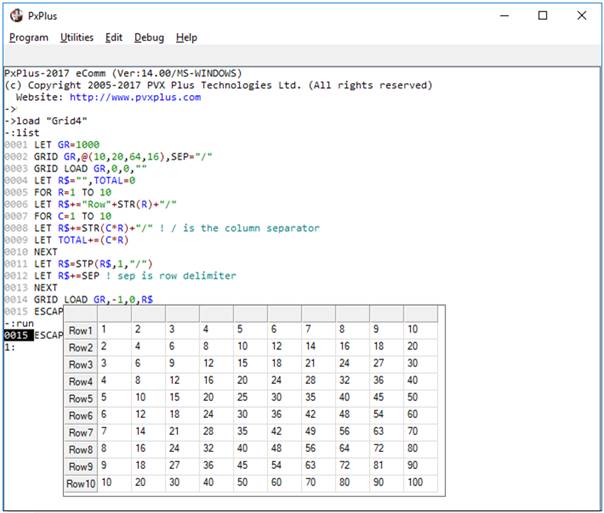
|
Grid Control |
|
GRID ctl_id, @(col,ln,wth,ht) [, ctrlopt ]
GRID { REMOVE | DISABLE | ENABLE | LOCK | UNLOCK } ctl_id
GRID { GOTO | HIDE | SHOW | AUTO } ctl_id
GRID SET_FOCUS ctl_id, ctl_val
GRID ADD ctl_id, col, row
GRID LOAD ctl_id, col,row, contents$
GRID DELETE ctl_id, col,row
GRID CLEAR ctl_id, col,row [, width,height ]
GRID READ ctl_id, col, row, var$, eom$
GRID READ NEXT ctl_id, col, row, var$, eom$
GRID SELECT ctl_id, col,row [, width,height ]
GRID SELECT READ ctl_id, col,row
GRID SELECT READ NEXT ctl_id, col,row
GRID SELECT RESET ctl_id
GRID FIND ctl_id, col, row, var$
GRID WRITE ctl_id, col, row, contents$
PxPlus includes the ability to create a highly flexible and complex grid control. Grids provide a spreadsheet-style format - basically a two-dimensional array of editable cells in columns and rows that may comprise multi-line (default), check box, button, drop box, or any combination of formats (each cell can be a different type). For syntax details, see GRID directive.
Grid controls are a very useful way of dealing with tabular data. However, loading and interacting with a grid can sometimes be slow, especially when working in a WindX environment. For information and examples on the different ways to speed up grid interactions, see How to Speed Up Grid Loading and Processing.
For information on adding a grid to a panel using the NOMADS Panel Designer, see Grid Control.
A more simplistic version of a Grid-style control can be created using a Report View style List Box. Once it is created, much of the format and operation of a grid is handled using different combinations of Dynamic Control Properties.
For a list of properties that can be applied to an entire grid, a cell, a column or a row, see Grid Properties.
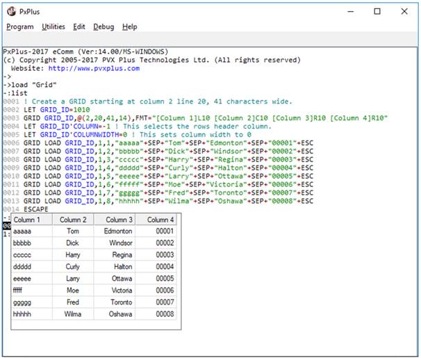
Example:
! Create a GRID starting at column 2 line 20, 41 characters wide.
GRID_ID=1010
GRID GRID_ID,@(2,20,41,14),FMT="[Column 1]L10 [Column 2]C10 [Column 3]R10 [Column 4]R10"
GRID_ID'COLUMN=-1 ! This selects the rows header column.
GRID_ID'COLUMNWIDTH=0 ! This sets column width to 0
GRID LOAD GRID_ID,1,1,"aaaaa"+sep+"Tom"+sep+"Edmonton"+sep+"00001"+esc
GRID LOAD GRID_ID,1,2,"bbbbb"+sep+"Dick"+sep+"Windsor"+sep+"00002"+esc
GRID LOAD GRID_ID,1,3,"ccccc"+sep+"Harry"+sep+"Regina"+sep+"00003"+esc
GRID LOAD GRID_ID,1,4,"ddddd"+sep+"Curly"+sep+"Halton"+sep+"00004"+esc
GRID LOAD GRID_ID,1,5,"eeeee"+sep+"Larry"+sep+"Ottawa"+sep+"00005"+esc
GRID LOAD GRID_ID,1,6,"fffff"+sep+"Moe"+sep+"Victoria"+sep+"00006"+esc
GRID LOAD GRID_ID,1,7,"ggggg"+sep+"Fred"+sep+"Toronto"+sep+"00007"+esc
GRID LOAD GRID_ID,1,8,"hhhhh"+sep+"Wilma"+sep+"Oshawa"+sep+"00008"+esc
ESCAPE
When creating a grid, FMT= settings allow you to format columns by defining column names, titles, widths, alignment and cell types. The format string consists of a space-separated list of column definitions laid out as [col_title](cell_type: col_name$) Alignment Width:
Example:
"[Client ID](Multi_line:CST_ID$)L10 [Name](Normal:CST_NAME$)L10"
The column title is displayed in the column header line. Cell types include various types of input boxes, buttons, check boxes and drop boxes.
See Cell Types below for a list of cell types that can be assigned to a grid. The default cell type is "Normal", which is a text cell containing one line of data. The column name assigns a variable name (string or numeric) to the column. The alignment character may be L (left), C (centred), R (right). Default is L.
It is also possible to format the grid after creation using Dynamic Control Properties. This method allows you to format the grid by rows, columns, individual cells, or all cells. Use the grid 'Row and 'Column($) properties to designate affected rows/columns/cells, then set the desired formatting properties.
For some GRID syntax (e.g. GOTO, FIND keywords), both column and row coordinates are required to act as pointers to particular cells:
GRID GOTO GRID_ID,2,1 ! Puts focus on column 2 row 1
GRID FIND GRID_ID,3,4,val$ ! Retrieves value of column 3 row 4
Other syntax allows you specify a particular row or column (or the entire grid), as well as a particular cell. To specify an entire row, set the column to 0 zero. To specify an entire column, set the row to 0 (zero). To specify the entire grid, set both to 0:
GRID LOAD GRID_ID,0,0,"" ! Clears the entire grid
GRID DELETE 100,0,2 ! Deletes row 2
GRID DELETE 100,3,0 ! Deletes column 3
When setting properties for rows, columns, or individual cells within the grid, 'Row and 'Column (or 'Column$) properties must be specified to identify the cell(s) involved. The special 0 (zero) values can be used to specify rows, columns or the entire grid:
GRID_ID'Row=n,GRID_ID'Column=0,GRID_ID'Lock=1 ! Locks all cells in row n
There are also special values for referencing column and row headers. To reference a column header, set row to -1. To reference a row header, set column to -1:
GRID_ID'Column=-1,GRID_ID'ColumnWidth=0 ! Row header is now gone!
To set properties that pertain to the general behaviour of the grid control (such as 'Auto, 'Sep$, 'LockColumns, 'LockRows, 'EnterMode, 'TabMode, 'AutoTrack, 'ExcelStyle, 'MenuCtl, etc.), the 'Row and 'Column($) values do not apply:
GRID_ID'EnterMode=2, GRID_ID'TabMode=1, GRID_ID'AutoTrack=3
For a list of properties that can be applied to an entire grid, a cell, a column or a row, see Grid Properties.
Example:
The grid in the following example is created without an FMT= string. All formatting is handled using dynamic properties:
! GRIDDEMO - Grid demo program
BEGIN ;
PRINT 'CS',"Grid Demonstration"
GRID 10,@(3,3,75,20)
GRID LOAD 10,0,0,""
FOR R=1 TO 10
R$=""
FOR C=1 TO 5
R$+=STR(C*R)+SEP
NEXT C
GRID LOAD 10,1,0,R$
NEXT R
X=10
FOR I=1 TO 5;
X'ROW=-1,X'COLUMN=I;
X'VALUE$="Col "+STR(I);
NEXT
FOR I=1 TO 10;
X'ROW=I,X'COLUMN=-1;
X'VALUE$="Row "+STR(I);
NEXT
X'COLUMN=-1,X'COLUMNWIDTH=8
X'COLUMN=0,X'COLUMNWIDTH=15,X'ROW=0,X'LEN=7
X'COLUMN=1,X'ROW=0,X'LEN=5
X'COLUMN=2,X'ROW=0,X'LEN=10
X'COLUMN=2,X'ROW=2,X'LEN=3
X'COLUMN=2,X'ROW=0,X'BACKCOLOR$="Light Red"
X'LOCKCOLUMNS=2
INPUT X$;
IF CTL<>4 \
THEN GOTO *SAME
END
The following cell types can be assigned using the FMT= option in the GRID directive or via the 'CellType$ grid object property:
|
Cell Type |
Description |
|
"BarChart" |
Used to display horizontal bar charts based on the contents of the 'Text$ property. See Horizontal Bar Charts in Grid Cells below. (Added in PxPlus 2017) |
|
"Button" |
Cell works like a button if clicked. Cell can be changed if not locked (on double click). Set 'Lock property to 1 to achieve standard button behavior for cell. |
|
"CheckBox" |
Check box with no 3D effect ('Value=0 or 1,'Text=label). |
|
"CheckBoxRaised" |
3D check box that looks raised. |
|
"CheckBoxRecessed" |
3D check box that looks recessed. |
|
"CheckMark" |
Check box that uses a check mark. |
|
"CheckMarkRaised" |
Raised check box that uses a check mark. |
|
"CheckMarkRecessed" |
Recessed check box that uses a check mark. |
|
"DropBox" |
A text cell that, when editing, allows the user to make a selection from a drop-down list. The drop list is loaded from the 'Text$ property. Drop boxes provide a multiple character search capability that makes it easier to search for an exact match in a drop box list. See Multiple Character Search below. (Multiple character search in drop boxes was added in PxPlus 2019.) |
|
"DropBoxHideBtn" |
Same as "DropBox", but the drop-down button is shown only when focus is on the cell. Drop boxes provide a multiple character search capability that makes it easier to search for an exact match in a drop box list. See Multiple Character Search below. (Multiple character search in drop boxes was added in PxPlus 2019.) |
|
"Ellipsis" |
Normal text cell that will show three dots ( ) if text exceeds displayable area. Ctrl - Enter can be used to force a new line in the cell (inserts $0D0A$ into cell value). |
|
"EllipsisDrop" |
Same as "Ellipsis", but forces the cell to drop vertically only during an edit. Ctrl - Enter can be used to force a new line in the cell (inserts $0D0A$ into cell value). |
|
"FlatButton" |
A flat button that shows no visible change when clicked. (Added in PxPlus 2014 Feature Pack 1 - Update 0001) |
|
"FlatButtonInOnly" |
A button that looks flat only when not depressed. (Added in PxPlus 2014 Feature Pack 1 - Update 0001) |
|
"FlatTextButton" |
Similar to "TextButton", but the button is flat and shows no visible change when clicked. (Added in PxPlus 2014 Feature Pack 1 - Update 0001) |
|
"FlatTextButtonInOnly" |
Similar to "TextButton", but the button looks flat only when not depressed. (Added in PxPlus 2014 Feature Pack 1 - Update 0001) |
|
"Lookup" |
Small button at the right side of the cell used to invoke a lookup. Button image is defined via the cell's 'Bitmap$ property. If no image is given, button shows three dots. |
|
"LookupHideBtn" |
Same as "Lookup", but indicates that the button is hidden when the cell is not selected. |
|
"Multi_line" |
Normal text cell that can contain multiple lines of text. Ctrl - Enter can be used to force a new line (value $0D0A$). |
|
"Normal" |
Normal text cell that contains one line of data. |
|
"Query" |
Same as "Lookup", but the user is unable to edit the cell. |
|
"QueryHideBtn" |
Same as "LookupHideBtn", but the user is unable to edit the cell. |
|
"SingleLine" |
Normal text cell that allows for a single line of entry, expanding the cell horizontally according to the overlap rules. It does not allow vertical expansion like a multi-line. |
|
"TextButton" |
Similar to "Button", except that the text on the button adheres to the 'Align$ property and will wrap. (Added in PxPlus 2014 Feature Pack 1 - Update 0001) |
|
"UseTextEllipsis" |
Similar to "Ellipsis", "Normal" and "SingleLine" respectively, except the value of 'Text$ property is displayed. During input and editing, the 'Value$ property is presented and entered into the cell. Sorting on a column is done using the 'Value$ property. To sort a date column, set the cell type to "UseTextNormal", and then write a sortable value to the cell's 'Value$ property and set the 'Text$ property to the value to be displayed. |
|
"VarDropBox" |
A text cell that, when editing, allows the user to make a selection from a drop-down list or enter any other value. Drop list selections are loaded using the 'Text$ property. Drop boxes provide a multiple character search capability that makes it easier to search for an exact match in a drop box list. See Multiple Character Search below. (Multiple character search in drop boxes was added in PxPlus 2019.) |
|
"VarDropBoxHideBtn" |
Same as "VarDropBox", but the drop-down button is shown only when focus is on the cell. Drop boxes provide a multiple character search capability that makes it easier to search for an exact match in a drop box list. See Multiple Character Search below. (Multiple character search in drop boxes was added in PxPlus 2019.) |
While some of these appear similar to other graphical controls, be aware that a grid will only accept Dynamic Control Properties that are listed specifically for use in Grid controls (not Multi-Lines, Check Boxes, Buttons, Drop Boxes, etc.).
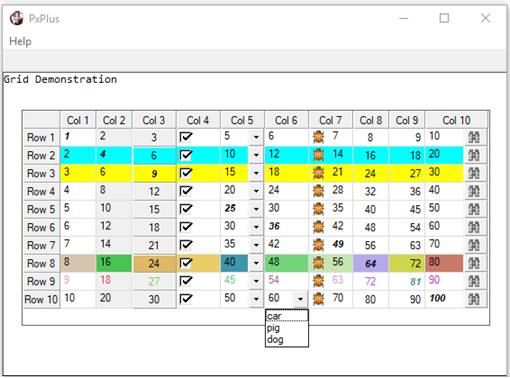
Example:
The following example creates a grid with "Normal", "Button", "DropBox", "Lookup", "CheckMarkRecessed" and "DropBoxHideBtn" cell types:
BEGIN
PRINT 'CS',"Grid Demonstration"
GRID 10,@(3,3,74,15)
GRID LOAD 10,0,0,""
FOR R=1 TO 10
R$=""
FOR C=1 TO 10
R$+=STR(C*R)+SEP
NEXT
GRID LOAD 10,1,0,R$
NEXT
X=10
FOR I=1 TO 10;
X'ROW=-1,X'COLUMN=I;
X'VALUE$="Col "+STR(I);
NEXT
FOR I=1 TO 10;
X'ROW=I,X'COLUMN=-1;
X'VALUE$="Row "+STR(I);
NEXT
X'MENUCTL=11
X'COLUMN=-1,X'COLUMNWIDTH=6
X'COLUMN=2,X'ROW=0,X'LOCK=1
X'COLUMN=3,X'ROW=0,X'COLUMNWIDTH=7,X'CELLTYPE$="Button",X'LOCK=1
X'COLUMN=4,X'ROW=0,X'COLUMNWIDTH=7,X'CELLTYPE$="CheckMarkRecessed"
X'COLUMN=5,X'ROW=0,X'COLUMNWIDTH=7,X'CELLTYPE$="DropBox",X'TEXT$="car/pig/dog/"
X'COLUMN=6,X'ROW=0,X'COLUMNWIDTH=7,X'CELLTYPE$="DropBoxHideBtn", \
X'TEXT$="car/pig/dog/"
X'COLUMN=7,X'ROW=0,X'COLUMNWIDTH=7,X'BITMAP$="!bug"
X'COLUMN=8,X'ROW=0,X'ALIGN$="C"
X'COLUMN=9,X'ROW=0,X'ALIGN$="R"
X'COLUMN=10,X'ROW=0,X'COLUMNWIDTH=10,X'CELLTYPE$="Lookup",X'BITMAP$="!Binoculars"
X'COLUMN=0,X'ROW=2,X'BACKCOLOUR$="LIGHT CYAN"
X'COLUMN=0,X'ROW=3,X'BACKCOLOUR$="LIGHT YELLOW"
X'ROW=8;
FOR I=1 TO 10;
X'COLUMN=I;
X'BACKCOLOUR$="RGB:"+STR(RND(200)+55)+" "+STR(RND(200)+55)+" "+ \
STR(RND(200)+55);
NEXT
X'ROW=9;
FOR I=1 TO 10;
X'COLUMN=I;
X'TEXTCOLOUR$="RGB:"+STR(RND(200)+55)+" "+STR(RND(200)+55)+" "+ \
STR(RND(200)+55);
NEXT
FOR I=1 TO 10;
X'COLUMN=I,X'ROW=I,X'FONT$="Arial,1,BI";
NEXT
WHILE 1
INPUT X$;
IF CTL=4 \
THEN BREAK
IF CTL=11 \
THEN POPUP_MENU "[&One=1,&Two=2,&Three=3,&Four=4]",X;
IF X \
THEN MSGBOX STR(X),"Menu Selection"
IF CTL<>10 \
THEN PRINT @(0,20),'CL',"Recv'd CTL=",CTL,;
CONTINUE
GRID READ 10,C,R,ZZ$,E$
PRINT @(0,20),'CL',"Col=",C," Row=",R," Dta=",ZZ$," Eom=$",HTA(E$), \
"$",
WEND
END
Drop boxes provide a multiple character search capability that makes it easier to search for an exact match in a drop box list.
To use this capability effectively, the characters must be entered within a ½ second of one another and must exactly match the start of an item in the drop box.
Example:
Assume that a drop box contains the following items:
C10000
C30000
C50000
Typing the character "c" followed within ½ second by the number "3" would select the "C30000" item.
(Multiple character search in drop boxes was added in PxPlus 2019.)
Columns can be given logical names. This feature allows applications to assign names to columns that are the same as the variables used within the underlying application; i.e. ITEMID$, DESC$, PRICE, QTY. It also facilitates dealing with swapped columns. Naming is handled in the FMT= clause or via dynamic properties. The name can represent a string or numeric variable.
Example:
GRID 10,@(10,10,60,10),
FMT="[Item](Normal:ITEMID$)L15,[Description](Normal:DESC$)L20,[Price](Normal:PRICE)L12,[Qty](Normal:QTY)L10"
Dynamic properties can also be used to set column names. This is done by setting 'Row property to -1 and assigning a variable to the 'Text$ property.
Example:
GRID 10,@(5,3,70,10) ! Define grid
X=10
X'COLUMNSWIDE=4,X'ROW=-1
X'COLUMN=1,X'VALUE$="Item",X'TEXT$="ITEMID$",X'COLUMNWIDTH=15
X'COLUMN=2,X'VALUE$="Description",X'TEXT$="DESC$",X'COLUMNWIDTH=20
X'COLUMN=3,X'VALUE$="Price",X'TEXT$="PRICE",X'COLUMNWIDTH=12
X'COLUMN=4,X'VALUE$="Qty",X'TEXT$="QTY",X'COLUMNWIDTH=10
Columns can be referenced either by column number using the 'Column property or by column name using the 'Column$ property. If you set 'Column$ with the name of a variable, then internally, the column number is used as a pointer. If you read the property 'Column, then the column number is returned. 'Column$ returns the name of the column. Column swapping has no impact on an application that uses logical column names to identify a column.
Example:
X'COLUMN$="QTY",X'ROW=4,X'VALUE$="200" ! Assign cell value 200 to QTY column
Once created, the grid can be updated using GRID LOAD and GRID WRITE directives. These, like most other GRID statements, require the specification of both the target row and column.
All column and row specifications are base 1; therefore, the topmost cell is 1,1. By default, there are also column and row headers that can be accessed by column and/or row -1. These headers may not be included in any range specifications.
If you write to a grid when the column number is 0 zero, then all columns will be affected by the change. If the row number is 0, then all rows will be affected by the change. If both are 0, then all cells will be affected.
Data may be loaded into a grid in three ways, using the GRID LOAD directive, dynamic properties, and named columns. For information and examples on the different ways to speed up grid interactions, see How to Speed Up Grid Loading and Processing.
To make the load process easier, the GRID LOAD directive will accept multiple rows and columns of data. The column data must be separated by the character identified in the column separator in the grid creation, and the rows must be separated by the delimiter contained in the last data character of the loaded data. Rows can also be loaded individually like a list box.
The column number and row number are used to indicate the starting point within the grid. If both are 0, then the grid will be cleared before loading. If just the row is 0, then the data will be appended after the last existing row on the grid.
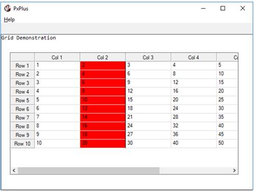
Example:
In the following example, the entire grid is populated in a single load:
gr=1000
GRID gr,@(10,4,60,15),SEP="/"
GRID LOAD gr,0,0,""
R$="",TOTAL=0
FOR R=1 TO 10
R$+="Row"+STR(R)+"/"
FOR C=1 TO 10
R$+=STR(C*R)+"/" ! / is the column separator
TOTAL+=(C*R)
NEXT
R$=STP(R$,1,"/")
R$+=SEP ! sep is row delimiter
NEXT
GRID LOAD gr,-1,0,R$
ESCAPE
Cells in a grid may also be loaded using dynamic properties. This is done by specifying 'Row and 'Column (or Column$) to identify the cell desired, then setting the content using the 'Value$ property.
Example:
The following code creates and loads a grid similar to the previous example, but uses dynamic properties instead:
gr=1000
GRID gr,@(10,4,60,15),SEP="/"
gr'ROWSHIGH=10,gr'COLUMNSWIDE=10 ! define cells
R$="",TOTAL=0
FOR R=1 TO 10
gr'COLUMN=-1,gr'ROW=R,gr'VALUE$="Row"+STR(R)
FOR C=1 TO 10
R$=STR(C*R)
gr'COLUMN=C,gr'ROW=R,gr'VALUE$=R$
TOTAL+=(C*R)
NEXT
NEXT
RETURN
The 'LoadList$, 'LoadIOList$ and 'RowData$ properties can be used to load rows of data into a grid.
'LoadList$ returns a list of column names in the order in which they physically appear within the grid object. When a grid is defined using FMT= in the GRID directive, or columns names are assigned to columns in a grid, 'LoadList$ returns a list of those column names in their current display order. The compiled version, 'LoadIOList$, simplifies the loading of grid rows from direct file contents or other IOList-based items.
The property 'LoadList$ allows you to define the order of the columns that are loaded from the data sent to the grid by a GRID LOAD. Historically, GRID LOAD loads the columns in sequence; i.e., column 1, column 2, etc. Unfortunately, this causes a problem with the ability to alter column order (swap columns). To avoid this issue, you can define the order of the column data that is sent.
When you read this property, it returns either column order list (if previously defined) or the column order by name as it exists currently in the grid.
The property 'LoadIOList$ contains the compiled version of 'LoadList$. The grid's column separator 'Sep$ is included between each variable in the IOList. Using this list enables the user to load data by record, as well as overcome problems involved with swapping columns.
Example:
GRID LOAD Grid1,1,Row,REC(Grid1'LoadIOList$)
The 'RowData$ property sets a row of data in accordance with the names defined in the 'LoadList$. The row number must first be identified using the 'Row property.
Example:
Assuming X contains the CTL value for the grid:
X'ROW=5
X'ROWDATA$=REC(X'LOADIOLIST$)
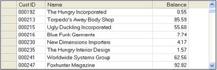
This loads the contents of the IOList into row 5. The example below loads fields from a data file directly into the grid using field names as column names:
g=10,row=0
f1$="[Cust ID](Normal:cst_id$)L8,"
f2$="[Name](Normal:cst_name$)L30,"
f3$="[Balance](Normal:cst_amt)R10"
GRID g,@(10,3,60,12),FMT=f1$+f2$+f3$
SELECT cst_id$,cst_name$,*,*,*,*,cst_amt FROM "cstfile"
row++ g'rowshigh=row
g'row=row,g'RowData$=REC(g'LoadIolist$)
NEXT RECORD
When the contents of a cell in a grid are modified, a CTL value is generated for the event. The location and value of modified cells can be retrieved using the GRID READ and GRID READ NEXT statements. These directives include the column and row of the cell that has been affected by a change.
To assure that no change ever gets lost, all changes are placed in a READ queue. Whenever a GRID READ request is executed, if there is additional input in the queue, another CTL event is initiated. This ensures that, should any CTL events be lost, the changed data will be preserved. However, it does pose a problem due to potential race conditions when the host is unable to keep up with the user input. Superfluous CTL events may be received. To avoid this problem, the GRID READ directive receives an Error #2 End of file if no data is in the READ queue.
To retrieve the contents of a single cell, the control attribute 'Value$ can be used. You must first specify the 'Column (or Column$) and 'Row properties to identify the cell desired. See Grid Properties.
Example:
Where X is the CTL value:
X'Row=r,X'Column=c
CellVal$=X'Value$
To retrieve the contents of the cell that currently has focus, use the 'CurrentRow and 'CurrentColumn properties to specify the cell.
Example:
gr'row=gr'CurrentRow,gr'column=gr'CurrentColumn
cur_value$=gr'VALUE$
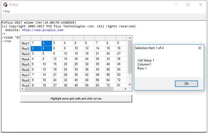
The grid allows multiple cells to be selected across multiple columns and rows. To return the contents of each selected cell, the 'SelectCount, 'SelectIndex, 'SelectRow, 'SelectColumn, 'SelectValue$ and 'SelectText$ properties can be used:
|
|
Number of items/cells selected. Set to zero to deselect all. | |
|
|
Index the selected cell. Set to point to a selected cell; e.g., set to 1 to point at the first cell selected, 2 to point at the second cell selected, etc. |
The following properties are used to access selected cells based on the location defined by 'SelectIndex:
|
|
Row number of selected cell | |
|
|
Column number of selected cell | |
|
|
Value within selected field |
Example:
! Create and load the grid
gr=1000
GRID gr,@(10,4,60,15),SEP="/"
GRID LOAD gr,0,0,""
R$="",TOTAL=0
FOR R=1 TO 10
R$+="Row"+STR(R)+"/"
FOR C=1 TO 10
R$+=STR(C*R)+"/" ! / is the column separator
TOTAL+=(C*R)
NEXT
R$=STP(R$,1,"/")
R$+=SEP ! sep is row delimiter
NEXT
GRID LOAD gr,-1,0,R$
! Select some cells and click the button
BUTTON 10,@(10,20,60,2)="Highlight some grid cells and click on me"
WHILE 1
INPUT *
IF CTL=10 \
THEN BREAK
WEND
! Display the selected cells
TotalSelected=gr'SelectCount
IF gr'RowsHigh<1 OR TotalSelected=0 \
THEN EXIT
FOR T=1 TO TotalSelected
gr'SelectIndex=T
SLval$=gr'SelectValue$
SLcol=gr'SelectColumn
SLrow=gr'SelectRow
MSGBOX "Cell Value: "+PAD(SLval$,50)+SEP+"Column:"+STR(SLcol)+SEP+"Row: "+ \
STR(SLrow),"Selection Item "+STR(T)+" of "+STR(TotalSelected)
NEXT T
END
The property 'RowData$ will return a row of data in accordance with the names defined in the 'LoadList$. The row number must first be identified using the 'Row property.
Example:
Assuming X contains the CTL value for the grid:
X'ROW=5
READ DATA FROM X'ROWDATA$ TO IOL=X'LOADIOLIST$
This loads the IOList with the data from row 5.
Reading more than one property at a time is not typically a problem. However, when accessing properties across a WindX connection, one packet is required for each property read. This can become a performance issue, especially when dealing with objects that use a large number of properties (i.e. a grid).
To reduce the amount of network traffic, three special "common" properties can be used to retrieve and set the values from multiple properties at the same time:
|
|
Comma-separated list of property names to read/write | |
|
|
Character used as a field separator between values | |
|
|
String that contains values for each of the properties in _PropList$ |
To retrieve the value of multiple properties, first set '_PropList$ and then read _PropValues$:
G1'_PropList$="CurrentColumn,CurrentRow,Value"
x$ = G1'_PropValues$
In this example, x$ would receive a string containing the values of CurrentColumn, CurrentRow and Value with each field separated by either the standard SEP field separator or with the '_PropSep$ character. Data can then be extracted using a READ DATA directive:
READ DATA FROM G1'_PropValues$ TO IOL=MYIOL
MYIOL: IOLIST Col, Row, Value$
To set values, simply set the value in '_PropValues$:
G1'_PropValues$ = "1"+SEP+"2"+SEP+"Data"
or
G1'_PropValues$ = REC(IOL=MYIOL)
The advantage here is that fewer packets will need to be sent to the thin-client for setting or retrieving the values of multiple properties. It is important to remember that the fields '_PropList$ and '_PropSep$ should not be constantly read from the control in order to parse the data returned by '_PropValues$, as this will defeat the purpose.
For example, do not ...
READ DATA FROM G1'_PropValues$,SEP=G1'_PropSep$ TO IOL=CPL("IOLIST "+G1'_PropList$)
This would actually result in three exchanges with WindX: one to get '_PropSep$, one for '_PropList$, and then one for '_PropValues$. The separator character and list should be maintained within the application code and not retrieved from the control.
The grid interface supports drag and drop functionality. Grids have four properties that are used to support drag and drop:
|
|
Column where the drag started from | |
|
|
Row where the drag started from | |
|
|
Column dropped on | |
|
|
Row dropped on |
When dragging off a grid, the starting point must be a column or row header. If a column header is used and column swapping is enabled using the 'SwapEnabled property, then the drop target must be a control other than the grid itself. This is because dragging a column header within the grid is the method used to swap columns.
Example:
1600 ! 1600 - Drag and drop rows from g1 (grid 1) to g2 (grid 2)
1610 ROW_DROP:
1620 LET R=G1'DRAGGEDROW; IF R<1 THEN RETURN
1630 LET G1'ROW=R
1640 READ DATA FROM G1'ROWDATA$ TO IOL=G1'LOADIOLIST$
1650 GRID DELETE G1,0,R
1660 LET R=MAX(1,MIN(G2'DROPPEDONROW,G2'ROWSHIGH))
1670 GRID ADD G2,0,R; LET G2'ROW=R
1680 LET G2'ROWDATA$=REC(G2'LOADIOLIST$)
1690 RETURN