|
Check Box Data Class |
|
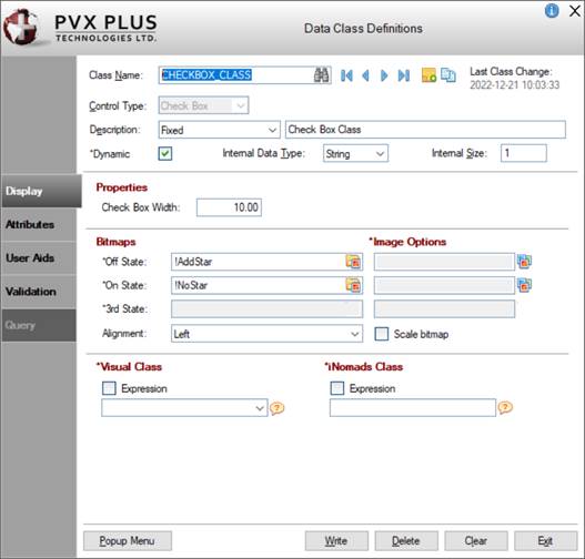
When creating or editing a data class for a Check Box control type, Data Class Definitions maintenance displays the following:
The following tabbed panels are available: Display, Attributes, User Aids and Validation.
|
Class Name |
Key to the data classes file (providex.dcl). When entering a new data class name, spaces are not allowed. Maximum length is 30 characters. Click the Query button (binoculars) for a list of defined data classes (if any). Click the Browse buttons to browse to existing data classes. Click the Copy Class button to copy an existing data class to a new data class. If unsaved changes are detected when selecting these buttons, a message will display to save the changes. (First/Last Class browse buttons were added in PxPlus 2019.) | ||||||||||||||||||||||||||||||||||||||
|
(Add/Edit Notes) |
(Available when a new or existing data Class Name is entered or selected) Button used to add (or edit) notes for a new or existing data class. Maximum 1024 characters. The button's appearance and tooltip change to indicate that a note was added for the data class. (The Add/Edit Notes button was added in PxPlus 2022.) | ||||||||||||||||||||||||||||||||||||||
|
(Copy Class) |
(Available when an existing data Class Name is selected) Button used to create a new data class by copying the settings from an existing data class. Once it is created, the new data class must be saved, as the Copy process does not do this. (The Copy Class button was added in PxPlus 2019.) | ||||||||||||||||||||||||||||||||||||||
|
Last Class Change |
This information is updated automatically whenever a change is made to the data class definition. (Last Class Change was added in PxPlus 2023.) | ||||||||||||||||||||||||||||||||||||||
|
Control Type |
Default control type used to represent the data that belongs to your defined data class. Click the drop-down arrow for a list of selections: Multi Line, Drop Box, List Box, Radio Buttons, Check Box. (Default is Multi Line.) The control type lets the NOMADS Panel Designer and File Maintenance Generator know which type of control to use for representing the data element. | ||||||||||||||||||||||||||||||||||||||
|
Description |
Generic description of the data class (Fixed value, Expression or Message Library Reference). This will be copied to the data dictionary when the data class is applied to an element. See Element Description. | ||||||||||||||||||||||||||||||||||||||
|
*Dynamic |
For new data classes created in PxPlus 2018, this check box is selected by default. For data classes created prior to PxPlus 2018, this check box is not selected by default. Select this check box to set dynamic control properties to Dynamic automatically when the data class is entered for a control in the Panel Designer. If Dynamic is not selected, dynamic control properties must be set to Dynamic manually after entering the data class for a control. See Dynamic Control Properties. (The Dynamic check box was added in PxPlus 2018.) | ||||||||||||||||||||||||||||||||||||||
|
Internal Data Type |
Internal format of the data when manipulated by a program, either String or Numeric. (Default is String.) | ||||||||||||||||||||||||||||||||||||||
|
Internal Size |
Maximum size of the stored data element. When the Control Type is Check Box, the Internal Size is 1. | ||||||||||||||||||||||||||||||||||||||
|
Display ( * indicates a Dynamic property) | |||||||||||||||||||||||||||||||||||||||
|
Properties |
| ||||||||||||||||||||||||||||||||||||||
|
Bitmaps |
Sets the button bitmap. Click the Bitmap Library button to select a bitmap from the Bitmaps dialogue for the state, if applicable.
(Bitmaps definitions for up to three states was added in PxPlus 2018.) | ||||||||||||||||||||||||||||||||||||||
|
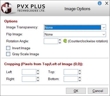
*Image Options |
(Available when Bitmaps for Off/On/3rd States are selected) Sets advanced image options for the bitmap. Click the Additional Image Options button to the right of the Image Options multi-line to invoke the Image Options dialogue. This dialogue consists of the following:
Note:
| ||||||||||||||||||||||||||||||||||||||
|
*Visual Class |
Assign visual class to the control. See Visual Class Assignment. Note: | ||||||||||||||||||||||||||||||||||||||
|
*iNomads Class |
The iNomads class contains class attribute references used when defining the control in the HTML code generated in iNomads. An iNomads class reference must start with an alpha character (A-Z or a-z), followed by any combination of A-Z, a-z, 0-9, underscore or dash. Multiple references may be entered, separated by a space. For a list of pre-defined iNomads classes, see iNomads Classes. | ||||||||||||||||||||||||||||||||||||||
|
Attributes ( * indicates a Dynamic property) | |||||||||||||||||||||||||||||||||||||||
|
Attributes |
| ||||||||||||||||||||||||||||||||||||||
|
*User Tag Field |
For controls, data/tag field which can be used to pass information on such things as formatting, error messages or validation rules. Field contents are placed in a variable using the control name with a .TAG$ extension. | ||||||||||||||||||||||||||||||||||||||
|
User Aids ( * indicates a Dynamic property) | |||||||||||||||||||||||||||||||||||||||
|
*Help Reference |
| ||||||||||||||||||||||||||||||||||||||
|
*Floating Tip |
Mouse pointer message for the control (Fixed value, string Expression or Message Library Reference). You can customize the floating tip by adding a tip title, descriptive tip text and a hyperlink. These features enhance the visual display and functionality of the tip by providing users with much needed information at their fingertips. You can define either a Standard tip or an HTML tip that provides a simplified HTML Editor for customizing the tip text. To do this, click the button to the right of the Floating Tip multi-Line input to invoke the Define Info Tip dialogue. See Defining an Info Tip. Note: | ||||||||||||||||||||||||||||||||||||||
|
*Message Bar |
Text to be displayed in the panel's status bar when focus is on the control (Fixed value, string Expression or Message Library Reference). | ||||||||||||||||||||||||||||||||||||||
|
Validation ( * indicates a Dynamic property) | |||||||||||||||||||||||||||||||||||||||
|
*Default Setting |
Initial value to be applied when the Check Box is drawn. | ||||||||||||||||||||||||||||||||||||||
|
*Values |
| ||||||||||||||||||||||||||||||||||||||
|
|
| ||||||||||||||||||||||||||||||||||||||
|
Popup Menu |
Button that is used to assign a popup menu to a data class (Fixed value or Expression, to be evaluated at run time when the popup signal occurs). A check mark displayed on the button indicates that a popup menu is currently assigned to the data class. This button invokes the
Assign Popup Menu window for assigning Prior Popup logic, a pre-defined popup object or user-defined program. If selected, Prior Popup logic will be executed before the popup menu is displayed. If On Select logic exists for the control with the popup menu, this will be triggered before the popup event. | ||||||||||||||||||||||||||||||||||||||
|
Write |
Adds a new data class definition or updates an existing definition. | ||||||||||||||||||||||||||||||||||||||
|
Delete |
(Available when an existing data class is selected) Removes the selected data class definition. Before proceeding, a message asks to confirm the deletion, as deleting a data class in use may cause issues. | ||||||||||||||||||||||||||||||||||||||
|
Clear |
Clears the current data class definition to allow you to define a new data class or select an existing definition. | ||||||||||||||||||||||||||||||||||||||
|
Exit |
Closes Data Class Definitions maintenance without saving any changes. | ||||||||||||||||||||||||||||||||||||||
(The Display and User Aids tabs were added in PxPlus 2018.)